Software
Houzz Logo Print
hjam1

New paint disaster!!! Sherwin William

11 years ago
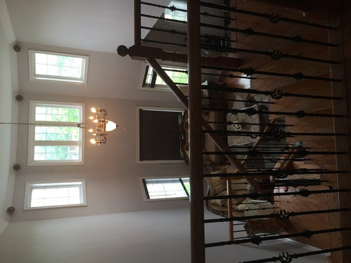
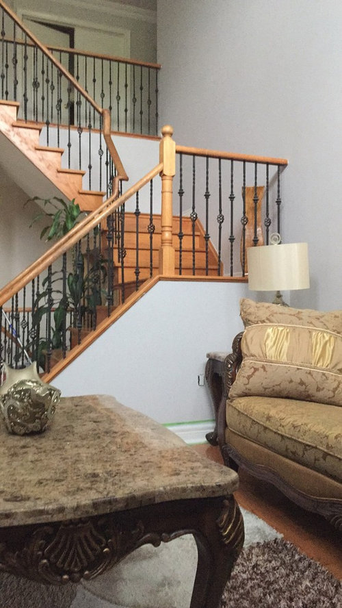
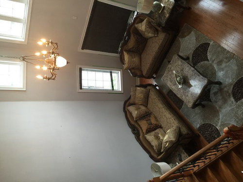
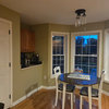
Hey, well after 4 years we finnaly took on the task to paint our 17 ft high living room walls. We went to Sherwin Williams and got 2 gallons of their Emerald paint in this colour called Grayish. It looked really nice in the store, then in the car it looked ok, still doable. At home we get everything ready and start painting, the old paint colour was this dingy goldish beige colour, and I couldn't tell how the new paint looked next to it, so we spent 2 days painting this gigantic room, only to end up with the horror of a paint that didn't match a thing in the house, it was screaming ugly blue undertones, it's like I have concrete on my walls, nothing like the paint chip at all. It's hideous.

Now we're going to repaint it all over the next few days, and I'll be getting SW SuperPaint instead (is it worse than Emerald?) I would appreciate colour suggestions to match with the floor and furnishing. I'm looking at Accesible Beige and Angora, what do you guys think?

Comments (18)

  • 11 years ago

    One should NEVER pick a color in the store without first testing it at home. And testing it at home doesn't mean just bringing home a chip but painting a large square on several sheets of heavyweight paper and then tacking the paper up in different parts of the walls. Then live with the color for a few days watching to see how it changes in different light.

    As an example of why. I had a color I loved when I lived in NY. I was convinced I was going to take that same color and paint my condo in FL. Well I painted a large square 15" x 15", put it on the wall, and noticed right away that the color that looked tan in NY became a very reddish beige in FL. The light in FL is warmer.

    hjam1 thanked cpartist
  • 11 years ago

    Superpaint or Emerald isn't going to affect the color you choose. Personally, I'd stick with the Emerald. As CPartist suggested, do a much larger 'sample' in your home. When we painted our house, we did several 'test' paints, with the color on a section of wall about 3'x3'. SW sells test size paints for around $6, more than enough to help you pick the right color.

    Good luck.

    hjam1 thanked groundbeef1
  • 11 years ago

    When you test colors, paint a 20 X 30 piece of cardboard and hang it on the wall for a few days. If you like it, proceed. If not, start over.


  • 11 years ago

    I'd recommend you simply the paint the 20x30 on the wall directly. That way the sheen will be correctly represented on the wall. Additionally, unless you're going to prime the cardboard, the color may not be correctly represented, and subject to color bleed from the cardboard.

    hjam1 thanked groundbeef1
  • 11 years ago

    Thanks ya'll, I'm gonna try painting over the walls in a few places to see how they look, and proceed based on that.

  • PRO
    11 years ago

    I have concrete on my walls, nothing like the paint chip at all. It's hideous.

    Nothing like the paint chip, huh? Wondering if your gallons do indeed match the chip.

    I ask because I'm a little surprised Grayish is giving off a blue vibe because its hue family is yellow-red. Depending on various how it was mixed factors, it could swing over towards the red hue family resulting in a purplish hue bias or overtone.

    With any color that is so knocked back from its parent hue that it gets labeled "gray", it can be tough to get a small quantity sample.

    Because fresh-mixed small samples like Color To Go Jugs will have a different formula vs. the gallon. And that difference can be the deciding factor as to which way the hue bias is going to swing for a color.

    e.g. I wouldn't be too terribly surprised if Grayish mixed in Super Paint looked different from the Grayish mixed in Emerald.

    hjam1 thanked Lori A. Sawaya
  • 11 years ago

    That way the sheen will be correctly represented on the wall.

    Only if you're using satin, because that's the ONLY sheen SW uses for sample paints.


  • 11 years ago

    @Lori A Sawaya:

    "Because fresh-mixed small samples like Color To Go Jugs will have a different formula vs. the gallon."


    Not necessarily, it's just a function of math. If a gallon contains 1oz of pigment, it's simply reduced to the proper amount for the sample. In some light colors, there may be a slight deviation, but the dispensers are very good now at adding the exact amount needed.


    No different than scaling up for a 5 gallon container. The color sample paints will give a much better representation than the small chips.

  • 11 years ago
    last modified: 11 years ago

    Take the paint chip, extend your arm fully, and hold it next to the wall color. Ive done this and found the paint is correct, even if I think it didnt look like the chip I chose.

    I disagree that gray is a red-yellow hue. Usually you will see it as some form of blue. Its a cool mix. This is why gray and blue or gray and purple go well together. If you want a warm mix you would do a beige or brown. Sounds like you had beige before but it was too yellow.

    I find that some stores do better than others at samples. The samples from home depot turned out correct for me, also SW and BM samples are spot on.

    Good luck in your hunt for the correct color. Took me 25 samples to get the green color I wanted (a warmer sage with less blue). I went to the wrong stores in the start of my hunt and chose too bold of colors also. Ended up with BM Olive Branch. Remember color multiplies on a wall so go a shade lighter.

  • 11 years ago

    @Lori,

    A color to go jug will give a very good approximation of the color that you will ultimately paint on the wall. It's been my experience (both sides of the register) that if the color can't be accurately represented in the smallest size, the next largest size is suggested (quart or gallon) if the client (or customer) needs the 'exact' color. For most folks the smaller size works for at least 90% of colors in the color deck.

    Anyways, I hope the OP has better luck with the second run.

  • 11 years ago
    last modified: 11 years ago

    Honestly it looks like the spectrum with dulled/muted colors and to my eyes, the only ones that look gray on that spectrum list are the upper row green-yellow through purple-blue and the lower row purple-blue and purple. All of those have blue in some way. When I think of gray, I think of concrete. :)

    The upper and lower row yellow looks like beige, the lower row green-yellow looks like a sage. Of course if you put a different green up next to that pistachio shell, it will probably look more like a gray, but you still know its green especially when you put it on a wall and the color multiplies.

  • 11 years ago

    Lori, Sounds like you've been around the block a time or two. :)


  • PRO
    11 years ago
    last modified: 11 years ago

    @groundbeef1 this is terrific advice, thanks for sharing: "It's been my experience (both sides of the register) that if the color can't be accurately represented in the smallest size, the next largest size is suggested (quart or gallon) if the client (or customer) needs the 'exact' color."

    I usually just spring for a quart in the brand, grade and sheen I ultimately want to use. Had pretty good luck doing that, but I know that's not even a 100% sure bet for every single color.

    @vith random color names like gray, beige and sage are purely subjective and essentially have no real meaning. One man's beige is another's tan, is sage the color of the actual herb or does that one word include all grayed-down greens, etc.

    I think the most interesting point the graphic makes is all the colors in each row are VERY close in terms of value and chroma. Value as indicated by the second number in the notation. Chroma as indicated by the last number in the notation i.e. hue/value/chroma. For conversation sake, we can combine the notions of value and chroma together and call it grayness.

    Despite the hue parent, each color in each row has about the same pitch of grayness. No one color is markedly less or more gray than the other.

    Unlike beige and sage, gray holds an important role in colorimetry and is defined as being neutral, achromatic - in other words colorless. When the word gray is used casually to describe a subjective interpretation of color, it's rendered equally as vague as the words beige and sage.

  • 11 years ago

    Not sure if this is too late, but I think Accessible Beige would be a great choice! I'd stay away from Angora, it looks like it has red undertones and may lean towards mauve. Other SW colors that might work: Rice Grain, Netsuke, Kilim Beige or Straw Harvest.

  • PRO
    9 years ago

    Your dilemma sounds familiar... I have been doing many Color Consultations when people are requesting gray paint because of its popularity. The clients are perplexed or disappointed because their furnishings and other elements are warm colors that are not ideal with most grays. I advise clients go more for the overall look and feeling of the room they are trying to create. I have found that the "greige" or "taupes" usually work beautifully. I agree with the suggestions of colors mentioned in previous comment Color from SW6133 through SW6154 strips scould be considered. Lower #s will be too yellow while the higher numbers may be too green (which could look very nice too but maybe not what you are looking for) My approach is less technical than Lori's. Lori has a wealth of information and her knowledge blows me away.

    Wishing you a brightly colored day,

    Mary

  • 9 years ago

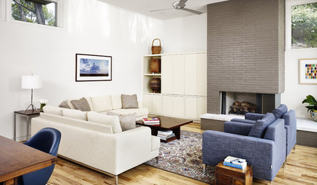
    I think this can be saved with out repainting it. The color is a bright and modern color. It did update your home! Sadly it made your furniture look dated. Have you looked for a modern extra large painting to place behind the sofa in browns and golds to break up the bluish gray? Can you afford to recover your sofa? If not how about a slip cover over the seat cushions in ivory canvas and see how the pillows look. I think this would perk it up.

    I actually think your home color looks beautiful painted this color.

  • 9 years ago

    Paint some posterboards, tape them in different areas of the room before you commit to a new color.