Software
Houzz Logo Print
huango

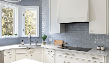
Missing prep sink: HGTV Dream Home 2016

10 years ago

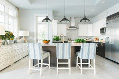
Great kitchen, but I just see drippage to/from the sink and the range.

Look at all the counter space near the range where they could have installed a prep sink.

scroll to the bottom to get the tour of the kitchen.


hgtv-dream-home 2016: missing prep sink

Comments (37)

  • 10 years ago

    Houzz appears to be broken for me, as it won't let me scroll through the pics. Could you post the pic of the area specifically mentioned? I'd like to see more.

  • 10 years ago

    Gosh. I'm on my phone and can't see the pics in detail, but I don't like that layout at all.

  • 10 years ago

    The sink looks to be about 3 steps from the stove. Why would they need a prep sink, too?

  • 10 years ago

    Interesting observation MamaG. Read about prep sinks almost every day on this forum, but I can't recall ever seeing one IRL either. Hmm.

  • 10 years ago
    last modified: 10 years ago

    That sink looks to me to be 8 or 9 feet from the stove, definitely more than 3 steps...although I admit I'm not good at judging such things. If it's the only sink I would really like to see it be bigger. I also have no one in my circle of friends/family that have a second sink in the kitchen, including me! Does anyone else think the hood looks too high?

  • 10 years ago

    My question is since they made changes to the footprint, why didn't they bump out the wall, eliminating the kitchen alcove and making the space wider? That would have made more sense to me and it would have made it easier to put the island with sink closer to the range, eliminating, IMO, a need for a prep sink.

    I also noticed that it appears they did less than the recommended 15" seating overhang on the island (why? looks like they had the room) and they stored dishware and coffee cups in the corner Susan. That's an odd way to use that kind of storage and an odd placement so far from the DW.

    But yes, we are looking at the kitchen through TKO goggles so we're likely to see improvements to be made when most people would be thrilled with that kitchen.

  • 10 years ago

    The island sink doesn't look large enough to be the main sink to me. Also don't like the pots/pans roll out storage - too far from range.... single range, so not large enough to cook for large group. I really dislike the traditional floor tile used on the backsplash - I've seen it on bathroom floors too much the past decade, so it screams "bathroom" to me. Don't care for the three dressers either - would rather have one long piece, such as a large sideboard with doors or drawers for storage. There's more I would change, but will just stop there.

  • 10 years ago

    I wasn't too keen about the backsplash either. Thanks to you Allison I figured out why...makes me think of bathrooms. Retro style bathrooms.

  • 10 years ago

    Wow. traversing back and forth in front of the frig for pans .... crazy.

  • 10 years ago

    I can't see the pictures either. I, too am the only one with a prep sink in my circle and I use it all the time. I will never give it up.

  • 10 years ago

    I'd hate to clean those dresser type drawers and even those white floors. Pretty to look at, not so pretty to work in.

  • 10 years ago
    last modified: 10 years ago

    Soooo many transoms, though! :) (I can only get the 360 degree tour to work, not the photo gallery or the kitchen tour)

  • 10 years ago
    last modified: 10 years ago

    Prep sinks are pretty common with my friends, relatives, and coworkers in homes above a certain price range and size.

    Those dresser drawers are precisely that --- I've been shopping for small chests and I've seen that design (Bowen Chest). Getting three of them in a row is pretty clever. I would not store foodstuffs there, but for extra linens and other infrequently used items, I like the idea.

    The kitchen pretty much hits all the trends in the Houzz Top 20, doesn't it? Still some white, still some shaker, brass, a little industrial, a touch of marble, white counters....

    I'm not a huge fan of the overall design -- it's so eclectic, it feels like a mashup with nothing to tie it together. Individual shots and products are lovely, but when viewed as a whole they leave me flat.

    The hood is too high, as noted above --- if the uppers are hung at the correct height that hood is 40" or higher above the range. The general lighting in the center of the kitchen seems inadequate -- it's apparent when you do the 360 view and look straight up.

    I also think whoever staged it with pots next to the stove, where obviously food is intended to go (in the rollout pantry unit), is someone who only eats out.

  • 10 years ago

    I wish I could open the photo gallery. I pretty much agree with the critiques so far. There is so much room for a prep sink. Why not? Just why? It's visually appealing except with the high ceiling and windows, I need more definition in the uppers. Color or even just some of the darker cabinetry. Something. It's just too stark. And I love the idea of the chests under the window. I'd love them a lot more if they were blue or somethin'.

  • 10 years ago
    last modified: 10 years ago

    I don't care for it much at all. don't like the dressers. the hood is too high.

    my sister has a prep sink in her about 13 x 13 kitchen. there's a small island in the center of it with prep sink on the corner by the stove. that keeps the cook out of the clean up sink/dw area. he cooks, she cleans up. the only other remodeled one was very small, 1 person kitchen - with 1 sink. Single woman who lives alone.

  • 10 years ago

    I agree the roll-out shelves shown holding pots/pans is meant for food storage... but things like that make the person staging for shoot look like an idiot to (good) kitchen designers and TKO-ers like us. I don't like corner units, but pots/pans would be better there than dishes. Another WTH? Also, visually, I dislike the single upper cabinet to left of single window.

    Three chest on sale totals $4500 plus tax. (regular price almost $2K each). While I like the texture (faux snake skin and nail heads), I would still rather spend the same, less or more on one big piece.

  • 10 years ago

    Very cold, and I really dislike the tiled walls/backsplash. Feels like a bathroom to me.

  • 10 years ago
    last modified: 10 years ago

    "Three chest on sale totals $4500 plus tax. (regular price almost $2K each)."

    good grief! I think those dressers are ugly. wouldn't want them if someone gave them to me. (ok, at those prices I could sell them!) same with the wall tile.

    evidently a lot of the people staging things don't cook... or use a kitchen for anything.

  • 10 years ago

    I noticed that this year's designer is different. I think he did an urban makeover show on HG that I watched. I wonder what happen to Linda (?). I adored her houses. This is too modern for me. I loved the Martha's Vineyard house.

  • 10 years ago

    The island is so odd, it's not in the kitchen work area at all. It's like a kitchen without a sink, but the sink is in the breakfast nook instead. I still don't know why anyone wants to sit at an island with a faucet in front of them, even if it's just to keep the cook company. And in this kitchen, all the prep and cooking is going on waaaaay back there.

    The dressers look like...dressers.

  • 10 years ago

    What you folks have to realize is that these things are made for show and marketing. There is no TKO obsessed client - only someone looking to create style and buzz - all through a camera lens .

    Why, because thats all you'll see and it's too dang hard to convey pizazz of flawless work triangles or the ultimate pot and pan storage cabinet. The owner of the house has no complaint because they didn't pay anything for it .

    The island was placed there because it looks good in a photo, I'm sure the architect had it rotated with the long axis parallel to the fridge wall. And those of you who think it's cold have never been to Merritt Island, last thing you want there is a warm anything.

  • 10 years ago

    I watched the special last evening and have to say I'm not thrilled with this year's DH. Like kelleg said, I miss Linda's decorating and all the local flavor she would pull in while accessorizing. Looks like we could recreate the furnishings by shopping at our local EA store, which I'm known to do. My DH noticed the grouping of lights in the LR. We have the same light in our DR.

  • 10 years ago

    I was going to hold my comments because they felt pretty negative but since we're all seeming to go that way why not pile on? This is by far the most lame dream house they've done in the years I've paid attention. I used to be very impressed by the unique design bits but this one was designed a trend follower rather than a trend leader which we used to get. Someone thought they were oh so clever to put bathroom floor tile on the backsplash. Give me a break. Those tiles look great on the floor in a traditional bathroom. As a kitchen backsplash they just look weird. I'd be willing to bet even the designer who picked them regretted her/his choice the second they saw them up. The island light fixtures are boring, the cabinets are boxy, the dressers are silly. Wasted space to have all those legs next to each other and having to keep them pushed together. And who wants to have to move all that stuff to clean under and behind them. How hard would it have been to make a real counter with great storage there? I think it's so sad because I would hope these design shows would aim to really inform the public on how to make good design choices rather than just tease the eye for their photos so they can sell more clicks/ads.

  • 10 years ago

    They are selling products.

    The three dressers aren't a deal killer. You can always retrofit cabinets with proper drawer hardware. In the current form, I guess you could call them cute.

    Either redesign the island to move it closer to the stove and provide better seating or put in a prep sink. Function, then form. Anything else is just irritating.

  • 10 years ago

    Xedos, I was going to say the same thing! This is hot Florida! I think cool (cold) is the look they are going for. Even though I adore white kitchens, when I first looked at this, I thought it was too white...the floor didn't even ground it. Then I remembered it is on the water in Florida! Duh! The entire house is not my style...but for a second home I would love it. And by far the best part of the whole renovation is the removal of sliders, and change/addition of windows!! The new windows just make this house.

    Oh...and the range is just screaming for a pot filler! Even though I don't cook much (at all) on vacation...you need to fill those pots to boil crab legs and shrimp!! Even if no prep sink, plumb it for a pot filler!

  • 10 years ago

    I can't get the links to work, so can only see the one photo. However, even with my poor design skills, I feel that this is not a well-designed kitchen.

    The dressers are not a functional part of the kitchen and are ugly -- at least not coherent in style with the rest -- so I would redesign that area with perhaps a bench seat included. I would rather have the island turned or brought closer to the rest of the functional parts or even eliminated in favor of a peninsula. I don't care about a prep sink, but the main sink is too far away from everything! It needs to be relocated and yes, larger. I think that I would so something different with the stove end -- it feels like, for such a big room, the actual most-used working area is crammed into a rather small, 2 cornered space.

    Go for it, folks, what else would you change?

  • 10 years ago
    last modified: 10 years ago

    Bean, you are living in denial if you think anything on pay television is there to inform the public of anything worthwhile.

    That is relegated to public access channels which none of you watch because the are boring and don't offer anything to capivate.

    Agian this is a vacation or 2nd home and doesn't have to be massaged to make everyday like easier for the occupants - of which there are none at the outset. So, it's partly least common denominator stuff. I hate pot fillers -and been in the biz for longer than I care to remember - so do lots of other people . Safer bet to leave it out and save the money since it's been seen a thousand times already.

    That less than fab floor is also a product placement , as well as the two DIFFERENT cabinet lines , plus all the brick a brac and radio on the dressers y'all don't like would look silly on a banquet. This is marketing and product placement at its finest people, it's got absolutely nothing to do with good or usable design .

  • 10 years ago

    g@xedos is right, this is all about the product placement. There is nothing inherently wrong with a cool palette, especially in this location. In the before photos, you can see the kitchen originally only occupied the small recessed area and there was a long peninsula down one side. In this sense, xedos is only partially right --- there was no island but definitely they chose this odd layout because it shows better. There was a breakfast nook that has been removed. One element that had me puzzled, the Viking fridge (vs. the Thermador sponsor), is there as it is a carry-over item from the original.

    They are heavily restricted to featuring the major elements from the sponsors. However, that does not excuse the designer from making good decisions among the stuff they have to work with.

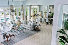
    I think it's also important to see the kitchen in the context of the great room and the patio/pool. I found this photo:


    Some of the decisions come more into context when you see the full view. You can see the nailhead repeat move from the sofas to the stools to the hall chests. I still don't think there is enough to make the kitchen design elements work -- and the designer still gets no "pass" when it comes to the bathroom tile that ended up on the wall (which I have -- in my hall bathroom). You would have thought the tile sponsor would have some other suitable alternative.

  • 10 years ago

    Don't know why y'all keep on about "bathroom" tile.

    Tile is tile for the most part . People use mosaic (which this is) all,over the place. Foyers, baths, kitchens, walls, floor and ceilings. How many people ooooh and ahhh over large format rectified porcelain in showers ? That's a floor tile. Typically . But again , tile is tile - use it where you want.

  • 10 years ago

    I have no problem with using tile in unusual ways I just don't think it works at all in this situation. There seem to be about a million other options that would have been better and not screamed bathroom floor. That's why I don't like it. Of course one CAN put any tile anywhere but that doesn't mean it will look good. I get the giggles when designers do silly things like that just to show how cleaver they are.

  • 10 years ago

    If you win it, you'll have a free house (after using the $250k in cash to pay taxes). Remodel the kitchen! :-)

  • 10 years ago

    I'm not loving this kitchen! I wouldn't want to sit & watch people wash dishes…could be wet & messy! Why are the pots/pans so far from range area & hood looks to high. And dishes in the lazy susan? away from DW? with this space they could have done so much better!

  • 10 years ago
    last modified: 10 years ago

    That is a Thermador range (I just purchased a 36" model).

    Two things about Thermador installation:

    1) the hood is probably to spec per the Thermador instructions.

    2) What they didn't do is install the required 9" high back guard at the back of the range. The range ships with the "island" back guard intended for there to be 12" of non-combustible material behind it. When up against the wall, they are supposed to install the 9" back guard, sold separately. The 9" guard is around $400+.

    The cabinet location flanking the range would be a code violation here unless those are non-combustible cabinets. They shouldn't be below the level of the hood...or, they need to be five inches away from the edge of the hood.

  • 10 years ago

    If you win it, you'll have a free house (after using the $250k in cash to pay taxes). Remodel the kitchen! :-)

    LOL, not me. I'd sell it and retire.

  • 10 years ago

    I really like this house----and "on trend" is great for a house i would certainly rent out about half the year. I dont lkke those dressers in the kitchen but to my surprise my mother loves them.