

2016 Kitchen Backsplash Trends
10 years ago
last modified: 10 years ago
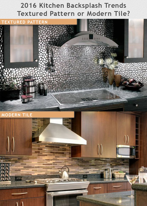

Modern Tile Backsplash

Rock Pattern Backsplash
Featured Answer
Sort by:Oldest
Comments (19)
 10 years ago
 PRO10 years ago
Related Professionals
Emporia Design-Build Firms · Gaithersburg Design-Build Firms · Brooklyn Design-Build Firms · Fresno Design-Build Firms · Boise Design-Build Firms · Tacoma Design-Build Firms · Westminster General Contractors · Starkville General Contractors · Wichita Falls General Contractors · Sierra Vista General Contractors · Fresno General Contractors · Miami Flooring Contractors · Ashland Flooring Contractors · Killeen Flooring Contractors · Jackson Flooring Contractors 10 years ago
 10 years agolast modified: 10 years ago
 10 years ago
 10 years ago
 10 years ago
 PRO10 years ago
 10 years ago
 10 years ago
 10 years ago
- 10 years ago
- 10 years ago
 10 years ago
- 10 years ago
 PRO9 years ago
- 9 years agolast modified: 9 years ago
- 8 years ago

Related Stories
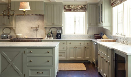
KITCHEN DESIGNKitchen Confidential: 9 Trends to Watch for in 2016
Two top interior designers share their predictions for the coming year
Full Story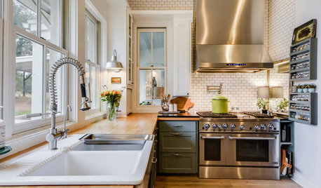
DECORATING GUIDES25 Design Trends Coming to Homes Near You in 2016
From black stainless steel appliances to outdoor fabrics used indoors, these design ideas will be gaining steam in the new year
Full Story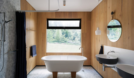
BATHROOM DESIGN15 Bathroom Trends Splashing Down in 2016
Four Australian designers break down the looks, finishes and features they believe will reign supreme in bathroom design this year
Full Story
LAUNDRY ROOMSTop 10 Trending Laundry Room Ideas on Houzz
Of all the laundry room photos uploaded to Houzz so far in 2016, these are the most popular. See why
Full Story
COLORColor of the Year: Off-White Is On Trend for 2016
See why four paint brands have chosen a shade of white as their hot hue for the new year
Full Story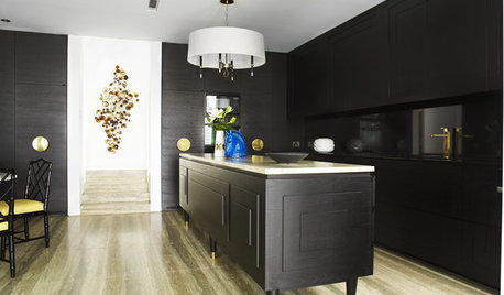
MOST POPULARTrend Watch: 13 Kitchen Looks Expected to Be Big in 2015
3 designers share their thoughts on what looks, finishes and design elements will be on trend in the year ahead
Full Story
DECORATING GUIDESPop Culture Watch: 12 Home Trends from the '80s Are Back
Hold on to your hat (over your humongous hair); interior design elements of the 1980s have shot forward to today, in updated fashion
Full Story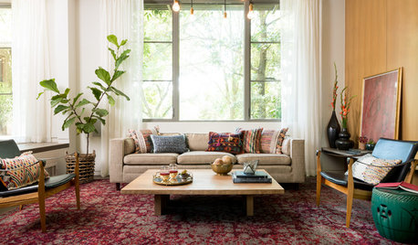
DECORATING GUIDES5 Decor Trends to Try — and 5 to Rethink
Some style trends are worth jumping onboard. Others you may want to let fade from your memory
Full Story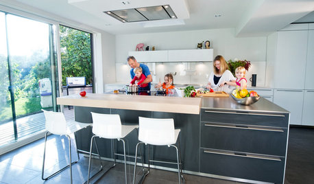
DECORATING GUIDES10 Popular Design Trends to Carry Into the New Year
A designer shares the looks that are likely to stay in style in 2016 and beyond
Full Story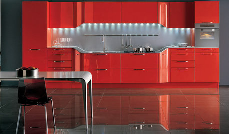
KITCHEN DESIGN2012 Color Trends: Using Red in Your Kitchen and Bath
Fiery hues bring high drama home
Full Story


Design Details