Software
Houzz Logo Print
katieme2015

Kitchen inspiration needed please

10 years ago
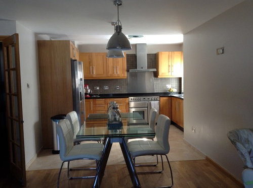
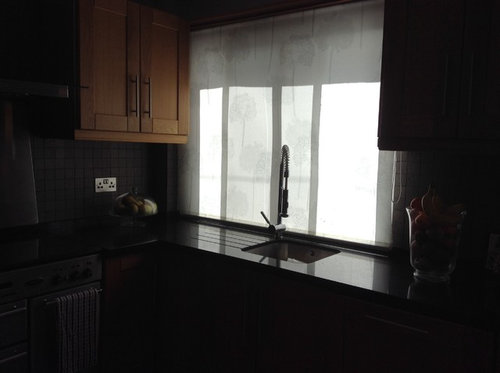
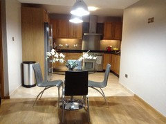
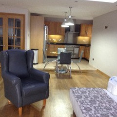
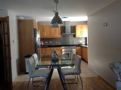
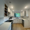
Hi this is my kitchen don't really know what but I don't like it. Previous owners design so not quite my style but due to budget constraints have to live with it. Not quite sure whether it's the splashback tiles but not liking the combination. I can't paint the cabinets and worktop is granite so a shame to take it away, I will be having an island where my current table is but again don't want to spend money on a matching black granite worktop if I am unhappy with it. would welcome any ideas of how I can improve the look and ideas as to island design preferably with seating area for four and storage if possible current table measures 1 Meter wide by 2 meters long thank you

Comments (26)

  • 10 years ago
    I agree with Patricia. Consider a beautiful patterned marble top work table (not island) to add texture...like a Carrara marble. Have black legs or wood to match cabinets and call it a day.
  • 10 years ago

    HI -- That is a real nice kitchen ,it is just lacking color or accents . I don't like the cabinet hardware and it is placed wrong . This kitchen has some high end features . It will be wrong to have an island in place of the table and chairs . You do not have the room for it and it will not look right for the room. Not liking the pub height table idea either and again not right for the room. I see your mixer is red so maybe pickup on that for some other accents . Or add a couple of large white jars with lids . Put a big square painting on the right wall or some prints . The backsplash area isn't that big so that could be changed to something you like . Check some tile shops and their discount room and find some discount tile stores . Maybe tiles with some gloss or a bit of sparkle . The tiles there are dull and lifeless .

  • 10 years ago
    Thanks for your comments you are fantastic, ok so no island although struggling to find a suitable table and chairs like the idea of a marbled one, lefty would sort of hardware did you have in mind for the cabinets and for the splashback love the idea of having something glossy will go tile hunting and see what I can find what areas would it be best to tile as currently the tiling goes all the way behind the extractor hood. For the right hand wall a tv is going to be installed Would a sticker quote look to dull ?
  • 10 years ago
    Thanks auntthelma not too keen on them. Anyone has any splashback inspiration photos of honey oak coloured cabinets and black granite work tops
  • PRO
    10 years ago

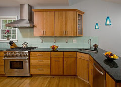
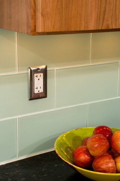
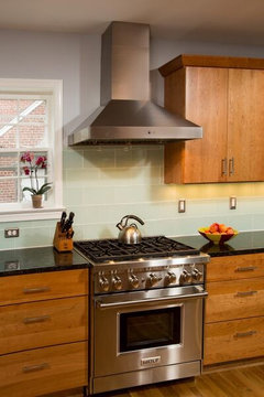
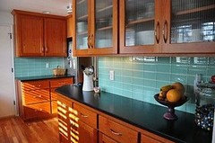
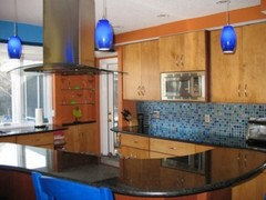
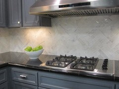
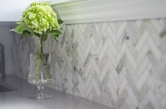
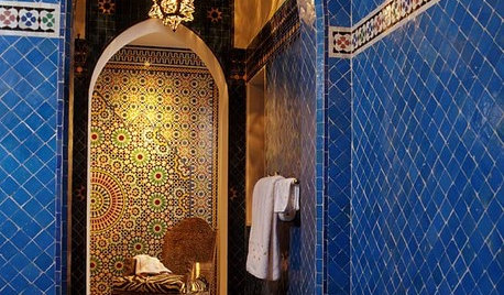
    This kitchen came out beautifully and I think the tile would work well in your space.

    Contemportary Kitchen Addition · More Info


    Blue Glass Subway Tile Backsplash · More Info

    Wolf Gas Range and Hood · More Info

  • PRO
    10 years ago

    For tables, take a look at the Thomasville Color Cafe line. You can choose size, height, shape, leg style, finish, and edge. That way you get exactly what you want.

  • 10 years ago
    It is a little hard to tell from the pictures, but it appears that the kitchen is lit unevenly. If you could somehow supplement the lighting, it might freshen your perspective on the whole space.
  • 10 years ago
    Pretty kitchen! I do think the backslash tiles blend in too much with the stainless stove and hood. Maybe something a little lighter may brighten it up. I also think the transition of the 2 flooring materials in the dining space under the table need to be camouflaged, until that can be fixed down the road. Maybe find a large rug for the space that would cover most of the transition, and use the colors for accent colors in the kitchen.
    Wilderness Club · More Info
  • 10 years ago

    The current backsplash goes with what looks like a metal backsplash behind the stove. I still think you could get color from accents on the counter.

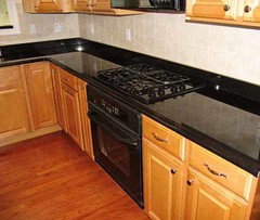
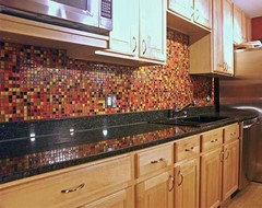
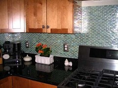
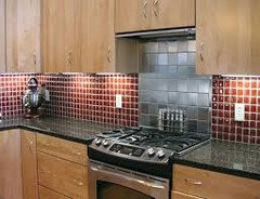
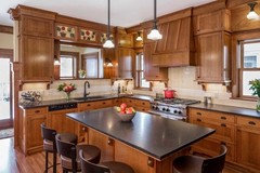
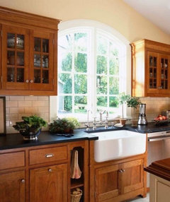
    Here is some of what I found for light wood cabinets and black countertop. It is mostly not encouraging.

    Also keep in mind, you are not required to have a backsplash at all. I think naked walls would look fine. You will still have the metal behind the stove and there is really little wall space above your sink anyway.

  • 10 years ago
    last modified: 10 years ago

    Please don't put an island in the dining area. That just won't look right.

    Replace backsplash. The tiles look like they belong in a bathroom.

  • 10 years ago
    Thank you all lee lee love the tiles where are they from?, I am thinking of going naked on the wall as suggested but leaving the stainless steel splashback behind the stove
  • 10 years ago

    I think your kitchen has a little difficulty because it is attempting to blend the "popular" grays with the warm honey colored cabinets. It works - sort of, because of the modern stainless hood. It is really challenging to mix warm wood tones with gray - I see a lot of "just missed" attempts posted here as dilemmas. I would look for a warmer paint color and a warmer backsplash.

    Also consider how much grain is in your cabinets. The grain gives "movement". The more grain, the more you want to use a simple backsplash. A busy backsplash combined with lots of wood grain becomes too busy when perceived as a whole.


  • 10 years ago
    Thanks Jhmarie I think you nailed my problem, when I see pictures I don't like them and I find them too 'busy' especially as I like simple looks, I hope I don't make a mistake taking down the current tiles and keeping it just painted at least I can keep changing the paint colours until I find a match. I also think my cabinets have to much grain! I hate honey oak furniture
  • 10 years ago

    Bassett Furniture also has a line called "Simply Yours"......similar to what Mark IV said above, you can pick design, top, edge legs, chairs etc. and in colors. A round table in that space would look good.

  • 10 years ago
    You can paint the tile. My Sil did hers and I would not have known it if she hadn't told me. It was originally purple grapes and she painted all of it white.
  • 10 years ago

    Your cabinets on my computer look very nice, and they have less grain then mine. Are you sure they are oak - they look maple to me - but looking at a picture on a computer is not always true to life. I actually do like wood - I like natural surfaces and have oak cabinets with much more grain than yours:) - pics in my idea book.

    You will have a hard time getting the tile down without damaging the wall. Hopefully. it is not too large an area and repair will not cost too much. There is certainly no problem with leaving the wall untiled and painting it - even if you choose never to put a backsplash in. I do recommend leaving the current backsplash behind the stove or putting something up in that area. It is also recommended that the small 4 inch granite piece be removed before tiling a backsplash.

    I do not have a backsplash and my house is 40 years old. I am planing on a very simple one, but will make that decision after the new counters go in.

    You may be able to put in a narrow island, like in the last picture I posted if you need more counter space. You need 42inches between island and sink and island and stove. Preferably 42 inches free all the way around but can go as small as 36 inches for an area that doesn't need as much space. I cheated on mine and it is 42 inches between island and sink, but less on other sides. It is freestanding, so movable and not subject to the code requirements of a built in island.

  • 10 years ago

    I like your kitchen. I think you're just lacking decor. A colourful large painting on the wall in the dining area and one on the wall beside the door would be great. Then bring in some of the colours from the art into decorative items for the kitchen counters. Right now everything is just fading away. I also think your table and chairs will look fine once you add some colour to the room.

  • 10 years ago
    Casandra never thought of painting the tiles although my tiles have a rough surface may not give a nice finished look but may be worth looking into it.
  • 10 years ago
    Jhmarie don't really know of they are maple or oak, the previous owner said they were natural wood and had coloured with age. I think if the cabinets had a light coloured worktop it would not have bothered me so much but it's looks so dull as it is at the moment . I like the thought of having a small island like the one in your last pic.

    I have just rearranged the tables and have put a round one in the kitchen/dining area. Would love to hear your thoughts. As to adding accent colour on the counter space I prefer to have a very clear and clutter free countertop.
  • 10 years ago
    Thoughts please


    Thanks
  • 10 years ago

    While your round table fits the space better, it doesn't blend well with the 2 ceiling fixtures above it. If you need more counterspace, perhaps a movable island on the wall to the right, but only as big as the kitchen floor space will allow. Be conscious that the flooring separates your rooms. That large wall also is crying out for a nice big pice of artwork. Find something that you love, pick up a color to incorporate on your table (your centerpiece is too large for your table as it is now). You might want to pick up a lovely bowl with bright fruit centered on your counter to the left of your stovetop. Just incorporating one bright color will blend the spaces without making it look cluttered.

  • 10 years ago
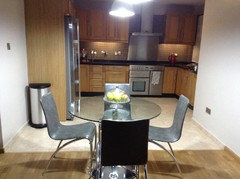
    Thanks Barbara I can sort the centerpiece right away is this better
  • 10 years ago
    Ok moved the fruit bowl(as a quick fix until i find a nice one) to the middle of the countertop as suggested. Thoughts as to which size/layout of table suits better i would also welcome comments as to a pennisular island on the right side wall, i cant make up my mind on this the width of the kitchen is 2meters 90 cm thanks
  • 10 years ago
    Photos
  • 10 years ago
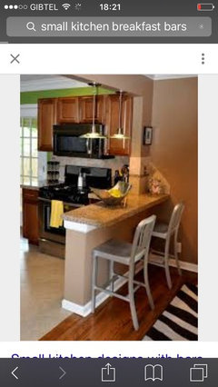
    Would do you all think looks better keeping the round table as it is or putting a small breakfast type bar( something similiar to the one on the pic) on the right hand side finishing where the kitchen floor is thoughts suggestions greatly appreciated i am clueless at how to make best use of the space