Software
Houzz Logo Print
stream13

Same wallpaper in multiple rooms/areas?

10 years ago
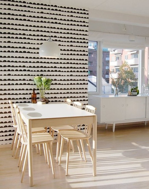
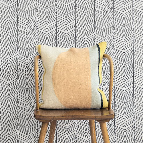
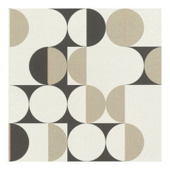
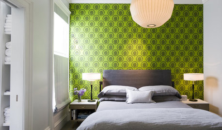
As part of a facelift (can't afford to fully gut the bathrooms) I plan on using FermLiving's Half Moon wallpaper (see first photo - not my house, just the wallpaper) on an accent wall in both the main bathroom and in the master bathroom. The rest of the walls will be white and I will paint the cabinets in each room a different colour (red-orange / mustard yellow - I prefer warm colours) and both with a matching white laminate countertop from Ikea.


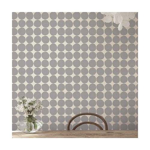
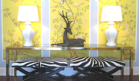
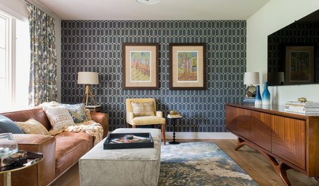
So my main question is whether or not I should use the same wallpaper (half moon) as an accent wall in the back entrance area and at the end of the bedroom hallway where I wanted to add some interest. Or should I use a different wallpaper (FermLiving Herringbone or Marimekko Grey dots - see photos 2 & 3) for accents in the other two areas? Is using the same wallpaper in 4 areas of the house too much? I would worry having too many patterns would also be an issue. I don't want to go with a colourful wallpaper as I want it to still be relatively neutral even with a pattern. That way I can add or change colours easily with art or accent items (towels etc)


The rest of my house is MCM/Danish/Scandinavian style so I think any of the wallpaper's will coordinate nicely (I do currently have the half moon wallpaper so I'm pretty set in using that wallpaper in the 2 bathrooms)


I can get photos of each area if anyone wants to see them in their current state (just have to get home from work)

TIA!


Comments (19)

  • 10 years ago

    I would suggest having a little more variety/interest by not using the same wallpaper in 4 areas of the house. :)

  • 10 years ago

    Elle - I'm torn between the two others if I go with a second wallpaper. Do you think one goes better with the half moon wallpaper than the other?


  • 10 years ago

    i like the half moon and the lined chevron ... :) they seem like a well matched pair :)

  • 10 years ago
    Thank you Leepani! I was torn between them but I think you're right. The colour/hand drawn feel do fit together
  • 10 years ago

    Brooke, between the herringbone and the gray dot as a 2nd paper, I would go with the gray dot because the pattern seems more subtle/less busy and therefore one that may be more likable long term. I also saw the gray dot as "full moon" in contrast to the half moon paper.

  • 10 years ago

    No, don't use the same one in multiple areas. I wouldn't even use wallpaper in more than two rooms.

  • 10 years ago

    Thanks everyone, I definitely wont be using the same wallpaper in all 4 areas!

  • 10 years ago

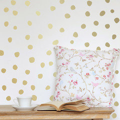
    I found these gold wall decals online this morning and I think I might just get these for now. They're temporary/cheaper than wallpaper so I can always remove them and put up something permanent later on. I have other brass items in the house and will have a brass shelf in the back hallway so I think the dots will go well with the house. They may not be the best fit with the half moon wallpaper but I like that these dots are a bit wonky like the half moons and I can add more or less dots as needed to prevent it from looking too bare or too busy.


  • 10 years ago

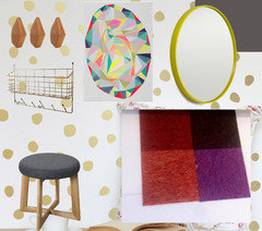
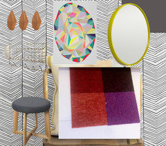
    Here's a quick image board... white walls, charcoal grey door, gold dots on the main wall, brass "mitten shelf" for mail/dog leash/keys and wood hooks on the gold dot wall, white floors, chartreuse round mirror, grey/wood stool and FLOR entry carpet in Red/burgundy/purple/orange. The art wont be on the gold dot wall, it'll be above the stairs going into the basement and the mirror will be closest to the art.

  • 10 years ago

    I think the gold dots look better than the herringbone. It's too busy

  • 10 years ago
    last modified: 10 years ago

    GOLD Dots ...I like them! .... especially after seeing your mood board!

    Brooke thanked Leepani Vancleef
  • 10 years ago

    Thanks Leepani! I think I'm going with the gold dots. They're easy to remove if I get tired of them and I can control how busy it will look. Thanks for the help!

  • 10 years ago

    Most welcome!

  • 10 years ago

    I'm glad you went with dots. Please post photos when you finish.

  • 5 years ago
    last modified: 5 years ago
  • 4 years ago

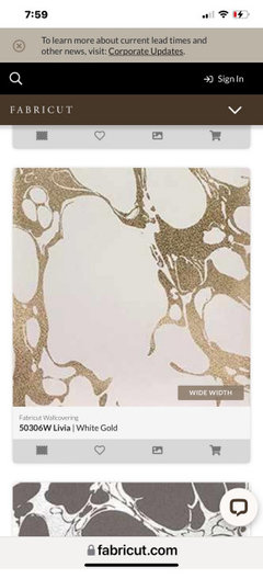
    I had a similar question. Using a pretty modern metallic abstract in half bath off kitchen and because of minimum purchase will have leftover and thinking about adding to an accent wall in pool house bathroom also? Two separate buildings on property. Pretty expensive paper so hate to waste it. Pool house bathroom is just all white right now.

  • 4 years ago

    I would use the half moon wallpaper as an accent in all 4 areas without hesitation, if it’s a money and paper saving idea. It’s cute and neutral, and most guests won’t see your back entry or master bath, and maybe not the bedroom hallway. But the gold dot is a bit more expressive and should be used more judiciously. Love them both!

  • 2 years ago

    just my opinion and thoughts, when choosing decor commitments like paint color, floor finishes, window treatments, light and water fixtures, counter tops and wall textures take a broader view that it will be in room when you sell the house and are no longer there as opposed to items you take with you. As it is easier and less money to add accessories to revise the decor for personality.... conceptualize the totality of the home not an individual room. This is why wallpaper companies will make stripe, dot, print, geometric and companion solids in the same "paper family" group so each room connects to the whole home. This would give variation without jarring unconnected images. Try using plaids in bathrooms and switch out towels for newness, stripes on the stairwell and a solid for accent walls...the for a bit of drama use a mural effect in the entryway; Ask this question, how will the dwelling look if the furniture, pictures, and personality clutter is absent? is the home still a home?