Software
Houzz Logo Print
lyricfox

Need help with paint color choice

9 years ago
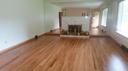

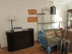
This is the living room that I am painting. I live in Youngstown Ohio, and I met with the painter earlier in the week .

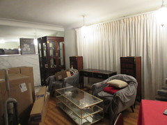
I'd originally chosen SW Truepenny for the room, but the painter suggested I might should go lighter. The room is east facing, and he's right that Youngstown doesn't have the same amount of sun that my hometown does, Dallas. I agreed with him at the time that he was right and SW Chivalry Copper was the better choice. I have dark furniture for the most part and MCM gray loveseat and chairs at the end of the room by the fireplace.

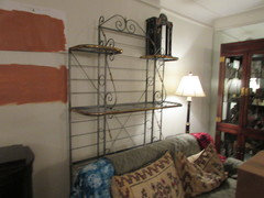
Now I'm not sure. I've painted large swatches on the walls, and lived with them for several weeks. I had a very similar color in my dining room before we moved. I adored it, and though I didn't intentionally pick this color for here, I know why I did it. I have dark furniture for the most part and MCM gray loveseat and chairs at the end of the room by the fireplace.

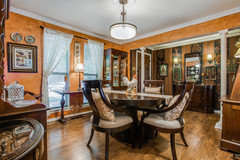
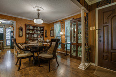
So I guess my question is whether or not the darker color would be oppressive in this room. This photo is one of the listing photos, but we've kept the mirrors and the large window has a light filtering sheer on it now.

Thoughts? Opinions? (I can't get a photo of the current room because bathroom cabinets are stuck in the middle of it, and we're moving things around for the painters.

Comments (16)

  • PRO
    9 years ago
    last modified: 9 years ago

    Dark is fine with East light, but not oranges/coppers. You will hate it once the sun moves around the house. A certain shade of orange would work in North light.

    You can do cobalt blue, or purple…something jewel like if you want to go dark.

    If you want a lighter color with you gray upholstery, try an apple green.

  • 9 years ago

    Judy,

    I've got certain collectable religious iconography that I'm actually working with that have this color. That's why I initially went this way. That and I lean hard towards earth toned colors.

    Why would I hate the copper/rust colors?

  • PRO
    9 years ago

    How do you feel about SW Totally Tan or SW Bagel? They have warm undertones, but still neutral. It could play off well with the sun coming in your room and your painting.

  • 9 years ago

    Libradesigneye:

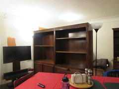
    I have a large bookcase that I'm using as a room divider that is going to be painted. Using Truepenny there would be the accent piece. I had originally planned for gray

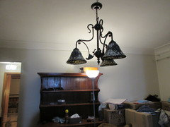
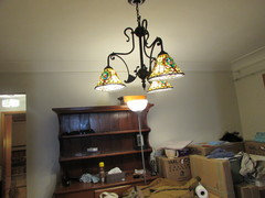
    I do have a stand alone dining room that the living room actually opens in to, but it's going to be something of a sitting room. The furniture will be a total change to early American antiques \. It's going to be the same color as the living room. I'm trying to get some consistency because the back part of of the house has the master bedroom (navy), a small gust room (coral) and my office (deep purple). The chandelier is a Tiffany style I inherited.

    What I have against the main living room wall is a large baker's rack. It's a pewter colored metal with brass accents. This is where all the Santos are displayed.On either side of the fireplace are large matching curio cabinets. There is a black and brass console table in front of the window and a pair of Louis XV lingerie chests on either side (they're chestnut with ebony and gold accents and not fussy for the era) and a rectangular brass and glass coffee table between the loveseat and chairs.

    What I've done is pull gray, brass and black into the room. The baker's rack and marble fireplace are the grey elements. The black is the console table. The brass is on various items in the room, a small table between the two chairs and the coffee table.


    This room and the dining room are never going to have similar furniture or minimalist design. I've inherited a lot of antique pieces and my mom's art, so we've got something of an identity crisis. It works for us, though.


    As the painter said: You have a lot of stuff.

  • 9 years ago

    let me study these photos and then come back . . .

    Donna Hurst thanked libradesigneye
  • 9 years ago

    I think I know what I'm going to do. I've got a huge emotional tie to the darker color, Truepenny, and I know I will be unhappy if I don't have it here. I will go one shade lighter than Chivalry Copper for the dining room. The pine hutch will fade into that color, so one down from it is Windswept Canyon. I think that will work.

    I like that French Grey a lot. I've been mulling over what color grey to use on that bookcase, and I think this is it. Behind it is the "entry hall" with more marble, and I've got wallpaper to go on the back of the cabinet (it's gray trees set against a white background with owls perched on them).

    This house is just about impossible to make coherent. Too many styles of furniture and way too much sit around $hit, but all of it has meaning to me, so I'm going to hoard it. :)

    Thank you (and everyone) for your comments...it's helped me work around what I want to do (and helped me find the gray for that bookcase!!).

  • 9 years ago
    last modified: 9 years ago

    I think you're craving warmth up there in Ohio! And some similarity to your last house. The last time I moved, I subconsciously painted for the season. I painted all cool colors... we moved in August (Dallas!), and it was 105+ the week I was choosing colors, haha.

    As long as you think you'll like those oranges year-round, I think you should do what you want. For sure don't use that light shade that you don't like. Can you try samples of a few more colors before deciding though?

  • 9 years ago

    Ok, I just saw your most recent comment. That sounds good!

  • 9 years ago

    Lindsay,

    This is the dining room of the house we left. Mom and I faux painted (well, I painted, she directed) it. When she died, I inherited the house and that color meant a lot to me. Didn't realize what I was doing up here at first, but I know now I am recreating that room.


  • 9 years ago

    Lindsay,

    We left Dallas for Ohio at the end of last August. I will NOT miss the heat. :)

  • 9 years ago
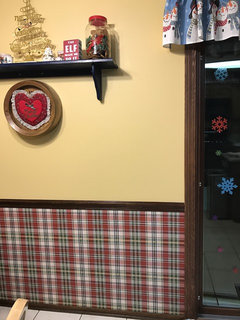
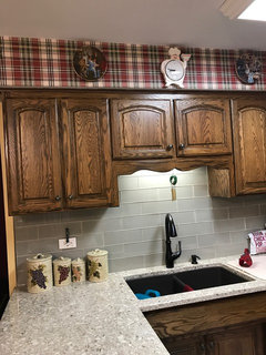
    I need help deciding on new wallpaper and paint color. We've recently installed new quartz counters & glass tile backsplash and I'd like to stay with a Tuscany/bistro feel, while keeping my decor. Help!
  • 9 years ago
    last modified: 9 years ago

    What a beautiful room you and your mother created together! I hope that color...and the whole set up, will bring some peace into your new home for you :)

  • 9 years ago
    last modified: 9 years ago

    No, you certainly won't miss it. I'm originally from the Midwest. I hope you like the summers!

  • 9 years ago

    Marcy B - what a cheerful christmas spirit you had going there and right on trend with plaid! Let me ponder and return . . the cool green grays may want warm tones to maintain your bistro feeling .. a deeper neutral desert green on the lower wall paired with a soft white above would pull it all together . . do you have good natural light here?

  • 9 years ago

    Well, it turns out all the paint discussion was for naught. My painter bought the paint yesterday, and it can't be tinted lighter or darker, so Chivalry Copper is where I stand.