Software
Houzz Logo Print
nomad

Is Something Not Quite Right?

9 years ago

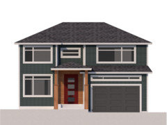
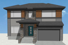
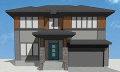
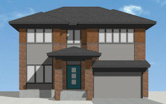
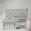
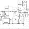
Currently building a new custom home. We couldn't quite visualize from the construction drawings so hired a freelancer to do a rendering. This is what it looks like with our current colour choices, the wood near the door is Sagiwall. We are in a very harsh and windy climate, so there are limits on our options. These are definitely the materials we're going with. The siding is a dark slate blue, close to gray.


I feel like something is not quite right though, but can't put my finger on it. Any ideas? I'd welcome your advice.

Comments (73)

  • 9 years ago

    Hmmm, good points Mike. I will be relying on my coloured pencils to get some sky and grass in but I'm sure that would make it look a little different. The eaves issue is from the effort to maintain the portico I think, which I do really love. I would love to get that garage roof out of the way without losing the portico but no idea if that's possible.

    HB was set on huge windows. We aren't overlooked in the back so it's basically a wall of windows there. I think we will be using semi-sheer shades in front. Wall colour will be white.


  • 9 years ago

    I'm wondering if the garage roof could just end when it meets the porch, basically have that right side of the porch be a solid wall.

    Does that seem doable?

  • 9 years ago

    You need to ditch the window over the garage. It's proportion is completely off

  • 9 years ago

    Yes, I think that's going to be out.

  • 9 years ago

    I didn't even SEE the window over the garage until it was pointed out in this thread. lol

  • 9 years ago

    ok, maybe not. haha

    I think there was actually supposed to be a transom over the front door and the garage.

  • PRO
    9 years ago
    last modified: 9 years ago

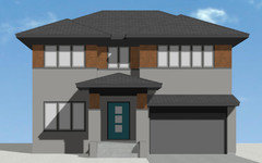
    I think there is lack in balance, colors aren't wisely chosen & also it seems like there is nothing common between the garage & entrance door..

    maybe if we change the rooftops color into wood like the entrance & the entrance door into grey like the whole house it will make more sense..try it

  • 9 years ago

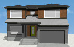
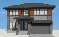
    Ok, so updated image with perspective that gives a better view of the roof.

  • PRO
    9 years ago
    last modified: 9 years ago

  • 9 years ago

    Another thought with all those windows in a northern climate is energy efficiency. Which side of the house faces north?

  • 9 years ago

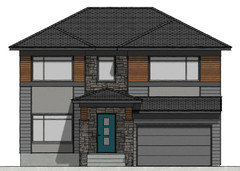
    Nice PPF, much better in scale with the windows, and roof tie in. Nomad, see the differcne between someone with design talent and your builder (unfortunately).

  • 9 years ago
    last modified: 9 years ago

    I like what PPF has shown you in both renderings. What bugs me about the representations you've shown were the window above the garage door and the column and roof areas on the left side of the garage. The overlapping of the roofs looks odd and the column placed forward in front of the garage wall makes the garage look lopsided. PPF solved that really well without changing the style much in the last one. Until the basic structure is cohesive it makes it hard to comment on the colors/materials as if kept as is I would recommend things to make that area less noticeable.

  • 9 years ago

    Have you posted your floor plans?

    And which direction faces south as that's the side that should have all the windows

  • 9 years ago

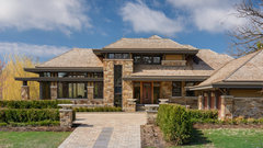
    The entry is not speaking 'prairie' in this rendering! Seems like a blend of contemporary cottage with a Craftsman/MCM entry. The house is boxed in visually by the white trim at the corners. The overabundance of white horizontal lines are a distraction. I do get the overlapping roof lines though - a true FLW look.


    Frank Lloyd Wright Prairie school, Oak Park style Architecture · More Info

    Arts and Crafts, Prairie in Wayzata · More Info

    Prairie style home · More Info

    nomad thanked decoenthusiaste
  • 9 years ago

    Ok, so updated image with perspective that gives a better view of the roof.

    Are you doing it yourself or is your designer doing this? I ask because this roof is nothing like the first roof you posted. What do the floor plans look like? You can't just change a roof willy-nilly if it has no relation to what's inside.

  • 9 years ago

    At my very first glance at your picture, my eyes were drawn to the 2 porch posts which instantly looked choppy to me. I also live on the east coast and understand your concerns.

    Can't wait to hear what you decide to do!

  • PRO
    9 years ago

    The proportions of the existing design are fragmented, disconnected and simply uncaring. For example, the separate roofs on the garage and entry compete with one another for visual priority, much like two small children arguing over blocks. PPF's illustrations are a big improvement. The windows seem like they were picked from a catalog and applied to the house.

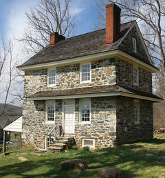
    Here's a simple 1700s farmhouse, the John Chadd house in Chadds Ford, PA. Do you see the wonderful and simple proportions, as compared with your design?

    You can do much better than what you currently have!

  • 9 years ago

    If you want these unusually divided windows, don't 'reverse' the one above the garage.

  • 9 years ago

    I don't care for the divided windows - and, like apple pie, I wonder if they even open?

    I am also curious which way the house faces.

  • 9 years ago

    Ok, I can see the roof overlap that decoenthusiaste posted, but a key problem here is that during a rainstorm, the garage roof will actually bring water under your portico, meaning you will get rained on in your covered doorway!! If you want that effect, then the roof layering needs to be different. Otherwise, I think PPF has the best idea(s) so far, and his scheme does away with the midcentury "tori gate" effect of your light entry pillars.

    nomad thanked acm
  • 9 years ago
    last modified: 9 years ago

    Sophie Wheeler - we've got 4000+ sq ft, I think we'll squeeze in some furniture. ; ) One of the upstairs rooms is my studio and the other a large bedroom with an extended window seat, so the light will be welcomed. I've had a good look around our area today and see many other houses with similar sized windows. The windows in my current home are not massively smaller than this in the same three areas of the front and we haven't had any trouble with cold?! We have upgraded insulation and high quality windows. They do open. We have actually seen these particular windows and roof pitch on a house so we know they meet regulations and we loved the look in person. The main roof looks like ppf's image above.

    As I mentioned, this image is not from the builder. It's a quick mock-up to help us figure out selections but it seems not a great representation of the plan and certainly not the quality of rendering the pros on here can do.

    Thanks so much for the helpful advice about the roofline issues, acm, lyfia, khinmn59 and ppf. acm, the rainfall inside the portico issue is absolutely our most pressing concern. We contacted the builder this morning and will be meeting to change that and a few other things. Interesting that you should mention the "torii gate" effect, I actually adore that and hope to maintain that portico as is while addressing the rest.

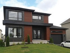
    decoenthusiaste, this is the "inspiration house" that was the basis for much of our design <3

  • 9 years ago
    last modified: 9 years ago

    Nomad, you are so polite! I too like the PPF rendering, as my eye went first to the portico post on the right and how it chopped the view of the garage. ppf fixed that, could the single posts be stone. And the colors if two tones, should be like the one you picked, and a true grey or a true blue (just a couple shades apart like the inspiration photo.) I think your front door choice from before was fine, seems like the FLW's from the post above!

    nomad thanked rnonwheels
  • 9 years ago

    Thanks rnonwheels! Adding 3/4 stone on those posts is also on the list for changes and I think we will keep the front door style but change the colour to grey. The comments I've found most helpful are helping me see that staying closer to that inspiration photo (and this one below) within reason for my location is the way to go.


  • PRO
    9 years ago
    last modified: 9 years ago

    nomad thanked PPF.
  • 9 years ago

    Your inspiration house is adorable. You should look to incorporate more of the things that make that house work - the recessed garage, the use of stone, the proportions. You are not there yet. And the inspiration house's colors are great too (I'd go down to 2 colors) - why not just copy it?

    nomad thanked just_janni
  • PRO
    9 years ago
    last modified: 9 years ago

    A big part of why your inspiration picture works and yours doesn't work nearly as well is the garage issue. Theirs is no so far forward, and several methods of fooling the eye to make it appear even further back are used.

    Use those tricks to your advantage as well. Pull the garage back more, and tuck it into the central massing of the home better. Recess the central opening on that gable between nice bulky actually appearing to be structural pillars, and recess a dark colored door yet again.

    Having the garage so far forward and giving it a focal point white outline is jarring. It makes the homes mass appear to be the afterthought in the build. The white trim is a big offender against the home's overall look. It just does not work.

  • 9 years ago

    I think your inspiration is better, but I feel even that house could be simplified with less exterior materials.

    Remember the movie Pretty Woman and how in the beginning she was overdone with the fake blonde wig, all the bangles on her arms, the thigh high boots, and way too much makeup? And how after she went shopping and edited her hair, makeup, jewelry and clothing she looked elegant and classy?

    Cooks Kitchen gave you good advice. I would further add that if it were me, I'd simplify down to only 2 or or at most 3 exterior materials.

  • 9 years ago

    PPF., I think you pretty well nailed it with #1!

    Thanks jannicone, cpartist, and Cook's Kitchen for the advice. Our house is very much modeled off the inspiration design (literally), exception that the part to the right of the porch was extended up for an additional room for me and windows changed. There is very minimal difference in the extension of the garage or the slope of the roof, actually I think the garage may come out exactly the same amount, so perhaps it is the white throwing it all off. Obviously that's not coming through in the rendering I have though.

    I am unfortunately not skilled in that area myself, so no none of these are done by me. So frustrating not to get that from the builder.

  • 9 years ago

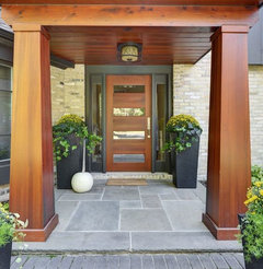
    Cook's Kitchen, when you say bulky structural pillars, is this anywhere near what you mean? heart these

    This is the colour scheme I love:

    Also, what would you guys suggest in terms of a darker door colour as noted in a few posts above?

  • PRO
    9 years ago

    The real problem is all the white window trim.

  • PRO
    9 years ago


  • PRO
    9 years ago

    Now you're talking. Much better proportions, fenestration and not so much lipstick and rouge! Good work PPF!

  • 9 years ago
    last modified: 9 years ago

    Ppf I like the latest rendering. The windows look much better balanced. Much better focus on the front door entry. Maybe I would like the stone in the central mass like you did in the previous rendering.

  • 9 years ago

    Playing off of PPF's latest which is a HUGE improvement, the one thing I still don't like is the stone columns. I think they distract from the overall feel and add nothing to the overall design of the house. This is my crude attempt at how I'd change them.

    PPF, can you fix what i did bringing the columns to the top of the porch?

  • 9 years ago
    last modified: 9 years ago

    Our house is very much modeled off the inspiration design (literally), exception that the part to the right of the porch was extended up for an additional room for me and windows changed.

    And I personally don't think it's the best example with all the lipstick on the proverbial pig. I like PPF's last version the best. Clean, modern with the prairie influence. And I believe PPF's version (with the straight pillars without the stone) would work very well with the colors you love.

  • PRO
    9 years ago

    Frank Lloyd Wright Willits house, 1901:

  • 9 years ago

    But, but, but...Virgil where are the 5 different materials on the Willits house?

  • PRO
    9 years ago


    nomad thanked PPF.
  • 9 years ago

    Wow, I can only imagine how that house would have stood out at the time. Talk about a man ahead of his time. I lived in Japan for an extended period and love his subtle Japanese influences, the torii gate entryways and the low roofs. Those are the influences I most want to have.

    cpartist, I actually love the look of wider stained posts without the stone, but do agree stone keeps it closer to the inspo house. You make a good point that it may not add anything though. I typically prefer a simpler style.

    So much to think about!


  • 9 years ago

    Many thanks again PPF! #notworthy

  • PRO
    9 years ago

    Those are all much better. But, the basic form is missing the "stepdown" effect of lower sections that anchor it to the ground like a true Prairie Style home would have. Part of that is the effect of the added room over the garage, but mostly it is due to the fact that this home doesn't emphasize horizontality. It's not wide. It's not low. It's a vertical home. Which is what makes those shallow hip roofs so incongruous. The house pops up out of the ground and reaches for the sky. It doesn't hug the land with it's roots.

    I think you would have a much more successful look if you eschewed any homage to Prairie style and focused on a pure modern look. Shed roofs. A flat roof. Color Blocking. Metal. Cedar. There is already a good deal of that going on. It's just a weak commitment to what the home's actual massing is telling you it wants to be. Strengthen that design direction.

  • 9 years ago

    And I think ultimately what we see here is the result / answer to the question: "Why get an architect / person of design talent; I have xx / yy home designer program or my builder 'has a guy' "?

    As The Cook's Kitchen noted above - the house has elements of prairie style but it's not putting them together with the core element of "horizontal-ness", coupled with too much contrasting trim, fenestration out of proportion, it's not giving you the same "feeling" as your inspiration house.

    Architects don't go to school for as many years as they do, or work under other architects and test for as long as they do just to use a CAD program.

    Nomad - can you enlist some better design talent to work in conjunction with your builder?

  • 9 years ago
    last modified: 9 years ago

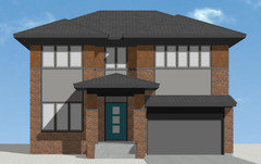
    OH, I LOVE PPF's, the first one where it is mostly brick! It looks stately and important. Now I want a Juliet balcony above the front door, lol!!

  • PRO
    9 years ago

    The only option in PPF's latest illustrations which has an emphasis on the horizontal (a significant Prairie School proportion) is the last illustration. All of the others have an incongruous vertical proportion.

  • PRO
    9 years ago

    Coming back to this with some coffee in hand... Notice the use of color and material on the Willits house. The two story portions are all light below, and dark above. That helps to minimize the fact that it is a two story. The use of the solid light colored garden wall in the same material as the home, in front of the two story section, also helps the disguise the height, emphasize horizontality, and connects the two lower home sections to each other to further reinforce the low and horizontal main theme.

    Do you have room for a different footprint for the home? Or, is the lot too small to spread it out more in order to give you more of the look that inspired you?

  • PRO
    9 years ago

    incongruous: strange because of not agreeing with what is usual or expected

  • 9 years ago
    last modified: 9 years ago

    Don't know what happened to the "inspiration house" everyone is referring too.

    I think the big problem here is the porch roof. It looks like an afterthought and not integral to the entire elevation. That, and the positioning of it makes the whole elevation look like one of those split entry houses out of 1965.

  • 9 years ago

    Looks like the inspiration house was removed.

  • PRO
    9 years ago

    Has the OP left the building...?

  • PRO
    9 years ago

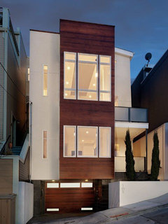
    It's a useful exercise to explore options for narrow, urban lots where traditional spreading and horizontal homes are not realistic. Here's some examples of "vertical" houses...

    and...


    of course, if one has a large lot, then one can always do something like this:


    or if a water feature is important, one can do something along these lines:


    These prove, once again, that strong and creative design always begin with an understanding of one's site and the opportunities/limitations therein...:-)