Software
Houzz Logo Print
dina19103

Cream paint has pink undertone! HELP!

9 years ago
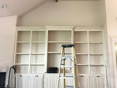
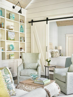
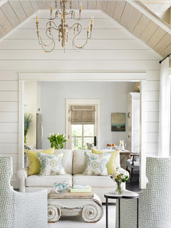
My husband and I just a lot of time and money installing shiplap on our vaulted ceilings and having the entire room painted monochromatic cream color - walls, ceiling, trim and all - one color. Now the cream paint has pink undertones that are driving me crazy. Aside from re-painting everything, is there anything that can be done to neutralize the pink undertones in the wall color? The picture is not the greatest - it also shows a blue/green undertone on built-ins as I had all blinds in the room open and plants outside of the window, but when the blinds are down - PINK. HELP.


Comments (51)

  • PRO
    9 years ago
    last modified: 9 years ago

    Repaint

    Dina Manuel thanked BeverlyFLADeziner
  • 9 years ago

    I was afraid everyone would say repaint. :-( Painter charged us 2K to paint and we supplied the paint. Very disappointing. Any suggestions of how I can obtain the right color I'm going for so that I don't fail again?

  • 9 years ago

    we chose a BM white paint with warm/pink undertones for our vacation home, to keep it from being stark. so don't choose Atrium White!

    but, i'm sort of wondering how your space will change with furnishings in it. right now there isnt a lot else to look at... you might save yourself some money by moving your things in, and then playing with lighting type to cool down your space.

    Dina Manuel thanked Judy Mishkin
  • 9 years ago

    Thanks nini. Spenard Builders recommended the same thing earlier. I am going to go that route for now and see if that helps tone down the pinkish hue. Just wondering also, are there any color accents that will help downplay the pink?


  • PRO
    9 years ago

    If you choose to repaint, I would recommend Benjamin Moore Simply White. It's a lovely off-white with no pink undertones.

    Dina Manuel thanked Alison Powers Color Consultant
  • 9 years ago
    Could a reflection from the brown ceiling fan you have up there be adding to the pink tones?
    Dina Manuel thanked hummingalong2
  • 9 years ago
    Does it look as pink when your lights are on too? If not maybe you can live with it when everything is loved in...
    Dina Manuel thanked Trem Wills
  • PRO
    9 years ago
    last modified: 9 years ago

    You need black or brown or a dark gray to neutralize a pink undertone… noticing your gorgeous dark floors, I would choose a dark brown paint

    The back of the built-in? Does that wall continue up to the niche?

    What if you tried the dark brown for that wall…leave the book case as is…paint the niche first and then the backs of the top five shelves…do two coats…it will take a bit of time, but what if it works?

    You may not have the perfect cream you were hoping, but you will have one gorgeous accent wall.

    Dina Manuel thanked JudyG Designs
  • 9 years ago
    *moved in
  • 9 years ago
    If you want to try for another color, follow Porter's tips above to evaluate large sample boards in different lights over several days. Good luck!
    Dina Manuel thanked simstress
  • 9 years ago

    Yes...I agree with Porter's suggestions, too. Also agree with Alison Powers regarding Simply White.

    Dina Manuel thanked chloebud
  • 9 years ago
    What is under the paint? The original product? That could be affecting the paint. Was the wood primed ( the ship lap) The walls? Cherry has a way of "bleeding" thru paint.
    Dina Manuel thanked Dawn
  • 9 years ago

    Curious what the name of the cream paint you used was? I used Wind's Breath in my kitchen and love it, but I swear at times it takes on a slightly pink/peach tone. But not as exaggerated as yours is.

  • 9 years ago

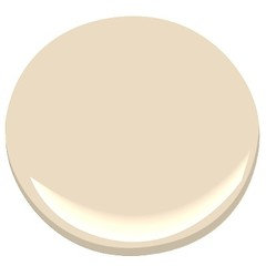
    Good Morning! Thank you all for all of the helpful suggestions. The paint I used is called sand dunes by Benjamin Moore. We used this same paint and painted our Kitchen Cabinets that came out BEAUTIFUL, so we figured how could we go wrong? Well, unfortunately we were not educated on lighting, undertones, etc. and how they affect paint color. :-( We have spent a lot of time and money renovating this living room (my walls were previously a tan brown with POPCORN ceilings - YUK). We did prime everything before it was painted (ceiling included). I am going to try and play with lighting and furnish the space with some neutral colors that Judy G Designs recommended and see where that gets me. Hopefully it will be something I can live with because I certainly do not want to have to repaint!

  • PRO
    9 years ago

    That solves the mystery. Sand Dunes is a pinky-peach color.

    Dina Manuel thanked Alison Powers Color Consultant
  • PRO
    9 years ago

    How did you think that this color would ever be white? Did the painting all get completed in one day or did you get to see the paint on the wall before it was complete? There is nothing you can do to fix this short of repainting.

    Dina Manuel thanked BeverlyFLADeziner
  • 9 years ago
    Hi, nice space but very frustrating...I made same mistake but with smaller space. I found Valspar Ultra White to be a true white...purchased at Lowes. You may be able to leave the ceiling the color it is...buy a sample paint a few 12x12 panels place them around the room, one next to ceiling, and see if you like it. The ceiling color may help it not to look too white. Goodluck!
    Dina Manuel thanked Lisa Fouts
  • 9 years ago

    BeverlyFLADeziner - we picked this color from a fan card in the store - did NOT look the color above either on that card or in paint can. We painted our kitchen cabinets in this same color. They came out a beautiful creamy off white. I'm guessing that is probably due to the warm color scheme I already had in that room as well as the lighting (???). The room(s) were primed in 1 day, then painted in 1 day so I did not see it on the wall until it was all completed, very unfortunate. I have played with lighting and at some points during the day - the color is fine, but at other points it just is not. As I mentioned before, I was not educated on paint undertones and this is what i've got. I am slowly accepting that we may have to repaint this room (and built-ins). Now, I just have to figure out what color. I will try some of the recommendations above and test them ALL during different times of the day before selecting another color. Your help is appreciated.

  • PRO
    8 years ago

    If you're starting over, thinking about paint colors in terms of undertones isn't going to be helpful.

    Sand Dunes belongs to the yellow-red (orange) hue family - the very end of the orange hue family right on the cusp of the yellow hue family. Because it's over so close to the yellow hue family, it makes perfect sense that it's a creamy white in one room on the cabinets yet it's showing peachy overtones on the ceiling.

    Dina Manuel thanked Lori A. Sawaya
  • PRO
    8 years ago
    last modified: 8 years ago

    Any suggestions of how I can obtain the right color I'm going for so that I don't fail again?

    Choose a color of white from the middle of the yellow hue family. Because if your cabinets are creamy white looking, then I'm assuming you don't want a white that looks too stark in the family room.

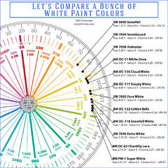
    Here's a list of whites in order by hue family. It's helpful if you collect all or some of the chips and put them in order exactly how they're listed. By comparing the chips - in order - you be able to see how they're different. Choose your top two or three favorites and test. For example, I'd pull White Dove, Cloud White, and Simply White. Good luck.

    Dina Manuel thanked Lori A. Sawaya
  • 7 years ago

    Lori, Your color wheel is very interesting. I would love to know where BM Atrium White falls on it? I chose Atrium white for our kitchen cabinets because I loved the pink hue. Atrium white felt very warm to me, but I'm also reading that it's a cool white. I guess it can go either way. Ive matched our counter and wood island, and wood floor to it. We have north east and south exposure. I loved it, and im reading so much about how it's such a difficult white and not to choose it. Our cabinets are not up yet and were staining our wood floors now. We have an open plan. I hope I didnt make a mistake. I think of myself as having good color sense, but Im very scared. Is there anywhere I can find a wheel like the one you post here, it seems really helpful. I'm wondering what to paint the molding around the windows and the very little bit of wall space we have in kitchen. Thank you in advance, all the comments here are very helpful!

  • 7 years ago

    One thing I find helps, if you are in doubt, is to look at the extreme end of the colour chip if they are in a series, or look where they placed it (among blues, greens, oranges etc). We got a grey for this house but ended up diluting it ourselves as it was far far too dark for our space, light changes everything.

  • 7 years ago
    last modified: 7 years ago

    https://www.benjaminmoore.com/en-us/color-overview/find-your-color/color-families/whi/white?source=%2Fen-us%2Fcolor-overview%2Ffind-your-color%2Fcolor-families


    The only ones I’d actually consider “white” are pretty much in the first row, the others definitely look like tints, you can see that from a distance if not up close.

  • 7 years ago

    Thanks very much. I really appreciate your comment. I did go back and really looked again at how Atrium White compares with other whites with undertones. I do think Atrium white can go both ways, sometimes with a pinkish hue and other times softer dependent upon what's next to it and the lighting. I'm trying to keep it warmish/creamish. Its definitely not an easy color to work with, and a challenge, but i'm trying to remain optimistic.

  • PRO
    7 years ago

    Lori, Your color wheel is very interesting. I would love to know where BM Atrium White falls on it?


    Sure. I'll get a Colorography done for Atrium and post it. I try to add a new one to the Lab every day and I haven't done one for today so... Atrium it is! :) Thanks for the suggestion.


    The topic of the strip chips just came up on my Camp Chroma Facebook group. Because a lot of people think that all the colors on one strip belong to the same hue family.


    And they don't. We know that because we can measure the colors. It is long and blog-post-like because it was for my FB group but it's important information that people need to know.


    ______________


    It’s a common assumption that colors on strips of color chips in a fandeck or out of the rack from the paint store all belong to the same hue family, that they are arranged in order from darkest up to the lightest, and as a result, guaranteed to go together.

    Truth is there is no consistent order or strategy built in to those strips of color chips. As anyone can determine with a Color Muse and app.

    Let's use the 2086 strip in the Benjamin Moore Preview Collection as an example. It's actually better than most. Because it was intended to be a “let-down collection”.

    The term let-down means starting with a color and then decreasing the colorant load to whiteness ratio in a can of base in order to create a range of new colors from the original color DNA.

    The fewer colorants involved, the more consistent and even the steps of new colors will be.

    This is why the Color Preview colors made with only one to two colorants look like even steps of light to dark on the strips. You pretty much have to measure the colors to figure out that they aren't from the same, exact hue family because the are so closely related.

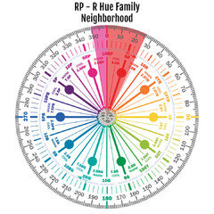
    On average, just one to two colorants are used to make the colors in the Preview deck – which makes it easier to create a range of light to dark colors in the same hue family neighborhood. Like the 2086 colors. They range from 350 degrees to 25 degrees. And that pretty darn good; it’s a small hue family range. (see the graphic below)


    Other strips are far more disparate. Benjamin Moore Classic Colors is a good example. On average 3 to 4 colorants are used to make those colors. The Classic Colors collection is about 40 years old and each color is what the color manager at the time wanted. The Classic Colors were meant to be unique colors not calculated let down ranges of light to dark like Color Preview.

    None of the brands claim that the strips of chips are the same hue family. They just let people assume and make no effort to state otherwise.


    Because it serves them to let people think that all they have to do is ‘go one up’ on the strip if they want a lighter version of a color. Or look at the last color on the strip to determine "undertone". Again, undertone doesn't work the way most people think it does.


    Color is is organized by hue family. Nothing is hidden or under anything.

    If they don’t go one up or down on the strip to get the color they want, etc. then somebody in the store is going to have to figure out lighter, darker, different versions of the color they chose.

    And that’s a lot easier said than done.

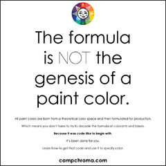
    Because the formula is not the genesis of a paint color.

    Paint colors come from CIELAB values - a theoretical color space. It’s CIELAB values that are used to figure out the recipe, the list of colorants needed to make a single color and ranges of colors to make up a strip.


    Which is why I always say color data values are like color DNA. It’s also why I say it’s only logical that the simple color systems that are used to make color are the same systems that should be used to specify color.

    Paint store staff can only manipulate the recipe. Not the DNA, they’re not working with CIELab values. And that’s part of the reason why getting a lighter, darker, different version of a color doesn’t always work out so well.

    Out of all the brands, Dunn-Edwards' Perfect Palette and Benjamin Moore’s Color Preview come the closest to organizing the colors on chip strips by hue family in tidy-ish steps.

    And, of course, Dunn-Edwards publishes the Munsell notation for all their colors in the fandeck and in the back of the architectural kit’s atlas.


    Even though they come the closest, there isn’t any guarantee that all the colors on a strip will be from the same hue family – or even a hue family neighborhood range.

    The only way to truly manage and control paint colors is to analyze one color at a time. Which why it’s important to know how to read and use color data values and notations that describe and define them.

    Bottom line is you're on your own. I honestly think it's beyond the manpower (not knowledge) capabilities of major paint brands to define attributes and use them to strategically order their colors in any helpful manner.

  • 7 years ago

    I don’t profess to know the science behind interior paint colours, I’m just an oil painter/photographer (whole other series of colours and mixing). But I have noticed in the stores I’ve gone to at least, that they usually group similar colours together on the rack. And the BM website groups their paint colours into colour ”families” so you can deduce if it’s considered a purple or a red (in their opinion). Now whether or not you consider these undertones I don’t know, but the online chips allow you to see them from a distance, and it’s much more obvious if it’s intended to be a green, brown or pink tint etc. And colours change in the environment they are placed in.

  • 7 years ago

    Thank you, Lori! I'm very excited to see a colorography for Atrium White and really curious. I have a visual background and love looking at color, i'm not sure Atrium White was the best choice color for my kitchen cabinets, but I want to make the most of what I saw in the color and do my best to bring it out. Truth be told, I think I used Benjamin Moore's, "whites made easy" guide - the little blue folder (which is helpful) and I decided between the 12 shades listed there, that some where too gray, some too yellow, and some too blue, and thought Atrium White was just right for me, with that pinkish tone (warmish too) which is what I wanted. Now, not so sure, and so many others I could have chosen. Like I said though, want to find the beauty in it that I see and create a whole kitchen that is soft and warm and right for us. It's all very interesting, thanks for your explanation above....I love looking at color, its hard work!

  • 7 years ago

    J, Im an oil painter too, but having such a hard time with this Atrium White color. I think I'm putting a lot of pressure on myself too, since it's the choice i made, and want to surround it with other beautiful choices that make the most of what I had imagined. Thanks for your comment.

  • 7 years ago
    I’d live with it awhile. 2K is a LOT of moola! Getting it furnished and accessorized might calm your anxiety. Good luck!
  • 7 years ago
    I hate trying to pick paint colors . My rule is if you see any color in the chip multiply it by 1000 and that's what your wall will look like.
  • PRO
    7 years ago

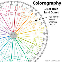
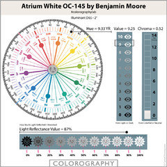
    Here's the Colorography. See more here: Atrium White OC-145 by Benjamin Moore


    And, yes, many color racks are arranged in spectral order by hue family. Usually with near neutrals and colors of whites pulled out and displayed nearby.


    But that doesn't mean that each color strip in the rack and is made up of individual colors that are all from the same hue family.


  • 7 years ago

    That may well be true, but it can help a bit if you trying to aim for a warm or cool colour. Atrium looks kind of like what I’d call bone white, with a yellowish/pinkish cast. I wonder if they are adding green to brown it up and deepen the shades...

  • PRO
    7 years ago
    last modified: 7 years ago

    That may well be true, but it can help a bit if you trying to aim for a warm or cool colour.

    If you want to go with the theory that you can split the color wheel in half and call one side cool and the other warm, then maybe. And that might work for mixing artist's colors but it's not specific enough for architectural color.

    In terms of architectural color, it's more effective to think of warm and cool as a spectrum within each hue family. Organizing warm and cool is yet another layer of how ineffective paint companies are at describing, defining and ordering their colors. Here's a blog post I wrote about color temperature. Disrupting what you think about warm and cool colors.

  • 7 years ago

    Link?

  • 7 years ago

    I had a look at your blog, I don’t get your argument I confess, but I am familiar enough with the concept of cool greens and warmer ones, if that is what you are arguing for?

  • 7 years ago

    Lori, Thank you! So very kind of you. Really fascinating and a challenge to wrap my mind and eyes around. Ive been reading the link you posted and trying to understand it. I thank you so very much. I think the wheel will really come in handy when I try and choose other whites to work with Atrium white, yet still complicated. Its one thing to find colors that I know will work with Atrium, but what hues do I want to bring out in the Atrium. Great! Thank you. Really interesting.

  • 7 years ago
    last modified: 7 years ago

    Lori, ...looking more at your site...is a gem.

  • 6 years ago

    Hi. What did you decide to do? I'm having the same issue.

  • 6 years ago

    My whole house (for now) is BM Atrium white. The ceilings, walls and moldings (including my kitchen cabinets. I love it. My house does get a lot of light and kitchen/LR/DR are open plan so works for me. The process was scary, but in the end it worked out. It's not the easiest white to pair with other paint colors. Can be tricky. It's very clean and warm and milky and soft. There's a glow to it that leans sunset red/orange not yellow. It's not a color that anyone would pick up on unless one is very sensitive to color and hyper visual. Most people just see white. I'm really happy with it.

  • 6 years ago

    I should say there are many colors that work well with Atrium White, but depends on what look/feel you're going for. That's the hard part. Getting it right.

  • 5 years ago

    I totally understand your frustration. I am currently having the exact same problem. We paid $4500 to have our interior painted and I decided to go with just one color throughout the house and bedrooms. I chose Sherwin-Williams Eider white and our open floor plan house looks pink! Eider white is supposedly a very light gray, white gray, but it’s showing the pink hues and I found it it’s because it has magenta or maroon in it. And I guess with this color being an off white and does not have as much saturation, that color is showing through. I should have went with my original choice of crushed ice. Even though that has a very slight blue undertone, I would’ve preferred a blue cast on my walls over a pink cast. Sorry you’re going through this. I like you do not want to have to repaint because that is not in our budget. Our painters are about 75% done and I want to tell him to redo the whole thing

  • 5 years ago

    Plz let me know how yours look after putting the furniture an accent pieces back in the house. That is what I’m doing now. Looking for ideas on how to decorate and which colors to use

  • 5 years ago

    You're going to be fine - I know it. It's very easy to be obsessive with nothing else in the house. You chose a great neutral color and i'm guessing, it has a warm undertone. I read on line that it's like a putty color which is perfect. That way everything will go with it. Once you start figuring out other colors, and you will, it will be just beautiful. You wont even notice that undertone other than think it's great. Keep doing research so you find other photos and interiors that you like, and see what colors are used and which ones resonate with you. I love the pink undertone in my white, I'm so glad I chose it. I feel like the sun is always setting in my home. Good luck.

  • 5 years ago

    Ditto Joanna. We painted our walls (ALL of them) a creamy white before we moved into our current home. Had professional painters spray it all. It looked bright yellow! I panicked and got that sick feeling in the pit of my stomach, but we needed to move in and "live with it". BUT...after the furnishings and rugs and floors went in, it completely toned down the walls and made them the perfect creamy white I was after. The appearance of bright yellow was gone once the furnishings came in. Darker wood floors and furniture and touches of warm color helped a lot. You might experience the same.

  • 5 years ago

    We still haven’t moved in the house yet, so decided last min to get floors refinished. They will be putting the stain down today and we went with Duraseal’s Ebony. Choosing a floor stain was just as difficult as the stain can look diff depending on light, age of wood, undertone of wood. So hoping the dark color will give the pink walls the contrast it needs and it will come together better. 🤞🏼

  • 5 years ago

    Absolutely, just as hard. Agree!

  • 5 years ago

    I had a similar problem in a room with little natural light. All colors took on strange undertones including “neutrals.” Experimenting with different light bulbs made striking differences. Ince furniture is in place, if you still are not satisfied with the color, try changing your bulbs.