Software
Houzz Logo Print
melsewell

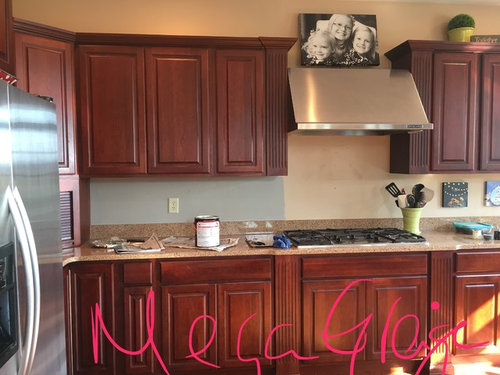
Cherry kitchen, greige walls turned blue!

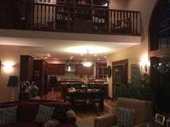
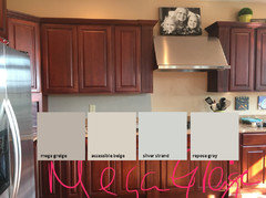
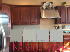
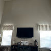
I feel like everything I've ever known about color selection has been turned on it's head. I use 8 1/2 x 11 Sherwin Williams samples & they are usually spot on. To the point where I haven't painted a sample in over 5 years. But this has me stumped. I had selected SW Mega Greige. But with the red toned cherry, suddenly it turned blue!! Then I tried SW Balanced Beige. Better but still reading blue to me. What gives?? Was really hoping for a Greige, but do I need to go more brown toned beige??

Comments (24)

  • 9 years ago
    You could prime and then sample. The wall color is interfering with your sample.
  • 9 years ago
    So odd. Have you tried applying the paint in another room without the cabinets? Maybe on foam board.
  • 9 years ago

    I checked the two colors with my Paint.NET program. Neither color has a blue tint. They both show up as gray with an undertone of yellow. And, neither paint looks blue on my monitor. Paints are mostly white with various pigments mixed in. A pale green can have black and brown pigments as well as green. Even white paint has an undertone of color.

    Does your kitchen have north-facing windows? Northern light is very blue, and that is the only reason I can think of for you to be seeing blue in these two colors.

  • PRO
    9 years ago
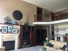
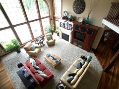
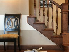
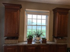
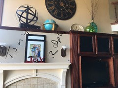
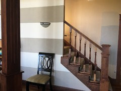
    Interesting. I was thinking I needed to stay away from green undertones so as not to make the cherry appear even more red. The really tricky part is that it's an open floor plan with 20 foot ceilings & amazing (mostly) east facing windows everywhere else. But the kitchen connects to everywhere-there's no stopping point really so I feel like if I can get the kitchen right, then it should work everywhere else. The hardest part is the current khaki color is fine in most spots, but in some light the peach undertones come out. Here's some more pics. Thanks so much for your input!
  • PRO
    9 years ago
    last modified: 9 years ago

    Cherry is really "similar" issue to oak when you paint walls. Oak never looks great unless with warm ivory, warm sage greens, warm yellows. Anything else ( cranberry is a thousand small cuts with a dull knife #$%^&) will always bring out the yellow/ orange undertone, in the oak. Also instant death with oak are the warm beiges , as both wood and paint will appear sick and clashing. The beige will likely go pink

    So...... try warming the "greige" with the "opposite" to the red on the color wheel. Which is the green undertone. I would in fact remove a drawer face, and take it with you to the paint store. A little trial and error will be involved. Take a few mat boards and test there in the store......my bet is the differences will become pretty glaring.

    That back splash could benefit with some light tile......riser off first : ) You're in the woods with the dark tones, literally.

  • 9 years ago
    last modified: 9 years ago

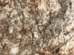
    I have the cherry cabinets with Perfect Greigh. The color hasn't turned blue. The Counters I chose were high definition laminate faux granite with cream background, grey and brown marbling. My kitchen is a mess so you are getting only selected shots. That shade goes well with stainless and grey...I didn't want to do grey

    as I wanted a timeless look. I had a colorist from Sherwin Williams come out with her samples. Well worth the fee, plus it was applied to the cost of the paint. Even the lighting in the room makes a difference. My light fixtures are amber glass. Golds really go well in here as well. We did an adjointing room Believable Buff and then I pulled the greigh, ivory, grey and brown into that space with furiture and drapes, The counter on this narrow bank of cabinets is a grey with brown veining. The rest of the kitchen is done in the laminate above. I love the way it all comes together!

  • PRO
    9 years ago

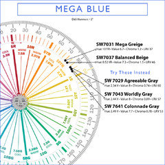
    Mega Greige and Balanced Beige are from the same hue family neighborhood. It's not uncommon for colors from this Yellow-Red region of the color wheel to shift and look purple/blue. It has absolutely nothing to do with the individual colorants in the can, it's the quality of light. Near neutrals from this hue family neighborhood aren't a good fit for the inherent quality of light you have to work with - unless you're looking for a blue-gray. Here's a video about this common color conundrum.

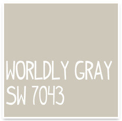
    To get a warm-ish, near neutral, "just gray" under that quality of light, you can try going farther into the yellow hue family neighborhood AND a snidge lighter and brigther. Try Agreeable Gray, Worldly Gray, Colonnade Gray.

  • 9 years ago

    I would say the second one is too green. Try something that's just a hint more toward tan. A tiny bit more red or orange, but not too much.

  • 9 years ago
    I had a similar issue when I repainted last year. I went with "Mesa Verde Tan" and "Pismo Dunes" from Benjamin Moore. I'm sure SW has something similar. They aren't as "tan" as the name implies--at least it didn't go that way in my wood and light-filled home.

    Good luck!
  • 9 years ago

    Welcome to the tricky world of grays / greiges. Square peg in a round hole situation... are there other colors you like?

  • 9 years ago
    last modified: 9 years ago

    The interaction of pigment and light can cause some unexpected effects. I do not think you want to choose a gray on the green end of the scale. I took swatches of your mega greige and three others ranging from green to red undertones and superimposed them on your kitchen:

    Then I adjust the mega greige to match the hue and saturation as it appears on your wall, and adjusted the other swatches exactly the same. (It's crude, but might give some idea.) ALL of them came out green:
    Which leads me to believe your lighting, along with the reflection from and juxtaposition of the red cabinets. is the culprit.

  • PRO
    9 years ago
    I cannot tell you all how grateful I am for each & everyone of you taking the time, energy & effort that you have to offer your guidance. The kindness of you strangers warms my heart! Truly! Blessings on your sweet heads!!

    Thus far I have tried Sherwin Williams:
    1. Mega Greige-too dark/too blue
    2. Balanced Beige-too blah, completely washes out
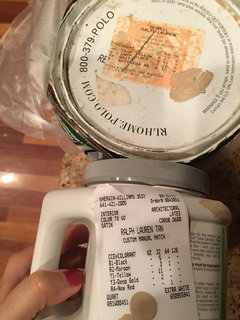
    3. A Ralph Lauren khaki color match from my exiting wall stripes that I love. So far that's my fav, but feeling like I'm still wanting a bit more change. I wish they could match it exactly.
    4. Anew- too blue/cold feeling
    5. Analytical Grey- too blue
    6. Intellectual Grey-too green
    7. Tony Taupe- better, but a real chameleon, looks grey above the fireplace, but a wink green under the cabinets & flat khaki near the desk.
    Tony & Ralph are the favs so far, but we're not in love with either just yet.
    Will try the suggestions. Some folks have a daily coffee habit, I suddenly have a daily sample paint quart habit.

    Again, blessings on your sweet heads for taking the time to help me!
  • 9 years ago

    Check out...


  • 9 years ago
    If you want to brighten up the kitchen, just paint it white or cream. I don't think grey goes with dark cherry.
  • 9 years ago

    I'm with Carrie...I don't think grey goes with cherry either.... I vote for a warm white/cream.

  • PRO
    9 years ago

    A Ralph Lauren khaki color

    What's the color name?

  • 9 years ago
    last modified: 9 years ago

    Kelly Moore KM569-M Hamlet would calm the red

    The cherry cabinets need a lot of green. as mentioned in an above post, to create peace. KM Hamlet has no yellow, pink or red undertones and would soothe the whole look. The color is a tan with green undertones

  • PRO
    9 years ago
    last modified: 9 years ago

    In 26 years, I have used exactly six colors (probably) ......that did not need a tweak from their chip formula, to a NEW formula. More green , more yellow, half strength WHATEVER!!!

    You need to take that drawer face to the paint store, along with a mat board and tweak the formula of one of the paints that is closest to what you want. When it looks good there, bring it home enough roll the entire room. Walls reflect on one another.....you will never be able to tell what you will get in a result until it IS A RESULT. On four walls. Or you can keep dragging this stuff home and doing what you're doing..........


  • PRO
    9 years ago
    Jan I did take a drawer front with my mat board which is how I landed on Tony Taupe. Thinking I may try a 50-75% of that one. Great suggestion & am grateful to know that you have to frequently tweak the formulas. Makes me not feel quite so crazy. :)
    And Lori I did try Amazing & Colonnade but both look way too washed out, almost white against all this warmth. Thinking I may try 125% of the custom Ralph. The Ralph Lauren was a suede color originally from the Home Depot in 2004 called Spitfire. You can see the formula in the pic & what they mixed up to match. We like it, but just a bit too close to what's currently in the house.
    This is all just baffling to me. I feel like I am loosing my mind! This is the craziest house I've ever worked on!
  • PRO
    9 years ago
    last modified: 9 years ago

    And Lori I did try Amazing & Colonnade but both look way too washed out, almost white against all this warmth.

    But did they shift blue?

    I did take a drawer front with my mat board which is how I landed on Tony Taupe. Thinking I may try a 50-75% of that one.

    Whenever the formula is adjusted, the entire color is changed and you end up with a new color. It may have similar characteristics to the original, it may not. All three dimensions of the color are affected and changes. Hue changes. Value changes. Chroma changes. And LRV changes too. There's no guarantee it's going look anything like the original color or that you're going to like the new color.

    It's smarter to spend your time and money finding the right color instead of wasting time and money tweaking a color you already know is wrong.

  • PRO
    9 years ago
    last modified: 9 years ago

    3. A Ralph Lauren khaki color match from my exiting wall stripes that I love. So far that's my fav, but feeling like I'm still wanting a bit more change. I wish they could match it exactly.

    These colors are similar to Spitfire. (GL is Glidden from The Home Depot)


  • PRO
    9 years ago
    Yes Lori, both the Collanade & Amazing turned a wink blue, but mostly just washed out dirty white. Thanks so much for your input.
  • 9 years ago
    Very interesting conversation. There is so much more to selecting color than "I like that!".
    Fortunately for me, I avoid greige and beige and gray.