Shop Products
Houzz Logo Print
gouri13

backsplash - vote please!!

gouri13
6 years ago
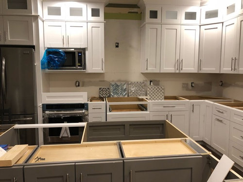
Hi All, seeking your much appreciated opinion on which of the four backsplash options in the pictures attached would go best in this kitchen. As you may see from the pic, there’s white shaker cabinets, white quartz (in the pic in front of the tile) and a medium gray kitchen island with the same white quartz countertop. Background wall will be Agreeable Grey (somewhat close to the gray splash behind the tiles).
We shortlisted these four among 10 and are now at a deadlock
Which backsplash would you choose (please help!!) thanks in advance!!

Comments (44)

  • bossyvossy
    6 years ago

    Two, b/c colorful. Lots of white and gray already

  • PRO
    BeverlyFLADeziner
    6 years ago

  • Ann Danen
    6 years ago

    I vote for #2 also, the beautiful watery blue lifts the gray in the countertop and cabs. Beautiful choices!

  • TC Hudson
    6 years ago

    Without knowing what any of your other decor is like, I would personally choose the tile in the far left or the third from left (next to the last). I agree some color or contrast would be nice. My personal favorite is the one on the far left, because when viewed from afar, the beauty of the interlocking circles gets lost in it's surroundings. The color of the chevron is pretty, but reminds me of too much of that dying trend. Good luck choosing! Your kitchen is beautiful!

  • beth09
    6 years ago

    I vote for far left.

  • annied75
    6 years ago
    What type of flooring are you installing -- wood floor, tile?
  • smitrovich
    6 years ago

    I like them all, except the cement tile. The blue glass chevron is gorgeous.

  • Stacey
    6 years ago
    I like #1 or #3
  • christina405
    6 years ago

    Really hard to choose without knowing other finishes: floor? appliances? lighting? And also something of the style and colors used in the nearby rooms. I'm tempted to say, "None of the above."

  • Angel 18432
    6 years ago

    It looks like the stove is on the far left, under the microwave. Shouldn`t it be in the middle with an exhaust fan above.

  • biondanonima (Zone 7a Hudson Valley)
    6 years ago

    The navy/grey ceramic or the blue glass chevrons, without a doubt. The other two are lovely but don't provide enough contrast to your white counters and cabs. And the more I look at them, the more I like the glass chevrons. They are gorgeous both up close and at a distance.

    Angel, it looks as though she has a wall oven installed under the microwave and will be installing a separate cooktop in the center with the gap for the hood.

  • herbflavor
    6 years ago

    Number 3

  • flopsycat1
    6 years ago

    Love the cement tile. Second choice, #3 . Does any of this help you make a choice? Apparently there is no consensus. Let us know what you decide, and definitely post pics.

  • palimpsest
    6 years ago

    If you can buy one of the glass chevrons and mount it with the thinset or mastic you would use and the grout you would use. I would try that. Glass tile can change dramatically when installed.

  • isabel98
    6 years ago

    I vote glass chevon too even though I feel like both chevron and glass are over done, this is just too good. 2nd for me is the cement. no to the others. Please come back and show us the final kitchen reveal!!!

  • traci_from_seattle
    6 years ago

    Good choices! I love the glass chevron best. Who makes that tile?

  • rnonwheels
    6 years ago

    #1 the cement tile!!!!!!!!!!!!


  • christina405
    6 years ago

    My vote does also go to the chevrons out of the four finalists.

  • PRO
    J Design Group - Interior Designers Miami - Modern
    6 years ago

    2 and 3 are great options

    J Design Group | Interior Design company in Miami, FL
    225 Malaga Ave
    Coral Gables, FL 33134
    Ph: 305-444-4611
    https://www.JDesignGroup.com

  • PRO
    Patricia Colwell Consulting
    6 years ago

    IMO the cement tile would give some pizazz to the space but you will need to think about long term and how you handle pattern . I would not do the glass chevron it is too busy and that is the one i would get tired of most.I love the interlocking circles they are subtle enought to work and simple enough to not tire of. I always like to add color with things I can change on a whim and for me fresh flowers do it most of the time.

  • gracie01 zone5 SW of Chicago
    6 years ago

    I vote #1 or #4. That way you can add any accent colors that you like.

  • gouri13
    Original Author
    6 years ago
    AND THE WINNER IS.... (scroll to the end directly for the final choice )

    Thank you all!! Your feedback/thoughts really helped clear some thoughts... I am so touched that you took some time to respond to my quandary. I really appreciate it.
    The least I can do is respond to each comment individually but it’s chaotic here so I hope you’ll understand...
    To answer the questions quickly:
    - the appliances you see in the left are microwave and oven not cooking range, the tiles are kept on the drawers that will house a cooktop set in the countertop right in that spot and there will be a stainless steel hood above.
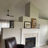
    - the kitchen will have a light grey wall color, it is an open kitchen and we want to visually integrate the living room and kitchen so both will stay same colors. On the left of the island is a window where there will a long storage built in bench. We will have colors in the upholstery and pillows we use. Currently there is our old dining table there so confusing but there is a pic below
    - flooring is a mess so no point in taking pics, we are keeping the dark brown with warm hues of honey. It is two shades below the darkest walnut in floor colors I am told.
    - island is medium grey so our top choice (the circle pattern) will sort of match it but I think I will get bored with the monochrome effect in a year so I got another color in the same pattern with a greenish and white look. The green is faint and in different tones but will stand out against the greys maybe?
    - we also love the greenish chevron/herringbone pattern but wondering if it is going to make accenting difficult in the long run, also the shine is something we are doubtful about in the long run... also may be a trend that is dying out as someone pointed. We also do want to sell the house in 7-8 years.

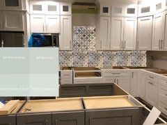
    I think this is it - pic attached. It’s the same pattern as number 3 but green and white and grey
    Based on collective feedback we think a greenish color so won’t blend too much with the island (medium grey) and will also go with white cabinets and grey walls without blending too much or standing out too much.
    PS: please excuse the typos, hurried but long text and messy under-renovation house
    THANK YOU AGAIN, will post the final pic after everything is done too!
  • smitrovich
    6 years ago

    So, the winner is an option that you didn't post there? :D

    Looks like it could work, but be sure the green-gray tile will go with your medium gray island and agreeable gray walls. That's a tricky combo to get right, as each gray will have different undertones.

  • annied75
    6 years ago
    Rats! I really liked the cement tile one. :-)
  • gouri13
    Original Author
    6 years ago
    I had posted it’s almost twin - this one was not in the reckoning before because it was so similar to it’s blue gray twin. Thank you for the tip - will consider that when we finalize the paint color
  • gouri13
    Original Author
    6 years ago
    I loved the cement tile too but we live in an open layout home and that pattern could end up restricting color choices for furniture or accents outside the kitchen too. Also need something more calming for current life stage hahaha. Hence it got dropped
  • smitrovich
    6 years ago

    I bring up the gray undertone issue because it's a frequent dilemma that's posted here. Three different grays, all with different color undertones often don't look right together.

    Something like Sea Salt by SW might work better with your tile selection than Agreeable Gray. Just be sure to get all your samples together before installing/painting anything.

  • littlebug zone 5 Missouri
    6 years ago

    Ha! I'm late to the party, but I'll tell you my picks anyway - which I made before I found out the winner. I would choose #3 or #4. (I was really surprised at how many picked 1 or 2 - neither of which I would ever have chosen.)


  • beth09
    6 years ago

    I like the one you picked also. I have a much larger version in a kitchen saved to my pics!

  • PRO
    Beth H. :
    6 years ago
    last modified: 6 years ago

    is that a Ming Green and Thassos Marble? love it. nice choice. Do agree about the Sea Salt paint color on the walls. Or anything w/the underlying green or sage tone

    too bad you didn't have a cement tile like these in your choices

    or this beautiful crackled glass chevron in 'Rain'.

  • christina405
    6 years ago

    Your new and final tile is brilliant. Can you share name and manufacturer? After 4 years in our new house, we are still living with "temporary" metal plate behind cooktop simply to protect the wall. I'd love a pretty tile section.

  • gouri13
    Original Author
    6 years ago
    Smitrovich, I did get a sample of sea salt and reflection by SW to make sure we have grey options with green-blue tinge to try our. Trying them out today to see how all the greys look.
  • M J
    6 years ago
    1 or 3
  • gouri13
    Original Author
    6 years ago
    christina405, thank you! The manufacture name is Maravilla; Caribbean green/Thassos tulip (see screenshot attached)
  • gouri13
    Original Author
    6 years ago
    Beth H, thanks, you are so close. Maravilla Caribbean green/Thassos Tulip
    Love your choices too, we just didn’t find these kind of cement tiles in stock and the black ones were the only ones so we picked them for samples. Anyway pretty happy with the greenish tiles now, fingers crossed!
  • PRO
    Beth H. :
    6 years ago
    last modified: 6 years ago

    gouri,,,it is very nice. will look great. ming green is the more common name for that green marble. It might possible be the same as yours. unless your green is deeper, less translucent. either way, it's still a great choice

    here's a similar tile to what you've picked if you want to see how it will look

  • PRO
    Napanee Design Ltd.
    6 years ago
    1st or 3rd one! Adds more of a unique element to the space.
  • christina405
    6 years ago

    Thanks for detail.

  • tresmamma
    6 years ago

    Love your pick! Please post a picture when it's on the wall.

  • TC Hudson
    6 years ago

    I think your choice will beautiful! I love the pattern, and the extra touches of color really make it stand out over the original posted sample. Can't wait to see the completed kitchen! (Hope it's not too difficult to part with in 7-8 years ;-)

  • meganmcki
    5 years ago
    I was wondering if you ever posted a picture of the finished backsplash ? Would love to see it . Thinking of a similar pattern , was wondering how it turned out !
  • gouri13
    Original Author
    2 years ago


  • Emily
    2 years ago

    Beautiful kitchen. Nice choice for the backsplash!