Software
Houzz Logo Print
lizzyg831

Please help-think I've blown it with kitchen

8 years ago
last modified: 8 years ago

Hi all,

i think I've blown it so far with kitchen choices and am very unhappy with my kitchen refresh.. I have purchased Cambria Montgomery Quartz which is kinda beachy look with lots of turquoise and Aqua creamish white and background taupe movement. . Husband very much wants mid taupe backsplaSh He has tile sample and likes it a lot. I have looked for lighter taupe tile but they are not here in my town. I would like lighter but he is insisting that that is color he wants and I am getting nuts about all this . Do you all think that this color might work? I'm also planning on Chantilly lace for painting our 25year old cabinets. Now I'm unsure that color might be too stark

I am sorry I don't have pics but don't have working camera.

Any advice?

Comments (45)

  • 8 years ago
    last modified: 8 years ago

    Hire a designer.

    Elizabeth Gorostieta thanked User
  • 8 years ago

    Hiring a designer is not an option for our budget.

  • 8 years ago
    last modified: 8 years ago

    How much do you think a design consult actually costs? How much does expensive mistake after expensive mistake cost? Which costs more? Especially since you can’t even help strangers to help you by providing diagrams and pictures?

    No one can see your house from here.

    Signs · More Info

    Make a couple more thousands of dollars worth of mistakes and tell me you “can’t afford” a designer.

  • 8 years ago

    Can’t say much without pics but based on my own research/sampling of whites chantilly lace is a stark white. Nice but a very clean white. May clash with your counter

    Elizabeth Gorostieta thanked Trem Wills
  • 8 years ago

    So your counter top is what I call a "cool neutral". The paint colour is a cool off-white (more blue/gray than taupe). Taupe can mean ANYTHING. I'm sorry to say, but without the NAME of the tile (name and maker of tile is needed so we can google it to see the tones). Taupe simply means 'GRAY' has been added to a colour. That means you can have yellow-taupe (ugly as sin), blue taupe, rose taupe, beige taupe (aka "griege"), green taupe, purple taupe (ugly as sin x2)...you get the idea.

    If you mean a BEIGE TAUPE then you could be in trouble. Big. Big. Trouble. But it ALL depends on the version of taupe you are trying to describe. I think that stone will pull a snick PINK if you put the WRONG beige up against it. Ooops. And BTW...pink is COOL. Beige can be WARM. It MIGHT clash.

    Personally, I think you should take the hints of BLUE and work with a glass tile in blue or a glazed blue tile of some sort. You can go soft. If you are afraid of colour, then use the b/s as a hint of colour rather than a statement (but it can be a statement with the counter top/paint choices).

    Tell us the NAME and MAKE of the tile your husband wants. We'll try to piece it together for you.

  • 8 years ago

    You will pick out the backsplash after the counter is installed. It is important to see the big picture of what the countertops look like before installing backsplash.

    You should have the cabinets painted first. If you are doing that DIY, you should wait at least 6 months to a year to be sure you did a good job. if the paint starts chipping off, you will need to rethink new counters. Most paint jobs looks great after they are done, but you need to see how well it holds up. I see lots of "sad up close" paint jobs at open houses.

    Once you have got your cabinets the way you want them, look at countertops that work with the cabinets. Since you like a particular countertop now, use that to help determine the cabinet color.

    You are a long way from doing the backsplash - just put that on hold. It comes last. If your husband's choice is a poor match, it will be apparent once the countertop is in and you are placing samples against the wall and seeing how the samples work with both the countertop and the cabinets. Wall usually comes very last - again keep in mind what you want, but there are thousands of paint colors but countertop and tile colors are a little more limited.

  • 8 years ago

    Thank you so much. My tile installer wants choices by March 5 including backsplash. He doesn’t want to wait. Another complication.

  • 8 years ago

    Your tile installer needs to wait. You can go ages without a backsplash. He can go on to another job and come back to you. The big picture of seeing my countertop in my kitchen changed the color tone I picked for my backsplash.

    Patience is important. You have a functioning kitchen now. If you need to find another tiler, do so.

  • 8 years ago

    Agree about the backsplash! I did my kitchen a few years ago and am just now getting around to the backsplash. It is such a focal point that I could not decide. I ultimately hired a designer. At the very least wait. Do not let the tile guy push you into this. Worse case scenario, tell him to go ahead and schedule other jobs ahead of yours while you decide.

    Also, can you post a design of your kitchen, and if you dont have a camera, then copy and post pics from online of your cabinet color, similar cabinet door panel, counters, flooring, sink and faucet choices. That might help people visualize the kitchen and give suggestions.

  • 8 years ago
    last modified: 8 years ago

    My mother is 95 years old. She has a camera phone and knows how to use it. There is not a phone made today that doesn’t include some type of camera. It’s disingenuous to say that you “can’t” include pictures.

  • 8 years ago


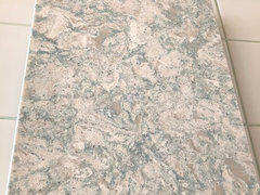
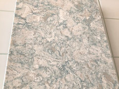
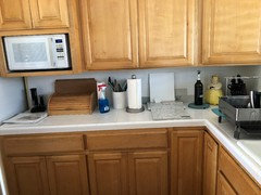
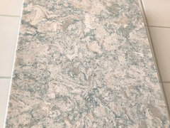
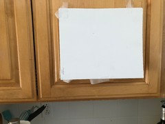
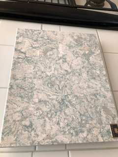
    Thank you all for your comments. I was able to convince my installer to wait on backsplash until I was ready. Here are a couple of photos.of Cambria Montgomery that is aready ordered and my kitchen. Hope this helps.

  • 8 years ago

    Thanks for the pics. It would be helpful to add a pic of the Chantilly lace color as well as the tile your husband wants.

  • 8 years ago

    Your cabinets look to be a warm maple. Mine are similar tone oak and I went with a cream tile. I was going to use white, but after the countertops were in, I painted part of the backsplash white and part cream (I had a sample jar of paint color matched to the cream tile.) The white was too stark against my cabinets.

    Your cabinets tone will be a little different because it is maple and you have a different countertop. To keep your kitchen light, get samples of the lightest color in the countertop. The one tile sample looks a little gray on my computer (computers do not show true color), but that may work too because maple seems to be the one warm toned wood that can work with grayer tones. It may or may not make the cabinets appear more yellow and may or may not darken the kitchen - but some like darker.

    If you cannot decide once the counters are in, color match the tile to paint (I got my sample jars at Lowes - $3.50 a jar) and either paint part of the backsplash or paint foam board cut to the size of your backsplash so you have a sample that goes from cabinet to counter. Too often, people just look at the counter and forget the color has to work well with the cabinet too.

    Good for you for getting the installer to wait on the tile. When you are spending lots of $$ and a person is working for you, they should be able to accommodate a simple and reasonable request:)

    Cream "Alabaster" subway tile in my kitchen:

    https://www.houzz.com/photos/my-pics-work-in-progress-phvw-vp~110720042

  • 8 years ago

    Thank you so much for this advice and counsel. Believe it or not, I have taken sample counter slab to HD but they said they couldn't do be white/off white was too swirly with turqoise grey and green of swirl countertops to get match with computer. Hence my possible choice of Chantilly lace to try and blend overall. I will be posting pics of c lace and backsplash tile my husband likes later.

  • 8 years ago

    I did not take the countertop to be paint matched, I took the backsplash tiles I was considering:) I pulled the sample paint cards myself and found one that was almost a perfect match for my tile - then painted part of the backsplash that color. Another part i painted white for white tile - I ended up preferring the cream for the overall look.

  • PRO
    8 years ago

    Do not go to HD, Lowe's or Floor and Decor for tile! My tile installer told me that he refused to install tile from there because they're not always consistent in terms of thickness and size because they get seconds and don't always state that. There was a thread on here recently from a lady who had done this and the front of her tile was projecting out different amounts. It was glazed and really noticeable. She'd gotten her tile at F&D.

  • 8 years ago

    Oh my. Thank you for that important info.

  • 8 years ago


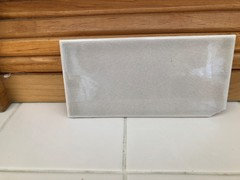
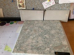
    Here are pics of Chantilly lace I am considering for cabinets and pic of tile my husband likes with counter.

  • 8 years ago
    last modified: 8 years ago

    I think you need a creamier white paint. BM White Down or Swiss Coffee might be good ones to try. They are a warm creamy white without being yellow.

  • 8 years ago

    I agree that the Chantilly Lace is a bit too stark with the counter--it is one of BM's whitest whites. Even Simply White has a bit more color. A slightly off white will still read as white, as long as it isn't directly up against a white white.

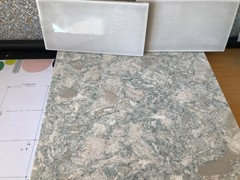
    The tile looks better than I would have expected from your description, though you should know that it is really hard for us to tell from pics--there's different lighting since they are in different photographs, plus everyone's monitor is different. With that caveat in place, the tile looks more gray and less taupe to me. I would like to see the tile next to the counter sample IN THE SAME PHOTO and ideally under the actual lights in your kitchen (separately under daylight, ambient light, and with the undercabinet lights on if you have them).

    I didn't have a smart phone until last year, and while my old flip phone took pictures, I didn't have a data plan so there was no way to get them OFF the camera. So never mind Sophie.

  • 8 years ago


    Here is tile sample and tile backsplash in daylight. I will send other photos later. Thanks to all for your help and advice

  • 8 years ago

    I think you should pick a creamy white tile that matches the color you choose for the cabinets... that tile, from this picture anyways, doesn't look warm enough to match the granite. It really is so hard to tell from a photo though.

  • 8 years ago
    last modified: 8 years ago

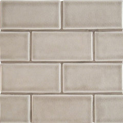
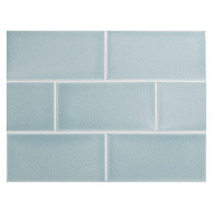
    Something like this looks as though it may work better with the colors in your tile.

    Dove Gray Handcrafted Glazed , 25 Sq. ft. · More Info

    Elizabeth Gorostieta thanked katinparadise
  • 8 years ago

    Seeing your tile and counter next to each other with the same lighting, I think the tile is too cool for the counter. I think something like katinparadise's suggestion (at least the way it looks on my monitor--it looks like a good match to some of the gray/taupe colors in the counter) would be a better choice. It's still a mid-taupe, so hopefully would pass muster with your husband.

    Elizabeth Gorostieta thanked cawaps
  • 8 years ago

    I will say it again: my kitchen designer was the least % of my budget and the best money I spent. It is hard to see the colors on a computer monitor though. I will say the colors of my cabinet seem to change with the light/time of day. Still, I am a big fan of a professional kitchen designer. She came up with ideas I never would have thought of. She charged by the hour, so I felt like I had some control of the budget and wasn't locked into a big box store or certain vendors.


  • 8 years ago

    You could try Allen + Roth pearl on the shelf at Lowes. Its a taupe color, very inexpensive too.

    Elizabeth Gorostieta thanked mtnmom9
  • 8 years ago

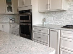
    https://www.houzz.com/photos/saunderstown-kitchen-cambria-montgomery-quartz-contemporary-kitchen-providence-phvw-vp~55505095


    Chantilly leans a little on the minty green side,,,it might work well w/your blue/green in the quartz.

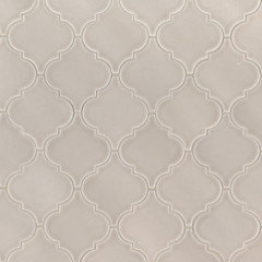
    some other splash choices,,,,that white in the counter looks a pit on the pink side,,these might work w/it

    mercury mosaics

    Portico Pearl arabesque.

    tilebar.com Nabi - Blue

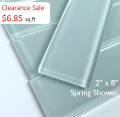
    Vermeere crackle Ceramic tiles, Ice Blue. I really like these.

    DiscountGlassTile


    I also like the icy blue/marble bars above.

    Elizabeth Gorostieta thanked Beth H. :
  • 8 years ago

    Love those tile ideas. Thank you.

  • 8 years ago

    As “discussed” here is a photo of the tile and countertop in this twighlight part of day.

  • 8 years ago

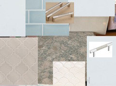
    lizzy,,those crackle tiles you have are nice too. I guess it all comes down to what you want in the kitchen.

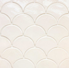
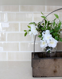
    I've put some next to each other so you can see, along w/the Chantilly Lace

    Elizabeth Gorostieta thanked Beth H. :
  • 8 years ago

    Thank you very much for putting that together!

  • 8 years ago
    last modified: 8 years ago

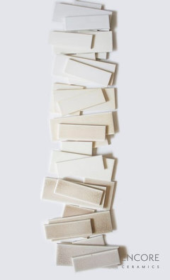
    lizzy,,,Encore Ceramics has some beautiful choices. and they have custom colors and blends. seriously gorgeous materials. take a look at them if you don't mind spending a little extra. They do crackles, glass, glazed, and do custom blends and shapes.

  • 8 years ago

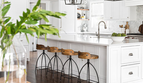
    I am not sure but I think the scale of the larger subway tile is throwing me off when placed next to the countertop. I think I like a smaller scale tile similar to what Beth H showed you above in the picture with the kitchen or the Encore ceramics..

  • 8 years ago

    That counter is not blue. That’s one of the issues that a designer would help you with. Blues will clash with it. And so will the wrong whites. This is not going to end well on the current path. No reason to spend the 7-9 K to have those cabinets coated in a conversion varnish and set under 6K of stone. Not without professional help.

    Elizabeth Gorostieta thanked User
  • 8 years ago

    Sophie, at the risk of total rejection, do you have any suggestions for s white for cabinets?

  • 8 years ago

    PS I am thinking KM Swiss coffee for white.

  • 8 years ago
    last modified: 8 years ago

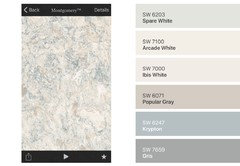
    SW Spare White, Ibis White, or Arcade White. All of those shades can be found in the stone. No stark whites.

    Not in paint. You don’t slap on House paint on cabinets. In a conversion varnish sprayed by an expert coater of cabinets.


  • 8 years ago

    Thank you very much. It is appreciated.

  • PRO
    8 years ago

    Sophie, an artist friend of mine told me that when we get older, our eyes tend to see more yellow in things. What looks to my son as blue probably appears as a blue green to me. Lizzy, keep that in mind as you get advice. A professional designer is still a good idea, no matter what age.

    Elizabeth Gorostieta thanked Carolina Kitchen & Bath
  • 7 years ago

    Can you share your completed project? We are also renovating our kitchen with Cambria Montgomery and I would love to see you your kitchen turned out!

  • 7 years ago

    Hi I have tried several times to send pic Did you receive? We love the Montgomery with our white cabinets and taupe backsplash. So easy to take care of and really lends itself to beachy look. Painted walls BM Alaskan skies.

  • 7 years ago

    No! I can't see a pic. Did you post it on this board, or send just to me? My email is novaleemn2@yahoo.com. You can send there!

  • 7 years ago
    Lizzy I’d love to see the final result if you’re able to post a picture!
  • 4 years ago

    What color did you paint your cabinets? picture please