

Help choosing paint colour for entire apartment
8 years ago

Featured Answer
Sort by:Oldest
Comments (15)
- 8 years ago
Related Professionals
Pittsburg Interior Designers & Decorators · Greenville Interior Designers & Decorators · Richmond Interior Designers & Decorators · Glenwood Springs Interior Designers & Decorators · Valdosta Architects & Building Designers · Florence Architects & Building Designers · Elmira Architects & Building Designers · Denver Architects & Building Designers · Amarillo Architects & Building Designers · Cody Architects & Building Designers · Gaithersburg Kitchen & Bathroom Designers · Myrtle Beach Kitchen & Bathroom Designers · Houston Kitchen & Bathroom Designers · Lima Kitchen & Bathroom Designers · Mansfield Kitchen & Bathroom Designers 8 years ago
- 8 years ago
- 8 years agolast modified: 8 years ago
- 8 years ago
- 8 years ago
- 8 years ago




Related Stories

COLORPick-a-Paint Help: How to Create a Whole-House Color Palette
Don't be daunted. With these strategies, building a cohesive palette for your entire home is less difficult than it seems
Full Story
DECORATING 101How to Choose a Paint Color You Can Live With
Check out 8 tips and tricks that can help you commit to a color you’ll love
Full Story
COLORColor Palette Extravaganza: Room-by-Room Help for Your Paint Picks
Take the guesswork out of choosing paint colors with these conveniently collected links to well-considered interior palettes
Full Story
EXTERIORSHelp! What Color Should I Paint My House Exterior?
Real homeowners get real help in choosing paint palettes. Bonus: 3 tips for everyone on picking exterior colors
Full Story
COLORPaint-Picking Help and Secrets From a Color Expert
Advice for wall and trim colors, what to always do before committing and the one paint feature you should completely ignore
Full Story
COLORHow to Choose a Paint Color
Designers offer tips for examining your closet, memories and daily life to find the right paint colors for your home
Full Story
COLOR PALETTESChoosing Color: See This Home Try On 5 Exterior Paint Palettes
Dark and dramatic, or soft and neutral. See how paint color alone can change the look of a home
Full Story
COLORPick-a-Paint Help: How to Quit Procrastinating on Color Choice
If you're up to your ears in paint chips but no further to pinning down a hue, our new 3-part series is for you
Full Story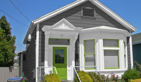
MOST POPULARChoosing Color: See 1 Cute Home in 3 Exterior Paint Palettes
Here’s proof that a little bit of fun color can add a whole lot of flair to your house
Full Story
COLORPick-a-Paint Help: 11 Ways to Mine Your World for Colors
Color, color everywhere. Discover the paint palettes that are there for the taking in nature, shops and anywhere else you roam
Full Story





Irene Morresey