Software
Houzz Logo Print
xlf14

Need help with the living room... Please help !

8 years ago
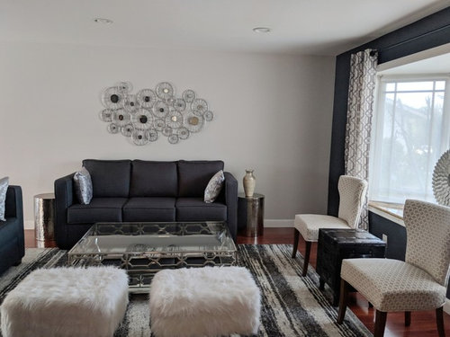
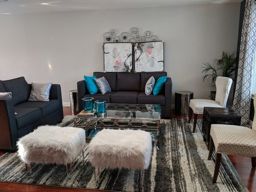
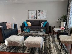
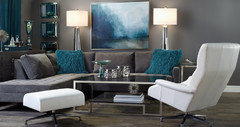
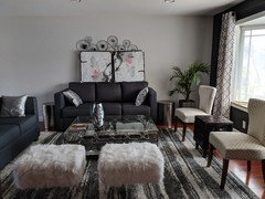
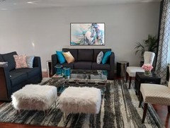
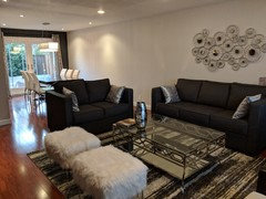
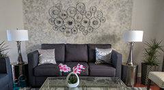
I started off the room with a gray, silver, white theme in mind. But it does seem that I managed to create a drab living room. I currently have the silver circular spokes as an artwork, but I found this new artwork and wanted to see if they work in that space or should I return it. I also tried adding teal pillows to add some color but do they conflict with the pink artwork ?
I also plan to have either a plant or a big vase on the far left as that space seems too empty.

Comments (38)

  • 8 years ago
    I don't see much white in the room. I think if you add more white accessories (pillows, a throw over the sofa, white candles with silver candleholders, white vases, a white orchid on the coffee table) it will brighten up your room. Good luck!
  • 8 years ago

    The first thing I noticed was the amount of furniture you have in the room. Do you entertain a lot and require seating for nine people at all times? The first things you could get rid of are those two side tables next to the couch - they're too low for them to be useful, and there's a coffee table more conveniently located anyway.

    If you look at the balance, you have all of the light, white pieces in one corner and both heavy, dark couches in another corner. Try rearranging for color balance, shape balance, and flow.

    The artwork isn't personal, and also seems a bit too uniform (I'm referencing the round shape of the window decor and that hanging over the couch). If you want to stick with the more monochrome motif, you could do a gallery wall of black and white family photos. If you stick with the blue, spread it out throughout the space - all the blue is in one section of the room (pillows and coffee table corner). The pink art strikes me as a bit too high - good width though!

    The pillows you chose seem really stiff, like the couches and the armless chairs. Get some throw blankets and drape them on the couch or grab a basket to store them in.

    Do you have inspiration photos you could pull from for the monochrome living room look you like? It might help clarify the look you like and give you ideas to complete it.

  • PRO
    8 years ago

    You are definitely on the right track!

    You do have a great mix of finishes, prints, and textures under your neutral palette.

    For an alternative pop of color, a rich mustard yellow would make a huge impact in your space and add some warmth. The existing wall art has a great silhouette which helps soften the abundance of rectilinear pieces. It is blending into the current wall color a bit; consider darkening the wall to make it pop! For the same effect, change the artwork to the pair of abstracts and consider a round rug. The plant you added gives the space some life; adding another plant or something else in your space with a more organic feel to it would help refresh your room.

    Best of luck with your project!

  • 8 years ago
    Find some large artwork that appeals to you. Pull from that artwork to accessorize with cushions.
  • 8 years ago

    Mix your colours up a bit. Let them talk to each other.


    Leena thanked Rina
  • 8 years ago

    I would like to see a lamp or two....floor lamp? Table lamp? Otherwise I like Rina's picture.

  • 8 years ago

    I was thinking of a table lamp to the left of the sofa, but I couldn't find one to use that I liked.

  • 8 years ago
    last modified: 8 years ago

    Yeah, the table lamp is pending as I couldn't wrap my head around what color the shade should be and what the base should be.

    So keep the pink artwork or return it ? Both the frames are the same art. I have just turned one upside down, so it can be arranged so that a circle is not formed in the center.

  • 8 years ago
    Neither art piece works. A large colourful painting (either abstract or representational) would be more to the point. The super-drab rug emphasizes the heaviness of the sofa and loveseat. A bright rug or a light one from North Africa would make a huge difference.
  • 8 years ago
    Leena, your pink, gray, white pictures look exactly alike to me, only one is turned upside down. Maybe it's just my old eyes. Lol. I like the large blue painting over your sofa.
  • 8 years ago
    Yes to lamps. And the blue tones that Beverley just posted via artwork are so much more relaxing, not blaring like the ex. teal pillows. Your room is quite lovely, and I’m afraid that those teal pillows “cheapen” it. Go for art first, then decide on the pillows.
    Leena thanked pat1250
  • 8 years ago

    I think maybe it is a little too crowded. A bit too busy...

    For what it's worth, I would simplify...

    I think either piece of art works, but probably not the spokes with the new art.

    Good luck!

  • PRO
    8 years ago

    I agree on the room layout. You have done a good job but there is too much furniture. I would relocate the chairs and the ottoman in front of the window. You can always pull them in should you need more furniture for entertaining. I think you are on track with a pop of color but the teal is too serious and dark. I really like the pink! It is fun and unexpected. I agree, get the art first and then find the right shades- maybe a subtle gradation of pinks from rosy pales to almost fuscia. Could you paint the coffee table base? To me its gets lost on the rug. I would prefer a more oversized vertical shape for the art above the sofa. Perhaps a triptych design that you could space apart but is still a vertical element? Perhaps a vertical piece flanked by two skinny mirrors of the same framing? Keep it clean and focus on lighting which you will need. Almost there! Good luck!!

  • 8 years ago

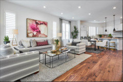
    This is what prompted me to go for the pink artwork. Anyone knows where to find the pink artwork in this picture.

    This was my original inspiration picture but when I got similar furry pillows, it looked too dark.

    I just put my pink artwork on the sofa to get an idea. It was going to be either the spokes or the artwork.

  • 8 years ago

    @Beverly, do you have the link for the artwork ?

  • 8 years ago
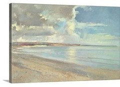
    @Beverly, I do like the blue but not in love with the art as much. If I were to order the art however what size what would you recommend - 60x50 or 48x40 ?

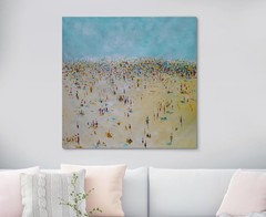
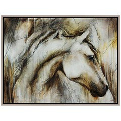
    Also what do you all think of the art below ? is that too bright blue ?
  • 8 years ago

    could put the plant on a pedastol or one of those cylindrical end tables to add height

  • 8 years ago
    It is already in a container with elevated base.
  • 8 years ago
    Have a look online at Etsy for art, so reasonable
  • 8 years ago

    I don't think the blue in your horse picture is too bright at all, if you stick with your current teal/blue accents -- which I like, by the way. I meant to suggest before that you move the plant a bit further out from the corner -- it looks squashed, is a bit hidden and gets less light where it is.

  • 8 years ago
    last modified: 8 years ago

    Thanks Rina. Yeah, I pulled in the plant a little so that it is now visible. Its a real plant so hoping that it will grow in height soon enough to be seen from afar.

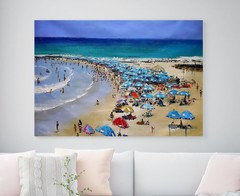
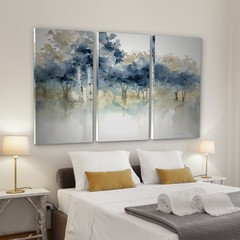
    The painting Beverly posted is slowly growing on me. But its the size I'm concerned about. I was thinking I could get it in 60x50 size and put in next to my dining table. I found this art which seems similar in color to the one she posted. I was thinking of maybe going with this triptych for its size 60x40 above the sofa.

    Basically I need art that works in both the spaces in terms of size and color and seems cohesive. Or another option I was thinking of is if I could keep the existing bike spokes and paint a rectangular portion behind the sofa and frame it so that it stands out. But I can't seem to think of a good wall color that will work.


  • 8 years ago
    last modified: 8 years ago

    Did I lose everyone ? Here's another art that I like (41 x 31 " size ) but not sure if the browns would work in this space ? Its hard to shop for art online as the colors vary so much and costly to make returns because of the size. This project has been dragging on for years now and I am ready to throw in the towel.

  • 8 years ago

    Leena, do you live anywhere near an art school? You might find a student whose work suits your taste and buy an original work at a reasonable price. I love the slim line of that horse's neck and its sweet face, but I really think you need to introduce more colour in that position. The teal is great but it's one-dimensional right now.

    I rather like the spokes but they just seem a bit flat in context.

    On the whole, I'm not fond of commercial triptyches, although I do like to see two or three related pieces hung together. May be a prejudice of mine, I don't know. But heck if you see a triptych you really love, go for it. I'm not feeling the love from you so far.


  • 8 years ago

    Oh, yes, sorry -- I see your comment about giving the spokes colour and framing. I don't think it would work, as they hint at industrial, which is essentially not colourful. It's a bit of a visual contradiction.

  • 8 years ago
    As mentioned, a lighter look of a rug, not so wooly looking, which comes off as heavy. I like the pink with the grey, or the light blue. Not a fan of the teal. Also you can mix metals, rather than sticking with only silver. `
  • 8 years ago

    I'd put the spokes in the dining room. Colour in the living room.

  • 8 years ago
    Houzz sponsored ad shows the same horse wall art.
  • 8 years ago
    Return the new artwork. Move the "spokes" art. What you need is a bright accent color around the room as accessories: a white/silver/black/gray scheme needs colorful accents. Add a few pillows, art, and a ceramic bowl or vase in one accent color you love. Find a painting or picture you like which includes some of that color.
    Leena thanked felizlady
  • 8 years ago

    @felizlady, will the horse painting work ? It seems to have a little yellow. And I can get some yellow pillows and a yellow ceramic bowl with succulents.

  • 8 years ago
    Etsy has great art...and most of it is original, so you will not only have a unique piece, you are supporting artists. I personally am not a fan of the furry ottomans...they compete with the rest of room as a whole for visual attention. Unless you absolutely need them for seating all the time, I’d relocate them to maybe under a hall console table perhaps?
  • PRO
    8 years ago
    I am an Interior Designer. You need a large piece of art above the couch. Extract colors from the piece of art to address pop colors for throw pillows.
    The art that you buy should have small amounts of the couch color in it.

    Additionally, you need a green planter in the corner to the right of the couch when looking at it.

    Also your room requires balance either perfect or imperfect balance. Take the room and draw a line directly down the middle ( straight down) and the across the center . Each quadrant should have the same amount of weight in it.

    Best Wishes

    Deb Darnell
  • 8 years ago
    Yikes. There are a couple of bullies in here. Cheers to the OP for remaining so friendly and light.
  • 8 years ago

    Good point about there being yellow in the horse picture, which you could pick up on -- it's quite a tricky yellow, though. Or seems to be on my screen. Not all yellows would work with it.

  • 8 years ago
    I think you may need some larger tables with lamps. Your inspiration photo is great! I’d look for a larger wood type piece, maybe a chest that goes closer to the floor? Your room seems a little “leggy” to me.
  • 8 years ago
    Leena, love the triptych! I think that’s a winner. You have great taste, and are turning a good room into a beauty.
  • 7 years ago

    Ended up faux painting the wall. Still have to frame that section. What do you think ?

Sponsored
Custom Home Works
Average rating: 4.6 out of 5 stars10 Reviews
Franklin County's Award-Winning Design, Build and Remodeling Expert