Software
Houzz Logo Print
racherz

Help picking a paint color/avoiding color overload?

8 years ago
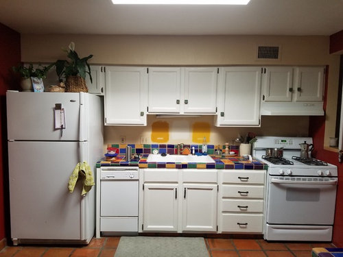
Hi,


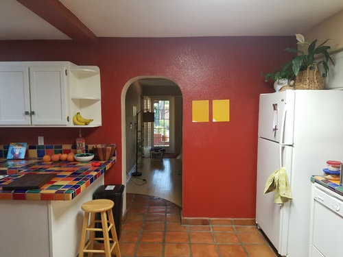
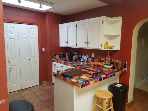
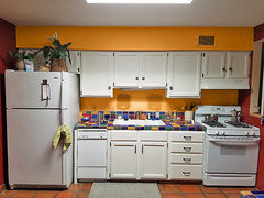
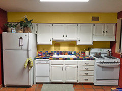
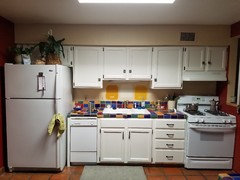
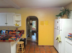
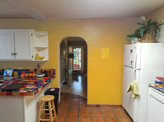
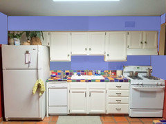
We just bought this southwestern style house that has some colorful countertops! We just had the cabinets painted white. We do like the countertops, but we are not really fans of the rust colored walls. I'm a little stumped on the wall color. We are considering dark gold/yellow (as you can see from paint samples), which I know will be bold, but it doesn't exactly match any of the tile colors. Should I try to match a tile color exactly? Or tone it down with neutrals? The white cabinets already make the kitchen quite bright. The kitchen gets tons of light with 2 skylights and, well...southern AZ.


Comments (45)

  • 8 years ago

    I kind of like the yellow you picked. What's throwing me off, though, is the reddish floor. Is that stone or stone looking laminate?

    racherz thanked housegal200
  • PRO
    8 years ago

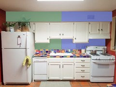
    I think your choices are green or blue.

  • 8 years ago

    @housegal200 thanks for your comment! The floor is traditional saltillo, which is a mexican clay/terra-cotta tile.

  • 8 years ago

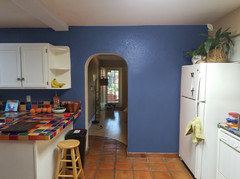
    Thanks @ BeverlyFLADeziner! I hadn't considered blue or green much, but the rendering you made looks nice. Thanks for your time!

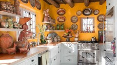
    I was using these photos as a source of inspiration: https://www.housebeautiful.com/room-decorating/kitchens/g1263/southwest-kitchen-design-and-decor-0912/

  • 8 years ago

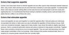
    This general info about color and its effect on appetite should be considered in making your choice.

  • 8 years ago

    As someone who is also in southern (baja) AZ, I love your kitchen. Picking any of the colors from the tiles should work (maybe a step or two lighter), keeping in mind that an orange or orangey yellow might clash with the saltillo.

  • PRO
    8 years ago
    last modified: 8 years ago

    You can pick yellow color from your countertop for walls

  • PRO
    8 years ago

    Ceramic cabinet pulls in Mid Western colors.......add......I would! (aka Yoda).....

  • 8 years ago

    I like Celerygirls colors. The yellow is just a little more muted than your original gold.

  • 8 years ago

    I love Celerygirl's yellow.

  • 8 years ago
    last modified: 8 years ago

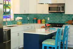
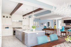
    I'd go with a soft greeny-blue/bluey green, in effect a soft colour shifting blue, a pale leaning turquoise.

    Colleton River · More Info

  • 8 years ago
    last modified: 8 years ago

    Thanks everyone for your comments. I definitely feel like I want yellow, but having a hard time nailing down which yellow. I don't want it to be too bright. I felt inspired by the yellow color in this Santa Fe kitchen.

    I also would really like to use a color from Dunn-Edwards "historically accurate" color line. I think it's really neat how Dunn-Edwards made this paint line, they did tons of research of historic homes and missions from 1800-1910 in the American Southwest to create this line. My house was built in 1948 in southwestern style, so I'd like to keep some history in the paint colors. Here is the link to the colors in this line: https://www.dunnedwards.com/colors/curated-collections/then-now-and-forever-r . The samples painted behind the sink are "Sunny Disposition" (right) and "Alameda Ochre" (left), which are also tagged as being Spanish style.

    I also tried "Ochre Revival" (not pictured) but I felt it was too light. I think today I will go and get samples of "Cornsilk Yellow" and possibly "Zucchini Flower". Anyone have any other suggestions?

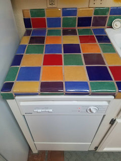
    Here is another photo of the tile colors. There is some variation in the yellow tiles, some are lighter, some darker.

  • 8 years ago

    I think those two new yellows look promising. On my monitor,the Santa Fe kitchen looks more orange...a shade somewhere between O'Brien Orange and Bittersweet. So hard to tell,just remember your saltillo will reflect on those walls like crazy. Best of luck!

  • 8 years ago
    last modified: 8 years ago

    Welcome to Baja Arizona, where all efforts to secede have been unsuccessful so far.


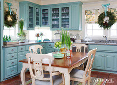
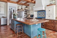
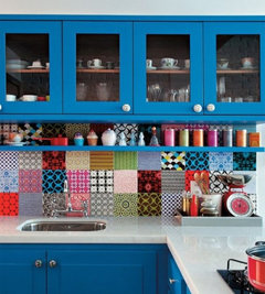
    I'm a big fan of blues in the cobalt family with Saltillo tile:

  • PRO
    8 years ago

    The yellow looks great, but also the blue.

    Saturated FourSquare · More Info


    Luxury Lorne Park Reno · More Info

  • 8 years ago

    Benjamin Moore Paints makes an exterior colour called "English Ivory". They moan and groan about having to mix it, will tell you it's discontinued, etc. but they can find the recipe and make you the paint as an interior colour. It's sort of a hard yellow to describe, it. It just looks like its been on the walls for years. I have used it in three very different kitchens and have always been happy with it. I have it now with a mexican tile floor and some very unfortunate granite counters and I still love it! Try a sample and see if it works with your counters.

  • 8 years ago

    those are fun counters! I like the one on the right in your picture. But, I like a blue or green too, so..I'm no help.

  • 8 years ago

    Awesome counters and I really love the green and blue that Beverly posted. In particular those shades looks wonderful with the counters AND the flooring.

  • 8 years ago
    My house is very neutral and I add color in my accessories. But the blue gives it a soothing feeling. I’m surprised how much I like it. It’s a fun kitchen. Whatever color you choose I’m sure it will be perfect. Enjoy!
  • 8 years ago

    Light blue-beige

  • 8 years ago
    last modified: 8 years ago

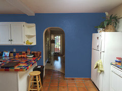
    I'd vote for the periwinkle blue that BeverlyFLADeziner mocked up for you. Probably because blue and orange are opposites on the color wheel, I think it complements the orange-y floor nicely while also tying in with the countertop. Also, that shade of blue just looks pleasant and cheerful to me.

    Here it is again, but covering the whole kitchen now:

    Yellow is my favorite color, so usually I'd be all over the marigolds you're considering, but I just don't love it here. I do totally love your inspiration kitchen (below), but in the yellow mock-ups in your kitchen, it feels as if the wall color is competing with the counter and floors and my eye can't figure out where to land.

  • 8 years ago

    What I get from this is that there are a hundred ways to do this and they are all correct.

  • 8 years ago
    last modified: 8 years ago

    Speaking strictly personally, I would probably paint the lower cabinets a blue to match one of the blue tiles (probably the cobalt), and I would remove the upper cabinets entirely in favor of a few open woodplank shelves to match the floor, for ceramics and spices, etc

    I would probably paint the walls white -- but I might continue with the blue or another color, depending on how it looked at that point. I realize that not everyone could live without the upper cabinets if they have a lot of stuff. At a minimum I would replace the upper cabinet doors with something with a bit of glass in them


    If I had the dough, I might also think about replacing the refrigerator with a colorful Smeg or other type of retro style refrigerator.


  • 8 years ago

    PS: If I was really crazy and rich, i might buy one of those over-the-top Dolce Gabbana Smegs (even though they are Italian, not Mexican, in design)

    Also, I note that your inspiration photo has open shelving like I would do, with thick wood planks.

  • 8 years ago
    last modified: 8 years ago

    What I have learned about painting with yellow is that you have to go a little more muted that you think. Leaning a little more toward haystack yellow/gold - definitely not too beige in this kitchen, but not a color that exactly matches the saturation of the tile - will help it not be overwhelming once it's on a large area like a wall. That said, I absolutely LOVE the cobalt blue walls on groveraxle's mock up. They look fantastic with the floor!

  • 8 years ago
    Yellow is the toughest color to get right so I’m leaning toward the blue. Good luck!
  • 8 years ago

    I was thinking something in the plum family. The Homestead Red from your historical collection, or Raspberry Patch (which would be a bit bolder) from the other.

  • 8 years ago

    What other colors do you use in your home? Would that help coordinate your home to the kitchen? So, perhaps choosing from the floor color, pick a soft brown/tan/taupe paint which would set off your counters for their fun boldness.

  • 8 years ago

    I'm leaning toward ktjensen50's comment on trying a soft, muted tone from the floor. Then I'm also looking at that fabulous plum color tile in the countertop and thinking maybe a paint shade 50% or so lighter could be fun. Best thing I ever did to help pick out paint colors for new construction was get a fan deck from Sherwin Williams...every color under the sun right there with you. Good luck !!!

  • 8 years ago

    Out of those historically accurate colours I like Sunnyside up. We have a similar yellow in our kitchen with clay tiles and it works well to keep it bright as it faces north. Might be too much everywhere if yours faces south.

  • 8 years ago
    Whatever you choose to do...and you can’t go wrong, please post!!!! This is so refreshing to see. COLOR!!!!!! It makes me happy just to look at your countertop tiles!
  • 8 years ago

    love the brighter yellow

  • 8 years ago

    Žlutou neřeším . Podlaha je super , já mám rád starý kameny . Ovšem pracovní deska je snad do cirkusu ? Nic proti pestrobarevnosti ! Hold 100 hlav - 100 názorů ( Pořekadlo ) .

  • 8 years ago

    I would try something like SW Torchlight SW 6374. It's a warm gold color which I definitely equate with southwest.

  • 8 years ago

    following...

  • 8 years ago
    What about a pale yellow? You need to have a wall colour that complements the tile floors and fun counters.
  • 7 years ago

    Sunny and bright

  • PRO
    7 years ago

    I love the floor and counter tiles, I think red is a bit Mc Donalds, love the blues and greens others have posted, such a fun home !! good luck, best, Debra

  • 7 years ago

    Love the yellow!

    racherz thanked housegal200
  • 7 years ago

    I love the follow up pictures. Great job with your yellow!

    racherz thanked tqtqtbw
  • 7 years ago

    It's perfect !!!!

    racherz thanked equinekdc
  • 7 years ago

    Amazing. After reviewing all of those renderings in different colors, the color you picked looks best of all.

    racherz thanked armchairshopper
  • 7 years ago

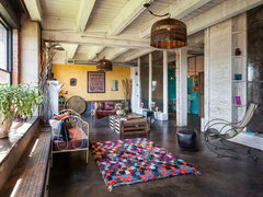
    You picked a good color. Now for a big colorful rag rug.


    Wabi-sabi - living room · More Info

    racherz thanked decoenthusiaste
  • PRO
    7 years ago

    I think a blue would have been a great choice.