Software
Houzz Logo Print
roomremedies

Monochromatic room

8 years ago
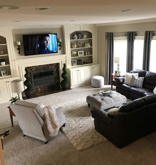
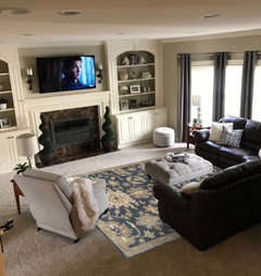
Wanted to get some feedback on this family room color (grant beige). Feeling like this room is a little blah. My thought was to go with more of a monochromatic look, but I am not loving the bookshelf color with the greige carpet. Paint has a lot of gold in it. Trying avoid having to paint all the baseboards, doors, window casings, ceilings, etc. I could paint wall color darker (pashmina) to get more contrast or paint cabinets. I have tried adding some pops of blue through pillows and accessories, but didn’t love that either. Any ideas on what color to paint bookshelves or what about just adding more depth to wall color???

Comments (69)

  • 8 years ago
    Thanks everyone for the great ideas! I really appreciate the feedback!
  • PRO
    8 years ago

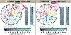
    I have pashmina paint in my office and it doesn’t fight the carpet so much so that’s why I thought it might help to bring it into my family room. Also, I am looking at amazing gray. It seems to like my carpet too.


    Trust your instincts.

    Pashmina and Amazing Gray belong to the same hue family, and they're very similar. Biggest difference is Amazing Gray is a little lighter and a little grayer compared to Pashmina.

    The fact that you feel that they like your carpet indicates that your carpet belongs to the YR (yellow-red) hue family too.

    The YR hue family also explains why you sometimes see flashes of violet/violet blue and blush/pink - in certain qualities of light, it's common for colors from this hue family neighborhood to shift violet/violet blue and blush/pink.

    It all makes sense.

  • 8 years ago
    For an easy fabric mount on the back of the cabinets try spray glueing fabric or glue gun to cardboard cut out to fit in the shelf - I did this for a China cabinet to hide a mirror. Burlap is cheap and has lots of texture and all sorts of colors.
  • 8 years ago
    Ditto on ldecor’s suggestion. Read Maria Killam book about whites, undertones, etc. BEFORE you do anything. You have lots of undertone issues going on and changing one probably won’t accomplish what you want. You need to first understand what’s going on and then develop a plan to remedy the situation. You will have to spend a little bit to buy the ebooks, but you will learn so much and won’t waste money buying rugs, painting bookshelves, etc. that won’t fix your issues.
  • 8 years ago
    I have similar cabinets and wall color. I’d just do colored curtains and perhaps a new ottoman with a colored pattern or new lampshades or throw pillows
  • 8 years ago
    Kjoy1, where did you find that rug?
  • 8 years ago

    Rug Studio...make sure to read the reviews


  • 8 years ago
    I am not a pro. I do not like carpet on carpet so I would remove the area rug. I would also remove the plants that are by the fireplace. Then I would try to focus on new toss cushions and the drapes to bring in colour. Then I would also consider a new chair for the room that could also bring in colour.
    Lori, where did you get those charts from - they are very helpful.
  • 8 years ago
    I believe they are from campchroma.com
  • PRO
    8 years ago

    Lori, where did you get those charts from - they are very helpful.

    The Colorography Lab. https://campchroma.com/blog/

    I/we make them. I do the color notations (numbers) myself, I have help with the images. We're adding new colors every day.

  • 8 years ago
    If you add some actual color to the room, the greige and cream scheme will look less blah. I don't like greige: it's as if you couldn't decide between grey and beige. The colorful accents may help, and next time you paint anything, avoid greige.
  • 8 years ago

    roomremedies Where did you find that first rug? I need that!

  • 8 years ago
    Do you mean the blue one?
  • 8 years ago

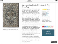
    This one, please.

  • 8 years ago
    It is a Surya rug and I found a great price on it on Wayfair. Here is the name of it on that site.
  • 8 years ago

    I love that rug too! Where are you putting it?

  • 8 years ago


  • 8 years ago
    I had planned to put it in my kitchen, but now I am tempted to try in my family room. Just not sure how I will like it with the chocolate leather sofa. I like the one you sent me too. Just wish I could see in person.
  • 8 years ago
    I love you! How do you do that? Is it through houzz? I think I saw something like that where you can place the item in your space.
  • 8 years ago
    I use photoshop:) Yes. It is always nice to see a rug in person...some sites offer sample sizes that you can buy or if they have a good return policy...order the smallest size they offer and then return...
  • 8 years ago
    Lori, thank you for the link to the charts.
  • 8 years ago

    The carpet seems to be a pink beige. the rest seem to go together

    . So very hard to tell on a moniter. But to me all of the above except the carpet seem to be in the same family. They all have cream beige and gold In them. Is the white that is in the number one picture the same white that is on the cabinets and fireplace surround?

  • 8 years ago

    This will be fun as there isn't going to be consensus due to monitor discoloration.

    Looks to me pink, orange, orange, orange..

  • 8 years ago

    :-) It all matches on my monitor, warm colors.

  • 8 years ago

    Wall with windows looks pinkish.. not with wall up close..

  • 8 years ago
    last modified: 8 years ago

    Actually like your room as is. Looks comfortable and a place intended for relaxing.

    What is your favorite bold color? Cobalt Blue? Emerald Green?

    Find a throw pillow or two with that color you like and/or curtains/drapes with that color in them and then paint only the inside of the open shelving part of the built ins that color -- the shelves and interior cabinet walls.

  • PRO
    8 years ago

    Yes, trim is definitely has yellow undertone. Here it is up close.

    Do you know the paint color name/number?


  • 8 years ago
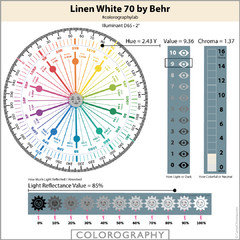
    Yes, it is Behr linen white.
  • PRO
    8 years ago
    last modified: 8 years ago

    Yes, it is Behr linen white.

    It doesn't have "yellow undertones".

    It *is* yellow. It belongs to the yellow hue family as you can see on the color wheel.

    And it has a healthy bump of chroma or colorfulness which means it's not a quiet, near neutral "just white" kind of color. It's pretty but definitely an ivory-creamy white.

  • 8 years ago
    That’s a handsome rug, but it’s getting lost. A modern or traditional oriental would add some life to the space.
  • 8 years ago
    Lori, thank you once again for checking into the color and sending the color wheel. Now I am curious...How do these color wheels for each color help you select colors that can go together? Do you want the amount of yellow in a color to be in same range when selecting colors for your home? For example, if my two colors have 1.52Y and 1.93Y. Does that mean they will work together? Or just that they have a similar undertone?
  • PRO
    8 years ago
    last modified: 8 years ago

    @roomremedies, great questions.

    First, most people have the concept of undertones wrong.

    Color - in every industry across the globe - is defined, described, ordered and organized by hue family like you see on the Colorographies.

    The theory that you can categorize color by undertones is ineffective because "undertones" are just somebody's subjective opinion about what they think a color looks like under whatever random light source they happen to be lookin' at it under. Which makes color a constantly moving target, it's hit or miss.

    Hue family comes directly from a color's DNA. It's not just somebody's best guess about what a color looks like.

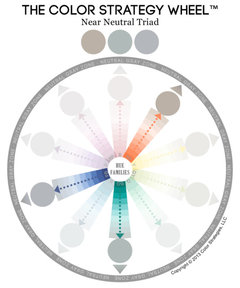
    In order to use a color wheel, the one you see above or any color wheel, you have to get your head around the fact that color is categorized by hue family.

    As far as what colors go together, the Colorographies map out hue, value and chroma and you can use that information to figure out color schemes.

    And you're right, colors from the same hue family neighborhood have a natural, organic relationship because they share hue family attributes.

    Categorizing color by hue family means you can use a color wheel. Some people knock the usefulness of color wheels. And that's almost always because they don't understand how color works to begin with - specifically they don't understand hue family.

    One function of a color wheel is it maps out color harmony for you.

    For example, once you figure out what hue families you're working with, then basic guidelines of color harmony apply. Like, triadic, analogous, tetrad, etc.


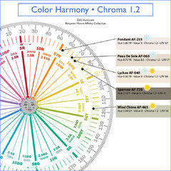
    As mentioned, colors in the same hue family go together. Also, colors with the same value go together, and last but not least, colors with the same chroma go together. For example this is one of my favorite color palettes, so pretty - the colors relate in terms of chroma.

    Different hue families, different values, different psychological color temperatures (warm/cool) but the thread of similar chroma makes a color palette that sings.

    Of course, color wheels and harmony guidelines are just guidelines.

    And hue, value, chroma color notations are only a framework to help you organize color so it's easy to manage.

    You always have to assess color>people>place>and things. Can't color by the numbers alone.

    You have to assess how a color or colors are actually perceived by human eyeballs in situ with inherent light sources.

    Hope that helps.

  • 8 years ago
    Wow Lori! This is all very fascinating. Seems like a great system! I have been plugging colors that I have been considering into the system on your site and they all come up somewhere in yellow hue family. At least I am consistent! They range a bit but all are similar. Thanks for sharing all the info.
  • 8 years ago

    Roomremedies...are you looking for a paint color for your trim or walls? I must have missed it...

  • PRO
    8 years ago

    Seems like a great system!

    It is. Which is why it's been around for more than 100 years.

    A good place to start if you want to learn more is the Munsell Color Order system.

    It is THE gold standard of color systems and was the template for modern scientific methods for measuring and organizing color.

  • 8 years ago
    Thanks Lori! I will check it out.
  • 8 years ago
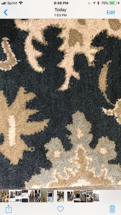
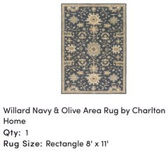
    Kjoy1- I am waiting for my new rug to come and then will paint my family room walls and bookshelves if I like it in that room. Otherwise, I will find another rug and use that as my color inspiration. If you have any suggestions please share:) Leaning toward pashmina or amazing gray as I have seen navy rug in person but want to see in my space with lighting. These two colors go with my carpet nicely.
  • 8 years ago

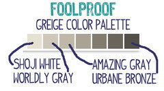
    I think amazing gray is very pretty:) This is my favorite color strip...which has amazing gray on it. Maybe consider going one shade down to worldly gray just because you have darker furniture. I like your trim color but consider Shoji White for trim if you decide to paint it. Urbane bronze on the back of bookcases...


  • 8 years ago
    Thanks for the suggestions! I love Urban Bronze too! I tried Worldly Gray and it went a little too blue in my room. Wondering if Amazing will do same. That’s why I am leaning more towards pashmina.
  • 8 years ago
    Greige is a color for someone who can't choose between gray and beige. And greige doesn't go with yellowish.
    For starters, try to work up a chart showing the colors of the permanent (not going to change) features of the home: hardwood flooring, stairs, fireplace, kitchen...things which affect what you do with the room in question. Working with those colors in hand, go to a good paint store and look at their color chart displays. DunnEdwards (my paint store) has fold-out color palette suggestions for different home styles: Craftsman, Spanish bungalow, ranch style, traditional. Try various color chips with your color chart, eliminating some colors, keeping chips with color possibilities. If you come up with three or four colors which work well together and with your permanent features, take them home to view within your home. That's a start. It may give you a direction.
  • 8 years ago

    I'm not an expert by any means but I like your room. It's very relaxing. I would only change the rug as others have suggested and see if that helps then maybe pull out the blue color of the rug into your curtains and pillows. I like a soft and comfortable traditional feel to a room. I also am not a big fan of the plants by the fireplace. I would find something softer that has colors that also pull from your new rug colors.

  • PRO
    8 years ago

    I would suggest changing your curtain rods and the hardware on your cabinets. It may be a seemingly small change but it could really help to add a pop of color to the room without being to labor intensive. I suggest maybe an a darker color like an Oil Rubbed Bronze. I think Century Hardware's Belvedere or Yukon collections would look great in that room! Best wishes!

    Belvedere Collection · More Info
    Yukon Collection · More Info

  • 8 years ago
    Thank you Lynn. I think I will be happy with a new rug and a few other changes.
  • PRO
    8 years ago
    last modified: 8 years ago

    I tried Worldly Gray and it went a little too blue in my room. Wondering if Amazing will do same.

    Even tho all three are from the same hue family neighborhood, Pashmina and Amazing Gray are less likely to shift blue because they have more Chroma than Worldly.

    They're not as neutral as Worldly.

    The rule of thumb is the more Chroma a color has, the less likely it is to shift and appear different from its hue family notation. Because higher Chroma means a color has a robust degree of colorfulness so it's not as susceptible to affects of light sources and context.

    That's not to say that it won't be affected by the light source at all.

    Just that it's less likely to shift and appear dramatically different than its DNA.

  • PRO
    8 years ago

    I noticed that revere pewter (.98) shifts quite a bit in person when I move it around and in houses that I have seen it in.

    It's true that lower chroma colors are more susceptible to dramatic color shifts under different light sources.

    But some colors are just more inconstant than others.

    That just means they're especially prone to shifting, changing in appearance under different light sources.

    Some bloggers and color training courses call this kind of color shift, change in color appearance metamerism.

    It's not metamerism.

    Metamerism is when TWO colors match under one light source but do not match under a different light source.

    When ONE color looks different under different light sources it's simply inconstancy. And, again, some colors are more inconstant than others.

  • 8 years ago
    Lori, this may not be in your speciality, but do you have any thoughts on recessed light bulbs? I have played around with warm, bright, and daylight. Bright and daylight cast too much blue light and warm is amber yellow. The cool makes me feel like I am in a department store and pulls more blue tones out of my carpet. The warm makes it more yellow and violet looking. Someone told me to look at the kelvin value and try warm with 3K or higher to make it look more like sunlight.
  • PRO
    8 years ago
    last modified: 8 years ago

    Grant Beige also has a higher chroma. It looks nice in my east light (see slight green tint at certain times of day) wonder what it would do in west with my red/orange walnut floors?

    It's easier to grab chips/samples and see what happens. Note what happens and what works or doesn't so you can develop a new strategy if Grant Beige doesn't work.

    You are correct -- because red and green are complements, there is a good chance that Grant Beige could appear greenish.

    As far as geographic exposures...

    In the early 2000s, I did a fair amount of research about paint colors and the geographic orientation of fenestration (windows and doors).

    LRV and the affects of geographic orientation on paint colors are probably the two things about color that I know the most about; the two topics I've researched the most.

    My logo is actually an edited version of an illustration I made for the study I did. Here's the original graphic. It's called the Color Compass Rose.

    Honestly, the whole north, south, east, west stuff that you read online is a really bad mashup of misinformation.

    Bloggers and people who offer color courses have taken scraps of questionable information and hacked it up even more, embellished, and just made stuff up for the sake of content. Pinterest is bursting with crap like "The Top 10 Colors for North Facing Rooms"

    The information about a Northern exposure is probably the most egregious.

    They NEVER reference their sources for the information they publish about how different exposures affect color appearance.

    And that's because most of them fabricate the information and/or just plagiarize the same misinformation from whatever sources pops up first in the Google.

    All of that is a really long way of saying that the direction the windows and doors face is about the last thing I consider - if I consider it at all.

  • PRO
    8 years ago

    Someone told me to look at the kelvin value and try warm with 3K or higher to make it look more like sunlight.

    This is another thing that is constantly repeated and is not exactly correct.

    The color temperature is only half the story.

    You also have to consider the CRI. The Color Rendering Index which is the ability for the lamp (light bulb) to render colors similar to how they look if you are standing outside at noontime in indirect daylight.

    The higher the CRI number the better.

    While it's true if you change the light, you change how colors look, Kelvins and CRI are a framework to facilitate well-lit functional spaces and create an atmosphere with light bulbs.

    They're not a prescription for flawlessly accurate color rendering.

    So much like the NSEW stuff, don't take it too literally.

  • 8 years ago

    Lori, the problem for consumers is that CRI is not listed when you buy a light bulb. HERE is a photo of an LED bulb package. It would be helpful if there were more comparisons of rooms and furnishings so people could see the differences. Below are a few links to illustrate:

    Kitchen

    Fireplace

    Art and flowers on table

  • PRO
    8 years ago

    Lori, the problem for consumers is that CRI is not listed when you buy a light bulb. HERE is a photo of an LED bulb package.

    CREE is a good example. It might take a Google or two but the information is easy to find online if it's not on the package. The name brands especially do a good job of making this kind of information easy to find for consumers.

    It would be helpful if there were more comparisons of rooms and furnishings so people could see the differences.

    But those are just Photoshop renditions of some graphic designer's interpretation of what they think "warm white" etc. color temperature should look like.

    So, they illustrate a general concept of color temperature. Ish.

Sponsored
Wannemacher Interiors
Average rating: 5 out of 5 stars26 Reviews
Customized Award-Winning Interior Design Solutions in Franklin Cnty OH