Software
Houzz Logo Print
kristam777

Need help with this disaster exterior paint job / colors

7 years ago

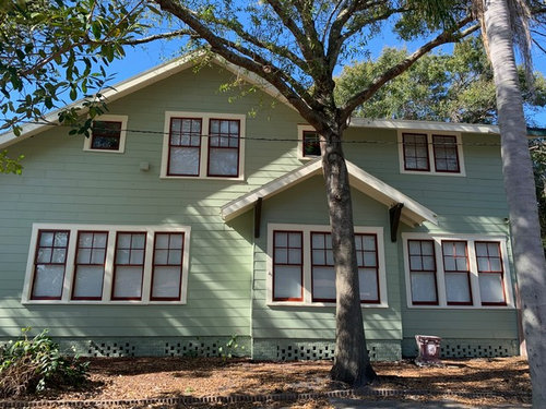
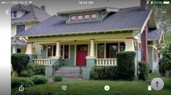
We just had our house painted and I am in shock at how bad these colors look. the progress is shown below...it is way more minty fresh looking & Christmas looking than I ever could have imagined. I honestly think the green has to go with something more earthy. hoping for any suggestions or help on what we can do to fix this by either painting the body again or windows (hoping not have to do both!) ! I was going for a sage green but this color from SW is way brighter / fresher than I think the house warrants. This is a historic bungalow but it looks like it belongs in a circus. thank you in advance for any feedback or advice!


NOTE: we will be painting the steps too and the upper porch windows but I told the painter to hold off for now.


Colors are:

Body: SW Clary Sage

Windows / accent: SW Carriage Door

Trim: SW Classical White

Door: SW Dark Clove


Comments (56)

  • 7 years ago

    Did you test it on the exterior first? Colors do tend to look lighter/brighter in exterior light.

    kristam777 thanked chloebud
  • 7 years ago

    I agree with Sammy that once you've added some nice plantings out front, I think your eye will be more pleased with the outcome. Seriously, it's very pretty right now. Time is your friend.

    kristam777 thanked Patti
  • 7 years ago

    I like it

    kristam777 thanked dyliane
  • 7 years ago

    I agree plantings will help, and you'll adjust to the color. It's a great house. :-)

    kristam777 thanked chloebud
  • 7 years ago

    I think it looks great. get in some deep green landscaping, some Hydrangeas, white roses. I feel like a darker sage would be a nice addition. maybe up top, or on the posts instead of that bright white.

    kristam777 thanked Beth H. :
  • 7 years ago

    Thank you all for your feedback!

    Sammy - THank you for the artichoke suggestion. I will try that paint sample and see! I love blue but unfortunately our roof is the desert tan color and blues don't seem to go well with that - sadly! That's a great suggestion about painting the area in front of the porch - I think that will help.

    Chloebud - We did test in exterior but did not consider how many windows we have and the height of our house - this color looks much better on a 1 story!

  • 7 years ago

    Love the windows!

    kristam777 thanked chloebud
  • 7 years ago

    I think it looks great. Would love to see a rendering with plantings and the front steps painted the creamy color of the trim.

    kristam777 thanked flopsycat1
  • 7 years ago
    last modified: 7 years ago

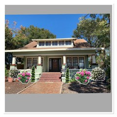
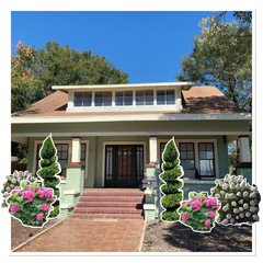
    I don’t have the mock up tools or skills of many but this


    kristam777 thanked pink_peony
  • 7 years ago

    Sorry having some issues with my phone trying to say this might give you an idea of how landscaping within aoften the look of the paint

    kristam777 thanked pink_peony
  • 7 years ago

    Add me to the list that thinks it's beautiful.

    kristam777 thanked missenigma
  • 7 years ago

    I'd consider painting the door the same color as your window sashes. The SW Dark Clove relates to nothing else in the color scheme.

    kristam777 thanked missenigma
  • 7 years ago

    It's darling. Focus on landscaping, deep greens, whites. It will look great.

    kristam777 thanked tfitz1006
  • 7 years ago

    I agree, looks nice, a deep gold (against rust) might be a nice accent colour to tone down the green, hard to tell just from looking at a monitor. It’s light and fresh.

    kristam777 thanked J Williams
  • 7 years ago

    I read your description and expected much worse than what I found in your photo ;0) And trust me, I'm one who firmly prefers a house painted a color that makes one think it has always been there, blends into the site - not something plopped brightly onto a lot.

    Its pretty, and looks quite nice. I do agree the color is a bit more ice creamy than I might have chosen for me. In fact, I suggested Pratt and Lambert 'artichoke' to a neighbor one year and at the last minute she changed her choice to more the color you have now. I may have liked your color drabbed down just a bit on a house for myself, but yours is not a catastrophe in any sense. Why don't you wait until winter season and winter light are over, see how you feel in the Spring.

    kristam777 thanked morz8 - Washington Coast
  • 7 years ago
    Go to a reputable paint store and ask about their historic range of colors...BM, SW, etc. All of them have a selection and periodize them. You need those selected for Craftsman or Bungalow style. They are earthier, warmer, deeper in tone than the green you have chosen. I also strongly suggest you go to your local historical society or preservation organization and ask for some help. They will assist you. I think you can get away with the red trim color, but the green is not appropriate for your house style. Any chance you can “blast” the masonry of your porch to return it to its natural state? Consider the paint that you have now as the primer for your final, “finish” coat. Good luck!
    kristam777 thanked ptreckel
  • 7 years ago

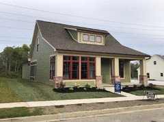
    This is a new construction home that was on zillow. It looks like others favored your color choices too ;)


  • 7 years ago
    i love the color.
    kristam777 thanked Hansen
  • 7 years ago

    It's a happy house! I would want to deepen, grey down the color a bit on the brick area of the porch and do the dormer window line in front the same. I'd live with the with the happy on the rest of the house because, unfortunately, I don't have a money tree in my landscape.

    kristam777 thanked hazelcraddock
  • 7 years ago

    Have you compared the actual color with the paint chip you used when choosing the color? Do they match? Could this be an incorrect mix job by the store?

    kristam777 thanked tatts
  • 7 years ago

    I like it! It looks fresh: no need at all to reproduce historical styles. It’s a contemporary take on colors from a hundred years ago. We aren’t living a hundred years ago. What’s wrong with that?

    Yes on some great landscaping.

    kristam777 thanked tangerinedoor
  • 7 years ago
    I’m partial to tones more along that artichoke color personally but with landscaping I think you could make it look lovely!
    kristam777 thanked Nicole R Dsp
  • 7 years ago

    Personally I don't like the window trim color. On my screen it looks red. I would repaint the red white or the front door color.

    kristam777 thanked functionthenlook
  • 7 years ago

    I LOVE your paint colors!!!! It looks so bright and pretty. I'd keep it as is, maybe live with it a little while and let it sink in. It might be because you're in shock it looks so different from what you envisioned. Honestly I wish I could paint my house that color. I love it. It'll look great with the landscaping.

    kristam777 thanked krisx2
  • 7 years ago

    I actually like it (though I think Artichoke is a nice choice too.) It suits the period of your house nicely. What about painting the brick foundation and perhaps also the brick wall in a darker neutral to help ground the building, so to speak? I sometimes use a dark grey for that. BM Kendall Charcoal, is a good one and I think it would play nicely with your green. And I agree that once landscape is in and everything gets a little scuffed, you’ll feel better about it. Nice job!

    kristam777 thanked scottie mom
  • 7 years ago

    I would bet if the stairs risers were a black it would tone it down overall for you. I think its the red brick giving it the christmas vibe. I think it is really cute and good for that type of house - I think you were likely looking for something more muddy/earthy so I can understand the shock, but it isn't "bad"

    kristam777 thanked Sarah
  • 7 years ago

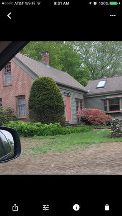
    I do think it is too minty. I would want a much darker sage. I can't really see the red but it looks good from here. I love red and sage on brick houses. Here is a neighbors house that I love:


    kristam777 thanked greenfish1234
  • 7 years ago

    Also don't paint the steps!!!

    kristam777 thanked greenfish1234
  • 7 years ago
    It’s very pretty!
    kristam777 thanked Ellen Tracy
  • 7 years ago

    I think it's lovely, but checking on the SW site it really doesn't look like Clary Sage.

    kristam777 thanked clt3
  • 7 years ago

    Thank you so much for the feedback everyone. So valuable - all of it! TY!


    Sarah B & Scottie Mom - I agree that giving the base and stairs a darker color and thank you for the BM paint suggestion


    greenfish1234 - I think the darker sage was what I was going for. I think the pic you've shown is pretty too - the trim looks the same as the body color and I think that helps balance out all the red with the windows and the brick.


    Clt3 - yes, it is clary sage. an important lesson in testing it on various parts of house in larger sections and studying it before committing!

  • 7 years ago

    @kristam777 - if budget is unlimited, repaint to get what you want - if it isn't, know that it doesn't look bad and is something for a year or so you can redo and not impact anything.


    kristam777 thanked Sarah
  • 7 years ago
    last modified: 7 years ago

    Funny look what I found in my pics when I was looking for the neighbor's house...very similar to your color. Here it is the red that I don't like I think. Needs to be deeper or maybe charcoal instead. But also it has no reference to a brick color as yours would if you left some exposed brick. What a difference with the mature landscaping. Note steps not painted!

    ETA: I see there is some exposed brick on the chimney, red should be that color if any red at all

    kristam777 thanked greenfish1234
  • 7 years ago

    greenfish1234- That house is so pretty. It has more trim than mine plus the trim is more yellow which I think helps balance out the colors more. yeah, maybe I should keep the steps. I do think I will be repainting the body at least to get a deeper green. I am hoping my painter will cut me a break!

  • 7 years ago

    If you live in a snow/ice area painted steps are very slippy.

    kristam777 thanked functionthenlook
  • 7 years ago

    One more thought, now that I've looked at it on a bigger screen: can you simplify the columns? I think that might be where you're getting the candy-cane christmas vibe ;-)

    I'd try them all in the trim color--get rid of the brown base and red trim. It's a little too Victorian, IMO.

  • 7 years ago

    scottie mom - Thank you! yes, I had it all in trim color initially and but then my painter put brown and red all over the columns. and it definitely looked worse when he did that. unfortunately his ability to pick a paint scheme is worse than mine!

  • PRO
    7 years ago
    Some really great suggestions here! It seems that the colors might be a couple shades off, possibly the green is too light and the brown accents on the columns don’t work with the window color. I would bring in that window color to the upper row as well. If you’d like to see a few different color options and find confidence in your selection, we offer a colorizer service that allows clients to see their homes digitally painted. It’s very affordable at only $75. Take a look at our profile and website for more information. Can’t wait to see the results!
    kristam777 thanked Huiz Home Design
  • 7 years ago

    I may be the odd person out but I kind of like the rust with the pistachio colour, and I wonder if the door should be a similar tone? These two colours are a classic combo. Red/rust twigged shrubs/trees might be nice to bring colour into the landscape, like paperbark maple, oakleaf hydrangea, birch, dogwood, Japanese maple etc.

    kristam777 thanked J Williams
  • 7 years ago

    I am the opposite^. I don't think the rusty window trim works with the minty green at all but I do like the door color and think that would be very good on the windows. I understand trying to bring some of the brick shade onto the house but it just isn't working, to my eye.

    Before my new siding, my house was painted in a soft sage green (Glidden High Tea) with Bleached Wheat trim and a dark red door -- and loved it. So yes, red and green can work together but they have to be the correct red and green paired. With the new siding I, like you, found that the color was not as expected, more of a yellow tint to what I thought was a gray-green -- but once I painted the red door, mailbox and accents black, it became much more as expected. It is amazing what a difference those small color details can make.

    kristam777 thanked raee_gw zone 5b-6a Ohio
  • 7 years ago
    last modified: 7 years ago

    To avoid minty-ness, green needs to be muted a little with some brown/beige or gray/blue.

    I think its quite attractive the way it is... but I think if the green was a darker, earthier mossy green that would take from "ok" to stunning. It really is a very handsome house ! Keep trim same - the rust color trim would look quite good and be better balanced with a darker, browner green.

  • 7 years ago
    last modified: 7 years ago

    Check out the dark greens on a 1900 craftsman about 1/2 way down the page - looks like maybe what you were aiming for? You really are so close! Theres some other greens + creams that look really great. The thing about old houses - they really do seem to come alive with original historically accurate color. Styles change, and 100 yrs later whats old looks fresh and new again!

    https://www.oldhouseguy.com/exterior-paint-colors/

    kristam777 thanked Debbie Downer
  • 7 years ago

    @Current Resident - Thank you! That is an awesome site. I was thinking something darker too - and it seems that rust / red window sashes looks less pronounced with a more yellow trim too.


    @ kmg11 - That's funny. looks very similar to my house except they nailed the colors much better.


    We have talked with our painters already and will be repainting our house (sigh). We have budget for it and I really want to turn it from "just ok" to "really awesome". Thank you everyone. This has been so tremendously helpful.

  • 7 years ago


  • 7 years ago

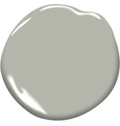
    Try BM Sea Haze...

    Sea Haze 2137-50 | Benjamin Moore · More Info

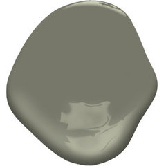
    ...or Rooftop Garden:

    Rooftop Garden CSP-765 | Benjamin Moore · More Info


  • PRO
    7 years ago

    I'm with those that think the house looks pretty. Perhaps a little mintier than you were aiming for, but pretty.

    There have already been some excellent suggestions re: some different greens to try if budget allows, however, if it doesn't . . .

    Definitely simplify the base of the pillars to the creamy trim colour, but leave the little hit of rusty red at the tops of the columns or they will look like they're missing something like your upper windows look now. That will keep the sash colour further away from the brick stairs which is good because it is a bit too "clean" relative to the brick and is making it look old.

    That said, I like the natural brick and would not paint it unless absolutely necessary. If the stairs have to be painted for some reason, I would make the colour more like the side walk which is a decent match to the roof, both of which are more orange than the reddish brick. Your roof is very visible and the "tongue" effect created by the walk and stairs visually grounds the house as it is now with them being similar in colour.

    And yes, foundation plantings will also help the house "settle".

    kristam777 thanked Elizabeth Minish Design
  • PRO
    7 years ago

    i like you house : )

    kristam777 thanked Java Painting & Restoration
  • PRO
    7 years ago

    I really want to turn it from "just ok" to "really awesome".


    Ken, The Old House Guy could definitely help you. The style of your house and the color palette you're after is totally in his specialty wheelhouse.

    kristam777 thanked Lori A. Sawaya
  • last year

    @kristam777 What did you end up doing with this? My wife and I recently made a nearly identical mistake painting Clary Sage and it coming out minty green.