Software
Houzz Logo Print
mlb418

Not sure about this backsplash ...

7 years ago
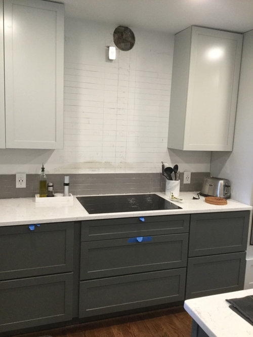
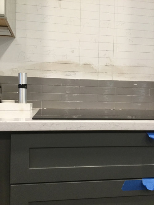
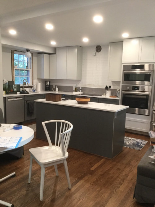
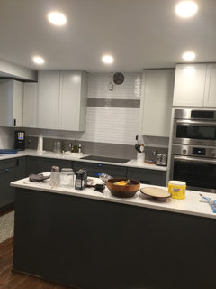
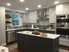
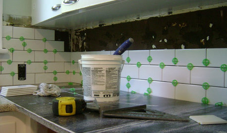
So, I am not quite sure about my backsplash choice now that it’s partially installed. My plan was to use two colors of this subway tile - a strip of gray at the countertop and then white above that strip. I like the way the gray looks against the counters, and I also like the way the items on the counter pop against the gray. But now that the whole strip of the gray tile is in, I am not sure how it looks with the dark gray counters on the bottom. It’s obviously not an exact match, which I knew, but does it clash? This is the first day I’m seeing it, so it might just take a day of getting used to. I know putting this stripe in is not most people’s cup of tea, but we really didn’t want an all white backsplash.

Comments (33)

  • 7 years ago

    I am totally not a pro and have no eye for design, but it looks just fine for me. I think that it would look more off to me if the tile did match the cabinets perfectly. I like the stepped down tone.

  • 7 years ago

    I like it! The stripe is a very nice transition.

    We are at the paint primer stage of our build, and I keep not liking the changes as they unfold but then after a day or so I see that they are just fine. On the whole, I also think there are few actual disasters, just things that didn't turn out the way I expect.

  • 7 years ago
    last modified: 7 years ago

    Sorry, I am not liking it.

    But of course it's your kitchen.

  • 7 years ago

    "... I am not sure how it looks with the dark gray counters on the bottom."


    You mean cabinets, right? This could just be my screen that can really distort colors, but the gray tile looks a bit brown-ish to me. Probably more so in your first photo. Is it more gray in person?

  • 7 years ago

    I like it. It's nice to see something a bit different. And it's a very confident shade of gray. I like that it's not washed out. Try to give yourself more time before you judge.

  • 7 years ago

    @chloebud, I think that’s the issue I couldn’t quite put my finger on. The gray tile has a hint of brown in it that isn’t present in the cabinets. And yes, I mean dark gray cabinets.

  • 7 years ago
    last modified: 7 years ago

    I think that looks pretty cool! I love it....you have brown floors, the gray can have brown it, But I don’t really see much brown in it anyway it may be just picking it up from that smudge above it

  • 7 years ago

    Okay, if it really looks somewhat "cocoa" in person it would bother me. I think the idea of the strip is nice, but it should be more gray. I'd want it to blend with the cabinets and ss appliances.

  • 7 years ago

    I love it - and I'm so glad you posted pics because I'm about to do a similar "stripe" at the bottom of my backsplash. It makes me happy to see an alternative to all-one-color backsplashes.

    I can see what you mean about the gray being more brown, but I think it looks nice with your cabinets, stainless appliances, white tile above, and brown floors. Nothing clashes and it's not too matchy-matchy.

  • 7 years ago

    I think it looks fine, but would probably prefer all white or a patterned tile incorporating a gray closer the the cabinets.

  • 7 years ago

    Sorry but I dont like it either. I dont see how it ties in to the overall design. It just looks like a random stripe. Sort of like an afterthought.

    Maybe once the kitchen is finished and accessorized it will look fine.

  • 7 years ago

    I like it.

  • 7 years ago

    IMO It’s not bad, but definitely more brown than the cabinets, so it seems a bit like a forced match in some ways. But it probably looks nicer in person and once everything else is in place

  • 7 years ago

    Really liking that marble tile from Beth!

  • PRO
    7 years ago

    Can you tell me what's going on with the white tile above? It looks like there's a smaller format (3x6?) in the center above the gray tile that is straight set while the rest is offset, but maybe the photo isn't representing this well? Regardless, the white tile should be installed the same way as the gray.


    And yes, in comparison to the gray cabinets, the gray you chose is a bit too warm.

  • 7 years ago

    Sabrina,,it's not tile. looks like it's a pencil marking or grid lines.

  • 7 years ago

    Yes, the white area is the drywall with pencil markings because we had been debating either putting a second stripe of gray further up in the open space or adding some random gray tiles in that open space (which will otherwise be white tiles). The markings are from my contractor. The difference in the grays is bothering me less today.

    @beth - thanks for the tile ideas. I always think it’s so nice how you do that for people on here. We don’t want to do all gray tile, as the room doesn’t get a lot of natural light. We are going to do both the gray and white on both walls. I tried a couple of marble tiles, but they clashed with the counters (which are a faux marble quartz).

  • 6 years ago

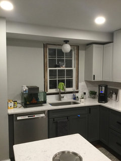
    Thought I would circle back with a picture of the wall finished wall. Now the question is whether to go up all the way on the wall with the window. I don’t want to, but my husband does, second stripe and all. We will be replacing the window, and to the left of the window, we will have three wood floating shelves. I think it will look weird to have a strip running behind a shelf.

  • 6 years ago

    i think it would look odd not to tile it. go all the way up with the same tile, or just one color, like the white.

  • 6 years ago

    Beth, you always nail the color! #colorguru

  • 6 years ago

    So have tile going behind the shelves? We will definitely tile up under the bottom of the cabinet/first shelf, but I guess I hadn’t seen tile done all the way behind open shelves. I’m sure I can find some pictures though. There’s also the wall where the kitchen ends that forms a corner. Would it look odd to tile that wall too, so there is tile covering that whole corner?

  • 6 years ago

    So the stripe detail is definitely unique and I applaud your bold vision. However for it to look like a design and not just a random thought I think the stripes should run on both walls. The height of the upper stripe should have been carefully planned with the height of the shelf. Best to blue tape the stripes and shelf and post another pic before proceeding further.

  • 6 years ago

    I would tile the entire corner. Looks good. Do plan spacing.

  • PRO
    6 years ago

    I would definitely tile the entire space. And I like the stripe, it's your own, personal touch. The most important thing is that you enjoy the look of it.

  • 6 years ago

    tiling behind open shelves is done all the time. (you have a very small area where the shelves are going. do the whole wall or else it will look choppy)

  • 6 years ago

    I love your stripe! It's fun to see something unique and it looks terrific.

  • 6 years ago

    Thanks for the feedback and encouragement! We will go with tile all the way up and covering the corner, which was my husband’s preference anyway. We will do some measuring to see whether to keep the stripe where it is or to move it so it works with the shelves. I’m also wondering whether I’d like to add a thin stripe at the top. As you can see from my choices, I like different, but it’s scary!

  • 6 years ago

    While you’re at it tape off where the hood will go, that will visually break the stripe(s). It’s easy to get some graph paper and sketch out both walls too scale and overlay tracing paper to see how the stripe translates to both walls. This way you won’t have to undo tile work. Or go crazy with blue tape.

  • 6 years ago

    Thought I would circle back with a picture of the finished backsplash. I love my stripe! Thanks for the encouragement to go all the way up on the window wall - that was definitely the way to go.

  • 6 years ago

    turned out great

  • 6 years ago

    That grey’s is a light eater. You can getaway with it if you ha good under-cabinet lighting.