Software
Houzz Logo Print
blessings2all

Paint sample craziness- Gray, Beige, Greige?

7 years ago
last modified: 7 years ago
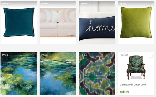
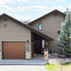
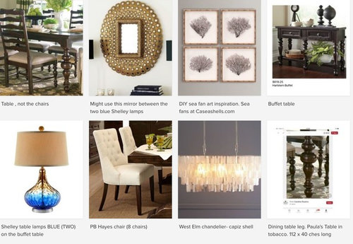
Bought a smaller house with E, W, and S exposures.. Brought the furnishings of the old house with us (see below) Need a paint color to work with furnishings in the public spaces and hallway. We do not have access to info re: paint in the old house. The current wall color is a builder pinky beige.


Thanks to the multitude of decor blogs regarding undertones, Paint store websites, Houzz images.....I'm in paint sample hell. Every warm gray (greige) that I like on SW website is paired with a blue-gray or coral pink plum, which is not in color palette. Sidestepping a 5150 hold for the moment, I welcome advice for an all over color in the public areas, considering driftwood floors and light walls, but cool Gray? Warm gray? We desire a neutral background that might enlarge the space (wishful thinking)


Which color family will work best with furnishings and make this smaller house feel light and larger? (Wishful thinking) Perhaps the answer is obvious to some, but I am too close to the problem and can't see the answer, due to swirling choices. Every paint color shade seems to say says "Pick me!" and "No, pick me!"

Front sitting room


Dining space in front room


TV room


Comments (20)

  • PRO
    7 years ago
    last modified: 7 years ago
    Gray is out already. Why not to go with whites? And no any headaches! Fresh, great, trendy all the time.

    My House thanked Celery. Visualization, Rendering images
  • 7 years ago
    last modified: 7 years ago
    Yes, I've thought of going to white, but then again.. Warm or cool or stark.....

    Which white, as there are numerous SW Extra white (trims). Or other tints like SW - Aethetic white, Marshmellow, Eider a White or White Heron or???

  • 7 years ago

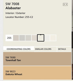
    I suggest SW Alabaster

    My House thanked wysmama
  • 7 years ago
    last modified: 7 years ago

    Wysmama-. Thank you. I'm not arguing with you -not at all. I thought Alabaster too, It is pretty, but when I see it on SW website, it is paired with warm tones .... How much weight should I give to SW suggestions? I don't have these colors in the floor, nor do we have tan sofas


  • 7 years ago

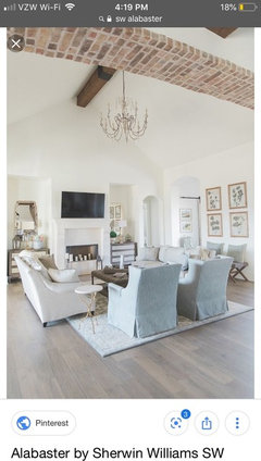
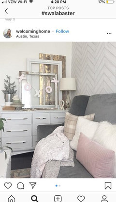
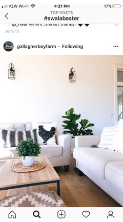
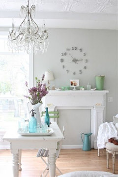
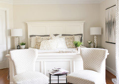
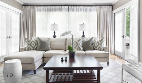
    We just built our home and used Alabaster in all the main areas. I love the color. It looks good all times of day. I think it can work with cool or warm tones! I have been having trouble trying to load pics. But I will try to find a pic that may help show you

    My House thanked wysmama
  • 7 years ago

    Not my pics, but snagged them from Instagram

    My House thanked wysmama
  • PRO
    7 years ago
    last modified: 7 years ago

    Alabaster is a very light shade of yellow , that why it has these coordinating colors. If your floor is warm color it would work.

    My House thanked Celery. Visualization, Rendering images
  • PRO
    7 years ago

    One color for 3 exposures…you need one undertone to work with all three and it should be blue.

    My House thanked JudyG Designs
  • PRO
    7 years ago
    last modified: 7 years ago

    I see you have most of green and blue accents. There is Olympus white by SW that is a light shade of green-cyan


    It looks gray for me

    My House thanked Celery. Visualization, Rendering images
  • PRO
    7 years ago
    last modified: 7 years ago

    Three different exposures and you need one color to work with all, plus your colors.

    I suggest a gray with a blue undertone (good for East, West and South light).

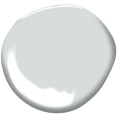
    B.M. Bunny Gray definitely will look lovely in your new home.


    My House thanked JudyG Designs
  • 6 years ago

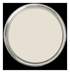
    I would use a warm white without any yellow, which would look great with your blues and greens. I don't think grays look right with your colors. We just painted with SW Shoji White, and it looks amazing. Enough color to have contrast with white moldings, but not too dark to read as "beige". It looks light, fresh, and elegant, and coordinates well with greens/blues.

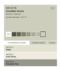
    We painted one of the rooms SW Liveable Green, which is also a nice soft backdrop.


    My House thanked calidesign
  • 6 years ago
    last modified: 6 years ago

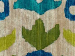
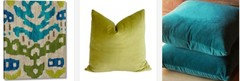
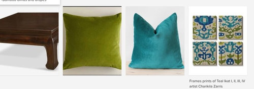
    Thank you to everyone .... The TV room area furnishings is proving most difficult for me. Although the home decor colors are blue and green, the accents in this area of the great room are warmer shades of the cool spectrum (Chartreuse and turquoise) If I choose white or gray....

    Which undertones - blue, green, yellow, should I embrace or avoid? . (E, W, S exposures room).

    -Should I match the background whitish-beige in the wall art detailed photo or contrast it ?


    Detailed view of wall art

    Family room · More Info


  • PRO
    6 years ago

    I like the Shoji White suggestion - coordinates with the background of the fabric. Of course, you'll have to see what it looks like in person but it has potential.

    My House thanked Lori A. Sawaya
  • 6 years ago
    last modified: 6 years ago
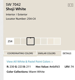
    1) Will WARM WHITE make the space feel smaller, like the ,"warm colors project" principle?-


  • 6 years ago

    Shoji white is light enough that it will not make the space seem smaller, and would work beautifully with your brighter greens/blues. We also tried a sample of natural choice and found it to be slightly greener/muddier and darker looking than shoji white. It looks like White Heron has slightly more gray - you could try a sample. You will only know when you see the colors in your own light. The whites to avoid are those with too much yellow.

    My House thanked calidesign
  • 6 years ago
    last modified: 6 years ago
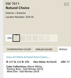
    Thank you everyone.

    Note to self: Another reference for Shoji White

    https://www.southernliving.com/home/colors/best-shades-white-paint


  • 6 years ago
    last modified: 6 years ago
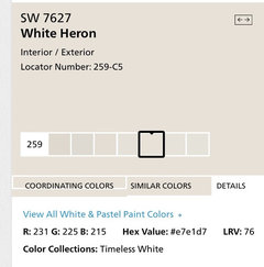
    Lori-. In researching paint reviews, I found this response from you....

    SW9166 Drift of Mist. It's my secret weapon color to rent and sell homes. And I think it's pretty. If you can or need to do two colors, SW6195 Gossamer Veil is darker and equally pretty and it's nice to a bump darker in bedrooms, den, office, etc.

    *Do you still use Drift of Mist as your secret weapon? Any colors to avoid with Drift of Mist?

  • PRO
    6 years ago

    SW Westhighland White

    here is a link to a blog where it is used with blues, even though it’s a warm white.

    https://www.fourgenerationsoneroof.com/make-white-bedroom-walls-look-gorgeous/

    I’ve used this color throughout a house.

    My House thanked myricarchitect
  • PRO
    6 years ago

    Yes. We have a unit vacating on the 31st and I just paid for another 5 gallons of D of M.


    D of M belongs to the middle of the Yellow hue family. (see the Colorography)


    When some yellows (most yellows) get darker and grayer they looker greener.


    It's not always noticeable, however. It's more like there are moments of greeness not necessarily an inherent sense of greeness.


    Personally, like that edge of greeness because to me it reads fresh and clean.


    What all that means is classic color theories apply. Colors that go with yellow and green will go with D of M and colors that don't, won't.


    Drift of Mist Colorography.

    My House thanked Lori A. Sawaya