

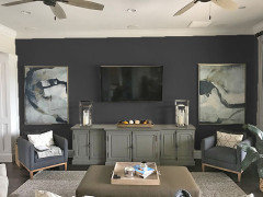
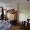
Advice on this wall
7 years ago
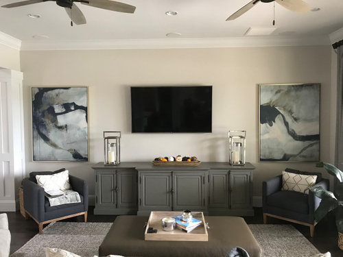
Featured Answer
Sort by:Oldest
Comments (29)
 7 years agolast modified: 7 years ago
 7 years ago
Related Professionals
Daytona Beach Interior Designers & Decorators · Greenville Interior Designers & Decorators · Oklahoma City Interior Designers & Decorators · Springfield Interior Designers & Decorators · Bennington Interior Designers & Decorators · Ocala Architects & Building Designers · Baton Rouge Architects & Building Designers · Rocky Mount Architects & Building Designers · McAlester Architects & Building Designers · Aurora Architects & Building Designers · Detroit Architects & Building Designers · Toronto Architects & Building Designers · Magnolia Kitchen & Bathroom Designers · Madison Kitchen & Bathroom Designers · Jackson Kitchen & Bathroom Designers- 7 years ago
 7 years agolast modified: 7 years ago
 PRO7 years ago
- 7 years ago
 7 years ago
- 7 years ago
- 7 years ago
- 7 years ago
- 7 years ago
- 7 years ago
- 7 years ago
- PRO7 years ago
- 7 years ago
 PRO7 years ago
- PRO7 years ago
- PRO7 years ago
- PRO7 years ago
- PRO7 years ago
 7 years ago
- 7 years ago
- 7 years ago
 7 years ago
- 7 years ago
- 7 years ago
- PRO7 years ago
- 7 years ago


Related Stories
GARDENING GUIDESOn the Up and Up: Expert Advice for Growing a Green Wall
Houzz pros share solutions for 7 common challenges you can face with a vertical garden
Full Story
LIFEEdit Your Photo Collection and Display It Best — a Designer's Advice
Learn why formal shots may make better album fodder, unexpected display spaces are sometimes spot-on and much more
Full Story
DECORATING GUIDES10 Design Tips Learned From the Worst Advice Ever
If these Houzzers’ tales don’t bolster the courage of your design convictions, nothing will
Full Story
KITCHEN DESIGNSmart Investments in Kitchen Cabinetry — a Realtor's Advice
Get expert info on what cabinet features are worth the money, for both you and potential buyers of your home
Full Story
HEALTHY HOMEHow to Childproof Your Home: Expert Advice
Safety strategies, Part 1: Get the lowdown from the pros on which areas of the home need locks, lids, gates and more
Full Story
KITCHEN STORAGEKnife Shopping and Storage: Advice From a Kitchen Pro
Get your kitchen holiday ready by choosing the right knives and storing them safely and efficiently
Full Story
REMODELING GUIDESContractor Tips: Advice for Laundry Room Design
Thinking ahead when installing or moving a washer and dryer can prevent frustration and damage down the road
Full Story
THE ART OF ARCHITECTURESound Advice for Designing a Home Music Studio
How to unleash your inner guitar hero without antagonizing the neighbors
Full Story
DECORATING GUIDESDecorating Advice to Steal From Your Suit
Create a look of confidence that’s tailor made to fit your style by following these 7 key tips
Full Story
TASTEMAKERSBook to Know: Design Advice in Greg Natale’s ‘The Tailored Interior’
The interior designer shares the 9 steps he uses to create cohesive, pleasing rooms
Full Story


BeverlyFLADeziner