

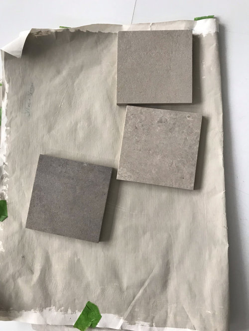
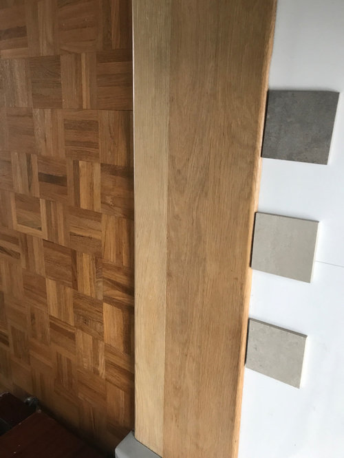
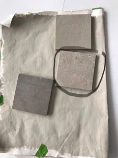
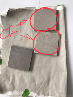
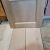
which flooring please ?
6 years ago
Featured Answer
Sort by:Oldest
Comments (22)
 6 years ago
- 6 years ago
Related Professionals
Grand Island Flooring Contractors · San Diego Flooring Contractors · Temecula Flooring Contractors · Eureka Flooring Contractors · Great Bend Tile and Stone Contractors · Gloucester Tile and Stone Contractors · Georgetown Kitchen Remodelers · San Marcos Kitchen Remodelers · West Plains Interior Designers & Decorators · Albert Lea Interior Designers & Decorators · Las Cruces Interior Designers & Decorators · San Angelo Interior Designers & Decorators · Victoria Interior Designers & Decorators · Muskogee Architects & Building Designers · Denver Architects & Building Designers- 6 years ago
- 6 years ago
 PRO6 years ago
 PRO6 years ago
- 6 years ago
- 6 years ago
- 6 years ago
- 6 years ago
 6 years agolast modified: 6 years ago
- 6 years ago
- 6 years ago
- 6 years ago
- 6 years ago
- 6 years ago
 6 years ago


Related Stories
BATHROOM DESIGNWhich Flooring Should I Choose for My Bathroom?
Read this expert advice on 12 popular options to help you decide which bathroom flooring is right for you
Full Story
FLOORSChecks, Please! 13 Choices for Checkered Floors
Checkerboard Patterns Go From Casual to Ritzy, From Marble to Grass
Full Story
REMODELING GUIDESYour Floor: An Introduction to Solid-Plank Wood Floors
Get the Pros and Cons of Oak, Ash, Pine, Maple and Solid Bamboo
Full Story
DECLUTTERINGWhen Simplifying, Which Papers to Keep and Which to Toss?
Find out which records you can get rid of when you are decluttering or moving to a smaller home
Full Story
MOST POPULARPros and Cons of 5 Popular Kitchen Flooring Materials
Which kitchen flooring is right for you? An expert gives us the rundown
Full Story
KITCHEN DESIGNDesigners Share Their Top Choices for Kitchen Floors
See which flooring materials and patterns these pros have been using in their latest kitchen projects and why
Full Story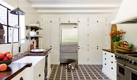
DECORATING GUIDESThings Are Looking Up for Artistic Floors
Why should walls get all the glory? Pleasing rug patterns and dramatic inlay details make for eye-catching statements underfoot
Full Story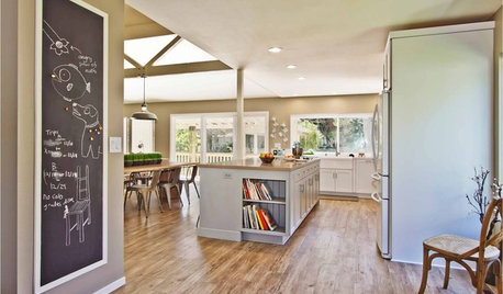
FLOORSWhat's the Right Wood Floor Installation for You?
Straight, diagonal, chevron, parquet and more. See which floor design is best for your space
Full Story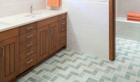
GREAT HOME PROJECTSHow to Install a New Tile Floor
Is it time to replace your tile floor? Here’s how to get it done, which pros to call and what it will cost
Full Story
DECORATING GUIDESPro Tips for Choosing the Perfect Hallway Flooring
Wondering which material will work hard, look wonderful and last well in your hall? Step this way
Full StorySponsored

Columbus Design-Build, Kitchen & Bath Remodeling, Historic Renovations


Tower Ceramics Ltd