


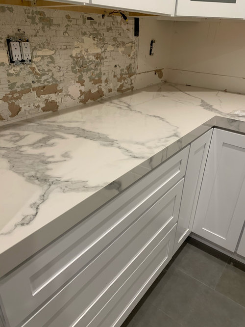
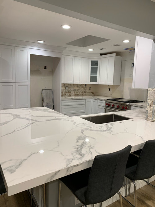
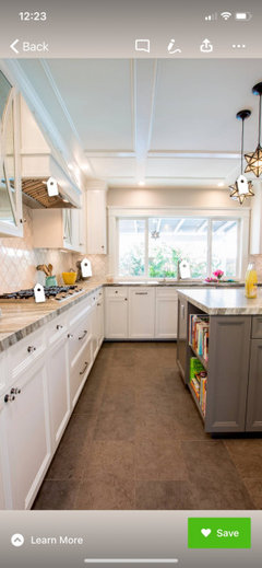
New white counters don’t match kitchen
futura431
4 years ago
Featured Answer
Comments (115)

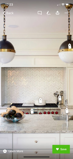
Design Girl
4 years ago
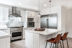
A C
4 years agoRelated Professionals
Ashwaubenon Interior Designers & Decorators · Reston Furniture & Accessories · Arlington General Contractors · Bowling Green General Contractors · Hampton General Contractors · Jefferson Valley-Yorktown General Contractors · Kettering General Contractors · Mansfield General Contractors · North Tustin General Contractors · Charlottesville Kitchen & Bathroom Remodelers · Saint Augustine Kitchen & Bathroom Remodelers · Mount Prospect Cabinets & Cabinetry · Milford Mill Cabinets & Cabinetry · Cornelius Tile and Stone Contractors · Mililani Town Design-Build Firmsfutura431
4 years agoDesign Girl
4 years agofutura431
4 years agoDesign Girl
4 years agoA C
4 years ago
WestCoast Hopeful
4 years agotedbixby
4 years agolast modified: 4 years agoA C
4 years agoDesign Girl
4 years agolast modified: 4 years agotedbixby
4 years agofutura431
4 years agotedbixby
4 years agoA C
4 years agoA C
4 years agoTheresa Janssen
4 years agofutura431
4 years agofutura431
4 years agoDesign Girl
4 years agofutura431
4 years agoA C
4 years ago
chloebud
4 years agoTheresa Janssen
4 years agoDesign Girl
4 years ago PRO
PROZapata Design, LLC
4 years ago
Kristel Quintana
4 years ago
Charlene Bevan
4 years agoA C
4 years agofutura431
4 years ago
Abby Mac
4 years ago
RedRyder
4 years agoXtal in Central TX, zone 8b
4 years ago
Janie Gibbs-BRING SOPHIE BACK
4 years agoXtal in Central TX, zone 8b
4 years agolast modified: 4 years agoAnita
4 years agoJanie Gibbs-BRING SOPHIE BACK
4 years agoDesign Girl
4 years ago
Zalco/bring back Sophie!
4 years ago
T
4 years agoJmoore
4 years agoTheresa Janssen
4 years ago
Rachel
4 years agoA C
4 years agoRedRyder
4 years ago- PRO
Business_Name_Placeholder
4 years ago Xtal in Central TX, zone 8b
4 years ago
Regan Noland
2 years ago- PRO
Zapata Design, LLC
2 years ago


Related Stories
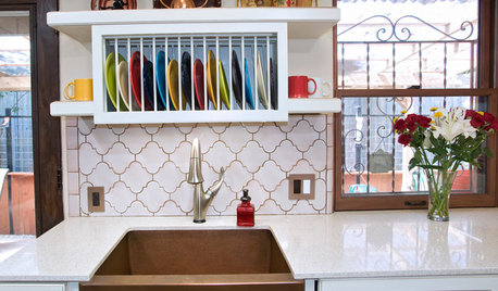
KITCHEN DESIGNDish-Drying Racks That Don’t Hog Counter Space
Cleverly concealed in cabinets or mounted in or above the sink, these racks cut kitchen cleanup time without creating clutter
Full Story
BEFORE AND AFTERSKitchen Rehab: Don’t Nix It, Fix It
A small makeover makes a big impact in a traditional kitchen in Atlanta with great bones
Full Story
KITCHEN DESIGNDon't Pass Up the Kitchen Pass-Through
A carved-out opening in a kitchen wall can increase spaciousness, make an architectural statement and improve social time
Full Story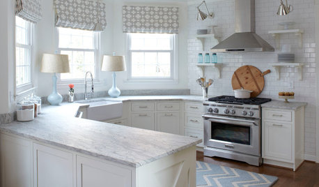
KITCHEN DESIGNHow to Keep Your White Kitchen White
Sure, white kitchens are beautiful — when they’re sparkling clean. Here’s how to keep them that way
Full Story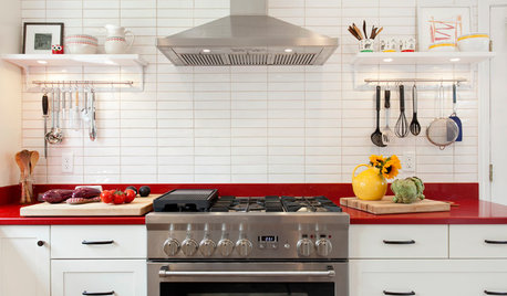
KITCHEN DESIGNKitchen of the Week: Red Energizes a Functional White Kitchen
A client’s roots in the Netherlands and desire for red countertops drive a unique design
Full Story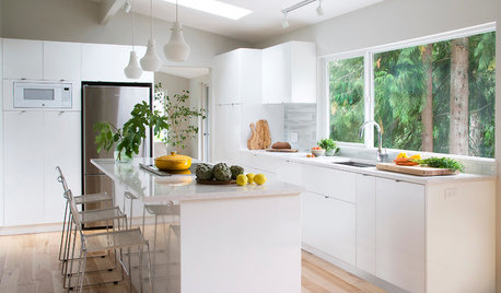
KITCHEN OF THE WEEKKitchen of the Week: A Storage-Savvy White Kitchen in the Trees
A smart layout and space-saving storage make this Canadian kitchen feel larger than it is
Full Story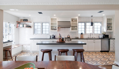
KITCHEN OF THE WEEKKitchen of the Week: Graphic Floor Tiles Accent a White Kitchen
Walls come down to open up the room and create better traffic flow
Full Story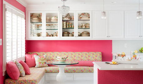
KITCHEN OF THE WEEKKitchen of the Week: A Punch of Pink for a White Kitchen
A homeowner shows her love of pink in bold walls that impart a cheerful vibe
Full Story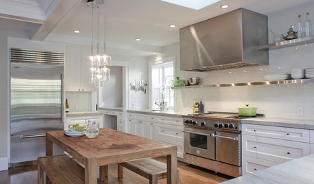
KITCHEN DESIGNCooking With Color: When to Use White in the Kitchen
Make sure your snowy walls, cabinets and counters don't feel cold while you're riding white's popularity peak
Full Story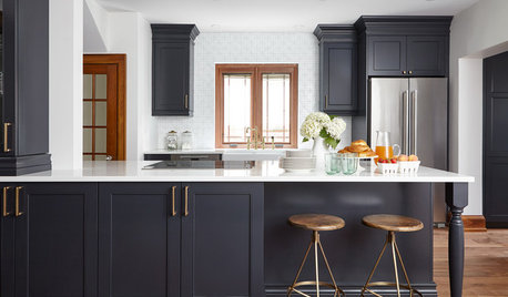
KITCHEN DESIGNKitchen of the Week: Wood, White and Blue in an 1890s Kitchen
A designer preserves 19th-century architectural details while updating the room’s style and adding modern comforts
Full Story


futura431Original Author