Software
Houzz Logo Print
sageviews

Help! Low-E windows changing wall paint colors

6 years ago
last modified: 6 years ago

I am choosing paint colors for our west-facing Great Room. In the living room area, there are three large glass sliders (144"w x 96"h) that open onto the patio. And in the dining area there are another three large windows. We are in the Southwest, on a hill and the sunlight streams in nearly all day long.


All of the windows are Solarban 60 so there is a definite green tinge.


We want to choose a white for the walls since the style of our home is contemporary with 13' high ceilings and large format tile. The kitchen is in Euro style with a bleached white rift cut oak and has a large island with white quartz.


We don't like grey, greige or tan paint colors. Among many other colors, I've tried SW Panda White and SW Creamy. They are neutral, slightly taupe and both take on a sickly greenish/grey tinge.


Has anyone else encountered this issue? What paint color(s) work well in the white/light color palette with Low-E glass?

Comments (19)

  • PRO
    6 years ago
    last modified: 6 years ago

    I agree and honestly I have never noticed the green tint from low e windows . All glass has a green tint unless a very specific glass type is used. Since you have so much natural light please make sure your other lighting is LED in 4000K or any color you choose will look different at night. As for white why not try decorators white BM. or purposly choose a gray/ green very pale but very neutral.

  • 6 years ago

    Sylva,


    I answered your question on the other post you hi-jacked, but thought it was worth repeating here in case others have the same issue.


    I just looked up Low-E glass, not something I have used or encountered before and probably won't in my climate, but what you are reporting makes perfect sense.

    It is reflective glass.


    Here is what I read.

    “Low-E glass has a microscopically thin, transparent coating—it is much thinner than a human hair—that reflects long-wave infrared energy (or heat). Some low-e's also reflect significant amounts of short-wave solar infrared energy. When the interior heat energy tries to escape to the colder outside during the winter, the low-e coating reflects the heat back to the inside, reducing the radiant heat loss through the glass. The reverse happens during the summer.”


    " Low-E coating is a thin metallic coat that is applied to the glass and will not have color variations based on the thickness of the glass. However, it may have a minor, often unnoticeable, reflective and slightly green tint. "


    " After installing low-e windows, some homeowners complain about poor indoor brightness or a greenish tint, which tends to make their wall paint and ceramic floor tile colors appear distorted."


    To understand your choices and what to do you have to understand what is happening.

    Red, Orange and Yellow are the longer wavelengths and produce more heat than the shorter green, blue and violet wavelengths. Your windows are blocking the longer wavelengths, leaving you with less light and shorter wave length light.


    I can't tell you a bright white that will look good in this lighting because bright white and colors with high LRV (Light Reflective Value) will reflect the color of the light coming through the window.


    To combat the green you need to add pink/peach to the color. To combat the low light gray you need to have more saturated color or a higher chroma.


    To figure this out you are going to need large paint samples - C2 sells 18"x24" samples that are probably about the right size to get a good grasp of what the colors will look like on your walls.

    If you have a C2 near you they often have a designer on staff and she may be able to bring samples to your house instead of you needing to purchase them.


    If I were you I would start with C2 Wink and see if that is enough pink to combat the green and light enough to still look white against your furnishings and finishes.


    Remember, it will look darker next to bright whites (like white primer), but if the whole room is painted with a more saturated white it will look more white. You will want to test the color with your interior lighting as well. We are going pink to combat the green from the window, but your artificial light doesn't have the same green cast, so it may go a subtle pink at night.


    You may find that your space with this unique lighting circumstance works better with a color on the walls vs a white. Some of the beach colors could give you a light, bright feel.

    .

    Please keep us updated on your success/failure with this nuance.

  • 6 years ago

    I will add - I trust Patricia - she is good and has apparently had experience with Low E Windows. I may have over estimated the gray/green impact. I would still try the C2 Wink, but you may be able to get a lighter, more subtle pinkish white and still be good. . . I might add BM OC 72 Pink Damask and OC-69 White Opulence to my test colors. They are both lighter than C2 Wink, but all have a slight pink tone. (Look at whites next to BM Chantilly lace to see what color is in the white.)


  • 6 years ago

    Here is a link to a blog by Maria Killam about picking white - she used the C2 Color Wedding Cake to take green away and has photos.


    https://www.mariakillam.com/choosingwhite/comment-page-1/

  • 6 years ago

    We had the same issue with low e windows on one side of the house. On another side of the house, our light paint turned green-ish because of large windows and an exceptionally treed and leafy sunny yard reflecting into rooms. And of course, the light and reflections changed depending on the time of year and time of day.

    We used BM monterey white. It might be too creamy for you. It wasn't a perfect solution but the color worked during most parts of the day.

    Sylva Leduc thanked deegw
  • 6 years ago
    last modified: 6 years ago

    Thank you, Jennifer Hogan, for commenting on my other post. I was not attempting to hijack as Creamy and Alabaster were two colors that I had tried and couldn't initially figure out why they didn't look good on our walls. Between your reply here and the reply by Glo European Windows & Doors, that's confirmed for me the Solarban 60 is casting a green hue.


    I checked C2's location page, and unfortunately, there isn't a dealer in Arizona. Sherwin Williams is closest to where I live. I've been trying to stay away from any pinks but it seems as though I may have to reconsider. I did find one at Sherwin Williams I'll try, SW Ibis.


    How do I determine the chroma, other than buying a Color Muse?

  • 6 years ago

    JAN MOYER, I found out the hard way that small test patches, even using 2'x3' poster board, wasn't big enough. The first color, SW Creamy, looked good on the poster board, but after having the entire Great Room painted was when I saw that green/grey tinge.


    So I've resorted to painting whole walls to test a color. It's tedious, but will cost less than having to repaint the entire Great Room - again!

  • 6 years ago

    Thanks so much for commenting, deegw. Isn't it amazing what this glass can do to colors and how the light can vary dramatically throughout the day?


    I'll put BM Montery White on the list of new colors to try.

  • 6 years ago

    I just answered you on the other discussion.


    This happens all the time - don't worry - no harm done.


  • 6 years ago

    To Jan's point - no one can see a color from a tiny 2" square.


    The lighter and less saturated colors are the more we need to see to understand what it will look like.


    I do a minimum of 8 1/2" x 11" samples for testing color, usually use 11" x 18" on whites and before a final selection I may paint 4 to 6 of the 11x18 or use my 4'x 6' piece of old drywall that I keep in my basement that has been painted over and over again.

  • 6 years ago

    You are right, Jennifer Hogan, no one can accurately predict what a color will look like from a 2" square.


    My new testing process is to start with 2' x 3' poster board(s) that I get from the Dollar Store. Needs to be a double coat of paint. And if it's a color that "seems" as though it might work, I graduate to painting an entire wall. Then I can see how the color looks at the baseboard level, eye level and how it meets with the ceiling color.

  • 6 years ago

    I like using 240 lb water color paper - doesn't get wavy, warped when painted, has just a hair of texture that mimics drywall pretty well. Available at Michael's / Hobby Lobby. (Can also be ironed flat with a piece of parchment paper between the iron and paint if it gets any curl).

  • 6 years ago

    Patricia Colwell Consulting, do you know the rating of the visible transmittance (VT) of your Low-E windows? I noticed that you live in Creston, BC, which is close to where my parents lived in Trail, BC. I helped them choose Lowe-E there and it was almost clear. So I suspect the light transmission for theirs (and yours) is .72.


    Where I now live, in Arizona, many of the new Low-E windows have a VT that is much lower. So there is a definite green, grey or blue tint. And the interiors are impacted. I had a choice of Solarban 60, Solarban 67, or Solarban 70xl.


    Here is the link to =>Solarban and their different offerings.


    I did a LOT of research before making my decision. The link below shows the different Energy Star ratings for different zones across the US. I don't know if there is anything similar in Canada. For our location (Phoenix), orientation (facing west), size of windows (large), frame (metal) and coverage (no coverage & some overhang), the recommendation was that we should consider Low-e with a VT of .51. I visited a local window company and took home several samples. The Solarban 70 was really dark (VT = .63) and would have cast an even worse colour into the room.


    Energy Star ratings for windows

  • 6 years ago

    I posted a follow-up on the other thread where I commented and decided to post here for anyone else who does a search for problems from the green reflected light from Low-E glass. This is a long post but it captures the relevant information about what I tried to eliminate the green.


    PART I:

    Our great room faces west and has three large patio windows (8' tall and 12' wide) made of Low-E glass which cast a green light inside the house.


    The ceiling height in the dining nook and by the patio doors is 10', and with the vaulted ceiling is app. 13' at the highest point in the middle of the room. Outside the great room, is a covered patio which is about 10' high.


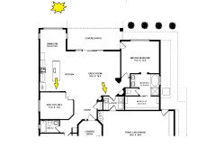
    Since I know how hard it may be to track what I described, I included our floorplan showing where the sun is in the afternoon.


    As the light enters the room the color changes. In the morning, the great room looks grey and dingy so I leave the warm 3000K LED lights on.


    In the afternoon, on the wall with the door to the laundry/garage (yellow arrow), from floor level to about 8', Creamy is light creamy yellow with a greenish hue. And then, from 8'-13' it looks less green and has more of a sickly grey tinge. On the wall in the kitchen (the other yellow arrow) the color is darker but has the same green look to it.


    I invited our new painter over so that he could see what I've been talking about since I'm trying to decide which is the best color for this space. I showed him the wall directly across from the patio doors (yellow arrow). He said he could sort of see what I meant about the wall color looking like it has a hint of green Then I opened the patio door, all the natural light flooded in and the color was much brighter - the way that I expected Creamy to be. He was shocked, saying he'd never before seen the color of walls change as much.


    So, it's not just the paint color. It is the color, the light(s), the direction of the sun and, in our case, the Low-E glass.


    PART II:

    So now that I know that the Low-E glass we chose is definitely casting a green on our rug, furniture and walls. I've been trying other colors that are still light and bright without picking up the green. I tried SW Panda White, but it still had the dingy green/grey. Then I tried SW Downy and it is nearly identical to SW Panda White but has a bit more pink or peach. But it doesn't look pink/peach. It is also not nearly as muddy, dingy or green as Panda White. And it actually looks Creamy!


  • 6 years ago

    So happy that you found the right answer!

    Sylva Leduc thanked Jennifer Hogan
  • 6 years ago

    Thanks for your help on this, Jennifer Hogan.

  • 6 years ago

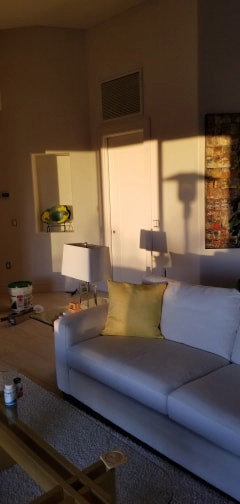
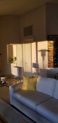
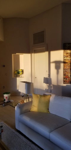
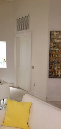
    Last month I posted about our challenges trying to find the "right white" for our Great Room and ultimately chose SW Downy. The painter is finally coming tomorrow to do the work and he asked me to send him a couple of pics of the wall color & the door trim. I took the shots just as the sun started to set and then a few minutes afterwards.


    For those who have never seen the impact of Low-E on interior paint colors, have a look at these.


    With the patio slider completely open.


    With the slider partly open.


    Slider & bug screen closed


    After the sunset had set and overhead fan light turned on. LED light 3000K. The door & trim color is SW Pure White and the wall to the right is SW Downy.