Software
Houzz Logo Print
5pack

Altadena Park House Plan

6 years ago

Has anyone built the Altadena Park house plan from Southern Living? I'd love to see photos of your finishes and modifications. :)

Comments (26)

  • PRO
    6 years ago

    In my opinion, it is a poor design.

  • 6 years ago

    Mark, I'd love to hear your thoughts on why you believe that. We plan on making some modifications.

  • 6 years ago

    This house plan is very similar to a plan by Mitch Ginn. I wonder if that is why it is no longer available on SL.

  • 6 years ago

    In my opinion, it is a poor design.

    Actually it's better than about 80% of the internet plans we see here


  • PRO
    6 years ago

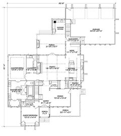
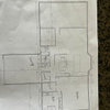
    This is the plan I found, but I am not absolutely sure. Is this the first floor plan of Altadena Park House?

  • 6 years ago

    Hi Mark. Yes, that is the one.

  • 6 years ago
    last modified: 6 years ago

    Good things about this plan:

    - Nice large laundry room

    - Dining room is actually sized large enough to fit a table and other furniture

    - I like the idea of the cozy dinette nook rather than having a breakfast room that the exact same size as, but "less formal" than the dining room

    - All spaces directly abutt an exterior wall, and many have windows on multiple sides

    - There is generous storage in places like the foyer that we often don't see it.

    - The flow of spaces seems to be generally well thought out

    Things that I feel could be improved:

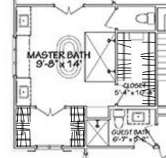
    - I'm definitely not a fan of the master bath and closet design. The ginormous master bathroom seems to be designed for a magazine spread rather being comfortable to use. What is under the big window? A window seat that no one will use or an oversized makeup counter? Where do you hang the towels? Why waste so much space on circulation in a bathroom? But worse, it comes at expense of useful closets, both of which are too small and awkward to be useful. I would rework this whole area for certain.

    - The master also feels way to public and exposed to the living area. From the family room and kitchen you can look right into it from the wide double doors. I would at least narrow this hall down to 4' and the door down to 32"

    - My partner sells furniture for a living and often does house calls for people to help them layout their space. We have worked on more awkward living spaces without a clear logical furniture layout than we can count. This family room is better than some of the worst, but with doors or major openings on all four walls, multiple focal points, and multiple traffic patterns flowing through it, this would be a challenge to furnish well for certain. And it's basically the only living space in the house so it has to function for many purposes. This room at least probably needs to be a little larger and the fireplace should be centered on the furniture grouping, not the full room. In general drop furniture into all spaces to confirm how the work for you early in design NOT after your contract locked down and the house is under construction.

    - The family room would be a brighter, more enjoyable place if the porch were not so deep. Options include moving the outdoor roof back further toward the back of the garage with a covered connector back to the house if you still want the space. Other possibilities include giving the outdoor space dormers or skylights.

    - The kitchen pantry would be more usable without one or both windows. and I don't think the exterior would suffer any.

    - I would explore simplifying some of the exterior, particularly the nested gables on the kitchen wall, and I would explore different looks for the porch extension and nested gables at the front door.

  • PRO
    6 years ago

    I avoid:

    1. Designs that do not relate to the site.

    2. Closets where hanging clothes turn corners.

    3. Windowless walk-in closets.

    4. Kitchens with overly large work triangle.

    5. Walk-in closets that will be difficult to walk into.

    6. Stairs less than 3'-6" wide.

    7. Powder room off main entry

    8. A powder room where you can sit in and carry on a conversation with someone in the living room and have visual contact with.

    9. bedrooms that have a view out their door to a dining room.

    10. Barn doors.

    11. Double doors into a master bedroom.

    12. Double doors into a bathroom.

    13. Double doors into a closet.

    14. Walk-in closets less than seven feet wide.

    15. Exterior doors in living rooms that affect furniture layouts.

    16. Bedrooms next to a bathroom without a sound barrier.

    17. Clothes closets accessible from a bathroom.

    18. Views from living rooms into bedrooms.

    19. Tiny mudrooms.

    20. Pocket doors in spaces that need a door that are heavily used.

    21. Gas chambers without windows.

    22. Gas chambers.

    23. Tray ceilings

    24. Two doors into one bathroom.

    25. No coat closet at exterior entrances.

    26. Doors that swing in front of other doors.

    27. Different ceilings in an open space that do not transition well.

    28. Laundry rooms where base cabinets turn corners.

  • 6 years ago

    A Fox & Mark. thank you both for thoughtful responses. Mark, you made me laugh. lol.

    I agree with many of the points made by both of you. Mark, I also dislike double doors, barn doors, and pocket doors.

    The main challenge we are currently facing is making the house smaller on the inside, while maintaining the original facade as much as possible.

    I do agree, as previously mentioned, that this plan is similar to the Shook Hill, Stone Creek & Elberton Way plans by Mitch Ginn. What draws me to this plan is the vaulted kitchen and stairway placement. We are still in the drawing phase but will eventually end with a hybrid of all the plans.

    For us, the upstairs of the shook hill is perfect because nothing is wasted. We don't need huge walkways and media rooms that this plan has upstairs. The master bedroom and bathroom will definitely lose space.

    Our other issue is the friends entrance that enters the house through the formal dining room. That will be eliminated. Our side entrance will be moved next to the garage and the garage will also be turned just like the shook hill. We are currently designing how this will affect the breakfast nook.

  • PRO
    6 years ago

    Have you considered working with a local architect (licensed) to design a home with you that meets your needs and fits your site? Sounds like you are buying a Chevy and a Ford to get a Porsche.

    And since you mentioned the company and models, you may want to research their copyrights.

  • 6 years ago

    Yes, we are working with a local architect. No plan as-is is perfect for us but there are bits and pieces from many homes we are getting inspiration from. I do not agree with the ford to Porsche reference though. I just dont like wasted space.

  • 6 years ago

    ...and going back to my original post, I'm interested in seeing the modifications made to the plan if anyone has made any. :)

  • 6 years ago

    There really is not much I like about this plan. I like a half bath close to the garage since that is where we normally enter our house. I also like the pantry close to the garage. We have both a breakfast nook and a separate dining room. Both are small and we have never used the dining room. I would have preferred one larger space. I don't understand having a main entry closet so big. A 12'x12' guest bedroom is really a decent size. You don't need the closet or dresser space in a guest room. I prefer to have separate entrances to my master bath and closet from my bedroom. Hate my current set up having to walk through the bath to my closet. Also like laundry close to my maser closet.

  • 6 years ago

    Cheryl, the guestroom will be a study with half bath. The master bedroom and bathroom are being completely redrawn, and the laundry is being moved to be accessible from the master closet.

  • 6 years ago

    That nook at 7'9" is unusable. You need a 3' walkway from the mudroom to the rest of the house. That brings the usable space down to 4'9". It looks like they designed it for bench seating. Now that brings it down to 3'3". Most tables are a minimum of 36" and even those are tight. It means that the only seating is the bench seating so if you're planning more than one or two people sitting there, it won't happen.

    The kitchen is overly long and very poorly laid out. Best kitchen layout goes from Fridge/Pantry to sink to wash food to prep space between sink and cooktop and then to cooktop to cook the food.

    The living room is not 18'10". You have a 6' walkway to the master so that makes the width now 12'10" and you need 30" as a bare minimum walking to get out of the french doors so now you're down to a usable seating area in the living room of 10'4". Is that enough for you?

    Closets need 2' of hanging space and 3' of walkway which is why Mark said if you want a WIC with hanging clothes on 2 walls, you need a minimum of 7'.

    Did you notice that the guest bath doors are banging into one another?

    With all those double doors, where do you put light switches?

    What part of the country do you live in?

    How large is your lot?

    What direction will the front face?

  • PRO
    6 years ago

    Normally an architect will gather their client's needs and wants and perform a site analysis to start the design process. Starting with a preconceived floor plan an trying to fix it handicaps the architects creativity in designing a home for their client and inhibits the ability for the client to have a home that meets their needs and fits their site. It is much easier to design a home from scratch then alter an existing plan. It many time results in a waste of time.

  • 6 years ago

    Do you actually want or need a formal dining space? Personally, I would opt for a kitchen and dining area situated so that the dining area is used for both a breakfast area and dining area. CP's is set up that way as are both of DH's brother's houses. Ours will be as well. Plus, you have an island that could be for breakfast seating. I would rather use the "Nook" area to enlarge your Mud Area (which is pretty narrow) and maybe create a pocket office.

  • 6 years ago

    Yes, we are working with a local architect. No plan as-is is perfect for us but there are bits and pieces from many homes we are getting inspiration from. I do not agree with the ford to Porsche reference though. I just dont like wasted space.

    Usually draftsmen calling themselves designers do as you're suggesting. Architects usually work from scratch because what you're suggesting he/she do could be considered copyright infringement.

  • 6 years ago

    CP....Elberton Way very similar...maybe a better plan in many ways.

    http://houseplans.southernliving.com/plans/SL1561

  • PRO
    6 years ago

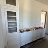
    One way to evaluate a floor plan is to layout the furniture and equipment and things that will be in the house. One of my favorites is clothes in a closet. Below is a graphic representation of clothes hanging in the master bedroom closets in the Altadena Park House. The front closet shows hanging clothes turning a corner, so two feet of the clothes hanging in one direction is covered by the clothes hanging in the other direction. The interior closet appears to be 5'-4" wide, and since hanging clothes takes up two feet that leaves an isle width of no more than 1'-4". This is one of many things that prompted my first comment of, "In my opinion, it is a poor design."

  • 6 years ago

    Mark, we are redrawing the master bed and bathroom from scratch. There is not much I like about it as-is. We are also moving the laundry room to be accessible from the master closet.

  • 6 years ago

    What about all the other problems with the house?

  • PRO
    6 years ago

    I think the exercise of redrawing the master bed and bathroom from scratch will work for the rest of the house too.

  • 6 years ago

    lol