Software
Houzz Logo Print
heatherpoppy

Countertop Color Choice is Not As Expected - Already Installed

6 years ago
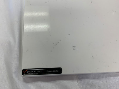
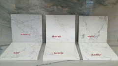
We are remodeling a beach condo in Florida, our vacation home and we live in another state. For the kitchen and bathroom countertops (which are the same), I gave a sample to the contractor of Quantum Quartz, Ocean White, which is a bright white with light gray veining. She chose another brand to work with (Hanstone), which I was fine with as long as she could match up the color. She told me that Hanstone's Monterey was a match to the Ocean White color. Due to the timing, and needing to make a decision quickly, I didn't have time to go out and see the color in person - I now realize, this was a giant mistake on my part. Online, it looked to be a match, but now I'm realizing photos can be deceiving especially with cool vs. warm tones.


Unfortunately, now that the countertops have been installed (and I've only seen pictures, not in person) the Monterey appears to be a light gray, which I absolutely did not want. I wanted to keep the colors bright white and warm within the condo because it's a small space, and felt this would work best.


Here are my questions: I don't know if

a) I'm making a big deal over nothing, and maybe they look fine as is but I'm stewing because it was not what I was expecting - would love another opinion; and

b) IF I do decide I can't live with it, how would this generally get resolved?


Thanks so much for any advice, opinions or words of wisdom!


Attached photos:

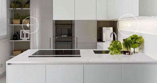
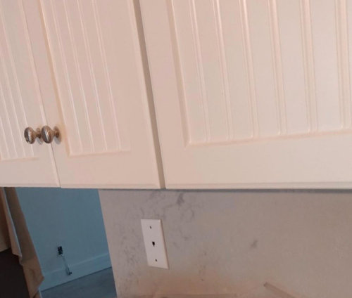
Pics 1 & 2) This is what I wanted! Ocean White sample of tile I provided to contractor and a pic of Ocean white on the manufacturer's website


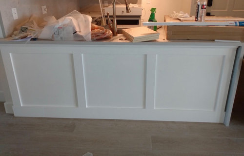
Pictures of how Hanstone Monterey actually looks in kitchen:


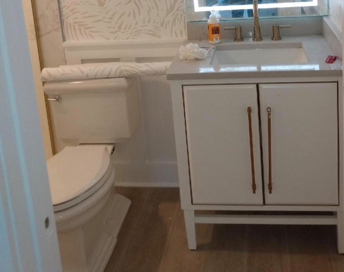
3) Picture of how it looks in bathroom


Comments (24)

  • 6 years ago
    last modified: 6 years ago

    Not a pro. Might talk with the contractor/installer.

    All I see on your island countertop is clutter.

    The backsplash is not all that far off from what you wanted ... perhaps a bit darker. Might partly be the lighting.

    The colors on any natural stone will vary.

    Bump ... What next is a question for the pros.

    Heather S.D. thanked suezbell
  • 6 years ago

    Much appreciated, I am unfortunately not there at the space to clear the clutter and send a different pic, so uploaded what had been sent to me. Thanks again for your feedback.

  • 6 years ago

    Not counter related but are the handles on the bath parallel to each other? The don’t look to be. Also how are you handling the gap between the cabinet and your waterfall in the kitchen?

    Heather S.D. thanked wsea
  • 6 years ago

    Looks more gray than what you probably expected but I think it looks very nice

    Heather S.D. thanked Katie B.
  • 6 years ago

    @wsea I agree, the handles don't look parallel on the vanity and I'll mention that - thanks for the good eye there. In terms of the gap, I was going to ask the same thing - I think I'll need a piece of molding to cover the gap for sure. Do you have any other ways you've seen this pulled together (other than molding)? Again, thanks for your comments.


    @Katie B. Thank you for saying - I appreciate this. Funny, when I look at some of the pics I've liked of other kitchens, they have this color combination (light gray counter/white cabinets), but I think it's that I wasn't expecting this color. Thanks again, much appreciated.

  • 6 years ago

    When I look up your Hanstone, it looks grey. I’m not sure you have much recourse, since you approved it. The next step is, in large part, personality- I think it looks lovely (I’d be more upset about potential craftsmanship on the work being done), so I’d personally let it go, say whatever. But, it’s your kitchen, your money, your vision. However you feel about it is valid. Tell the contractor you’re not happy (if you aren’t). What is a “match“ to one person isn’t to another. Most professionals would want to know your complaints before you review them poorly or don’t recommend them to others.

    Heather S.D. thanked Katie B.
  • 6 years ago

    Thanks @Katie B., It's great to hear your thoughts that it's not too terrible looking. It's been a challenge to renovate from afar, and I think that's been part of the issue. I only wish I had taken a trip to see this in person. Thank you again for taking the time to give your thoughts!

  • 6 years ago

    I love sharing my thoughts (probably too much)!


    She could’ve picked a better match.

  • 6 years ago

    Yes, I think the Montauk would have been my choice if I had taken more time to research. And, no, I asked and appreciate the thoughts! I've been driving myself crazy all day, so I'm glad to get out of my head and hear other opinions....:)

  • 6 years ago

    It’s possible she got her Ms wrong.

    Heather S.D. thanked Katie B.
  • 6 years ago

    I think it looks nice wrt the color, but it your project.

    Heather S.D. thanked ShadyWillowFarm
  • 6 years ago
    last modified: 6 years ago

    I would be extremely disappointed. But, doing a renovation from afar is never a good idea and especially not when substations have to be made.

    You do not have recourse as you agreed to the change. Moving forward, it certainly could have been worse. It looks lovely, so far.

    Lesson learned. If you can’t be present during major renovations than you have to be more accepting of the end result. Sorry.


    Heather S.D. thanked eld6161
  • PRO
    6 years ago

    No blaming anyone but yourself and your designer.

  • 6 years ago

    It will probably look wonderful when you see it in person., remember photos (pictures) also distort colors. Your designer probably nailed it.

    Heather S.D. thanked plattsbecp
  • 6 years ago

    Meet them part way and don't do the waterfall. It will save them some money on the do-over and will look better with the style cabinets you have. Waterfall counters look best in very contemporary and sleek settings and those words do not describe what is shown in your photos.

  • 6 years ago

    Great news. Please have them fix the cabinet/ waterfall counter issue, the cabinet should not have the molding separate the waterfall leaving that gap.

  • 6 years ago

    I agree with chispa--don't do the waterfall--not the right space for it.

  • 6 years ago

    Boom! So glad for you.

  • 6 years ago

    I agree on the waterfall. I am going for a contemporary and clean look throughout the space, and plan to re-face the cabinets that were shown in the pic, but something about the waterfall I didn't exactly love. Maybe because of the style, as mentioned here, or perhaps the way it was done, or the small space....not sure. But I do agree wholeheartedly. Thanks again for the community of support and design intelligence here, it was so very helpful.

  • 5 years ago

    Waiting on the reveal hopefully everything turned out awesome and you’re happy

  • PRO
    5 years ago

    I am a fabricator ... with a background in high end printing. I know from my days as a printer that a monitor simply cannot accurately reproduce the range of colors discernible to the human eye. For most applications this is not important but when color is very important the only reliable approach is direct comparison, preferably in sunlight. Kudo's to your designer/contractor for owning the problem. In my experience that is unusual.

  • 2 years ago

    Did you notice the right side handle on the vanity is not straight?

  • 2 years ago

    This was mentioned above about the handle. Three year old thread anyway.

Sponsored
J.Holderby - Renovations
Average rating: 5 out of 5 stars4 Reviews
Franklin County's Leading General Contractors - 2X Best of Houzz!