Software
Houzz Logo Print
sarahmarthasw

Design help: deciding the backsplash in vacation rental

6 years ago
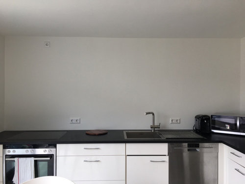
The backsplash decision is at hand. But what I’m really struggling with is to come up with the „magic“ that takes a rental from wonderful to unforgettable! That happens often in these kind of finishing decisions, as well as the decor. Our ultimate goal is to provide five star hotel accommodations with the convenience and warm setting close to nature accessible from a private rental. This tiling/storage decision one of the last decisions on the fixed “bones” of the place. Eventual income of the apartment will allow for any necessary upgrades in furnishings, etc to achieve the five star ambiance (and ultimate rental price tag) we are looking to create.

The backsplash/ storage decisions:
• Hang uppers? The existing upper cabinets to match the bottoms haven’t been hung yet, as we frankly prefer the openness, and don’t know if a 485 sq ft apartment needs so much storage for a rental.
• Add open shelving? An option for a thick oiled wood shelf running the length of the kitchen is a second option, either with or without the cabs. The backsplash could extend to shelf or to ceiling.
•Just backsplash: no shelf or cabs, with tiling just 1/3 or 1/2 or all the way up to ceiling

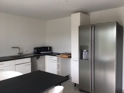
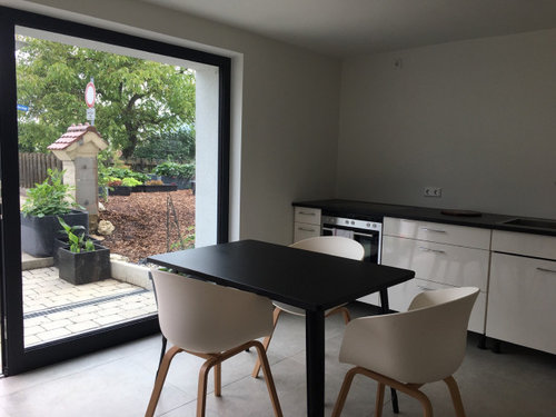
In the first comment are pictures showing the bare bones of the rest of the apartment, plus the actual kitchen table in black glass, replacing the old (but keeping the existing chairs).
In the following comment are pictures of options we like and are deciding between.

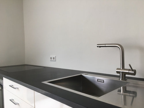
As a bit of background context: this vacation apartment with a private driveway and keyless entry is meant to feel like an escape. The natural light, lime plastered walls, porcelain and hand-oiled floors throughout were carefully chosen to provide a wonderful living climate. The fact that the apartment is literally built into the slope of the edge of Germany’s Swabian Alb (imagine a plateau looking south to the Alps) means the apartment is always insulated and the bedroom is particularly cozy, buried nearly underground. In the kitchen, the wall of glass gives the apartment a feeling of calm connection to nature, bright from morning til night. With granite counters, induction stovetop, stainless steel sink and European coffee machine, the kitchen is stocked with amenities that we think make it the highlight of the place.
With the bones completed and final design details wrapping up, the natural aesthetic gives a nod to Scandinavian’s clean minimalism. We love its use of raw materials (steel, wood, stone, adding natural materials and furs for warmth) but we would love additional opinions as to how the final details of this apartment might take shape!

We’re excited for your ideas. But quick please, we must decide urgently!♥️

Comments (22)

  • 6 years ago

    Other snaps of the apartment ...

  • 6 years ago

    We are inclined to do a matte tile in white, cream or light gray with a very thin grout to continue the calm and crisp ambiance, but I get tempted by the matte black Herringbone pattern, even though it would probably make the area feel smaller. The question of grout color for a light tile also has me perplexed! As for shape, we’re leaning towards a large hexagonal or long subway (4x16 inches).


  • PRO
    6 years ago

    Love the space I agree about the need for uppers for holiday renters but if high end is your goal a counter depth fridge needs to at least look built in not just pluncked in where ever. I would use large format subway tile in a color close to the wall color and very light gray grout or even nicer would be back painted glass . I really would have stuck to a European fridge / freezer for size instead of the typical huge US type . You need a hood over the range and then I would just do some art on the large wall. I am curious about the open space next to the pantry under the counter what is that for? Is there a reason for that TV in the bedroom IMO it is better in the LR with Maybe a Besta type console for it to hang above.

  • PRO
    6 years ago


    Something like this white Carrara backsplash would look amazing! It would give the space the crisp look you want and would also incorporate the herringbone pattern you like with the darker tile. This is photo is from a recent project of ours and we love the way it turned out!


    Here are a couple of links that might be helpful in your search!

    Carrara Search

    Carrara Bella 1×4 Herringbone Mosaic, Honed

    Carrara Bella 1×4 Herringbone Mosaic, Polished

    Architetto Modulo Carrara Bella

  • PRO
    6 years ago
    last modified: 6 years ago

    I would do either a stacked bond tile or vertical stacked tile in a high gloss white. Something similar to this:


    I would not do uppers, but tile the entire wall with a single shelf.

  • 6 years ago
    last modified: 6 years ago

    Hi Sar.

    • Hang uppers? Consider hanging uppers over the counter on the fridge wall where the X is.


    • Add open shelving? Open shelving is a problem for a space that is not in constant use. I would not use it in this space.

    •Just backsplash? I would fill the wall on the sink run with backsplash tile, or a backpainted tempered glass. You needn’t use color, but consider using a more interesting shape. Herringbone is great, but a hex tile or a picket, or diamond shape tile can still look “calm,“ while providing visual texture.


  • PRO
    6 years ago

    ooh, that's a good point about open shelving from eam44

  • 6 years ago

    I would use green. A green like the outdoors, herringbone. A nice thick floating board for shelving and only tile to the bottom of board. Too much of a good thing is just overdone. Gives you another color for pop. People will remember, "ya know the one with the green tile".

  • 6 years ago

    @Patricia, there are some cultural differences in play. In Germany, it is quite unusual to have a side-by-side fridge. The Euro stacked fridge is as standard here as a side-by-side might be in the States. Opting for the big fridge was a design (or size) risk I chose with deliberateness because it IS a luxury here, particularly with the filtered dispensers. (In fact when I discussed then with various kitchen planning architects my own kitchen, as and American I was often encouraged to make a side-by-side the main attraction, back lit and all! And I was there wanting to hide it in the pantry.😆 I stuck with my Euro fridge.)
    In this case it stands for luxury. I agree that it could be built in somehow so it feels deliberately placed.I have planned for a niche on the right side of the fridge, the hole to the left was left for a side by side garbage can (the other two types of garbage are under the sink.) I have no pictures posted of the bedroom, what you are seeing is the TV in the living room — with its open pull-out bed. The TV is also luxury sized for a German rental, also a design (size) risk, but on a good wall anchor that allows a very good pivot for flexibility. Don’t love how it looks! I have a compact comfortable chair planned for the space under the TV, as more furniture would crowd the space.

    I love the Carrara subway too @Decorative Materials! I’ve tried multiple ways with different suppliers to bring Carrara in and it just doesn’t work with the creamy undertones in the floor tile, and I don’t care for the contrast between them.

  • 6 years ago

    If you want something warmer than Carrara, you could consider Calacatta Gold.


    You could even look for a slab to put on that wall.

  • 6 years ago

    I appreciate a vacation rental kitchen that is well-stocked enough cooking equipment (pots, pans, and tools) and staples (seasonings, oil, sugar, etc.) that I can cook without feeling like I'm merely making do. I'm not sure that the existing cabinetry has enough space for the stuff I'd want to have available. I'm sure there's enough space for a minimally equipped kitchen, which would be fine in a budget rental, but from the way you talk about marketing the rental, expectations may be higher. I was thinking along the same lines as eam44 to hang uppers on the fridge wall but leave the back wall range wall empty.

    If you want to stick with white I like the idea of an interesting shape--hex, elongated hex, rhombus, etc. Ogee seems a bit too traditional for the space. I'd tile the whole wall; it will add interest.

  • 6 years ago

    @eam Yes, that’s where one upper would be, as it is an L shape that goes over the corner, with a thin one fitting in the other corner just to the left of the stove next to the hood. The open shelf would actually be in regular use, featuring our earthenware in pops of the accent colors (gray, black, cream and green). By backsplash, I meant wrapping the entire length and sides of the walls above the countertops. Am I calling it the wrong thing?
    Glass is SO common here in higher end kitchens, to me it feels a bit sleepy or “safe” in this space, plus magnifying the cold nature of the hard, shiny, cold materials. With matte satin marble tops and matte floors and matte walls, I’m inclined to go with a matte backsplash, but maybe I haven't found the perfect shiny tile yet? I agree with your tile suggestions. I do love that Calcutta Gold! My husband doesn’t live the marble trend the last five years, but I think this could sway him. Did you see my first two comments on this post and have any feedback? My many years living here have influenced my taste in preferring the minimalist approach: fewer grout lines and larger tile format, no handles and clean lines. But there is still a tension to go the other direction with the hex and stacked tiles, or herringbone because it is so interesting! Just done want to ride of it in 5-7 years...

    @Heather If I went for a colored tile it would be a true green (our accent color) and I think you’re right about making a lasting impression with color!

  • 6 years ago
    last modified: 6 years ago

    We have a few vacation rentals. Here are some tips from a practical point of view.

    Though I love open shelving, you will have to dust a lot more and keep plates matching and beautifully displayed. People are not careful with things in a vacation rental. I would advise against open shelving and agree that some upper cabinets are needed for both storage, keeoing your dishes intact and your housekeeper's sanity. Dust on a dish is a no no if you want high ratings for your space on whatever platform you are listing it.

    Guests will HATE that TV placement. There has to be a better spot. You will get all kinds of comments that people can't see it properly or that it gets in the way. Not all guests like watching TV in bed. I would consider putting it elsewhere in your space.

    If this in in Europe, why not get a cute, smaller Smeg fridge than that clunky American style one? Everything else in the space is scaled down and minimalist. It looks huge and out of place.

    I can't comment on the decor or finishes as it looks very much like every place I ever stayed in Berlin (don't know if that is where this is, but that is what it reminds me of.) I think it needs more personality and less generic "saw this in Instagram" finishes. I am not seeing the oasis you are describing but appreciate that you are trying to get there. It just needs something to make it stand out and I don't really think anything you have identified is particularly unique. But that is just me. Good luck!


    ETA-- just read some of your TV explanation. Again you will rely on a website and pics to book and that TV will make people scratch their heads. Guests won't read paragraphs about how you designed the space or your intent. Perhaps take a step back from "big" as "luxury" and note the actual size of your space/choose items that are very good quality and fit appropriately.

  • 6 years ago

    Switching gears, I’m strongly considering wood under the shelf (with the potential addition of the few upper cabs in the corners). Not sure if it would be veneered panels, or straight up solid Scandi wide/long Parkett that matches the shelf (and white oiled wood floors in the other rooms?). Is this crazy bad or crazy good? And why? With the potential of tile inlays behind the cooktop and maybe sink?

  • 6 years ago

    @cawaps you’re spot on with your thoughts on stocking supplies and storage! You’ve swayed me I think. These deep drawers and corner swallow a lot, but uppers can tuck away even cleaning supplies and specialty kitchen tools.

  • 6 years ago

    @ls1114 The open shelving may have to come down to weighing the pragmatics with the end design. Appreciate your real life perspective as an owner.
    The fridge is massive in this space. Smeg was the main competitor in the beginning, but honestly it was too cutesty for me then, as clunky as this one is here perhaps. Can this be built in to be redeemed in the space?
    The TV is in the living room, no TV in the bedroom (that’s the sofa bed). I wanted the sofa across from the window for the full view of the terrace (not finished yet), so the TV doesn’t logically fit anywhere else (yet).

    I’d be surprised if you had heated floors, a walk-in rain shower, and Jensen bed (6K+€), but the minimalist design is definitely a European thing. And you are SO right! The fun work of individualizing really begins when all the bones are in place! That’s where the magic is. 💫 I just need so much more time — and am grateful for this community!!

  • 6 years ago
    last modified: 6 years ago

    @Sar heated floors/ minimalism are common enough in many European Airbnbs. Just take a look at the many many many apartments listed. Beds are also something that you can spend a lot on and still have guests complain because they prefer a different type, In the US spring mattresses are the norm but we spent loads on memory foam, top of the line in one place, and rather middling memory foam hybrids in another, We have had more compliments on the less expensive beds. Mattresses are very personal and you will go mad trying to please everyone.

    I hate shower only bathrooms but understand that one must make do while traveling. If I was paying top end pricing, I would expect a soaking tub no matter what continent I was on. See? That is how guests are. Very individual. Very personal. Don't get so caught up in thinking "there is NO WAY someone could possibly complain about my space as it is the ultimate! All details thought of and provided." Because they will complain. Its simply human nature. Your ultimate is not ultimate for everyone.

    So as someone who has done this successfully in a variety of different spaces over the years I offer you this-- make this space a bit more unique and interesting. I understand minimalism. Its not my taste but nonetheless, I get it. There is no "hook" that makes me want to stay in this space. It looks sterile. There is nothing that makes me remember it. It looks like you have a beautiful garden. Why not bring some of that color indoors? Or concentrate on your indoor/outdoor lifestyle. Stop fussing over the perfect backsplash ( you will never encounter a guest who reviews the quality of your backsplash or cares what you spent per square metre) and concentrate on what makes your space appealing. Right now it looks to me like the glass wall and garden would be much "sexier" to guests than anything I can see inside.


    And frankly, if I am on vacation I am in no way in need of a huge fridge. A wine fridge would be more useful frankly. Cooking is NEVER on my list of things I want to do when exploring a new place. But guess what? We have had so many guests who have cooked and baked in our vacation spaces-- large meals. But its never a good idea to invest in high end kitchenware in these spaces. They tend to disappear,

  • 6 years ago
    last modified: 6 years ago

    sar,,i love the matte black idea. and no, it won't make it look smaller. stick in a couple of floating wood shelves and add some white crockery to it.


    In fact, if you did a black Zellige tile, you could go half way, and top the entire span w/a wood ledge/shelf


    this one has black cabs and flooring, but it still doesn't look small.


    Or, do a lighter zellige tiles. I love these.


    I have a black herringbone zellige in my own house

    Cloe has this tile in black (wayfair or Lowes carries it)


    you could also do a basalt tile with light gray grout. add some sconces and shelving


    or try the Kenzzi tile (the black and white)


  • PRO
    6 years ago

    Different ways to create a backsplash and shelves


  • 6 years ago

    @ls1114 Great comments! I love hearing different perspectives, and there is no better teacher than experience. Thanks for letting me benefit from yours!
    To your point, the apartment hasn’t been decorated yet (the shelf items aren’t even symmetrical). These pics were snapped for this post to give a sense of context for the apartment concept. But your perception of nature as a huge player in my decor style through the windows is right! The accent color to our neutral palette is lively green for the very reason that we are on the edge of the vacation region of Germany and right in the middle of beautiful Nature. When the bones are finished I hope you come back to a future post and give me some feedback on the apartment design! I’d love to see your apartment rentals. Do you have them online that you can send us to see?

  • 6 years ago

    @beverley, thanks for your thoughts. Did I lose the rest of your comment? Someone recently posted amazing tiles and comments similar to the ones in your third picture and I can’t find them again!

  • PRO
    6 years ago

    I only posted one sentence and no sources for anything.

Sponsored
Daniel Home
Average rating: 4.8 out of 5 stars20 Reviews
Premier Interior Design Team Transforming Spaces in Franklin Co, Ohio