

Laundry room makeover help!
6 years ago
last modified: 6 years ago
Sort by:Oldest
Comments (12)
Related Stories
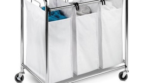
Guest Picks: Laundry Room Mini Makeover
The laundry area gets a fresh look with storage options and helpful tools to make washing and folding a breeze
Full Story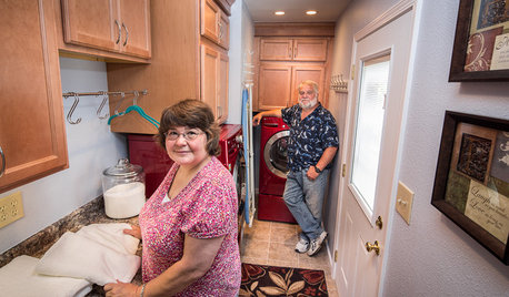
REMODELING GUIDESCheck Out Our Sweepstakes Winners' 2-Room Makeover
The laundry room's organization needed ironing out. The guest bath didn't make a splash. See the makeovers a Kentucky couple won
Full Story
MOST POPULARShe’s Baaack! See a Savvy DIYer’s Dramatic $400 Bathroom Makeover
You’ve already seen her dramatic laundry room makeover. Now check out super budget remodeler Ronda Batchelor’s stunning bathroom update
Full Story
DECORATING STYLES10 Polished Looks for a Bedroom Makeover
Pretty as a posy? Naturally rough? Whatever you're craving for a new year's bedroom refresh, these styling ideas can help you get there
Full Story
BATHROOM MAKEOVERSRoom of the Day: See the Bathroom That Helped a House Sell in a Day
Sophisticated but sensitive bathroom upgrades help a century-old house move fast on the market
Full Story
STORAGEDownsizing Help: Shelve Your Storage Woes
Look to built-in, freestanding and hanging shelves for all the display and storage space you need in your smaller home
Full Story
ORGANIZINGDo It for the Kids! A Few Routines Help a Home Run More Smoothly
Not a Naturally Organized person? These tips can help you tackle the onslaught of papers, meals, laundry — and even help you find your keys
Full Story
Houzz Call: Show Us Your Paint Makeovers
Let your newly repainted house or room do the "How d'ya like me now?" strut right here — it might just be featured in an upcoming ideabook
Full Story
DECORATING GUIDES9 Planning Musts Before You Start a Makeover
Don’t buy even a single chair without measuring and mapping, and you’ll be sitting pretty when your new room is done
Full Story
DECORATING GUIDESDecorate With Intention: Helping Your TV Blend In
Somewhere between hiding the tube in a cabinet and letting it rule the room are these 11 creative solutions
Full Story
B GOriginal Author
B GOriginal Author
Related Professionals
Olympia Kitchen & Bathroom Designers · Santa Maria Bathroom Remodelers · Portsmouth Cabinets & Cabinetry · Redding Cabinets & Cabinetry · Dover Interior Designers & Decorators · Bartlesville Interior Designers & Decorators · Middletown Interior Designers & Decorators · Florence Kitchen & Bathroom Designers · Hempstead Kitchen & Bathroom Designers · Odessa Kitchen & Bathroom Designers · McAllen Interior Designers & Decorators · Brainerd Interior Designers & Decorators · Clovis Interior Designers & Decorators · Texarkana Architects & Building Designers · Helena Kitchen & Bathroom DesignersEllen S
tartanmeup
B GOriginal Author
B GOriginal Author
B GOriginal Author
Cavimum
tartanmeup
B GOriginal Author
B GOriginal Author
tartanmeup