Software
Houzz Logo Print
chintlian

North Facing Condo Wall Color- HELP!

Hi everyone!

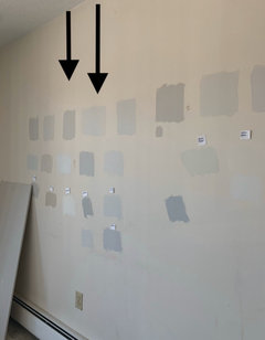
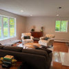
What color would you paint a north facing condo that doesn’t get much light? I tried over 20 BM samples- and my favorite colors were: Pale Oak, Classic Gray, Light Pewter, Balboa Mist, and Sea Pearl. Unfortunately all of those colors are too dark! I need to make a decision ASAP and seriously I am struggling!!

I love Greyige tones, but I want a color as light as possible for throughout. Floors are a dark walnut stain.

Open to colors other than Benjamin Moore as well!

Would so greatly appreciate anyone’s feedback!

Comments (17)

  • 6 years ago

    Paint is the last item chosen in a decor scheme. Fabrics and textiles will be set in stone once selected, but paint can be custom blended to work with those unchangeable items. Flooring needs to go down and excellent lighting, as Patricia suggested, should be installed before you begin painting yourself into an impossible corner.

  • 6 years ago

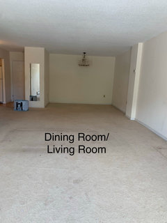
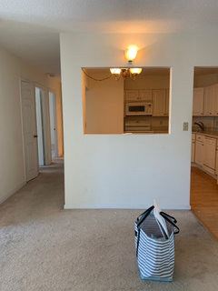
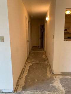
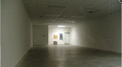
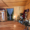
    Thank you so much for your input! The floor has just gone down - I’m heading over there now to see it for the first time. This is a rental and unfortunately I have to choose the paint color before the furniture. I’m also stuck on lighting- and just did a separate post about that. I have to replace the existing fixtures with something that will fit in the current places. Here are photos of the lighting in place- that I need to replace.

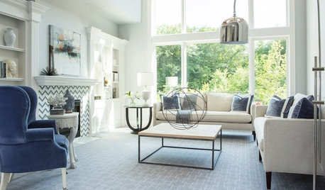
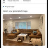
    There is no recessed light unfortunately. My style decor is very light and airy- although I have not chosen the furniture yet- I will have a white linen slipcovered sectional - light wood furniture pieces and some brass/chrome metal glass furniture pieces.

  • 6 years ago

    So I'm looking for wall outlets for lamps and not seeing any except in the dining area. Upgrading to 4000K LED bulbs will take the yellow cast out of the spaces.

  • 6 years ago

    Your testing the colors in small splotches on a white wall. They seem dark in contrast to the white , but by the time you paint the entire room it will not have that contrast and won't seem so dark.


    If you go too white and don't have some color you will get the same gray shading as is showing in your pictures - white needs light to be white, so I wouldn't go any lighter than seapearl and would probably go for something a bit darker, like the other choices you mentioned.


    With bright white trim you will have something that feels bright and clean and won't have that dingy look that you can get with white when you don't have enough light.


    Of the colors you picked my favorite is Pale Oak, but you are the one who has to love it.


  • 6 years ago

    Oh my goodness Jennifer- I cant thank you enough for your post. I don’t know enough about this- and although I’ve done a ton of research- I still can’t figure it out. I have been wondering about the lighting and also if the wall color (which is actually more of a very light light Beige) has been effecting the way the paint samples over it come out. Pale oak is my favorite of the colors, so to hear you say this is a relief. I’ve just been nervous that it will be too dark. I bought a sample of regular pale oak and then also a sample of it reduced to 50%. When I tried it on the wall- it came out with more of a purple look. Would you suggest figuring out the lighting first? Hopefully the contractor will go for that. Here are up close pictures of the paint samples. The one with the arrows was the pale oak and pale oak reduced to 50%

  • 6 years ago

    Pay for an electrician to install pot lights throughout.

  • 6 years ago

    Sorry I was not online over the weekend.


    Also sorry that you are getting overwhelmed - picking light neutrals is not easy.


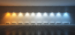
    It is difficult to see the colors that are lurking below the surface and lighting changes the way light colors and whites work. They reflect the colors that are in the light that is hitting them and not just the colors that are present. (This is true of dark and saturated colors, but they are strong enough that you don't notice the changes all that much.)


    I created this to demonstrate how light impacts white. It may help you.


    I love working with and playing with paint colors. Have been painting since I was a kid and got obsessed with interior paint colors about 15-20 years ago.


    Knowing what color is going to look like on your walls is about experience, no one can see the colors from some small swatch painted on the wall and they see less looking at a little 1" square in a fan deck.


    I usually test large areas (3'x4') before I commit to a neutral. I use 140 lb watercolor paper to make test swatches for my preliminary selection. I always use a neutral white background - mine is a 1/2 sheet of drywall that I have painted with BM Chantilly Lace - a bright, neutral white.


    Link to water color paper:

    https://www.amazon.com/Canson-Watercolor-Textured-Charcoal-100510941/dp/B004M59O4C/ref=pd_lpo_229_img_1/144-8896929-4489445?_encoding=UTF8&pd_rd_i=B004M59O4C&pd_rd_r=170725f0-225e-4263-a7aa-5774151be230&pd_rd_w=LoNJF&pd_rd_wg=8BTf1&pf_rd_p=7b36d496-f366-4631-94d3-61b87b52511b&pf_rd_r=7YV26ZES8D731QS8NDQA&psc=1&refRID=7YV26ZES8D731QS8NDQA


    To help you visualize Pale Oak I can offer a comparison to a color I used in my last home. It was also a taupe, quite a bit darker, more colorful and more red than Pale Oak and the pictures I have are of a north facing room.


    FYI - the image below has 3 listed values

    Light - 0= Black 100= White -

    Chroma measures how colorful vs gray a color is 0 is gray.

    Hue defines the color on the color wheel by degree:

    18 = Red

    52 = Orange

    90 = Yellow

    162 = Green

    234 = Blue

    306 = Purple


    The color on my walls was mid toned, but not dark. Pale Oak is pretty light.


  • 6 years ago

    Once again, I am going to advise you not to go lighter than Pale Oak.


    Another picture to illustrate what happens when a white does not have enough light . . .


  • 6 years ago

    Here is a blog someone wrote on Pale Oak - I think the pictures are a pretty good representation of what you can expect


    https://www.remodelaholic.com/color-spotlight-benjamin-moore-pale-oak/


  • 6 years ago

    You mentioned that Pale Oak and the 50% version seemed to have some purple. The truth is that it is a light taupe - which means it has some purple undertones, but they are subtle and it is usually beautiful unless you have a lot of yellow in the space. I have seen one Houzz Dilemma recently where someone didn't like the Pale Oak painted on their walls. They had really yellow floor tiles and the two did not look good together. I saw one other post quite some time ago where someone didn't like Pale Oak and felt it was too Gray. Those are the only two times I have seen where someone didn't like Pale Oak - the rest seem to be rave reviews.


    Any time you pick a wall color before you have furniture you do run some risk that the wall color won't work with the furnishings. Classic Gray is probably safer than Pale Oak, but I simply don't find it as pretty. That is my personal preference, but everybody likes something different.


    I am a winter - light ivory complexion - dark hair. I like clean, bright colors, especially teals and purples and deep wine reds and taupe is a perfect complement to those colors.


    My sister is a fall - she looks good in olive greens and burnt orange and fall colors. (By the way - most people like colors that look good on them - we like looking pretty). Taupe is not a good complement to her coloring - the same colors she picked for her home.


    I use 5000k light bulbs in my home (CREE brand, daylight bulbs) - the lighting enhances purple tones. My sister uses 2700k lighting in her home - the yellow tones enhance the greens and golds she uses in her decor.


    Knowing what colors you love will help define both the neutral you should use and the lighting.


  • 6 years ago

    Again, Jennifer, THANK YOU SO MUCH!! That article was sooooo insightful- exactly what I’ve been looking for. It’s making me want to take a chance on pale oak....

    So I love blues, shades of beige and tan, black, and white. I also like green, but probably wouldn’t incorporate it into my color scheme (in terms of fabrics). In regards to lighting color, (this is a total personal preference, because I know many people who disagree) but I LOVE the daylight bulbs. I always buy those for my home. I just don’t like hints of yellow in lighting- I prefer more cool white. Hopefully based on the amount of sunlight I get in my new place, the daylight bulbs will best suit me...

    Based off of that picture above....my preference would be the 5000-7000 range.

  • 6 years ago

    Grey is not the color for North facing. Greige is also not the color for that exposure. You can throw anything on the wall. But if you want something to help with the north exposure light situation, a warm white or a gold or tan type of color would be more helpful.


    5,000 + range in daylight bulbs is extreme-but if you’re painting the walls grey, you may need that. You can determine whether it’s worth battling the dark, dreary thing - now that the grey fad is over.

  • 6 years ago

    I love the Cree Brand Daylight bulbs. I have tested multiple brands and have found that colors render beautifully with their lights and they provided the closest approximation of what sunlight looks like at 2:00 in the afternoon on a clear day. Each brand of LCD is made with slightly different compounds and each renders colors a bit differently than the next and even if 5 different brands are marked at 5000k they vary in how yellow or blue they are. Found this out initially when I had a light fixture with 3 bulbs. One bulb burned out and my husband bought a replacement, but it was a different (less expensive) brand and it was soooo yellow!

  • 6 years ago

    Jennifer this is so helpful! What I have learned is that this unit has a decent amount of natural light- but there is not a lot of artificial light inside the unit. No recessed lights. Do you happen to have an idea as to what % LRV I should find a color in? Or any ideas of a very light off white paint color that will not have any yellow undertones? I’m open to SW in addition to BM and farrow ball. I can’t believe I delayed this is long as I have… The contractor told me I need to make decision- I have tried reaching out to numerous color consultants but all of them are booked! Starting to get really nervous about this!

  • 6 years ago

    I have a north facing bedroom that also gets some greenish reflection from the outside greenery. I had a terrible time finding a color that looked good and ended up with something I never would have originally thought of. It works so much better than the cooler bluish based colors I had originally thought of. Valspar Shoreline Haze which is a more beige color with a LRV of 64.


    p.s. your color samples are way too small. When you get it narrowed down to a couple strong contenders, paint larger samples, and do them on different walls of the same room because even adjacent walls in the same room appear very different..

  • 6 years ago

    Devine Cappuccino - the color of my entry/living room in my last home had and LRV of 42.

    Pale Oak has an LRV of 70.


    I would target the 55-75 range to give you both the lighter feeling you are looking for and the depth needed to work in your lighting.


    0-10 DARK

    10-20 MEDIUM-DARK

    20-40 MEDIUM

    40-55 LIGHT-MEDIUM

    55-75 LIGHT

    75-82 OFF-WHITE

    82+ WHITE