Software
Houzz Logo Print
littletiger88

Is there any potential in this backsplash or should we remove it?

6 years ago
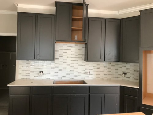
Is there any potential here or should we remove it asap? We are having a house built and are very split on this backsplash.


We chose this glass mosaic backsplash based on a small sample from Emser.


I couldn't imagine that it would look like this. It turns out that when you multiply the number of these things, it looks very different than the sample size. Thanks in advance!


There's potential
Remove it

Comments (31)

  • PRO
    6 years ago

    IMO these tiles are a bit dated but that one seems a bit different than the old type . I think it works well in the space.

    little tiger thanked Patricia Colwell Consulting
  • 6 years ago
    last modified: 6 years ago

    Yes, small samples are sometimes hard to imagine. That said, it might not be as you expected but I think it looks nice. Certainly far from an eyesore.

    Keep it. I think you will learn to like it. Especially when you receive great compliments on it.

    Give yourself time. If you decide that you really hate it, then you can always replace it.

    You are not alone. Many of us here have had to replace backsplashes. In my case my first choice clashed.

    little tiger thanked eld6161
  • PRO
    6 years ago

    I love it! The color seems to work. It is an interesting pattern instead of the same boring subway tile... Embrace it!

    little tiger thanked Debbi Washburn
  • 6 years ago

    Even if it isn't what you envisioned, the tile is beautiful in your space.

    little tiger thanked Jennifer Hogan
  • 6 years ago

    I like it!

    little tiger thanked pkirkha1
  • 6 years ago

    Thank you so much for all who have responded so far! There's some great points being made. I think what gave us the greatest reservations was how dark some of the mosaic tiles are. We were expecting something less loud. Additionally, the vertical columns are a bit strange in hindsight.


  • 6 years ago

    There seems to be some inconsistency with the counter color..which looks beige or cream?...the splash looks bright white...

    little tiger thanked btydrvn
  • 6 years ago
    last modified: 6 years ago

    I like it! IMO your BS adds nice texture to “smooth” cabinets & simple pattern countertop. Can’t see what your flooring is or the rest of the space but I’m imaging SS appliances too. The tile colors blend with both countertops & cabinets very well & unifies the result. I also like that your outlets in BS are placed horizontally instead of the usual vertical placement. They flow with the linear tiles. What is that outlet looking plate inside the open top cupboard over sink? Or, is that the cooktop space & outlet is for cooktop hood or micro hood?

    little tiger thanked KW PNW Z8
  • 6 years ago

    It only looks off now because it is the only thing you see. It comes to the foreground and stands out.


    Once the hood and cooktop are in, the outlets covered, and something on the countertops, it will go back to being a very nice accent, rather than the focus of the room.


    It's a nice touch to a very nice kitchen.

    little tiger thanked Mark Ellis
  • 6 years ago

    I think backsplash looks good and intentional with the darker mosaics because of the dark cabinets -- what's the plan for cooktop and exhaust fan? or is it going to be an over cooktop microwave? I think that cabinet going to the ceiling looks weird - how are they going to work the crown molding? Any way you could replace that cabinet with a cabinet that lines up (top) with the others and then run the crown straight across?

    little tiger thanked rmsaustin
  • 6 years ago

    I’m no expert, but I think it looks great! Not nearly as busy of a mosaic as I was expecting from your intro.

    little tiger thanked chiefy
  • 6 years ago

    @KW Its the cooktop space and the outlet is for a cooktop hood exhaust fan.


    @rmsaustin Its going to be a cooktop w/ cooktop hood exhaust fan. Great suggestion on the cabinets that we never noticed. Something to think about.


    @btydrvn The color clash between the backsplash and the countertop is a little concerning. We'll have to take a second look.

  • 6 years ago

    The back splash looks fine with your cabinets.

    Maybe it is the angle, but it looks like the back splash doesn't go with the counter.

    little tiger thanked loobab
  • PRO
    6 years ago

    A little bit busy for me.

    little tiger thanked Celery. Visualization, Rendering images
  • 6 years ago

    Dexter, if there's one thing I've learned from experience about asking for opinions from others here it's that everyone has one and they're each different! And, the OA will receive lots & lots of unsolicited inputs on everything else in the posted pictures. Not a bad thing for sure as makes for interesting reading and sometimes sparks some great ideas or even saves some grief for the OA but also can be overwhelming when one is in the middle of making many design decisions that one has to live with and pay lots of $$ to have done. I stand by my original posted impression of your backsplash, which is what you asked about. Love it! Wouldn't worry about the color match to counter since you can see it and all of us see the colors our monitors give us. It looks like a compatible blend to me on my monitor. I don't mind the tall cabinet either. You have nice crown molding going around the ceiling & Im guessing it'll be added along that cabinet wall too. I see there's already trim molding at cabinet tops & it might be that adding any more crown to cabinet tops would be too much or detract from ceiling crown. See - more opinions & lots of inputs you didn't ask for! Isn't this a great site? ; )

    little tiger thanked KW PNW Z8
  • 6 years ago

    The backsplash looks fine--and that is coming from someone who dislikes mosaic backsplashes in general.

    little tiger thanked cawaps
  • 6 years ago

    I like the backsplash, I say keep it.


    I agree with @rmsaustin's suggestion to use a shorter cabinet above the exhaust hood so that the top lines up with the others.


    And the colours are all looking compatible on my monitor. The backsplash is predominantly white, the darker accent tiles tie in with the cabinets, and the lighter accent tiles tie in with the counter & walls. It's going to be a beautiful space and once you have appliances, door handles, decor, etc the backsplash will not be so in-your-face.

    little tiger thanked comelyhomely
  • 6 years ago

    I like it. once your hardware is on the cabs and everything else around it is completed, it will look fine. It's a lot better than 3x6 white subway tile.

    little tiger thanked Beth H. :
  • 6 years ago

    I'm not a pro. I think the backsplash is very nice and goes great with the cabinet color but it doesn't really go with the countertop. Definitely need to shorten that cabinet so it follows the line of the others.

    little tiger thanked aiallega
  • PRO
    6 years ago

    Color off with countertop. Sorry. Maybe photo is off?

    little tiger thanked Flo Mangan
  • 6 years ago

    I agree with @Mark Ellis, once the hood and cooktop are in + your under cabinet lighting, the mosaic will not be so prominent. It will just be a nice, artistic touch.

    little tiger thanked freedomplace1
  • 6 years ago

    I see a lot of mentions regarding the color clash between the backsplash and countertop. I'm just as confused. The natural light changes the appearance of almost everything that's white in the room. One second it looks like white, then bluish, then beige. The countertop should be bright white. Maybe once some artificial light in the room is used, it will look less off?!

  • 6 years ago

    I actually love it!

    little tiger thanked Shawna Hays
  • PRO
    6 years ago

    Yes, your lighting will be critical. Use around 3,000 lumens or higher. You can test to see what will level works best. Just use your best judgment. I am sure lighting will help a lot!

    little tiger thanked Flo Mangan
  • 6 years ago
    last modified: 6 years ago

    little tiger, do you have under cabinet lighting? that's what's going to alter the look of the countertop the most. do an LED under cab unit and make sure the bulb brightness is 4000K. 5000k will be somewhat blue/white, 3000K will be yellow, and make the countertop look even dingier


    ceiling lights should be the same. 3500-4000K


    little tiger thanked Beth H. :
  • 6 years ago

    I think it's nice and different. I also agree the counter color looks off in the pics but again, maybe it's just the light. Can you replace some bulbs with 4000K (or under cabinet) and take another pic? Also, are you able to shorten that cabinet over the cooktop or is that a moot point now?

    little tiger thanked Gcubed
  • 6 years ago

    Update for the curious ones:


  • PRO
    6 years ago

    Looks good. When you get hood,appliances and accessories in I think you will be happy.

  • 6 years ago

    I think it looks stunning! it adds a nice visual contrast and interest to the space. Love your cabinet colors too. Enjoy your kitchen!

    little tiger thanked St561 W
  • 6 years ago

    @little tiger Nailed it!

    little tiger thanked missenigma