Software
Houzz Logo Print
pamlamping

Hi Everybody!! quick decision for fabric

6 years ago
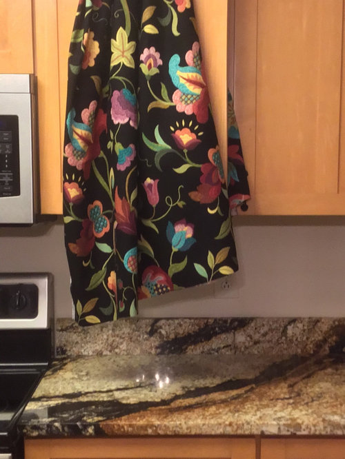
Which fabric looks better agains the counter top
Always, Thank You
Pam

Comments (34)

  • 6 years ago

    I think the second one coordinates better, but I love love love the first fabric!

  • 6 years ago

    Such a hard decision , to be fun or sophisticated!, I just can’t get this !, thank you, Linda

  • 6 years ago

    I also have this settee in my kitchen🙄and believe it or not this rust settee has the color in the floral!! And i have to keep the settee in kitchen,so now which one

  • 6 years ago

    Not loving the black background with your countertop. Do they make it in another color way? Most fabrics are part of a collection, so look to see if another fabric in the collection might work better.

  • 6 years ago

    I will do that,Thank you!

  • 6 years ago

    Which goes better with the counter? I prefer the second fabric...more sophisticated.
    The first fabric is fun but it would be better in a kid’s room.

  • 6 years ago

    second


  • 6 years ago

    Don’t hate me but I’m not liking either. I instantly thought of the backsplash advice - busy granite needs a plain backsplash so they don’t clash. My preference for fabric is the first but the colors are too bright/or varied for the granite. Maybe the colors meld better in person? The second Pattern choice dates back to 2005 but the color family looks good. Whats the fabric for - curtains, upholstery? Is there an option in fabric A but in a different color family?

  • 6 years ago

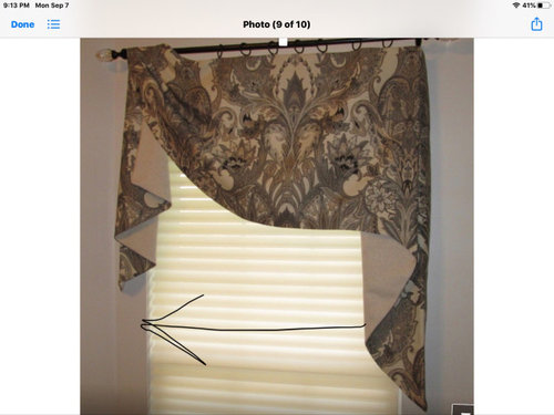
    I looked for option in A but there is none. You are right about 2005!😂 the fabric is for a valance i will make as in option 2. This is a picture of the window. And thank you for the help!!

  • PRO
    6 years ago

    How about a picture of this area with your counter lamp on?

  • 6 years ago

    Oh boy. Here I go again, being contrary. I love the first one. The second is neutral, as are your counters, and I think you need some pop for a focus and some fun. I think the black would not be an issue as the colors would really stand out. Good luck with this. 😉

  • 6 years ago

    I hope this is better

  • 6 years ago

    I wish I had friends like you that lived near me, none of my friends are interested in decorating or having nice things to put together!

  • 6 years ago

    Your floors are so pretty! The lighting is much better now with the light on. Can you bring Fabric #1 into the frame and take a picture in this lighting, so we can see how fabric #1 plays with the counter? And I agree, I love this app for all the creative people who share their talents, opinions and expertise!

  • 6 years ago

    This is 5he best I could do! 😂 I also found this fabric. Maybe I need a completely different color altogether!!🙄

  • PRO
    6 years ago

    the last picture is a huge help. the second fabric looks the best with your countertop and cabinet color. so I would use that I e above kitchen sink window then let the settee stand alone and make a statement with a splash of color

  • 6 years ago

    Can I ask what flooring you have? Love it! And think it might work with my cherry cabinets- thanks! FWIW I like the black fabric- it looks better in the picture with your sink, etc. than in the first picture.

  • PRO
    6 years ago

    Neither fabric. The first fabric may have been selected because the whimsy caught your eye but it doesn't really correlate with any of the finishes in your room. The second fabric may be closer in color to your counters, but it's very busy as window coverings go.


    I would consider white or off white fabric shirred on rods for your windows. You don't have to purchase plain white fabric. You could select voile with black or white dots, or even a white on white sheer plaid. I have also replaced your overhead light with a black decorative pendant


  • 6 years ago

    I’m with Beverly on this. Neither fabric seems to enhance both the countertop and window. The settee should be a solid color with fun pillows.

  • 6 years ago

    Oh my goodness!! How did you do that! Fantastic!

  • 6 years ago

    I’m looking for the paperwork for the floors, I’ll be back with that

  • 6 years ago

    Beverly, I think all of it hurt your eyes!😂 It does mine also!😂😂

  • 6 years ago

    Oh, Beverly even with the cream walls and white trim I should go with off white or white?

  • 6 years ago

    Beverly, my review for you would not send. Did I do something wrong?

  • 6 years ago

    Ahhh. Good light on that last picture. The light colors really are so much better near the countertops.

  • 6 years ago

    As much as I do love the “fun” fabric, I agree with Beverly on her choices ... a nice off white would look really good, go with something that has some detail (like the dotted one she selected). But definitely use that fabric somewhere in your house!

  • 6 years ago

    I like the whimsy of the floral. The other two seem so austere and formal. You could also have throw pillows made for the settee which you say will be in the same room?

  • 6 years ago

    You’ve opened the Genie bottle! Lol. The pic showing the window and flooring helps. The wood grain gives me a “not so formal” feel, would that be what you’re going for? Do you need a valance? It’s a nice window with a good frame. I ask because a friend recommended that I not put in curtains in our guest room. With some lively artwork, the additional pattern wasn’t needed.

    But if a valance is your choice, perhaps a muted grid or weave that echoes that rust and cream you have in the granite. Or, find the solid fabric you’ll use for the settee and find a coordinating pattern. If possible, buy a yard of the two final choices and tack each up for a week or two. See which you like in the different light/day/evening.


  • 6 years ago
    last modified: 6 years ago

    I totally agree with BeverlyFLADeziner. I was thinking the same thing, but with cafe curtains. There is little benefit of covering the top of a window. Light come farthest into a room from the top, plus you have an unobstructed view to the outside.

  • PRO
    6 years ago

    I would put a decorative solar shade on this window and to “cottage it up” put balance at top with fabric you love. Best of both worlds! 😅

  • PRO
    6 years ago

    Pam, you may have to hold the fabric (once you find something) to the windows. The Off White would pick up the color of your walls and the white would pick up the color of your trim. Simple window coverings can still be creative. I just thought that either the dots or the plaid is not in conflict with your counters and would provide some texture. I understand where you heading with your valance, however, I thought that providing a decorative light fixture might dress up that area close to the ceiling and not distract from your lovely kitchen. Some times you have to take a step back and view things with a fresh eye.


    Houzz tells me it sometimes takes days for Reviews to post. Thank you.....I hope.

  • 6 years ago

    Love the lava fabric but then this is what I have in my kitchen ;)

  • 6 years ago

    What is the name of your fabric? Is it beige? It’s beautiful

  • 6 years ago

    Hi, I can’t recall the name but it’s available at/they JC Penny! The cream is very light and it has a linen feel which I love because it makes it seem less formal. I then paired it with a ready made panel from JC Penny and just bordered it with the same floral fabric and added buttons