Software
Houzz Logo Print
johnstongator

Gray paint color for drab master BR with little light - help!

5 years ago
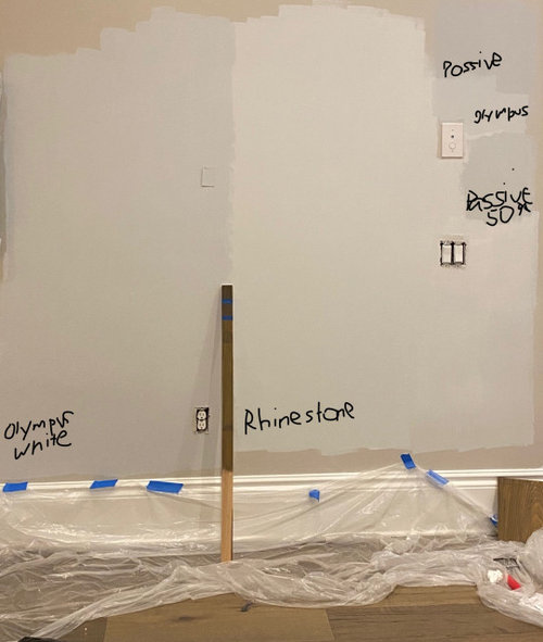
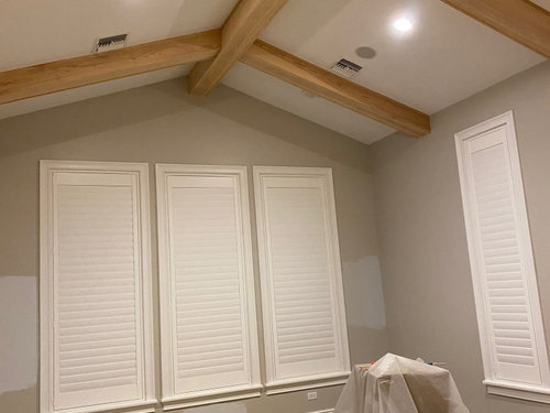
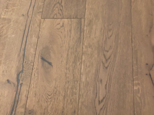
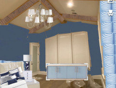
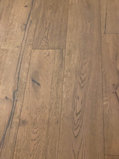
We are painting our Master BR which has poor lighting. Currently, Collingwood cut 25%. 3 large wet facing windows which are usually closed due to FL sun/heat. North facing windows receive almost no lighting due to trees. Accent wall across from bed will have Serena and Lily Grenada wallcovering in Indigo. Trim is SW Extra White. Seeking a gray paint color with LRV of ~70 as 66 was too low and 74 too bright. I've attached pix with samples from L to R: SW Olympus White cut 20% (too blue), Rhinestone (too bright), Passive Gray too dark (top right), Passive Gray with about 50% white mixed in by me (bottom right and currently fave but too dark). Cypress wood beams to be stained close to wood floor color. Any ideas are welcome! @Marylee H @Flo Mangan Lori suggested I tag you : )


Comments (28)

  • PRO
    5 years ago

    @Marylee H or @Flo Mangan - ideas?

    johnstongator thanked Lori A. Sawaya
  • PRO
    5 years ago

    Well first, stop “cutting” colors. Not effective method. Second, a gray is wrong tone for low light room. I will dig into my colors tomorrow afternoon and see what I can suggest.

    johnstongator thanked Flo Mangan
  • 5 years ago

    What about painting the beams? Would lighten the room somewhat. Let us see the room when you decide.

    johnstongator thanked lovemrmewey
  • 5 years ago
    last modified: 5 years ago
    Hi - I’m with Flo there.


    When faced with a dim to moderately lit room, it’s understandable to think that choosing the most neutral, nearly-not-there colour, is the best way to bounce the light around. But those colours are often at their best in rooms with enough light to bring them to life.


    You may actually find you can afford a more colourful colour than you may originally think appropriate, as it can help combat the shadowiness.


    Wind’s Breath and Olympic Mountains have an LRV of 69 & 70, but they have a deal more Chroma (colourfulness) than the colours you have experimented with so far.


    Should you choose to sample any more I suggest 2 coats on boards or decals, so that you may move them around the room, both in shadow and light.


    White Down is lighter with an LRV of 77 and it is the most colourful of all. You may find these colours offer a little more lift in somewhat subdued lighting.


    I think these colours could work well with your lovely wallpaper and could be picked up in rugs or accessories too.


    If you still prefer something much more neutral, then perhaps a colour from the same Hue Family as your wall covering, may offer the room a greater sense of connection. The silvery blueness could work well with more shadowed areas too,


    johnstongator thanked Marylee H
  • PRO
    5 years ago
    last modified: 5 years ago

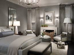
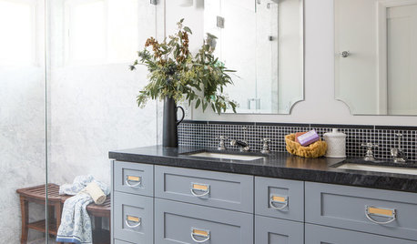
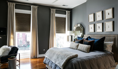
    I happen to love gray bedrooms , honestly how much natural light do you need in a room you sleep in. Stop with the LRV and get some poster board to paint samples on. Pick 3 and get large boards. BTW this is one of my favorite gray bedrooms . IMO you choose the accent wall after your bedding so post some pics of the stuff you are working with


    johnstongator thanked Patricia Colwell Consulting
  • 5 years ago

    I like gray bedrooms too; charcoal gray. Mine is Valspar's Urban pulse on all four walls. Go dark and intimate.

    johnstongator thanked decoenthusiaste
  • PRO
    5 years ago
    last modified: 5 years ago
    No offense, but many of us see our bedrooms throughout a day. No need to feel sad when you glance in, when you could look at WOW. . Vistas are as important in a home as the room you happen to be in at the moment!.........

    Case in point? I recently painted a clients small , dim, den a very deep navy. White sofa, navy and emerald accents. Gilded metals.

    Last week? ""OMG!!!! I'm in heaven! ... I just love gazing into that room, I wouldn't have believed it.- its absurd, i keep staring at it! And I adore having my wine in there, every single night"

    Gray is not the last color on earth, and I don't feel the pictures the op has posted do much for the flooring or the beams. To each is own, but........I'd go deeply charcoal, before any mid toned or light gray.

    johnstongator thanked JAN MOYER
  • 5 years ago

    Thank you for the suggestions, I appreciate them all and am so grateful that you would take the time to help! We have ordered the wallpaper and I absolutely love it. I want the beams to retain their gorgeous wood beauty and am working on getting the right light stain - cannot clear coat as they are cypress and have a lot of red which will deepen if not stained.


    We had Extra White on the walls when we moved in and it was not relaxing - far too bright and we never felt comfortable. I tried Pure White on the walls and it was still too bright. We wanted a kiss of color and felt gray was the best choice as my husband detests light blue paint, reminds him of our son's baby room.


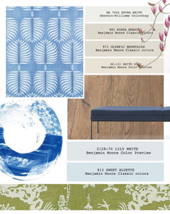
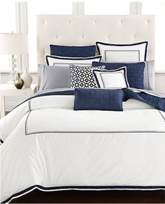
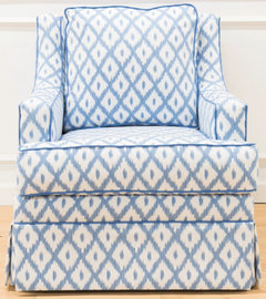
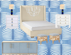
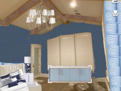
    I'm not afraid of color so the dark hues don't trouble me, we just want the room to continue to feel light and bright. Our bed frame is Serena and Lily in the Ivory Faux Raffia which has great texture and Lori did a review on paint to match that fabric! We have classic solid white bedding with navy blue embroidered border. We have two Society Social swivel chairs for the west wall with the 3 large shuttered windows in their Malavi Chambray. Also on order the Wooster console from Serena for under the TV and their Avalon stools covered in the Granada fabric. I created a hokey mood board in Word with two choices for nightstands and the lamps that I'm using in the room. There will be accents of beige which is another reason why I was hoping to introduce a very faint gray to complement the furnishings.


  • 5 years ago

    following....

  • PRO
    5 years ago

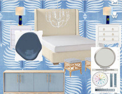
    Well, you have plenty of input here but I hunted fir what you say you are looking for but I am not a fan of a light Gray. But SW Crushed Ice is nice color. HOWEVER, I just saw you have wallpaper ordered. That is a lot of baby blue! Plus, with your bed I think you need to rethink paint color. I added BM Van Deusen Blue which is great deep but not super dark color. I am not sure about your bed lamps but if you choose deeper blue go for dark blue base lamps.

    johnstongator thanked Flo Mangan
  • 5 years ago

    I can't add, esp. after Flo's post. :)

    But surfing around I found a pretty print. Maybe a mix-in look - if a look that you/ yours like. Everything with such a print would have to 'go'... oh well here it is.

    https://www.overstock.com/Bedding-Bath/Madison-Park-Pierce-7-piece-Cotton-Twill-Printed-Comforter-Set/19891272/product.html?kwds=&option=12659888&refccid=ZEYFR5QVQF3JCUKL6FUH4FXZ4E&rfmt=&searchidx=16

    johnstongator thanked everdebz
  • PRO
    5 years ago

    If you are going with the wallpaper, that bedding won’t work. I would go with bedding but return wallpaper. That color is very hard to work with. Go with all white and deep blue such as Naval on walls with your white trim. Use lamps and chandelier for lighting. Current plan just has too much going on. Do you own bed? Is it linen rather than white?

    johnstongator thanked Flo Mangan
  • 5 years ago

    Oh... was the wp for one wall, or all walls? the beams as so good in light/natural as they are imo. If you found bedding as was said in about same hue family, maybe that'd be a part.

    Or if S.O. would like a certain pale color that's "good with wood" like silver sage bedding... might that matter?


    https://www.overstock.com/Bedding-Bath/Superior-Jacquard-Matelasse-Basket-Cotton-Bedspread-Set/18528645/product.html?option=31080021&recalg=949&recidx=3&recset=6927c0fe-86b8-45a4-b7be-7928ceb4c4f3&refccid=PTSVSW4XZ3J34KCE4MI2ZA3FYI

  • 5 years ago

    From houzz: "Chantilly Lace by Benjamin Moore for minimalist design... it reads cool, clean, crisp. Sometimes when people are fearful to go too white, they wind up choosing something with a yellow undertone, and it reads yellow, making the room look more RUSTIC." [my Dover White a bit?]

  • PRO
    5 years ago
    last modified: 5 years ago

    You can't select "loves' in isolation, as nothing lives in isolation. These The bedding and your paper ? Not together please!!!! and why ANY gray with either one? No, please no. !!! Beg you NO.

    FORGET the wallpaper for a grasscloth on all four walls.


    Try a grasscloth all four walls. Take a SHAM with you: )


    johnstongator thanked JAN MOYER
  • 5 years ago

    Thank you all so much for your continued advice! I've not posted on Houzz before and this was a fun experience and your contributions really make this a community.

    I don't want to disappoint, so forgive me, but the wallpaper is going up! I love it. It's bold and a neat print, it makes us happy. I will revisit Flo's original paint color suggestions. I do love Van Deusen blue and happen to have it on some built-ins in our living room! The great thing about paint is that it's not permanent nor expensive, so if I paint it and hate it once the furnishings arrive, I'll repaint!

    All the items I mentioned are owned or on their way, so there is no turning back. Here is the link to Lori's review of the fabric that my bedframe is being made in, which is a gorgeous color with subtle texture - I loved Lori's review (and her entire website):

    https://thelandofcolor.com/serena-lily-faux-raffia-fabric-is-fabulous/

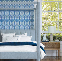
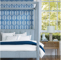
    To give you comfort with the bedding and wallpaper, here was the picture from the S+L website that started it all. I visited their design center in Palm Beach and a designer and my husband and I put everything together, as they had all items in stock, so we could see what it looked like before pulling the trigger. Design is an expression of art, and we all see and respond to things differently and I've really enjoyed reading all of the responses! Thank you all so much for your time!!


  • PRO
    5 years ago

    If you are going with the wallpaper, that bedding won’t work. I would go with bedding but return wallpaper. That color is very hard to work with. Go with all white and deep blue such as Naval on walls with your white trim. Use lamps and chandelier for lighting. Current plan just has too much going on. Do you own bed? Is it linen rather than white?

  • PRO
    5 years ago

    Well, I hope everything works out for you. Come back and give us peek at final product.

    johnstongator thanked Flo Mangan
  • PRO
    5 years ago

    FYI. This is chandelier I put in that mock up. I think you need more presence with beams and cathedral style ceiling. More white with the shades too.

  • PRO
    5 years ago

    If you do want to purchase from Houzz, email me at manganflo@gmail.com and I can get you my Trade Program discount. It takes 5% more off your purchase.

    johnstongator thanked Flo Mangan
  • PRO
    5 years ago

    One more thing. I would do a walnut stain on beams. The grayer look of walnut will compliment the blues and calm the whites.

    johnstongator thanked Flo Mangan
  • PRO
    5 years ago
    last modified: 5 years ago

    home-design.jpgAs we always say...............we can only ADVISE. ............

    There are literally thousands of ways to love a space. Designers are not dictators, they just realize this fact,, and it is always about maximizing what one has, and minimizing that which one does not have. In this case, it is abundant natural light and a "coastal feel" . This is what Serena and Lily is known for. It appeals in their catalogue and on their site. When you look at both, note the natural LIGHT, and the obvious seaside feel. Just as we don't generally make locales such as that into dark and cozy, furry bowers, the reverse also holds true.

    I'll just say a prayer that the ivory ground print comforter set finds a home OTHER than this bedroom, or I missed something up here prior. It will appear a disjointed and disappointing complement to the paper you have to have. Sigh................deeply lol. Add tons of clean white......

    WHAT MADE YOU LOVE THIS PAPER?? Answer: The Abundant, simple, WHITE. The bedding: )

    A room only needs one show stopper. Don't dilute the effort.


    this below? Not so much..... apologies.


  • 5 years ago

    I'm not using an off white comforter. It's all white with navy blue border. The bed is in Serena & Lily Ivory Faux Raffia, perhaps that was confusion. I agree, an ivory comforter would look awful. I fell in love with the wallpaper because it's gorgeous. We love botanical imagery as well as blue, green and white and have it throughout our home, so this was instant connection.


    Flo-we are trying to get walnut tone. Issue is that cypress is very red and it's been hard to neutralize. I have local cabinet company and the only authorized General Finishes rep that offers their color match. They have tried about 13 samples and still not there, but getting closer!


    I appreciate very much all of the help and advice, you're all very kind and helpful!

  • PRO
    5 years ago

    Add Ebony to Walnut. It will cut red. 😊

    johnstongator thanked Flo Mangan
  • 5 years ago

    Specific colors, grays especially, appear much different on a screen so unfortunately can't help with the paint selection. Your bedding will totally work with the wallpaper. Please post the finished room.

  • 5 years ago
    last modified: 5 years ago

    Pro Jan's point surely is well taken. A light neutral is of course good! The wood beams, and w.p. and the rest is a serene place I think. Saw something, and wanted to present an eclectic idea... it's ok.