Software
Houzz Logo Print
jennyloupru

help choose quartzite!

5 years ago
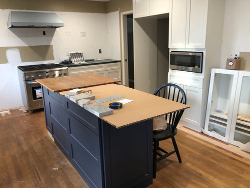
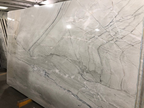
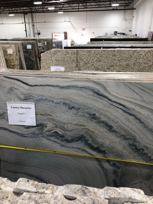
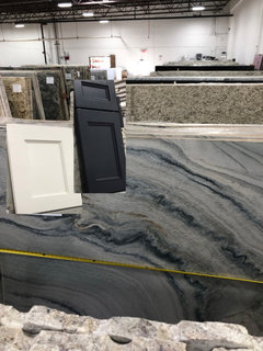
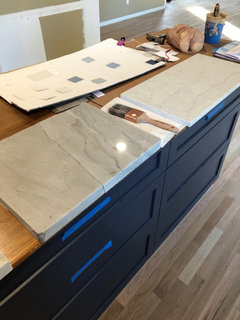
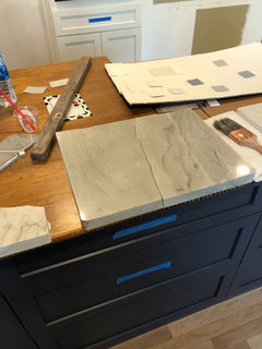
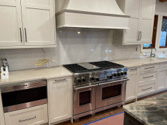
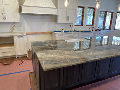
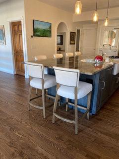
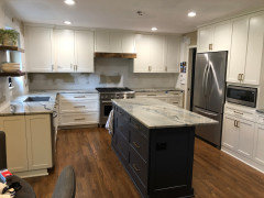
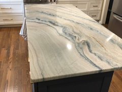
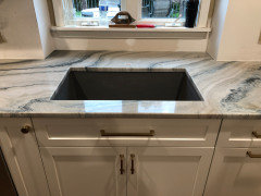
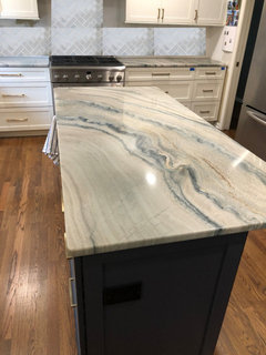
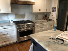
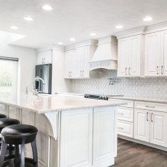
I can’t decide which quartzite I like best. I originally wanted the kitchen to be light light light! We are installing slightly off-white perimeter cabinets and blue island. Currently in middle of install. I originally wanted the marble-look quartz but husband does not. So here is kitchen under construction (wood floor to be refinished) and the two quartzite slab we are considering. First is fantasy macaubus and the second is Nuage. FM is dramatic and interesting, Nuage is light and airy, just slightly darker than perimeter cabinets.

fantasy macaubus
Nuage

Comments (46)

  • 5 years ago
    FM.. ties in bettter with the blue island.

    both are reading very gray to me... not the 'light light light' that you are after.

    J Pru thanked sprtphntc7a
  • PRO
    5 years ago
    IMO the floors should have been done before cabinet install and what are they going to be now?IMO too soon to choose counter unless you post a pic of the new floor finish. Light comes from actual lighting and all of that should be LED 4000K and I agree neither of those choices is light.

    J Pru thanked Patricia Colwell Consulting
  • 5 years ago
    Oooh, that Fantasy Macabus is gorgeous! The blue in it would tie in nicely with the blue of your island.

    J Pru thanked porkchop_z5b_MI
  • 5 years ago
    @Patricia Colwell Consulting, the floor will be refinished after construction is finished, and I can choose what color depending on what the counters, etc are. Most likely a medium brown. My contractor wanted to install cabinets and do other construction first, since we changed the footprint and moved walls and doors. Also, the wood stretches across the whole first floor and we wanted to wait to refinish for when we are out of town in April.

  • 5 years ago
    I agree they both seem a little grey for to bring in the lightness you are looking for? Both are gorgeous though!

  • 5 years ago
    last modified: 5 years ago
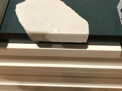
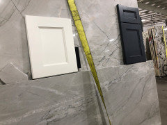
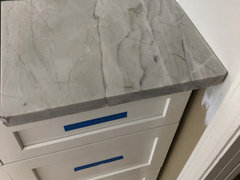
    @sprtphntc7a, The FM has grey but also tan, white, etc. It's hard to get a good photo in the warehouse - the light is crap and I can't get a sample of the FM from the actual slab before its cut. the Nuage is a very light oatmeal, although I agree it does look grey in the warehouse. I do have a sample of the Nuage, here it is above new cabinets (with the new 4000K LED lights on) (and that is a piece of my old teal laminate counter that we are using as a temporary counter) In the bottom photo you can see the same piece of rock sitting next to my cabinet door sample and see how much more grey it looks in that light?


  • 5 years ago
    Have you considered Taj Mahal quartzite? You would need to find the slabs that are more creamy/swirly and not the ones you see more often these days, that are more gray-green and have a stripe-like pattern.

    Do your white cabinets have a gray tint to them? Or is that the lighting making them look gray?

  • 5 years ago
    @chispa cabinets are a warm white. No grey at all. The lighting makes everything look more grey. I am so confused with all the colors. At this point Im ready to throw darts at the wall and pick whichever one I hit.

  • 5 years ago
    wow that is a big difference!

    see if the warehouse can bring a light, even just a light bulb with a 'warm' bulb to see the true color of the granite. that's what we did. warehouses just have flourescent lighting which does not convey the true color of the granite.

    FWIW: if u can't match your cabs exactly, the counters will look "off". this is a difficult task. either match exactly or find a granite that compliments rather than matches. having the granite a shade or two off, and it will look like a 'miss' with your cabs.

    whites are notorious for being difficult to match. you have to be in the same temperature of the whites. you don't want a warm and cold white together. i hope i am making sense.

  • 5 years ago
    Throwing this out there - have you considered doing a butcher block on the island and the Nuage on counters?

  • 5 years ago
    I had originally thought about doing a wood island, but I wasn't sure if there would be too many elements. Since the island and the perimeter cabinets are already different (blue vs. white), would it be better to keep the counter the same?

  • 5 years ago

    I can relate! I’m going through a similar struggle. I waited to install my quartzite counters before picking my cabinet color. They were installed last week and I’m just torn on paint colors.


    My stone looks completely different from in the warehouse, in pictures, outside on a sunny day (I got a 10”x10” scrap for backsplash tile shopping), and in my kitchen during the day and at night with lights on. It’s a chameleon and I’m glad I took a chance on it. It looked like camo olive green with strong kakhi brown in the warehouse and in my kitchen it’s a soft teal grey with warm creams.


    I think the Nuage sample is your best gauge on what the slab will look like in your kitchen. Go for it if it works with your cabinets color (under your kitchen lighting).

    J Pru thanked Cherie
  • 5 years ago

    I like this combo.


    J Pru thanked Beth H. :
  • 5 years ago

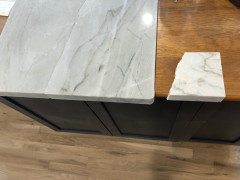
    I was able to get a better sample of the Nuage to see at home (the crack you see is an actual crack - they gave me both pieces) Makes me like it more...


  • 5 years ago

    The larger sample makes a huge difference! How does it look with your island?


    Were you able to get a sample of the fantasy?

  • 5 years ago

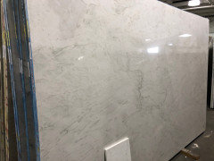
    No samples of the FM, that is at another fabricator and they are not as accommodating. But I found two other options. One is called White Lux and is beautiful. Also quartzite and passed the tests except for olive oil overnight caused a shadow. The other is a quartz product from MSI called Calacatta Monaco. My husband still prefers natural stone but I’m really intrigued.
    White Lux slab is first photo. The sample is shown on the island next to Nuage. Lux is lighter. The other big piece that looks like marble is Monaco.

  • PRO
    5 years ago

    Hi J Pru, How about using two colors:


    1) Island: Fantasy Macabus, in Blue


    I understand this is the busier slab.

    and could be used on the island as a 'highlight'.


    2) Use the lighter slabs of countertops on the sides of the kitchen.


    The two together could make a great compliment!...


    J Pru thanked Arlene Awarda Architect
  • 5 years ago

    With that island, I prefer the lighter choice.

  • 5 years ago

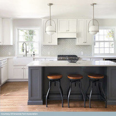
    We just had a similar issue with our warm white cabinets and navy blue Island. We changed direction just like you because we found our original quartzites to be too grey. We end up with 2 different colors. Superior Blanco (a more brownish slab) and Blue Tempest for the Island. The Slabs actually match the cabinets very well. The Blue Tempest may not be for everyone but we wanted a stand out piece. Everything else is very neutral. Not quite finished yet but this gives you an idea


    J Pru thanked Gary
  • 5 years ago

    @Gary thanks so much! That is very helpful. I had thought it would look disjointed with two different colors of cabinet and counters, but yours is lovely.

  • 5 years ago

    I’m with your husband. I like natural stones over quartz.


    The White Lux might be the winner. It gives you the marble quartz look you were originally after and it’s a natural stone. Some people on this forum use sealers on their quartzite that would help with the oil stains.


    @Gary your counters are striking!

    J Pru thanked Cherie
  • 5 years ago

    J Pru - stunning!

  • 5 years ago

    LOVE!!! I can't wait to see finished pic


  • 5 years ago

    beautiful!! make sure the fabricator contacts you before cutting those! you should tell them exactly which part of that stone you want cut, and where to cut it.

    J Pru thanked Beth H. :
  • 5 years ago

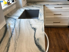
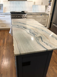
    @Beth H. : thanks for the tip! After they come to template, we have a "layout appointment" where we meet with the fabricator to discuss exactly how it is going to be laid out, and I can see the cut lines on the computer. I'm definitely putting that "river blue" part on the island!

  • 5 years ago

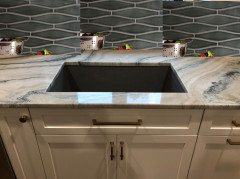
    Update! We had our Fantasy macaubus installed yesterday - now we have to figure out backsplash.... ughhhhh


  • PRO
    5 years ago

    Those counters are beautiful!

    J Pru thanked Debbi Washburn
  • 5 years ago

    It's STUNNING!

    J Pru thanked sayboone
  • 5 years ago
    last modified: 5 years ago

    gorgeous.

    If someone recommends 3x6 white subway tile I'll lose my mind.

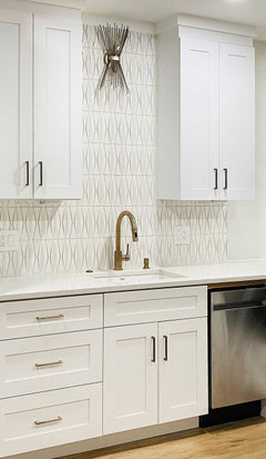
    I immediately thought of Tilebar-Nabi Jewel in the natural white


    or the Nabi Harlequin. (why not order some samples?)


    what do you think about going w/a shade of blue green to match the veining and pick up on the blue island?


    Encore Ceramics. they have a ton of diff shapes too

    this one is the Bali color in the herringbone


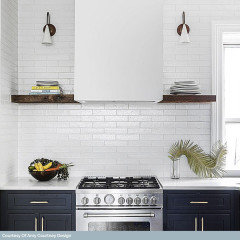
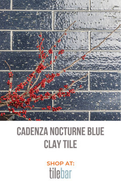
    glazed brick type of tile. it also comes in a navy blue that would match the island perfectly


    Home Depot carries this tile under Ivy HIll- Rythmic Nocturne.


    https://www.tilebar.com/cadenza-tidewater.html they have a lighter green color too

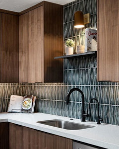
    Fireclay Tile has this Wave tile. shown here in a dark blue/green, but they have about 80 different colors you could choose from. and they have regular sized tiles, or other shapes


    Personally, I don't think something liek this is too busy looking. There is NO reason you must stick w/a simple white subway. in fact, a regular white will be too bright against this stone. I like the blue/green color idea much better.

    I like the dark teal-blue/green colors.

    the 4 subway colors are from Fireclay, Peacock, Nautical, Slate and Tempest


    https://www.fireclaytile.com/subway-tile/colors

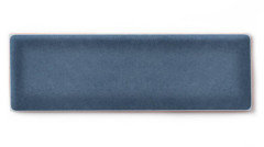
    I think the slate blue would be pretty. this is the 2x6


    https://www.fireclaytile.com/tile/colors/detail/slate-blue/tile-field-2-x-6

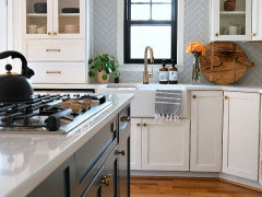
    or if you want lighter, a softer, blue gray. shown here in the herringbone layout


    check out their kitchen photos

    https://www.fireclaytile.com/gallery?application=kitchen

    J Pru thanked Beth H. :
  • 5 years ago

    WOW! Thanks @Beth H. : Lots of ideas there. We are not thinking white subway tile, but I don't want too deep of a color. I am leaning towards a soft pale blue, maybe in a square shape or herringbone pattern. I also like the wave tile shape you referenced above.

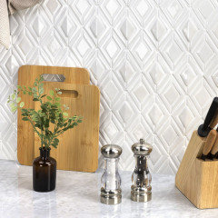
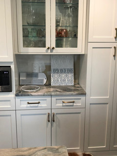
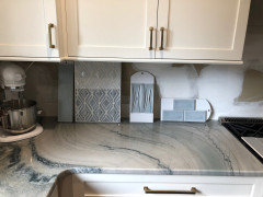
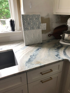
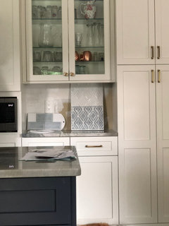
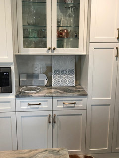
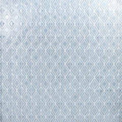
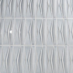
    Here are some photos of some samples I picked up today. We like the blue subway tile and the - I don't know.. diamond shaped tile? We like both the blue and white versions of that one! That looks very similar to the one you offered above - it has a very slight icy blue cast. It says Soho studio Baroque on the back of the board and costs a zillions dollars/sq. ft. :-(


    natural light


    overhead can lights on


  • 5 years ago

    I love what you have done so far. I am just beginning the process and aiming for something VERY similar to what you have done. I love that quartzite. I haven't seen that one and have not yet found "the one" I want. Keep us posted.


    J Pru thanked mkuyekawa
  • PRO
    5 years ago

    This diamond pattern tiles are awesome!!! Don't like the subway at all - they seem blah...

    J Pru thanked Debbi Washburn
  • 5 years ago

    We are using Soho Baroque for our backsplash as well, but in the deep green shade. I chose the subway option because our counter has a lot of movement, and I felt like too busy of a backsplash would compete.


    Have you seen the Sequin pattern in that tile? It comes in the Sky color and I think it would look great with your counters. They also have a textured square option that's really cool. Our tile shop didn't carry samples of every color and pattern, but you can request that they order them.


    You should also look at Ivy Hill Tile, which I think is the exact same thing, just sold under a different brand name. Wayfair carries it. https://www.wayfair.com/home-improvement/pdp/ivy-hill-tile-delphi-valor-3-x-4-ceramic-mosaic-tile-sost4419.html?piid=52031583


    J Pru thanked sayboone
  • 5 years ago
    last modified: 5 years ago

    that Soho tile you have is EXACTLY the same that I posted in the white. (I told you that Jewel pattern is perfect! it's the first picture I posted)

    It's from Tilebar, Nabi Jewel, $41.50 sq ft


    and Nabi Harlequin collection.

    $26.95


    https://www.tilebar.com/collection/tile-mosaic-collections/nabi.html

    Are these prices similar to the samples you have?

    (but I found it much cheaper!)

    Actually, Home Depot also carries it and it's 31.99 sq ft!!

    https://www.homedepot.com/p/Ivy-Hill-Tile-Delphi-Jewel-Arctic-Blue-12-in-x-16-in-Polished-Ceramic-Mosaic-Tile-1-19-sq-ft-Sheet-EXT3RD100360/314908617

    It comes in a 12x16 size which is 12.19 sq ft, and the cost per sheet is actually $38. I don't know if that other place quoted you sq foot size or sheet size.

    The other Harlequin shape is on their site for $29 a sq foot, or $40 for a sheet 1.5 sq feet.

    They also carry it in this Tundra color. it might be a nice match w/your stone. has that gray/greenish/blue tone to it.


    Here's the jewel in white


    and the Harlequin.


    in the last comment above, she is posting the Argyle


    Argyle in the color Tundra

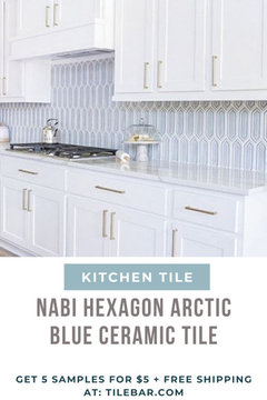
    and Hexagon from the same Nabi collection.


    I gave you the link above to that entire series

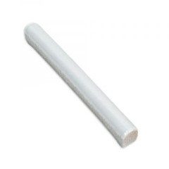
    don't forget the matching pencil liner if you're going to do borders.


    J Pru thanked Beth H. :
  • 5 years ago

    Those prices are all MUCH less expensive than the price I saw on the tile board. I haven't gotten a quote yet but the sticker said $49.99, and it looks like the sheet is just about 1 sq. ft.. I like the Diamond shape best, wavering between white and blue. The slight green in the stone makes me a little worried about doing the blue and having it not quite go together. but I think the blue looks best with the island. Thanks so much for helping, you were right on the money with your first pick.

  • 5 years ago

    @sayboone I really like the textured square (Argyle) you included. I found it at Home Depot in the arctic blue color so I ordered a box to take a look. They have free ship to store and will accept returns - can't believe how much it is discounted over the Tile store. Thanks for your help! I will post photos when it gets here :-)

  • 5 years ago

    That's fantastic! I can't wait to see.

    J Pru thanked sayboone
  • 5 years ago
    last modified: 5 years ago

    That slab is FABULOUS in your space.

    If it were me, I'd do a plain subway in a dark blue to play off of that stunning hunk of rock. White, grey or a light, soft color will not do it justice IMO. I'd choose a subway shape -- the quartzite is the star here, just need a shot of rich, deep color to highlight it; a textured or non-subway shape is going to compete with it.

    J Pru thanked porkchop_z5b_MI
  • 5 years ago

    FM is beautiful and very different.

    J Pru thanked Elissa Torre-Lewis
  • 5 years ago

    @mxk3 z5b_MI, thats a good point. I have ordered the textured tiles from Home Depot and I am going to see what they look like - but you might be right and they might be too much with the stone. I'll post photos when they come

  • 5 years ago

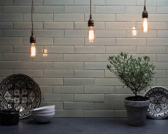
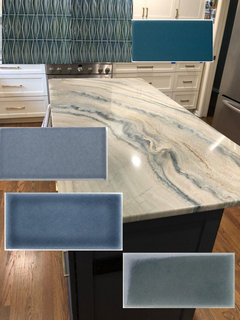
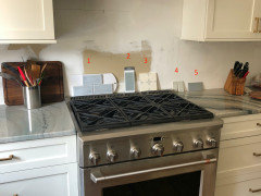
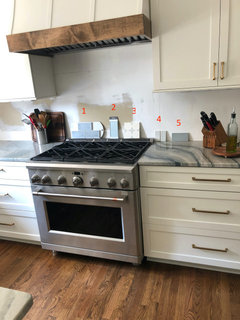
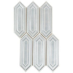
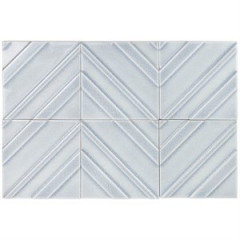
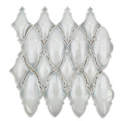
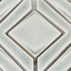
    Some tile options - I am not interested in subway tile shape, however these are the color samples they had at the tile store. I would go for a 6" square or elongated hex if available.

    1. The same blue color as above from the Soho/Nabi line. This is the subway tile version and looks very nice with the island.

    2. Glass tile with reflective back. Comes in an interesting elongated arabesque shape.

    3. My favorite, from Pratt and Larson and very pricey. I am trying to decide if I like it enough to spend the money, or if It would look good enough just over the range.

    4. Another crackle tile from Pratt and Lambert, watercolor line. These come is the elongated 6" square option.

    5. I think this one actually matches the counter the best, but it looks very green from across the room and I think would overpower the blue of the island.


  • 5 years ago
    last modified: 5 years ago

    did you get the tilebar (or the Harlequin or Argyle samples yet?)

    #2 and 5 seem to work best.


    But, I like the blue Jewel tile out of all of them


  • 5 years ago

    The other samples are coming tomorrow.

  • 5 years ago

    The very expensive tile, while pretty, may fight your beautiful countertop. #1 looks too bright blue.

  • 5 years ago
    last modified: 5 years ago

    J Pru -- I just had Pratt and Larson tiles installed last week. They are beautiful, hefty, and well worth the price paid. I got a dark green matte color (P210) on rustic field tile -- the texture is subtle but lends just a bit of oomph to the plain rectangular shape. If you have P&L dealer near you, ask them have a full-size sample made and sent to you. I am glad I did this because when I received full-sizes sample tiles, some of my choices with more variation looked *a lot* different than the small 2 x 2 sizes, and the one I ended up going with looked not as green on the small sample than what it actually looks like full-size.


    I am not lovin' the light samples you have, they're too pallid are just not popping the countertop. I really think you need a deeper, richer color. Why don't you pick up some samples of a dark blue or even dark grey and see how you like them?


    P&L has some beautiful, rich blues, as does Fireclay:

    Gloss - Pratt + Larson (prattandlarson.com)

    Tile Colors | Fireclay Tile

    J Pru thanked porkchop_z5b_MI