Software
Houzz Logo Print
petunia853

I hate picking paint colors!!!

4 years ago
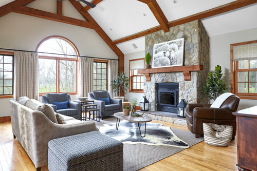
Hi everyone - I think I am officially on a "downward spiral" of picking a color and need some help as I get ready to paint my great room this weekend.


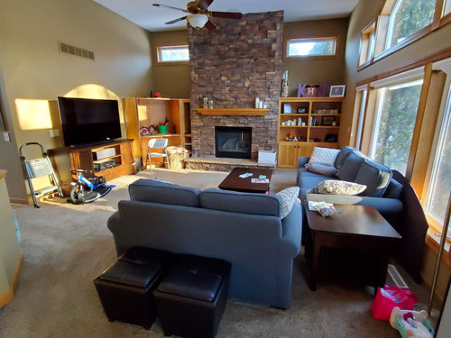
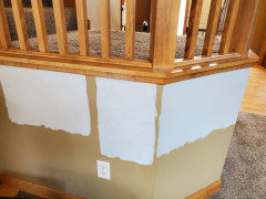
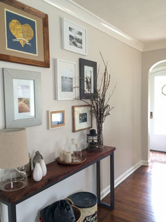
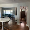
My partner really wants a "gray" color but I am concerned on how it will look with our maple stained trim. First picture below is our "inspiration room" and second picture is the room as it currently - lots of natural light and windows face southwest.


I have test painted samples of Agreeable Gray and Colonnade Gray - concerned the Agreeable might get washed out in the natural light and the colonnade is too cool. Am I on the right track with either of these or do I need to go more brown / tan / something to achieve the look below? TIA for your help!


Comments (40)

  • 4 years ago

    Is the carpet staying? It looks beige on my monitor so I wouldn't like with gray with it.


    Some ideas but all depend on your lighting


    Farrow & Ball Bone

    BM Camouflage

    BM Edgecomb Gray

    Kat thanked jck910
  • 4 years ago

    Thank you! No the carpet is being replaced. We are ditching the brown and going with a lighter/greige type color. I'll try to post a picture of the sample we are looking at.


    I like the look of the BM Edgecomb Gray looks slightly warmer than the SW colors - do you think I should have any concern with the LVR and color getting too washed out? I don't know how concerned I should be with 12' ceilings and the southwest light of a color getting too washed out in the natural light? I am probably overthinking this all :-)


  • PRO
    4 years ago
    last modified: 4 years ago

    OK so we have seen your posts about this room before. Are you not doing any additional work in the room?

    Are you going to paint the stone?

    Remodel the built ins?

    Pull up the carpet?

    https://www.houzz.com/discussions/6225337/layout-of-family-room-needs-help

    Kat thanked BeverlyFLADeziner
  • 4 years ago

    Edgecomb Gray is very similar to SW Accessible Beige if you want a SW equivalent. I have Edgecomb Gray in my bedroom. It recedes into the background and to me looks like a good balance between beige and gray. My room has windows on the west and north sides. It might work for you, but the only way you're going to know is by sampling.

  • 4 years ago

    @BeverlyFLADeziner yes I am trying to take the changes step by steps - stone and trim is staying, built ins are being updated to symmetrical, and replacing carpet after the painting is done. I'm a bit overwhelmed by the whole thing and wanted to get to feedback on the paint - vs. all the things in the room we aren't changing.

  • 4 years ago

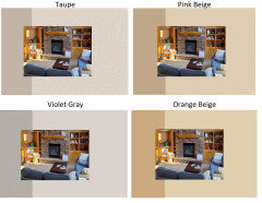
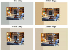
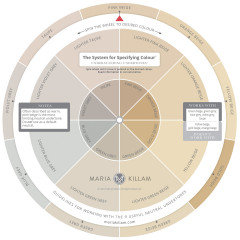
    I pulled the colors from Maria Killam's neutral color wheel.


    What colors do you like with your room?


    Personally I like both the blue grays and the green grays.


    Maria does not have greige (green gray/green beige) as a separate family, so her Green Gray may be a bit less green than some and a bit more beige than what I would consider a Green Gray, but overall it gives you a starting point.

    Kat thanked Jennifer Hogan
  • 4 years ago
  • 4 years ago

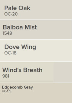
    I like any one of these Benjamin Moore colors for your room. Use a matte finish on the walls.


    Kat thanked houssaon
  • 4 years ago

    @Jennifer Hogan This is a great perspective to see my room with the different color wheel!! I am definitely drawn to the green gray and gives me a bit more confidence in the colors I'm looking at. My wood trim is really throwing me off with making a decision, especially when white trim seems like the baseline these days.

  • 4 years ago

    @Jennifer Hogan I LOVE THIS! That pup is definitely going on my inspiration board now :)

  • 4 years ago

    @houssaon Thank you - meant to ask about finish but forgot in my original post :) We are having to do some light mudding/dryway work to repair holes in the walls prior to paint. I know its a bit off topic but any suggestion on how to avoid the "shiny" look where ever we sanded the repairs? Just a higher knapp on the roller or anything else to help?

  • PRO
    4 years ago

    No the carpet is being replaced.


    That makes choosing a color easier - use the new carpet color and the colors in the FP stone to inform the wall color.


    Because for a cohesive, put-together look the paint color needs to relate to fixed finishes and contents of the room.


    should have any concern with the LVR and color getting too washed out?


    No. Because the only thing LRV tells you is how much light a color reflects; that's it's only job. Too washed out or too colorful is about colorfulness and Chroma does the job of telling us how colorful a color looks.


    any suggestion on how to avoid the "shiny" look where ever we sanded the repairs?


    Spot prime. If you're using a top tier paint, you can use that. Or talk to the pros at the paint store for product recs.


    Kat thanked Lori A. Sawaya
  • 4 years ago

    I think your reddish stone is also a wild card. I would honestly just go for a creamy white or off-white. The wood and stone add a lot of warmth already!

    Kat thanked stellarceline
  • 4 years ago

    @Kat - When new homes are built today, most have inexpensive, paint grade trim, so it has become the norm. I would have a difficult time painting over most stain grade trim and making it look like paint grade trim, but people get conditioned to seeing what everyone else has.


    When I pick colors for my home or help someone else pick colors for their home I start with the things that must stay, then I look at the colors they love (Those colors that draw you in and say "buy me" when you walk past) and then I pick a neutral color family that works with both.


    I try to pick out flooring, cabinets, countertops, large upholstered items, area rugs before selecting the final paint color because there are fewer color selections available in these items than paint color, so I can tweak the paint color to work with the other items.

    Kat thanked Jennifer Hogan
  • 4 years ago

    @Jennifer Hogan Thank you for your comments. When we bought the house we were set on painting white (because thats what everyone seems to do?), but after a little time appreciated the quality and warmth of the wood - happy with our decision to keep but makes me keep second guessing other colors!


    We are set on the wood, fireplace, couches staying. I painted some larger samples around the room (I know - pictures don't do justice)

    From Left to right is Agreeable Gray - Repose Grey, and Colonnade Grey.

    Its down to the Agreeable and Colonnade - will probably be a flip of the coin when I get to the SW store today :)


  • 4 years ago

    I don't see any brown in the picture above. I would completely stay away from the brown if you want to achieve the look in the picture. The colors are very cool which I love. I have used light gray throughout my house. Remember that you have a pretty large space and color looks darker when you use a lot of it. Even though you have a lot of windows your room comes off a little dark, I have the same issue. Going with cool colors will really change the feel in a positive way. I also have some blue upholstery and it looks great with gray. Have fun and please post your final pictures.

  • 4 years ago

    We have a similar room with lots of windows and sunlight and gold wood finishes. Our wall color was similar to yours also and I too agonized over a new wall color. Finally we went with Snowbound by SW but really anything would have been an improvement over the original peachy-yellow. Any of the grays you are considering will be beautiful! You will be pleased with how much cleaner and updated your room is going to look! Good luck and please post an after photo.

  • 4 years ago

    I love what Jennifer Hogan has to say. A few years ago I read a story about a designer and her “go to” color was often Behr paint Wheat Bread. It combines beautifully with grays and beiges (just like those animal pictures), creating a warm, soothing and welcoming affect while still feeling light and airy. It pairs well with your color of woodwork too. It’s lovely with furniture tones of grays and blues. I’ve now used it in 3 homes and a friend recently did as well. I’ve always had compliments about this color.

  • 4 years ago

    My favorite gray is Mindful Gray by SW! It may even be considered a greige. Also, looking at your inspiration photo-you may just want to go for a white like Kelly Moore's Swiss Coffee. Good luck.

  • 4 years ago

    I think agreeable looks really good with your wood railing, which is beautiful!

  • 4 years ago

    I have seen many posts that say SW Accessible Beige is similar to BM Edgecomb Gray but I encourage you to try a sample first. I find Accessible Beige pulls pink. Edgecomb Gray does not. I used it throughout my home and love the look and I never see it pulling pink like Accessible Beige.

  • 4 years ago
    last modified: 4 years ago

    I like your maple trim very much, but don't really like it with any of the colors you've sampled in the post above. If you're down to those three, though, I'd go for the Agreeable Grey, which seems a bit warmer. The other two feel bluer, which makes the maple look too vibrant. If you look at a color wheel, it might help you pick color tones that feel most comfortable to you. Since orange tones (maple) are directly across the color wheel from blue tones, they will each make the other more vibrant. If you stick to the tones that are closer to orange on the wheel, the colors will blend a bit more. Since you mentioned preferring the green-greys to the blue-greys, choosing one that has a bit more yellow in the green will make for a softer overall look. Perhaps something like S-W September Fog, Nantucket Breeze, Repose Grey, or Create. They're all just a bit more on the green side of grey. You might also like S-W Evergreen Fog, which is their color of the year. It's definitely more green, but a really lovely color that would look great with all your natural light. If you'd rather not begin with a bunch of samples, it's worth trying their color visualizer and using your own photo to try different colors. It's not a replacement for sample paint, but it can allow you to play around to get (and dispose of) some color ideas.

  • 4 years ago

    There is grey in your fireplace which is a beautiful dominant feature. Pull a grey from that and then use the lightest shade. That will keep the room airy and reduced contrast with your trim while working beautifully with your focal point. Suggesting actual colours from photos is a slippery process as all monitors register colour differently.

  • PRO
    4 years ago

    Wall paint is the very last thing to think about and do until everything else is done. If you are changing your woodwork, carpet, etc., get all of that done first and then choose wall paint. I would also suggest that you get some color consulting help actually in your home. There is no way that anyone can truly help you without being in your home and seeing everything that you have in your true light.

  • 4 years ago

    I would get a sample of BM Pale Oak which can look more tan or warm grey depending on light in the room.

    bm pale oak - Google Search · More Info


  • 4 years ago

    I've always liked BM Gray Mirage....which is more green than gray. Agree, paint is last.

  • 4 years ago
    last modified: 4 years ago

    I wouldnt pick collonade gray or agreeable gray. I have worked with both colors and know that your fixed elements wouldn’t handle it. Look at whites and creams. I will give you some suggestions to check out. BM Ballet White, SW Shoji White, and SW Greek Villa. Your moldings are too orangey for agreeable gray.

  • 4 years ago

    No gray! It's over, done, depressing

  • 4 years ago

    Not all gray is depressing, and some people really like gray, and in some rooms, it looks really nice.

  • 4 years ago

    BM White Dove might look really good with your maple stained trim -- I worry a gray or beige will not work well with the fireplace and the trim, White Dove can be very warm and I think would bring out the details of your room.

  • 4 years ago

    I agree with Michelle…..BM Ballet White, or BM Greek Villa……get some samples, paint a large sample- 4’ x4’ in the room…..look at it in different lights, times of day…..

  • 4 years ago

    There are many things that change the way a color looks in our home vs someone else's home. The direction of light, the amount of natural light vs artificial light and the other elements in our homes.


    I think we sometimes get hung up on paint colors because we feel inept. We don't pick paint colors every day, so we lack confidence, but you do pick colors every day.


    You pick what outfit you are wearing, you pick makeup and nail polish colors, you pick jewelry to accessorize your outfits.


    The concept is the same. Much like picking makeup that works with your hair color, eye color and skin tone, your paint needs to work with your flooring, woodwork and furnishings.


    They make lots of foundation colors and blush and lipstick colors because what looks good on you may not look good on your sister or neighbor or best friend. The paint color that looks good in your home may not look good in your sister's home or your neighbor's home.


  • 4 years ago

    I have always had good luck with BM Pashmina. Doesn’t go purple or green. It’s a nice warm gray.

  • 4 years ago
    last modified: 4 years ago

    Hire a "color expert"! Like an interior designer but just for paint colors. We just hired a wonderful woman and we can't wait to get started!

  • 4 years ago

    ^^^ I hired a color consultant when I painted the interior and exterior of my house, and it was some of the wisest money I ever spent. It was not that expensive, either, considering the (all too likely) alternative- buying endless samples and still not being happy with the finished product.

  • 4 years ago

    I see comments about the fireplace and my first thought was to do a very thin lime-wash on the stone, to soften the red tones. I think it will take the reddish tone out and make it feel more like your inspiration photo. We did that in a customers home and it was a great economical way to bring it together. The colors you are viewing are looking lighter than they really are because the current colors are darker, reflecting onto your samples making them seem lighter. Paint nearly always looks a shade or two darker after you apply., and the tint reflects. The Agreeable Gray, BM pashmina, BM Dove are all great and very reliable staple colors and not TOO gray-all very organic colors. I don’t think you will go wrong with any of those. Good luck! I think it will be lovely.
    On your spot repair-use wallboard based spackle instead of plastic based filler, and be dab it with a damp sponge. Use a washable primer-based flat paint with a medium piled roller and it should smooth it beautifully.

  • 4 years ago

    Try Revere Pewter. i had a similar problen in our last home. It‘s different undertones are pulled out in different light. i had friends swear i used different colors in various rooms. it went with everything - tans, grays, greiges, bright sunlight to darker quiet rooms. it really likes natural materials. i was asked, What is that chameleon paint you used?


  • 4 years ago

    I had a similar style post and beam home. We used Benjamin Moore Pale Oak and it looked great with the wood and in different lighting.

  • 4 years ago

    I used SW Light French Gray with flooring that is the color of your wood and loved it so much that I used it again in my next house.