Software
Houzz Logo Print
casadilola

is this too much?

4 years ago
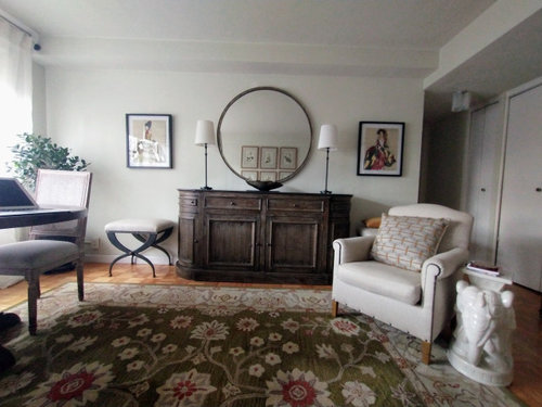
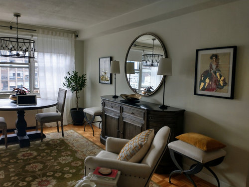
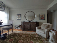
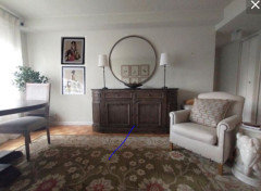
I just added this pictures which i do like, but feel maybe it's too much or I have hung them wrong.

Maybe better without pics? Any ideas helpful.


Thanks for your help.


Comments (54)

  • 4 years ago

    If you are going to do such a formal symmetrical layout on that wall I’d start by centering the console. Right now it’s skewed too far right. That is why the suggestion to stack vertically on the left makes sense to take away from the tightness in the right. But, questioning why everything wasn’t centered in the first place?

  • 4 years ago

    I like the pictures on either side of the mirror but I think the mirror is too big. It looks like it's 36" in diameter? Probably 30" would be better, or a rectangular shape. I also think in view of the other things in the room the mirror frame could stand to be more interesting, not plain, thin black.

  • 4 years ago

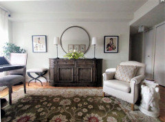
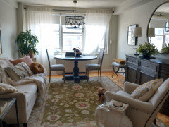
    Hi, i should have explained that this is a small nyc condo that functions as living room and dining room. so centering you're right is a problem. but I removed the plant and think that it opens up the room better,


  • PRO
    4 years ago
    last modified: 4 years ago

    The plant has nothing to do with what's wrong with the wall. You have to center the sideboard at least on the area rug. It looks like there is room to slide it over.


  • PRO
    4 years ago

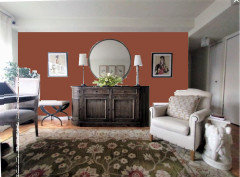
    Did you give any thought to pulling the red from the area rug on to the wall?


  • 4 years ago

    Yes, I will need to center, but that's a bigger job as I will need to move the mirror and will need help with that. As for the color, I really like the darker wall, but am concerned that it is a side wall and the room is 12 X 14. I've attached a photo of the room as you walk in. Would an accent wall still work or would a darker all over room color be better @BeverlyFLADexiner.


  • PRO
    4 years ago

    Maybe use some red accents with pillows and accessories instead of painting the wall.

  • 4 years ago

    I think the pictures are too big to stack.

  • 4 years ago

    Where did you get the rug...My friend and I are looking for one with the same colors for her living room. As for your room it is lovely but yes center console, remove bench on the left of console and a smaller mirror would be a better choice and then hang the art on the left and right of the mirror. And yes more red in the room would be lively and lovely ( must confess red is my favorite color!)

    casadilola thanked threers
  • 4 years ago

    I would leave the console where it is. I’d remove the pictures and put the plant to the left of console. I think that is all you need. The console, mirror and lamps are already a nice focal point.

  • 4 years ago

    I agree with centering your sideboard.

    Another part of the problem with the art on either side is that the mirror is very large, and the lamps are very tall, but the art pieces are smaller, so they are just not in proportion.

    You do need art on that wall, but I would select pieces that are taller.

    I would also consider removing those lamps from the sideboard.

    Sonces would look marvelous, and you could find ones that work by battery, or that plug in to a socket and you could get a cord cover that you could paint to match the wall so it would be invisible.

    When you do get different art, the bottom should be no higher than 6 inches from the top of the sideboard. Wherever that puts it from the bottom of the mirror, the top of the art should be the same distance from the top of the mirror.

    Do you have those two stools there for extra seating at your table?

    See how they look after you move your sideboard.

    If the room still seems crowded, perhaps you could put them at the foot of your bed to sit on while you put on your shoes, and just bring them out when company comes.

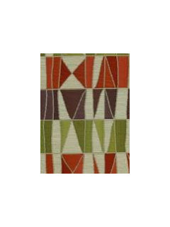
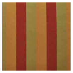
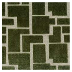
    Although you haven't asked, I think your room could use more integration with the color of the rug.

    For example, I would work in more of that olive green that is in the rug.

    (Is that the color? Everyones's computer renders color differently.)

    You could recover the seats of the hard chairs, and recover the stools.

    You could also think about covering the pillow that is rough-textured, it seems a bit boho for the rest of the room.

    A velvet in the green that is in the rug would be great for either the chairs or the stools, and use a trim that has the green and the pumpkin/umber.

    Here are some more fabric ideas for you,


  • 4 years ago
    last modified: 4 years ago

    Center the rug and center the side board.

    Would you share a photo of the room? Not sure about the elephant.

  • 4 years ago

    I am assuming you have the sideboard there for a reason, so I think if you stack the two frames on the left side and leave the right side open it would help a ton. Currently everything is symetrical except that it's all not centered on the wall, this will rebalance things but allow you to keep the symetry of the sideboard lamps.

  • 4 years ago

    The photo showing a small room has literally the 'big picture'; the dining area fills the visual looking at your grouping [stool, console, wall items]. Please don't move it, doesn't have to be even. As to how large the mirror is, imo, it helps that rug pattern is large, console and dining base too.

  • 4 years ago

    Center console, pics, mirror, letc., and move the elephant to the right of the console (keep bench on the left) (or vice versa). It's a really cool looking piece and I imagine you would like to keep it, but I think it's too heavy for the middle of the room.

  • 4 years ago

    I see you also did the stack idea LOL Just what I was Thinking, I would try and stack them centered on the wall to sideboard measurement with a little more space than your mock up between them top to bottom. Good option imo.

  • 4 years ago
    last modified: 4 years ago

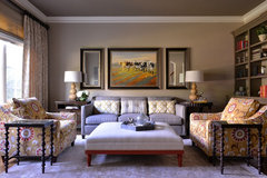
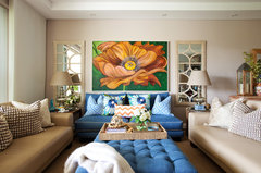
    I'm on the track of leaving it - if your room were like these, of course you'd center it on the wall [but actually I doubt it matters so much].

    Editing to say that they centered the grouping to be farther from book case.


    Comfortable Yet Elegant Family Room/Library · More Info


    Breakfast Point Apartment · More Info


    casadilola thanked everdebz
  • 4 years ago

    Honestly you have to look at it, how does it make you feel? In your first photo looks like art is not at same height. The buffet lamps could be more elegant if you can get shades that color compliment the art or the rug.

  • 4 years ago

    It's not quite right to me. I like the pics, but something is off. the height is the same - the photo is at an angle. it could be the proportion, or the lamps - maybe changing the shades is an idea.

    It's hard when you like something and want it to work! @bearbev

  • 4 years ago

    The lamps might be the culprit. Maybe a bit too tall relative to the mirror, or too skinny at their bases?

  • 4 years ago

    I agree it is the lamps that aren't working

  • 4 years ago

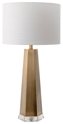
    any ideas for lamps?

  • 4 years ago

    I dont think the lamps work but the bigger issue is the buffet and rug. if you are not able/willing to center the buffet on wall and rug then i think the rug needs to be replaced. right now its too big anyways as the table is half on/ half off. I think the combo is not offering the defined spaces needed so they look jumbled up.

  • 4 years ago

    I'm sure it is a big job to center it, but the room will balance better if you do. I prefer the larger plant on the console side. The issue with the pictures is that one is dark and one is light. They way the art is hanging vertically makes for a precarious feeling since the visually "light" one is too fragile looking to support the visually "heavy" one on top. I think if you could eliminate the lamps and hang the 6 pieces that are above the sofa right and left of the round mirror, you might get a better look. Hang them about one hand's breadth apart. Then use the darker piece over the sofa and the lighter one in your bedroom, along with the two stools at the foot of the bed. I also like the idea of pulling a color from the rug to the wall, and I would flank the console with a pair of floor lamps.


  • 4 years ago
    last modified: 4 years ago

    Little thing is that lampshades seem stark white, but it's all up to you. I see a very nice room. The console and mirror seem as big as a car, and I don't insult you when saying that ...just my view that the lampshades or art shouldn't be larger than they are?! btw, I already posted that it's fine as it is, because the dining set/chandelier seems a filler at the console's side.

  • 4 years ago

    Consider adding brown or reddish color drapery panels on the windows. You can keep the current ones on just add new ones to the ends. It will help frame the window. Then add those same accents to pillows on the sofa. Pretty room!

  • 4 years ago

    The problem is that the mirror is too big. The diameter of the mirror is about the same of the height of piece of furniture it is hanging over. The lamps are trying to out-tall the mirror. Shorter, fatter lamps would look better.

    You have other eased elements in the space--a round table, a round light fixture, softened ends on the buffet; the round mirror is an overstatement. A rectangular mirror would look better.


  • 4 years ago

    I know you asked about the pictures... however, it looks like the 2 lamps are a little too tall. Lower them (if adjustable) or try out smaller/different lamps before moving pictures or mirror.

  • 4 years ago

    i have taken the pictures down. they are just too much for me where they were. I now need to find a shorter fatter lamp - probably just one. any ideas? moving and centering the buffet is difficult as it requires additional help with the mirror and as this is a small nyc condo, I need the room behind the chair so that it pulls out.

  • 4 years ago

    Do you really need lamps on the sideboard at all?

    Do you have a lighting fixture on the ceiling or track lighting?

    If so, why not forgo the lamps on the sideboard altogether.

  • 4 years ago
    last modified: 4 years ago

    yes. i do need one by the chair for reading. Other than that - just styling it.

    just editting to say - that i'm a bit confused - is there too much rounded edges? do i need

    an agular lamp - do I need color?. sooo confused.

  • 4 years ago
    last modified: 4 years ago

    What works for you is what you told us just now: "I need the room behind the chair so that it pulls out." Slow down, is my advice for today. :)

    But a help is to post measurements - of floor to top of both console, and to top of the mirror...?

  • 4 years ago

    thanks, everdebz. i think i am trying too hard and need to clear my head. :)

  • 4 years ago

    I would just start by centering the grouping and the rug on the wall …..and removing the lamps…to see how that feels to you…if it is possible to change table to a rectangle shape top..that may also make it feel roomier…

  • 4 years ago

    casadilola, we all do it, and approach our final limit. We take a break. :)

  • 4 years ago

    If the stools don’t serve a function try removing them as well…

  • 4 years ago

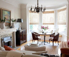
    I very much like your console & your mirror and the comments here will be helpful in maximizing that grouping. If I may say what caught my attention is the dining room table & chairs. In such a small space it’s hard to successfully put both living and dining room furniture. If it were mine, I would change out the chairs to something folks could comfortably pull up in a living room arrangement but still be useful as dining chairs. I think that would be a more cohesive arrangement. See picture below. I like the dining table but feel it is too massive & intrusive in this setting. I would personally skirt it. I know I know some will say that it dating it but unless you can switch it out I think that’s a better choice for this making this room elegant. Right now it looks like putting 2 rooms of furniture into one.

  • 4 years ago

    Is there enough room to switch the LR and DR? Won’t that put the DR closer to the kitchen? Draw it out to scale before moving anything - try the arm chair angled between the buffet and window, slide the sofa closer to the window, also see if the rug fits better turned 90*, and move the DR set closer to the hall. If that layout works, then address all the pictures.

  • 4 years ago

    This is what I would try: Remove the mirror and hang the two pictures over the sideboard. No lamps. Stand back & evaluate.

  • 4 years ago

    I think the mirror is too large and makes the whole arrangement look “off”. And I agree you need to move the console to the center of that wall. A larger work of art would be better as @Everdebz posted.

  • 4 years ago

    I would center the console. I love the simplicity of the lamps. I would add greenery to the bowl and perhaps a real tree in corner. Your room is beautiful.

  • 4 years ago

    I would measure the distance between the plant corner and the edge of the console. At the halfway mark, hang the prints vertically, one on top of the other. I think it would lend a lot more balance and interest to the space rather than trying to make everything balanced based on the mirror. The asymmetry of the current placement bothers me because it is such a symmetrical layout. Hanging the paintings in a vertical row to the left of the console eliminates this problem.

  • 4 years ago

    theres too much going on on the mirror wall. keep it more simple. youve already stated centering the console on that wall is not an option. so you need to balance it out. i suggest eliminating the lamps and pictures. place a tall, full plant (taller than one in pic) on window side of console this will provide balance for the off centered console. the mirror on the wall over the console is enough. just place a couple of small/low pieces on console - perhaps a small framed picture n a round colorful dish. Find somewhere else in the condo to place tall skinny lamps n wall pics. I would probably eliminate the ottomans on either side of console. perhaps place them side by side at bottom of your bed. its a small room for so much furnishings. you want it to be more airy, less heavy looking. If in your budget, I would definitely replace the dark heavily patterned rug with a much lighter one with no or minimal pattern. - perhaps a light textured single colored rug the dark console is such a heavy piece everything else should be simple lines n light texture. i would not paint the wall a darker color as it will close in the room more and that you dont need. chairs and sofa are lovely and work teally well in the room

  • 4 years ago

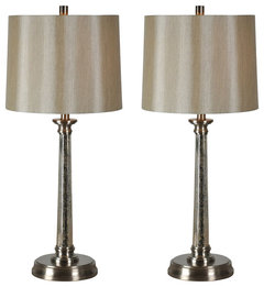
    30” H, mercury glass, satin nickel, and champagne linen shades.


    Brooks Table Lamp · More Info


  • 4 years ago


  • 4 years ago

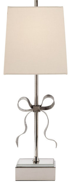
    yep $669 for this little thing. You could add a premium metal bow onto yours, and have adorned lamps of your very own!

    Kate Spade New York Ellery 1 Light Table Lamp, Polished Nickel, Cream Linen · More Info


  • 4 years ago

    Trying to follow this, please post pictures of what you end up doing. There are many great suggestions to help make it better, but the room is very nice and warm already.

  • 4 years ago

    A very belated thank you for the info on your rug...I have been traveling and away from my computer. You have gotten a lot of contradictory "help" and it has got to be confusing. Please review all you need the room to do....reading, eating, working, entertaining...then evaluate what works and what doesn't. I don't think you need the mirror where it is. I would hang the two artworks over the buffet. Hang mirror across the room to reflect the art or on the wall opposite the windows to reflect the view and the daylight. Once you have done that, move on to the position of the buffet and the rug. Then go for a walk; it is springtime in New York. Enjoy it.