Software
Houzz Logo Print
jonesj

need help with a paint colour

4 years ago
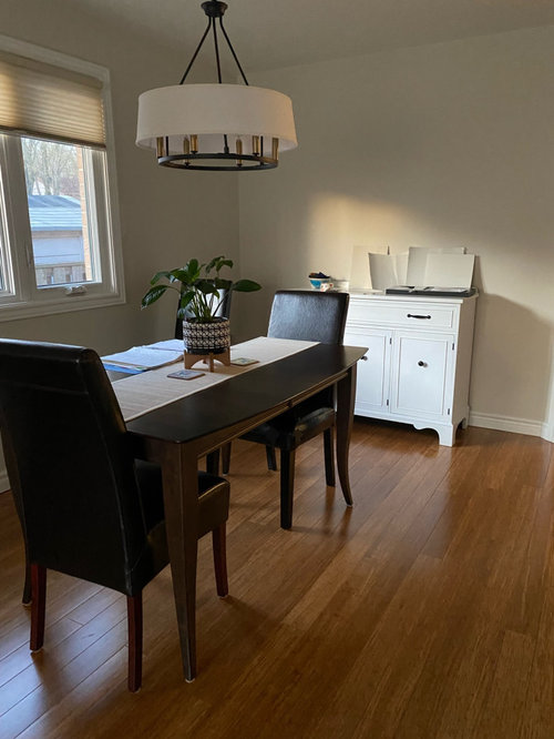
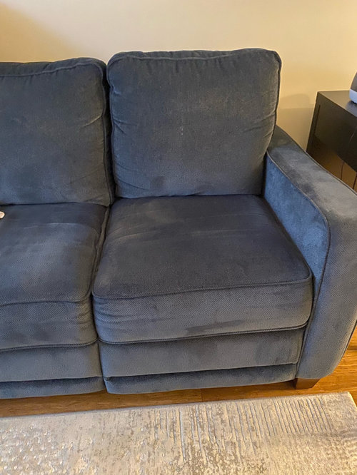
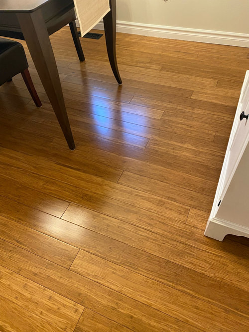
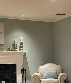
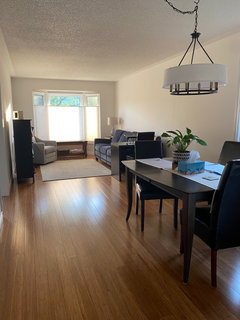
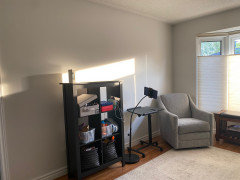
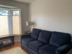
Like many others I’m driving myself nuts trying to pick a paint color. I already had the room painted in windsbreath which I thought I loved but it looks greenish yellow . So I tried some others. White dove, classic grey, silver satin and Lacey pearl. I’m leaning toward silver satin. Open to suggestions. Here are pics to show the hard surfaces and furniture I’m pretty much stuck with for now. The room has a west large window and smaller north window. The chair is new and thus has the tag on it still, it will be delivered this weekend.

Comments (31)

  • 4 years ago

    Are you looking for a light gray paint?

    or a white oaint?

  • 4 years ago

    Either! Want something that does not turn green yellow- also fairly light- I tried a sample of edgecomb grey and like it but hubby says too dark, I’m not sure

  • 4 years ago

    I plan to get a different rug and possibly paint the buffet depends on wall colour

  • 4 years ago

    Take a look at horizon, shoreline and paper white by BM

    all are very light grey

    you’ll have ronsee hownrhe undertones show uo in your space, as that always plays a factor

  • 4 years ago

    * to see how the undertones

  • 4 years ago

    I think you're looking for something between the window shades and the light shade. Generally, paint is coordinated with fabrics and textiles in a room. Maybe you should get a rug first and use the tones in that to help you select the right color.

  • 4 years ago
    last modified: 4 years ago

    deco's suggestion would help narrow it down. Here's what I found with s. western sun and my green rug - I say that the yellowish-green became "aggressive" ugly. I think your paint was pale, but the sun doesn't waver, or lie... ;)

  • 4 years ago

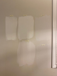
    Thanks and ideally I would get a rug first but I’ve been grappling with this for 2 wks and painter is coming Friday- here is a pic of paints I have sampled

  • 4 years ago

    From the pics, i see pink , yellow yellow, and purple understones in those

    Again, , maybe it is jsit how it looks in the pic, but that is what i see

  • 4 years ago

    Cloud cover looks yellow, white dove is a bit yellow, silver satin very light almost green tinge, classic grey green ugh, Lacey pearl purple for sure - so out of those white dove or silver satin seem the best options to me

  • 4 years ago

    Everdebz, I’m not sure what you mean- are you saying I’m likely to get that greenish colour with other light paints?

  • 4 years ago

    Thankyou for all those ideas Beth- I did try simply white and it did show a lot of yellow in my space- I may try balboa mist or pale oak they were on my list originally. Maybe I could paint the buffet smoke embers from your palette. Love the rug you found. Skylight is very pretty but it’s probably too dark. I appreciate all your suggestions.

  • 4 years ago

    What do you think of pearl river? Fairly light grey blue

  • 4 years ago

    i have bm grey wisp in my LR. its not a light color, but is a really pretty blue/ grey grey/ green - depending on time of day


    maybe try that?


  • 4 years ago
    last modified: 4 years ago

    jonesj - that is a great question! I think paint formulas are complicated what with different bases, etc. maybe with bit of grey or brown.... Just offered that I was disappointed with the green that faced west.

  • 4 years ago

    I struggled with a light beige/grey. Everything turned green or yellow (tons of trees and grass outside my windows). The one that finally worked was BM Fog Mist. Runner ups were BM Ballet White and BM Maritime White.

  • 4 years ago

    I painted quite a bit of my new build house in Wind's Breath and I'm also looking to repaint all of it. It turned really yellow in my house. I chose it because my parents have it in their house and it looks great there, like a nice gray-beige.

  • 4 years ago

    Oh my gosh Chispa- Thankyou for sharing- its so disappointing, the color looked so great on the sample. G8rfrog the Fogmist looks great- I’m not sure I could do that, but I think I do need more depth on the wall than the light paints I’ve been favoring- today I’m going to try Pewter, and balboa mist and look for a blue grey as well. I have 24 hrs left😵‍💫

  • 4 years ago

    I know this is last minute - I was out of touch yesterday, but this may still help you.


    Colors all have 3 elements - light, chroma and hue.

    Since Windsbreath was too green I selected the BM colors that have a lower hue (more yellow/orange than yellow/green.


    Organized in 4 groups:


    Similar light range

    more colorful (higher chroma)


    Similar Light Range

    Less colorful (Lower Chroma)


    1 step lighter

    Less colorful (Lower Chroma)


    1 step lighter

    More colorful (Higher Chroma)


  • 4 years ago

    Thankyou Jennifer- that’s very helpful- I can select from this list instead of all the grieges

  • PRO
    4 years ago
    last modified: 4 years ago

    Silver Satin is in the yellow hue family, so it's very possible that you will see it as too yellow just like the others.

    Since you don't want anything in the green/yellow hue family, try the low-chroma neutrals in the blue and blue/purple family. Gray Cloud (2126-60), Pelican Gray (1612), Early Frost (CSP-0590), White Water (2120-60), Whirlpool (1436), Heaven (2118-70), Cascade White (2127-70), Gray Sky (2131-70). All might work, but you need to test them in your room with your light.

  • 4 years ago

    @jonesj -


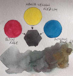
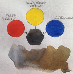
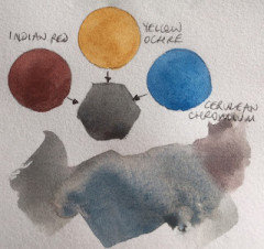
    You literally add purple to yellow to create gray

    Purple is Blue + Red

    Perfectly neutral gray is achieved when the yellow red and blue are seen equally.

    Lighting impacts how we see colors, so what may appear perfectly neutral in one space may seem more green/yellow/red/blue . . . in another space We are also influenced by colors that surround a color - our brains compare the two colors.


    In your case you seemed to like Wind's Breath, but it was a bit green in your space.


    We need to move warmer (or lower the hue) to get away from the green or we need to make it more colorful (less gray) to move away from the green.


    As you test a color - Edgecomb Gray, you noted that your husband felt it was too dark.

    Edgecomb gray will be less green, but it is darker, so you could test Fossil or Maritime White or Strand of Pearls and see if you like one of those, and you can eliminate anything that is closer to an L value (luminance or light) of 85 or 86 (Edgecomb) as too dark.


    Lacy turned purple - That happens when you get too much purple added to the yellow so you need to make the chroma higher than 2.5


    Classic Gray - still to green - I think that is also too low in Chroma for that hue.


    Reading through your evaluations of the colors I would guess that you are going to end up with something in the more colorful grouping.


    You do want to be careful how you are testing the colors. Painting them on WindsBreath is going to accentuate the difference. You want some white space between your current paint color and the new paint color.


    Sadly their isn't a straight line that is a breakpoint between the undertones, it is dependent on the lighting, surrounding colors and the combination of LC&H values.


    The numbers can help you get there, but you still have to test the colors in your space and decide what is making it not work or work in the space.


  • 4 years ago

    Have you tried Benjamin Moore seapearl? highly recommend Samplize for easy real paint samples.

  • PRO
    4 years ago

    Adding purple to yellow creates brown, not gray. Complements (purple/yellow, red/green, and blue/orange) are opposite on the color wheel and combining them results in various brown hues. Try it with some paints and you'll see.

    White and black added to a high chroma hue tones it down, but it doesn't change the hue. The more pure black and white you add, the more toned/neutral/gray it becomes. Adding more black than white will result in a darker gray and more white will result in a lighter gray. You can also try that with paints and see for yourself.

    We did such an exercise in a color class in design school, and seeing the paints mutate was fascinating.

  • 4 years ago
    last modified: 4 years ago

    @Diana Bier Interiors, LLC - I haven't taken any color theory classes, but I have heard this demonstration before. The teacher failed to explore different concentrations of the colors.

    I think you will agree that the mixing red and blue gives you purple.

    I will agree that adding purple to yellow will give you brown, but if you add more purple you will eventually get to a concentration that has equal parts red, blue and yellow and that gives you gray.


  • 4 years ago

    Well thanks everyone I chose bm calm- just under the wire. Really appreciate all comments.
    Beth H, I like some of the items you posted above, are these from Houzz?

  • PRO
    4 years ago

    I'll be so interested to see how you like your choice of "Calm"! Post photos!

  • 4 years ago

    Here’s the finished paint- calm! I do like it- no green tinge at all, sometimes light grey other times light yellow but very easy to live with- I should post this in design help needed. I want to purchase a new rug, new storage sideboard to replace the open shelving unit, then pillows and art to pull it together- and a couple of new lamps- I just have no time to shop- actually been looking for a rug for a few weeks and not found what I like-

  • PRO
    4 years ago

    Very nice--so happy for you!

    I might also consider curtain panels on the window. That is a lovely bay window that would look even nicer with panels to soften it.

  • 4 years ago

    The paint color looks great!


    And.....I love that chandelier, I love it so much, that I bought it for over my Kitchen table!

Sponsored
Mary Shipley Interiors
Average rating: 4.8 out of 5 stars34 Reviews
Columbus OH Premier Interior Designer 10x Best of Houzz