Software
Houzz Logo Print
webuser_624921883

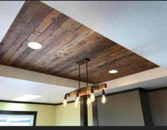
This bulkhead how to make it better?!

4 years ago

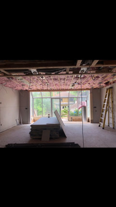
All these bulkhead is around my kichen

1 will be center of island and I will have pot lights 4 is going to be above my main kitchen wall and itd 20” deep i think maybe it would look better if i go with 15”deep upper cabinet instead of 12”? and put crownmoulding so they will be almost flushing with bulkhead?


my contractor said I could add more bulkhead here where marked and make less busy too would this be better?


i am planning to put crownmoulding and not sure what would look the best with which bulkhead …


Comments (26)

  • 4 years ago

    Too much asymmetrical soffit structure. It's too overwhelming.

  • 4 years ago

    yeah, I'd be tempted to lower the ceiling so it's all flat. you can always put more lights in the empty space, but this seems distracting and pointless as is.

  • 4 years ago

    i think my photo was zoomed too much in the photos?

    yes it is a bit busy but i dont think its too overwhelming?

    its open concept floor kitchen 16’ by 9’ and dining room 9’ by 9’ and family room 14‘ by 10’

  • 4 years ago

    unfortunately most of buldhead are there for reasons ( plumbing , hvac etc)

    i could only add more betwen 2 and 3 to create less busy look,. or completly make all flat on kitchen ceiling it will be 7” lowered in the center

  • 4 years ago

    I would close the 2 area and make it rectangular give it a design propose

    Yun Kim thanked User
  • 4 years ago
    last modified: 4 years ago

    Thank you @User

    how about this bulkhead its only 2” 1/2 and should I make the whole wall there same level? the problem is the rest of wall each side .. wont be leveled with this marked wall then


    or should I live with that bulkhead?

  • 4 years ago


  • 4 years ago
    last modified: 4 years ago


    look at the pink. can't you just close it and make it the same? I don't understand whay you have this weird inset portion in the ceiling.

    I also have a drop ceiling. (I wished I had taken it up 20 years ago when the cabs were made!) but see? all level


    or, remove that ceiling portion and raise it to what's surrounding it.

    back up and lets see this part of the kitchen.

  • 4 years ago

    @Beth H. : this is my main kitchen wall and yes those bulkhead because of hvac and drain unfortunately i am

    thinking maybe make square shape and put edge ligting? would it work?


  • 4 years ago

    I see that you have another “tray” ceiling right next to it? What is that??? Why? I wouldn’t add light to outline and draw attention to these tray areas in either room. If the best that can be done is to fill in the little bit that you ask about…do that. Make the trays into rectangles. They at least appear to have some symmetry, then.

  • 4 years ago

    @ptreckel the other side is not tray ceiling its just one side bulkhead straight all the way this is the view of left side

    you can see i am putting pot light on bulkhead that across kitchen to dining room on left side


    you mean make rectangular shape of bulkhead in center of my kitchen like my original plan


  • 4 years ago

    This is that project from before with the plumbing, HVAC and beam issues, correct? So those lower ceiling areas have to be there.


    I would just drop that irregular central area as Beth suggests.

    Yun Kim thanked palimpsest
  • 4 years ago

    Ok. I get it now. I agree. Just lower the ceiling in the kitchen area so that it is one, lower, height than the dining area and the rest of the room. Once it is painted, etc. it will be fine. Rather than having the bulkheads everywhere…

    Yun Kim thanked ptreckel
  • 4 years ago
    last modified: 4 years ago

    You may get exact layout advice for faux soffits if you post a current floor plan with soffits marked alongside the pictures and a kitchen cabinet plan. I tried warning you about these soffits a couple months ago - it all has to be visualized across the entire space.

    All I can say is hang in there Yun - you apparently were thrown right into the fire and I know it is overwhelming for you! The only advice I can say now is not to "shoot from the hip" - meaning, don't just be reactive to situations where you wind up taking 2 steps back for every step forward. Try and get ahead of conflicts and design issues to prevent as many as you can from happening.

    Edit: and a nice red or a fun bubble tea.

    Yun Kim thanked 3onthetree
  • 4 years ago

    level off the inset over the sink area. level it w/rest of ceiling. don't have the 'tray' in that one portion.


  • 4 years ago

    @Beth H. : so make all flat on ceiling like your photo beth? will do thank you so much for your input

    @3onthetree hi yes you remember me, oh you described my circumstances so well thanks for your encouragement, its my very first time reno for anything its a total gut out,...


    thank you so much i will talk to contractor to close the area to have no bulkhead on ceiling


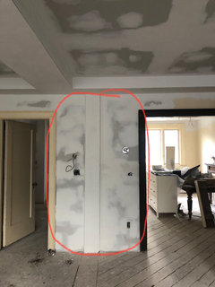
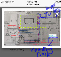
    how about my vertical small bulkhead area on Right side of kitchen between dining room?

    how can i make it look better?

  • 4 years ago


  • 4 years ago

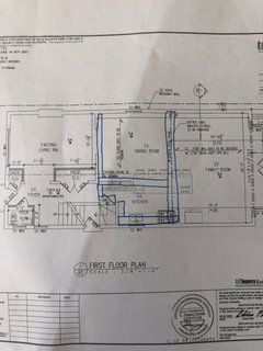
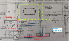
    @3onthetree this is my floor plan blue is where i marked all bulkhead


  • 4 years ago

    I don't see a very clean, uncluttered solution for the ceiling plane. The Kitchen will be very messy visually, expounded by open concept, because the hood/cabinets/soffits/walls/openings all have no relationship to each other. So at this point, just a bandaid to help.

    A couple things I notice marked in RED, there is an offset along the exterior wall that looks to happen at the refrigerator. I also marked the pilaster and the hallway opening looks cased (can't tell if you added a door there).

    It appears that your bottom of soffit is almost at 8'-0", with a main ceiling almost at 9'-0"? And the sink window has been raised up higher?

    I might consider lowering the entire Kitchen ceiling to lessen the visual clutter. Really. An important part of this is your furniture layout. What occurs in the space next to the refrigerator? How big is your Dining table? How is the Family room furniture placement?

    So hopefully this sketch reads:

    - RED is the walls

    - BLUE is the current soffits

    - GREEN would be the new faux soffits to hide the current soffits, by defining the island and refrigerator as part of the kitchen space. The Dining would get a matching soffit on the exterior wall to define that space (essentially creating a tray ceiling)


    As far as the pilaster, if you will have furniture there or wall deco, then it would be better to widen the pilaster. If nothing goes there, you could leave it as is too.


  • 4 years ago

    dry wall over the odd recessed area. thats all.

  • 4 years ago

    Then you have a hanging island seat and a fridge off the field of play.

  • 4 years ago

    @3onthetree

    yes actually on where I marked in purple we have high velocity ac outlet so cant be covered in family room area

    i have not bought dining table yet or any furniture really yet


    there will be built in tv unit on north wall and next to fridge I added another 18” pantry cabniet which leaves now about 7’ space will be reading nook with shleves


    does it look ok if i just close that kitcheb area on ceiling how beth suggested?


  • 4 years ago

    Oh yes and left side next to pilaster I have door is it odd?


  • 4 years ago

    Off set in fridge area has been already addressed we are levelled

  • 4 years ago

    Adding the door in the Hallway I guess blocks view into the Kitchen from the front door, so ok?

    The soffit filled in inside the Kitchen is a start. I was going beyond that to include the island and refrigerator into the Kitchen. However, the length of island might conflict with any seating at the tv area, you might want to layout some generic furniture in there.