Software
Houzz Logo Print
pamrnj

SW paint colors

last year

I’ve narrowed down to three cream colors but can’t find a whole lot of reviews on them. Can anyone compare/contrast these three paints:
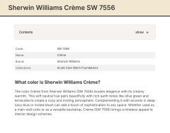
Crème
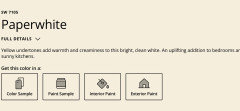
Paper white
Medici Ivory

Thanks so much!

Comments (12)

  • last year

    I painted our laundry room a bright white. Because of the trees outside, the walls looked green. I wish everyone would stop picking paint by the cute names the paint companies spend so much time and money selecting using evocative words. Your room will be different than a room in a different setting. It will look different than a house located two hundred miles south of yours or north of yours. Go get samples and check the color on each of the four walls in the room and at different times of the day. My previous house had one wall color of paint on all the walls. However, based on the furnishings, window treatments, time of day, lamplight, and trim colors, the rooms were different.

  • last year

    All of that goes without saying- i am not remotely considering the names ( and frankly found it quite insulting for you to suggest that). I tried researching the colors and haven’t found much. Was wondering about their undertones etc. not relating to my setting but how they compare to each other.

  • last year

    Eld6161- i have the 8x8 samples that you stick on the wall and have moved them about the room at different times of the day. I like all three at different places in the room at different times of the day.
    Paperwhite seems whiter than the others- but was curious what others read them to be, relative to each other.
    We’re having it professionally painted and i dont want to screw up.

  • last year

    Sorry if you thought that was insulting but so often posters here are only concerned with the names.

  • last year
    last modified: last year

    Pam, now you got me going down the rabbit hole😀!


    All paints will change throughout the day. They will also look different on different walls!

    The idea is to like the subtle changes no matter how or why.

    I have a custom gray paint in a bathroom. In the evening the amethyst tones come out. At first I was upset, but then I started to like it.

    Color changes are more crucial of course in your common areas.

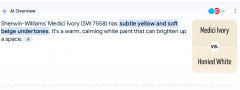
    All your choices have yellow undertones.

    Out of the three, I prefer the Medici because there is also beige in it.

    Other paint to consider. I love BM Manchester Tan. I have it in my living room now as well in other places. ( My daughter’s as well as rental properties)

    This paint looks good in all exposures.

    Years back, BM Montoe Bisque was popular.

    For painting a large space, I personally like to go with popular, best selling designer choices. I'm not a decorator for sure, but I do know what I am drawn to.

    There is a reason why certain paints work for the masses.

    Have you looked at videos by Kylie Interiors? There are others as well that explain everything about color, undertone, exposure etc.

    I would be open to moving on to other colors. You need to like the color all through day and night.

  • last year
    last modified: last year

    If interested in other shades, try looking up on Pinterest as oftentimes you can find their particulars. Not sure how helpful the info below will be though when already having compared the three in your room. Suggest eliminating your least favorite and get sample pots of the other 2 as painting larger areas will help much better than 8x8 samples.

    https://housekeepingbay.com/creme-sw-7556-by-sherwin-williams

    https://housekeepingbay.com/paperwhite-sw-7105-by-sherwin-williams

    https://housekeepingbay.com/medici-ivory-sw-7558-by-sherwin-williams

  • last year

    Whites and off-whites are hard. Take your samples outside mid-afternoon and hold them next to each other -- the undertones will become apparent. This is important if you're trying to stay away from a particular undertone, it doesn't always reveal itself until you've got the wall painted.


    I like Medici Ivory but sampling didn't look quite right in my house. I don't remember why, though.

  • last year

    Thank you- ill do that.
    So, i assume you didnt use Medici Ivory- what did you wind up using?

  • last year

    I ended up going an entirely different direction in my kitchen and painted it in BM High Park.

    In another part of the house and in my home office I used BM Moonlight White. It is one step down from the famed Simply White on that paint strip. Simply White was too stark in my house, but the Moonlight White is perfect. It's a warm white and has a very slight tinge of silvery-green it in, which looks beautiful with my wood floors, it doesn't read yellow-tinged (which many off-whites in my house do).

    Another BM off-white I like is Acadia White. It has more yellow in it than the Moonlight White but isn't too yellow-ish. I may use that in the kitchen when (if) I repaint in there, IDK. (I hate the High Park, I really screwed that up, but DH loves it and I do get compliments on it, so really it's just me who doesn't like it...but I'm the one who has to look at it the most...so there's that)

  • PRO
    last year

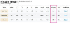
    Can anyone compare/contrast these three paints:


    The only way to to do this is comparing by LCh (Lightness, Chroma, hue angle) and/or Munsell Hue Family, Value, Chroma.


    I wouldn't waste time considering LRV. Because LRV just tells you how much light a color reflects; it's a measurement, a quantity, not a descriptive color attribute.


    I put them in order by Munsell Chroma least to most. They all sit very close in the same hue family pocket and vary slightly in terms of Value which is how light/dark they look.


  • last year

    Thank you so much for taking the time to put that together. Very kind!