Software
Houzz Logo Print
mxk3

Opinions on painting placement, please

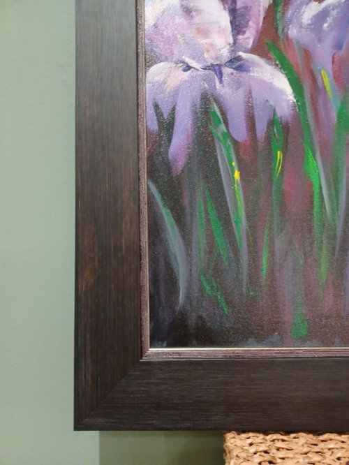
I picked up my painting from the framer today. I'm glad I trusted my instincts and went with a thicker frame. It doesn't capture well in the photos from a distance, but there are stacked frames, there's a hint of metallic on the inside purple frame -- here's a close-up:


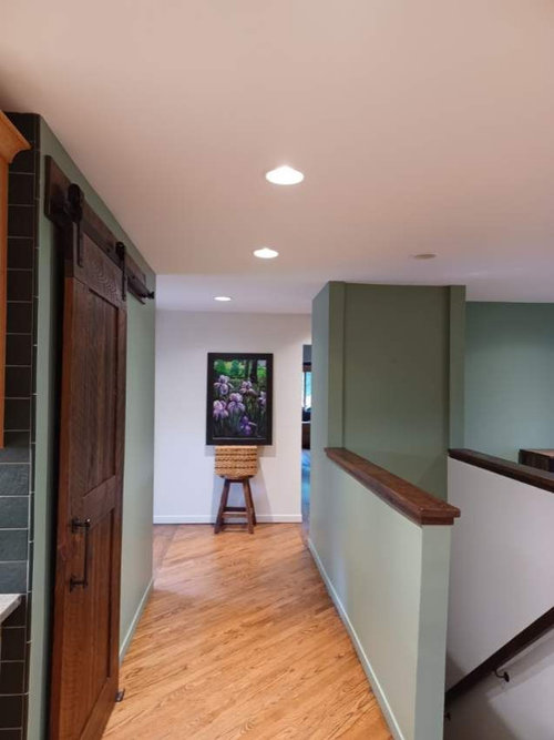
Anyway, now that's it's home I'm second-guessing placement. I bought it for this big blank wall at the end of the hallway, but even after beefing it up with a thick frame, I'm hesitant because it still seems not quite big enough. Here is it propped up at about the height I'd hang it:


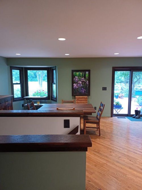
Then I realized it might look good on this kitchen wall. What I like here is the frame compliments the window trim and the heftiness of the kitchen/table buffet, but then again it might not be quite right here, either.


Thoughts?


Comments (24)

  • last year

    I like it better in the kitchen/buffet area.

  • last year
    last modified: last year

    As you have it in the kitchen, the first thing I noticed is it is not centered on the wall. What is the little square...wall switch? Paint it the wall color.

    I don't like the stool and basket at all with the painting, regardless of where it is hung.

    You have to add something in the kitchen to bring in the iris color.


    Again, if you want to hang it at the far wall, you have to bring in some purple (but not the stool and the basket). A runner, and something lower to the floor, under the painting.


  • PRO
    last year

    The picture seems too small to me on it's own or it needs to be grounded with a narrow console. Of course I have no idea of the width of that hallway at the end nor where it leads to.


  • last year
    last modified: last year

    "I don't like the stool and basket at all with the painting, regardless of where it is hung."

    It's on a stool, propped up with a basket to get it at about the height I'd hang it -- the stool and baskets are not decorative items, here.

    "The picture seems too small to me on it's own or it needs to be grounded with a narrow console. Of course I have no idea of the width of that hallway at the end nor where it leads to."

    Can't. Painting needs to fly solo. There are back-to-back 90-degree turns there to continue down the hallway to the bathroom and bedrooms, can't put anything that impede the walkway. There was a previous suggestion for a wall-mounted console beneath the picture, but I'd be concerned about constantly bumping into it because of the footpath the two turns cause. Which is why I think a really big painting might be the better way to go, here.


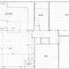
    ETA: Here's a pic of what I mean. Because of the back-to-back turns, you tend to go through the area on the diagonal. The turns are caused by the staircase bulkhead, so it's not a simple just-remove-the-wall problem. The architect who designed this should have his license revoked...


  • last year

    Suggestion, then move the stool and basket, as both look like decorative items to viewers.


    Okay, school of hard knocks. You mention that you had a professional framer. Suggesting the pro gave you the wrong advice. Now, this is my opinion, it is not a challenge to you or the framer. The frame is too dark and too heavy. To make it larger, a matte (for oils, often a fabric) would let the irises show their beauty. Now they are squished in by the heavy frame.

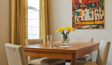
    Let's say you chose a lighter of the purples for the matte and a lighter frame...this idea:


    The matte, the frame, draw your eye into the art.

  • PRO
    last year

    So perhaps your solution is to hang the picture in the kitchen as shown as it seems to fit nicely there, and find another painting your love in a much larger format for the hallway.

  • last year
    last modified: last year

    It looks great alone at the end of the hall. Centered at eye level.

    If you feel like you need something in the kitchen, add a small sideboard and style it.


  • last year

    I like it better on the lighter color wall, but I think it could be a bit lower. I understand this is just "propped up" and not exact and I think that was pretty evident.

  • PRO
    last year

    I think the art needs a lighter wall and I"m wondering if your kitchen isn't too green????


  • last year

    "...and I"m wondering if your kitchen isn't too green????"


    Oh, my kitchen is definitely too green. And the wrong shade of green, to boot. But it is what it is....for now. :0)

  • last year

    I think it works well at the end of the hallway (lighter wall color). I don't feel the space needs to be embellished with anything else, let the art stand on its own. But to balance it out, consider adding an art light above. Example below I tried to center it more on the wall. Art light (battery operated found on Amazon) would be same finish as door hardware there in the hall.


  • last year

    I was also going to suggest an art light above it as I like it at the end of the hall.

  • last year

    In my opinion, the painting looks great in the hallway, but it should be centered not relative to the center of the hallway, but relative to the lamp. And you can add backlighting (laconic form, black metal).


    As an option, you can add a white backing about 1 cm thick under the painting. I would even consider an option with ultra-white gloss.


  • last year
    last modified: last year

    I love that you went with a decorative frame made specifically for that painting. I like it in both spaces. So, I am no help, but, yay for the purple frame with a touch of glimmer.

  • last year

    Excellent framing- it's very dramatic and shows off the purple iris colors.

  • PRO
    last year

    I find if I do not want to add something below a piece i hang it just a bit lower than I would with anything under it so really the center at eye lel . I like it in theehallways but IMo it needs to be hung to center on the hall so visually it centers on the hall in front of it. I am sorry but the frame for me is heavy but if you love it that really is all that counts

  • last year

    I like it between the doors. In that space you may want to put a small cabinet for serving items. Make sure to keep it at eye level, like they do in museums. People need to be able to look at it.

  • last year

    Beautiful art!


    I am going to be the odd man out. I actually love it in the kitchen and would pick something softer for the entry.


    When I look at the two placements it feels more natural with the green walls and the large windows. In the hallway it is so dark and so vivid that it doesn't feel at home.


    I would want something with a frame that matched the woodwork in the hallway and pulled in the same green as the walls but didn't overwhelm the space. (Just grabbed something from the internet with the general feeling, not the perfect piece of art.)


  • last year

    Thank you, all, for the input and additional suggestions.

  • last year

    I like your original placement on the lighter wall. It brings some of the wood tones and the green down into that part of the room.

    Not sure why anyone would think the basket and stool are anything but acting as an easel to hold it up!


  • PRO
    last year

    Love the Iris art. The framing i like because it harkens to woodsy outdoor feeling. I like it in the kitchen. The shape and darker framing repeats the general framing of the doors and windows. Nice look. It’s the break the green wall needs. I would leave wall color because it unites your spaces. But the art is the main feature and it’s beautiful!

  • last year
    last modified: last year

    I like it in the hall and centered on the wall at eye level. Like the framing you chose.

  • last year

    It looks best on the white wall. It really makes the painting stand out and the colors more vibrant. On your green kitchen wall, the purples become abysmal. Additionally, in the kitchen you have the quesiton of centering it between the corner and the left side of the switch plate or the corner and the slider. Neither will look completely right. In the hall, the painting just looks like it belongs where it was hung.

  • last year

    I love the view down the hall. Beautiful artwork and frame!