Software
Houzz Logo Print
peggy_kline67

Help!Cambria Kendal or Cambria Clifton

last month

I’m on a deadline and am having a hard time deciding countertop.
A Lake house in need of much
TLC we have worked on for 5 years. Now it’s time for the kitchen and we want to get it right!
New Cabinets- Shaker White
Floor- light wood Hickory laminate
Open Floor plan- mainly navy
Style furniture
Entryway you see Kitchen Island

The two options I’m considering are:
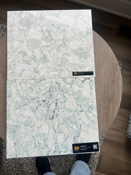
Cambria Clifton- ( Top in photo)muted tones of a sage green, white, taupe. Little contrast with white cabinets, soft, safe
Cambria Kendal- ( Bottom in photo)a white background with a soft, lighter teal pattern and a very thin black veining randomly placed. It is pretty, but a commitment to more color on the counter. A little bolder counter choice. Not sure the feel it will give. Has anyone used this? Any feedback and opinions really appreciated!

Comments (8)

  • last month

    I wish theyd had these colors when I did my kitchen. I like them both but I love the top one.

  • last month

    Have you viewed the whole slabs in person with one of your sample cabinet doors and a sample piece of your flooring? I think it will help others (and you) to see all the sample pieces together.

    Will your new kitchen have any corners where you will want to make sure that veining lines up? (That could affect how many slabs you need to buy.)

    Hickory floors can be very busy, so that might be a consideration if you're looking for a countertop with veining or pattern.

  • PRO
    last month

    I cannot imagine either with hickory floor and is that the flooring in the whole house ? Those counters are IMO very busy and not what I would consider timeless for sure. But I aslo really dislike fake stone always.Maybe post another pic of the cabinet , counter choices and floor all in one shot .

  • last month

    Of these, the top one.

  • last month

    of the two options shown, the top, more subtle option with such a bold flooring choice and dark navy furnishings..

    Too many contrasts end up making the home look cluttered before you've even moved your things in.

  • last month

    Are those your hickory floors in the background of your photo of the countertop samples? If yes, the variation seems to have been softened quite a bit. When I read @Patricia Colwell Consulting 's comment, I immediately thought of the hickory floors I've seen - and they are super busy/bossy = I would go with a plain countertop. However, if the floors in the background are your hickory floors - they seems more toned down/evened out due to the color (maybe stain was used?)


    I am getting ready to update my lake house kitchen also. While I see how the bottom sample would look nice with the navy colors that you've used in the rest of your open layout house, I think that I would use the first sample. The first sample will look nice with navy as an accent color without having actual navy in the countertop.


    I have a Q - when will you renovate the kitchen in your lake house again? I assume that it won't be for awhile. My mom asked me that same question about my primary residence when I was building a home many years ago - she thought that the countertop + backsplash that I had selected was too trendy (they were). While she liked how it looked now, she asked me what I would do when it wasn't still "in" style? I told her that I would just have the countertop and backsplash replaced - but that was my primary residence - and I was 28 and thought I knew more. 😆


    I am being fairly conservative with my lake house kitchen - I don't plan on renovating it again for MANY years - if ever. My plan is to select a "boring" countertop - that way I won't want to change it whenever warm colors are out again and cooler tones come back into style.


    Then again, it's a lake house - and if you love both of your two options, I'd go with number one.

  • last month
    last modified: last month

    We just finished a lake house - i am a fan of super simple so i’d probably go just plain white (it ages well)

    fwiw we went with white quartz perimeter and a black walnut island counter

  • last month
    last modified: last month

    If I were preparing food on and cleaning those counters, I would find them too busy for visual comfort (not the light-fixture brand, just my comfort). I'd feel distracted while cutting, and I'd never be sure my counters were clean. If you don't react to busy-ness as I do, then this is non-issue for you.


    They sure are pretty, though! I can see why you're attracted to them.

Sponsored
Moda Kitchen and Bath
Average rating: 5 out of 5 stars50 Reviews
Fairfax County's Custom Kitchen & Bath Designs for Everyday Living