

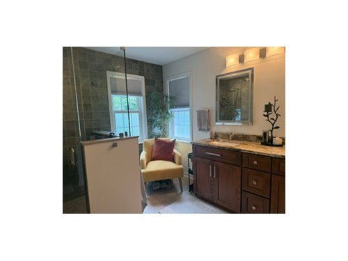
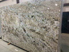
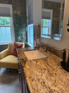
Need color help!
4 months ago
Featured Answer
Sort by:Oldest
Comments (11)
 4 months ago
Related Professionals
Louisville Bathroom Remodelers · Aberdeen Bathroom Remodelers · Decatur Kitchen & Bathroom Designers · Knoxville Interior Designers & Decorators · Jacksonville Kitchen & Bathroom Designers · Bangor Kitchen & Bathroom Designers · Odessa Furniture & Accessories · Charleston Interior Designers & Decorators · Plattsburgh Interior Designers & Decorators · Marietta Architects & Building Designers · Waterbury Architects & Building Designers · Gulfport Kitchen & Bathroom Designers · Pittsburgh Kitchen & Bathroom Designers · Aberdeen Kitchen & Bathroom Designers · Spanish Fork Kitchen & Bathroom Designers 4 months ago
- 3 months ago
- 3 months ago
- 3 months ago
 3 months agolast modified: 3 months ago
- 3 months ago



Related Stories

MOST POPULAR9 Real Ways You Can Help After a House Fire
Suggestions from someone who lost her home to fire — and experienced the staggering generosity of community
Full Story
DISASTER PREP & RECOVERYHurricane Harvey: How You Can Help
Want to donate or volunteer to aid victims of the storm? Here are groups assisting with disaster relief and recovery
Full Story
DECLUTTERINGDownsizing Help: How to Edit Your Belongings
Learn what to take and what to toss if you're moving to a smaller home
Full Story
COLORPick-a-Paint Help: How to Quit Procrastinating on Color Choice
If you're up to your ears in paint chips but no further to pinning down a hue, our new 3-part series is for you
Full Story
LIFEDecluttering — How to Get the Help You Need
Don't worry if you can't shed stuff and organize alone; help is at your disposal
Full Story
ORGANIZINGGet the Organizing Help You Need (Finally!)
Imagine having your closet whipped into shape by someone else. That’s the power of working with a pro
Full Story
PETSHow to Help Your Dog Be a Good Neighbor
Good fences certainly help, but be sure to introduce your pup to the neighbors and check in from time to time
Full Story
SELLING YOUR HOUSEHelp for Selling Your Home Faster — and Maybe for More
Prep your home properly before you put it on the market. Learn what tasks are worth the money and the best pros for the jobs
Full Story
MOST POPULAR7 Ways to Design Your Kitchen to Help You Lose Weight
In his new book, Slim by Design, eating-behavior expert Brian Wansink shows us how to get our kitchens working better
Full Story
EXTERIORSHelp! What Color Should I Paint My House Exterior?
Real homeowners get real help in choosing paint palettes. Bonus: 3 tips for everyone on picking exterior colors
Full Story



Emily