Software
Houzz Logo Print
dunowen

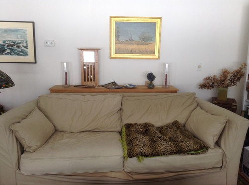
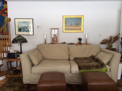
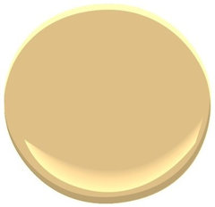
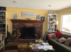
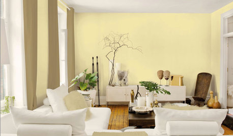
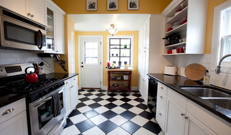
I want to paint our living room a rich yellow gold.

12 years ago
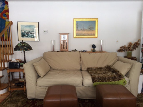
We get a lot of north-east light from picture window wall opposite sofa. Trying to decide between BM Stuart gold, Marblehead or concord Ivory. Weigh in, please or throw me a curve.

Comments (81)

  • 12 years ago
    This wall is crowded. You already have another good looking sofa in this room maybe this one can go. How about re thinking furniture arrangement.
    Cass Collins thanked Kathleen Jamison
  • 12 years ago
    On the computer sketch up, paint the ceiling also. Maybe a shade a little lighter in the same yellow.
    Cass Collins thanked pcmom1
  • 12 years ago
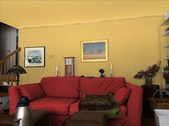
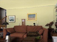
    I wrestled with color all weekend on the BM site and with your help, Houzzers, realized I need to change that sofa color. I won't be able to change the sofa, but since it is slipcovered I can change the cover. I tried a green wall color (not really what I envisioned but nice) with a darker sofa color and a Stuart gold wall with a red sofa. See what you think.
  • 12 years ago
    The green is Castleton mist, btw.
  • PRO
    12 years ago
    I like both the red and brown sofa and wall colors. Are those colors in some other elements in the room? In pillows or rug? or adjacent rooms? I like the red sofa for a bold statement. Two different feelings for a room. Bold/dramatic or soft/subdued.
  • 12 years ago
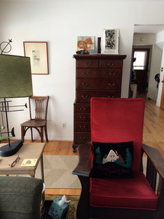
    LB, I have a red upholstered Mission chair in this room and several Kilim pillows with red and tan and a red paisley throw on the green sofa. The rug has gold, green and red.
  • 12 years ago
    Here are the photos
  • 12 years ago
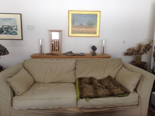
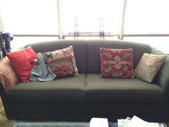
    and the sofa
  • PRO
    12 years ago
    I like the furniture as is and the pillows. Paint the wall a golden color you love or a carmel toffee color.
    Cass Collins thanked LB Interiors
  • 12 years ago
    I like the link LB Interiors posted of the room done in Stuart gold. The room looks nice IMO because of the contrast with the white woodwork and sofa. Can you slip cover the sofa in a light cream color?
    Cass Collins thanked rosiegabby
  • 12 years ago
    rosiegabby, I tried this on the app but the sofa is tooooo big to be any lighter.
  • 12 years ago
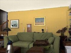
    Here is the Stuart gold with a green sofa.
  • PRO
    12 years ago
    Not so fond of the green sofa : )
  • 12 years ago
    I absolutely love yellow rooms and think the red cover really goes well and resolves the problem with the tan sofa. I also liked the two tone wall on your stairway.

    My current favorite picture in houzz is

    http://houzz.com/photos/614404

    With warm yellow walls and a grey sofa - another option for your slip cover.

    My question - what is bm room designer and where do I get it?
  • 12 years ago
    BM design refers to the Benjamin Moore color designer app. Just Google Benjamin Moore and go to color designer.
  • PRO
    12 years ago
    Well i appreciate your Stuart Gold paint choice, which is giving no doubt giving extra zeal to the walls, but the hanging piece of art is not going too good with the wall color, for which i would advise to shift that picture to another room & put another piece of art with darker frame shade.
  • 12 years ago
    What about doing the fireplace wall gold and the other walls another neutral color. I think you'd tire of the color all over and it does not go great with beige.
    Cass Collins thanked rosiegabby
  • PRO
    12 years ago
    I agree with rosiegabby.
    Cass Collins thanked LB Interiors
  • 12 years ago
    Take a look at the painting over the sofa. It has a soft gold and blue/gray that look beautiful together and also work with the sofa. Maybe some of the decorators here could recommend paint colors for a gold accent wall and a blue/gray for the other walls.
  • 12 years ago
    I think the mistake that too many people make, including myself, is getting too focused on a specific item whether that's a fabric, color, furniture etc. rather than trying to achieve the effect that is so appealing in your particular environment.
  • PRO
    12 years ago
    last modified: 12 years ago
    Have you chosen a color?
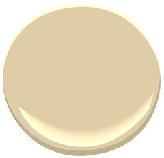
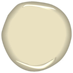
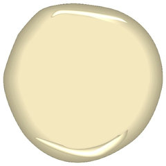
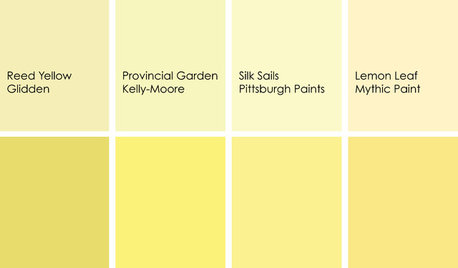
    A more subdued yellow? and other options
    Chestertown Buff HC-9 Paint · More Info

    Golden Straw 2152-50 Paint · More Info

    Monroe Bisque HC-26 Paint · More Info

    Blonde SW6128 Paint · More Info

    Benjamin Moore Ben Paint, Cork · More Info
  • 12 years ago
    Sherwin Williams Blonde is a very rich color. You really ought to consider it. I think it would probably get you the effect you want.
    Cass Collins thanked rosiegabby
  • 12 years ago
    BM Cork
  • 12 years ago
    IMO works better than the Stuart gold
  • PRO
    12 years ago
    I like the Cork better than Stuart Gold.
  • 12 years ago
    Would you (rosiegabby and LBInteriors especially ) consider BM Guilford green a neutral for the sofa and staircase walls, with Stuart gold on the fireplace wall?
  • PRO
    12 years ago
    last modified: 12 years ago
    I like BM Guilford green. I think Stuart Gold is too much of a harsh accent color with the green. Stuart gold is a strong color that I think I would use sparingly. MO
  • 12 years ago
    Thanks LB. I'm still working on it.
  • 12 years ago
    Go for the Stuart Gold. I live in a house with bold colors and we love our rooms. Art gets changed around until it finds a good spot.
  • 12 years ago
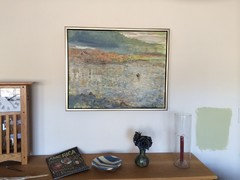
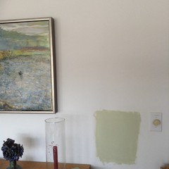
    Ok, I have done a complete turn-around on the deep gold idea for this room. I painted some swatches and left them there over the weekend and anything gold that looks good at night looks gaudy during the day. So I'm going to green. A light green with either a dark green or caramel on the fireplace wall. Please weigh in. I also changed the art on the sofa wall. Thank you!
  • PRO
    12 years ago
    last modified: 12 years ago
    I love the green paint. also the #2 pic , not the gray/green color. The yellow above mantle is a good color too.
  • 12 years ago
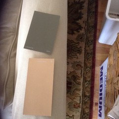
    If anybody is listening, today is D-Day. The painter has finished the dining room, a bedroom, the basement, and has primed the living room. He is coming in tomorrow morning and will want a color decision. I have gone back to the yellow-gold but much lighter. I started looking at the LRV factors of the colors I liked and most of them were way too low on the scale of 1-100. I'm also leaning more toward the neutral but on the brown, not gray end of the spectrum. This is Powell Buff, a BM color. Still a little too dark, I think.
  • 12 years ago
    last modified: 12 years ago
    Other contenders are Birmingham Cream
  • 12 years ago
    I'm having trouble with the color links...
  • 12 years ago
    and two Martha Stewart colors, Macadamia....
  • PRO
    12 years ago
    last modified: 12 years ago
    BM Powell Bluff
    Powell Buff HC-35 Paint · More Info

    I can't find Birmingham Cream. Who makes it?
  • PRO
    12 years ago
    I like Powell Bluff. If you think lighter is better, you can't go wrong.
  • 12 years ago
    Have you ever used Farrow & Ball paint? I found a color, Matchstick, on their site that I love. It was featured in a story in This Old House this month. But the nearest retailer is 57 miles away....
  • 12 years ago
    Matchstick
  • PRO
    12 years ago
    That is pretty, but I think you can find something in BM or SW that you'll like or is close.
  • PRO
    12 years ago
    last modified: 12 years ago
    Here's a few
    Close
    butter cookie CSP-995 · More Info

    SW6119 Antique White by Sherwin-Williams · More Info

    SW2833 Roycroft Vellum by Sherwin-Williams · More Info

    Mannequin Cream 2152-60 Benjamin Moore · More Info


    A little darker
    melted butter CSP-905 · More Info
  • 12 years ago
    Thank you so much. I was going to spend hours on the road today to get the Matchstick but the nearest store doesn't keep F&B in stock so I'm back to what's available locally. I love the way Powell Buff looks on my computer but on the wall it is way too dark. I like the Roycroft Vellum by SW. Now it all depends on the Home Depot paint computer.
  • PRO
    12 years ago
    When shopping, use the Powell Buff chip and try to find a lighter hue.
  • 12 years ago
    last modified: 12 years ago
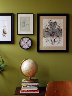
    I on the other hand would go with this
    VisuaLingual home/HQ · More Info

    Orinda Family Fun Room · More Info
  • 12 years ago
    Genevieve, my late mother's favorite color was avocado!
  • 12 years ago
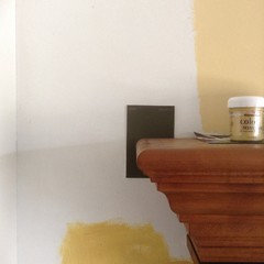
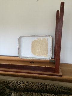
    I have to laugh at myself when I look back to February (!) at all the changes I went through about this wall color! So this morning, after waking up at 6 am to see if the paint store halfway across the state had the paint I wanted (no, they don't keep it in stock, only order it) I called a small local paint retailer I have dealt with before who stocks Benjamin Moore and asked if he could replicate a Farrow & Ball color. He could. I put my blinders on and drove straight over the hills and valleys, got the paint ($65/gal) and drove home. Didn't even stop at the bagel shop. My painter was there with a gallon of Behr from Home Depot (I had tried to call him to head him off but our cell phones don't work so well around here) in Navajo white- the default choice after all this. He is using the F&B Matchstick color in Aura and I'm really liking how it looks. Have to go to a rehearsal now. The true test is how it looks at night in incandescent and warm led light. I'll let you all know.
  • PRO
    12 years ago
    Wow, good for you. I think you will be happy with F&B because Navajo white will not have the interest or pizzazz that any other very neutral color would have in your room.
  • 8 years ago

    Any pictures of the final paint job ?

  • 8 years ago
    Wow, I really dropped the ball on this post! I went with the Matchstick and we love it.
  • PRO
    8 years ago

    Looks so nice! It's soft but still shows some warmth.