
Search results for "Hanging kitchen storage" in Home Design Ideas
 House of L
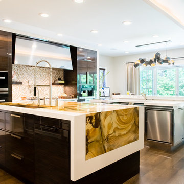
A traditional Georgian home receives an incredible transformation with an addition to expand the originally compact kitchen and create a pathway into the family room and dining area, opening the flow of the spaces that allow for fluid movement from each living space for the young family of four. Taking the lead from the client's desire to have a contemporary and edgier feel to their home's very classic facade, House of L worked with the architect's addition to the existing kitchen to design a kitchen that was incredibly functional and gorgeously dramatic, beckoning people to grab a barstool and hang out. Glossy macassar ebony wood is complimented with lacquered white cabinets for an amazing study in contrast. An oversized brushed nickel hood with polished nickel banding makes a presence on the feature wall of the kitchen. Brushed and polished nickel details are peppered in the landscape of this room, including the cabinets in the second island, a storage cabinet and automated hopper doors by Hafele on the refrigeration wall and all of the cabinet hardware, supplied and custom sized by Rajack. White quartz countertops by Hanstone in the Bianco Canvas colorway float on all the perimeter cabinets and the secondary island and creates a floating frame for the Palomino Quartzite that is a highlight in the kitchen and lends an organic feel to the clean lines of the millwork. The backsplash area behind the rangetop is a brick patterned mosaic blend of stone and glass, while surrounding walls have a layered sandstone tile that lend an incredible texture to the room. The light fixture hanging above the second island is by Wells Long and features faceted metal polygons with an amber gold interior. Woven linen drapes at window winks at the warmer tones in the room with a lustrous sheen that catches the natural light filtering in. The rift and sawn cut white oak floors are 8" planks that were fitted and finished on site to match the existing floor in the family and dining rooms. The clients were very clear on the appliances they needed the kitchen to accommodate. In addition to the vast expanses of wall space that were gained with the kitchen addition the larger footprint allowed for two sizeable islands and a host of cooking amenities, including a 48" rangetop, two double ovens, a warming drawer, and a built-in coffee maker by Miele and a 36" Refrigerator and Freezer and a beverage drawer by Subzero. A fabulous stainless steel Kallista sink by Mick De Giulio's series for the company is fitted in the first island which serves as a prep area, flanked by an Asko dishwasher to the right. A Dorenbracht faucet is a strong compliment to the scale of the sink. A smaller Kallista stainless sink is centered in the second island which has a secondary burner by Miele for overflow cooking.
Jason Miller, Pixelate
 Design Studio West
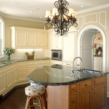
Committing to a kosher kitchen is quite a daunting undertaking and when you are also taking on a complete remodel, it can be overwhelming. It does not, however, have to be insurmountable. There are many resources to help guide you through the experience. Check out the internet and magazines to guide you. Once you have done the initial research, contact your Rabi with questions and for clarification on a kosher kitchen. Kosher requirements can vary differently between Orthodox, Conservatism, Ultra Orthodox and Reform Judaism. Your Rabi most likely will have a list of rules and guidelines. Also, hire a professional kitchen designer. They will not only be able to design the needs of a kosher kitchen but also make it personal to your needs and beautiful too.
If the space and the budget allow, two distinct kitchens within one space is a possibility. A kosher kitchen requires stringent separation of meat and dairy items. Depending on the sect of Judaism you practice ------
Storage:
The Storage areas need space for two sets of dishes, pots and pans, flatware, cups and utensils. You can combine the storage areas as long as there is a separation and that you do not mix service ware. A good recommendation is to color code your plates, flatware, table linen, pots. For example, red plates, gold-colored flatware, copper pots for meat items while dairy items have white plates, stainless flatware, stainless pots. You may want to label each area so when you have your new sister-in-law help in the kitchen; everything stays in the correct place.
Appliances:
When selecting appliances look for the STAR-K logo. This will help you determine to what extent an appliance is Kosher. Some ovens will have Sabbath modes where they will turn on automatically at a predetermined time. Once the oven is open, the oven turns off. Some refrigerators also have Sabbath modes where the ice maker turns off on the Sabbath and back on the following day. One refrigerator is usually sufficient provided all foods stay on the proper container in the proper section of the refrigerator. Having an immaculately clean refrigerator is a must if this is the case. You do not want spills from one food source contaminating food from the other. If you decide on two refrigerators, one can be full size while the other is smaller. A good kitchen designer can help assess your family’s needs to determine which is best for you.
Dishwashers cannot be Kosher in most cases. You either need two dishwashers, separate compartment dishwashers as in dishwasher drawers or wash by hand. Look at Fisher Pikel or Kitchen Aid for dishwasher drawers. Each drawer is on separate controls. You can dedicate the top drawer for dairy while the bottom drawer is for meat service ware.
If you have space and decide to have two dishwashers, you can get two 24” wide dishwashers. Another option is to have one full size dishwasher and supplement it with a small 18” wide dishwasher. Miele makes an 18” wide dishwasher that is super quiet and cleans dishes very well. You may also opt for a single dishwasher drawer in addition to a full sized dishwasher.
A single Microwave oven can be used for milk and meat provided that a complete cover is used around the food. You will also need separate plastic plate’s places on the bottom or glass turn table. Keeping the unit clean is very important.
Counter tops:
Counter tops may or may not be able to be koshered depending on your sect. Simply having sets of trivets for dairy, meat and pareve (not meat or dairy) will provide adequate separation of foods.
Sinks:
If you can’t have two separate sinks, include three separate tubs to be places in the sink. Color code the tubs for meat, dairy and pareve. If you have one sink or a single divided sink, you will need to be cautious about splashing, to keep the meat and dairy particulates apart. You will also need space for separate dish cloths or sponges and dish towels. Again, color coding is extremely helpful and highly suggested.
Must Haves:
~Storage space for two sets of dishes, flatware, pans bowls
~Color Code and label where appropriate
~Separate burners dedicate for either meat or dairy
~Separate clean up areas
~Clean environment to avoid contamination between meat and dairy
~A space that functions for how you cook
~A space that reflects you
Design and remodel by Design Studio West
Brady Architectural Photography

 Connecticut Stone
Photo Credit: Neil Landino,
Counter Top: Connecticut Stone Calacatta Gold Honed Marble,
Kitchen Sink: 39" Wide Risinger Double Bowl Fireclay,
Paint Color: Benjamin Moore Arctic Gray 1577,
Trim Color: Benjamin Moore White Dove,
Kitchen Faucet: Perrin and Rowe Bridge Kitchen Faucet
VIDEO BLOG, EPISODE 2 – FINDING THE PERFECT STONE
Watch this happy client’s testimonial on how Connecticut Stone transformed her existing kitchen into a bright, beautiful and functional space.Featuring Calacatta Gold Marble and Carrara Marble.
Video Link: https://youtu.be/hwbWNMFrAV0
Find the right local pro for your project
 Glickman Design Build
Photo Credit: © John Cole Photography
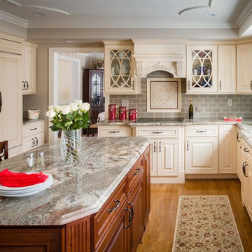
Inspiration for a timeless u-shaped medium tone wood floor kitchen remodel in DC Metro with an island, an undermount sink, raised-panel cabinets, beige cabinets, gray backsplash, subway tile backsplash and paneled appliances
Inspiration for a timeless u-shaped medium tone wood floor kitchen remodel in DC Metro with an island, an undermount sink, raised-panel cabinets, beige cabinets, gray backsplash, subway tile backsplash and paneled appliances
 Studio Dearborn
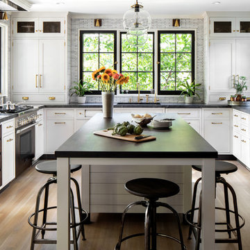
INTERNATIONAL AWARD WINNER. 2018 NKBA Design Competition Best Overall Kitchen. 2018 TIDA International USA Kitchen of the Year. 2018 Best Traditional Kitchen - Westchester Home Magazine design awards.
The designer's own kitchen was gutted and renovated in 2017, with a focus on classic materials and thoughtful storage. The 1920s craftsman home has been in the family since 1940, and every effort was made to keep finishes and details true to the original construction. For sources, please see the website at www.studiodearborn.com. Photography, Adam Kane Macchia and Timothy Lenz

 Liz Schupanitz Designs
Cooking for Two
Location: Plymouth, MN, United States
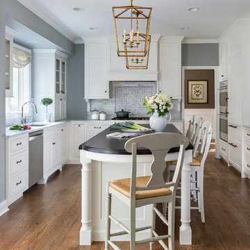
When this couple’s last child graduated from college they began the process of looking for a new home. After a lengthy search they decided to stay with the neighborhood they loved, saving money by remodeling rather than starting over.
The top priorities on their wish list were adding character to their 1990’s era home with a classic white kitchen and a larger island while keeping within the existing footprint. With the intention of honing their cooking skills, they were also considering better appliances and two ovens.
Challenges and Solutions
Design a larger island with seating for at least two. The existing island was small and the area behind the seating was less than recommended clearances.
To solve this challenge, the seating area of the island was extended out into the open area of the kitchen. This created a larger island with seating for three, extra storage and a bookshelf across from the range.
The original kitchen had a range with microwave above, so adding another oven was a challenge with limited wall space.
Because the adjoining dining room is used infrequently, the homeowner was open to placing the second oven and microwave in the walkway. This made room for the small buffet between the built in refrigerator and ovens, creating one of her favorite areas.
The client requested a white painted kitchen but wanted to make sure it had warmth and character. To achieve this the following elements were chosen:
1) Cabinets painted with Benjamin Moore Capitol White, a luminous and warm shade of white.
2) The Range hood was painted with warm metallic shades to reflect the bronze of the Ashley Norton hardware.
3) Black Aqua Grantique granite was chosen for countertops because it looks like soapstone and adds contrast.
4) Walker Zanger Café tile in Latte was chosen for it’s handmade look with uneven edges.
5) The to-the-counter-cabinet with glass door shows off serving dishes and lends sophisticated charm.
The result is a welcoming classic kitchen, where this couple enjoys cooking more often and sharpening their skills with gourmet appliances.
Liz Schupanitz Designs
Photographed by: Andrea Rugg Photography
 Beautiful Habitat: Design & Decoration
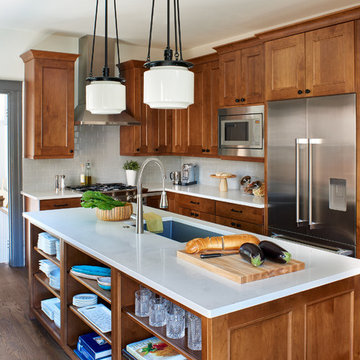
The existing kitchen was completely remodeled to create a compact chef's kitchen. The client is a true chef, who teaches cooking classes, and we were able to get a professional grade kitchen in an 11x7 footprint!
The new island creates adequate prep space. The bookcases on the front add a ton of storage and interesting display in an otherwise useless walkway.
The South wall is the exposed brick original to the 1900's home. To compliment the brick, we chose a warm nutmeg stain in cherry cabinets.
The countertops are a durable quartz that look like marble but are sturdy enough for this work horse kitchen.
The retro pendants are oversized to add a lot of interest in this small space.
Complete Kitchen remodel to create a Chef's kitchen
Open shelving for storage and display
Gray subway tile
Pendant lights
Sponsored
Fredericksburg, OH

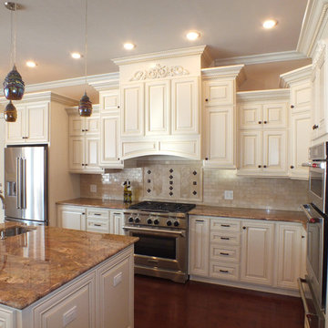
High Point Cabinets
Columbus' Experienced Custom Cabinet Builder | 4x Best of Houzz Winner
 Jennifer Gilmer Kitchen & Bath
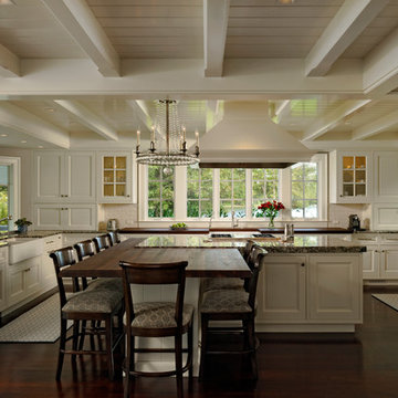
Easton, Maryland Traditional Kitchen Design by #JenniferGilmer with a lake view
http://gilmerkitchens.com/
Photography by Bob Narod
 Advance Design Studio, Ltd.
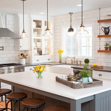
When this suburban family decided to renovate their kitchen, they knew that they wanted a little more space. Advance Design worked together with the homeowner to design a kitchen that would work for a large family who loved to gather regularly and always ended up in the kitchen! So the project began with extending out an exterior wall to accommodate a larger island and more moving-around space between the island and the perimeter cabinetry.
Style was important to the cook, who began collecting accessories and photos of the look she loved for months prior to the project design. She was drawn to the brightness of whites and grays, and the design accentuated this color palette brilliantly with the incorporation of a warm shade of brown woods that originated from a dining room table that was a family favorite. Classic gray and white cabinetry from Dura Supreme hits the mark creating a perfect balance between bright and subdued. Hints of gray appear in the bead board detail peeking just behind glass doors, and in the application of the handsome floating wood shelves between cabinets. White subway tile is made extra interesting with the application of dark gray grout lines causing it to be a subtle but noticeable detail worthy of attention.
Suede quartz Silestone graces the countertops with a soft matte hint of color that contrasts nicely with the presence of white painted cabinetry finished smartly with the brightness of a milky white farm sink. Old melds nicely with new, as antique bronze accents are sprinkled throughout hardware and fixtures, and work together unassumingly with the sleekness of stainless steel appliances.
The grace and timelessness of this sparkling new kitchen maintains the charm and character of a space that has seen generations past. And now this family will enjoy this new space for many more generations to come in the future with the help of the team at Advance Design Studio.
Photographer: Joe Nowak
Dura Supreme Cabinetry
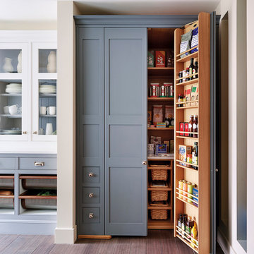
 Mylands
Sloane Square No.92 External Wall Cabinet.
Archway House No.106 External Base Cabinets.
Leadenhall No.118 Larder Exterior.
Kitchen by Smallbone of Devizes.
Smallbone’s Beaconsfield showroom.
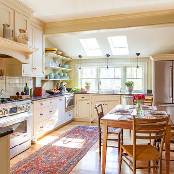
 Heartwood Kitchens
Houzz Kitchen of the Week April 8, 2016. Kitchen renovation for Victorian home north of Boston. Designed by north shore kitchen showroom Heartwood Kitchens. The white kitchen custom cabinetry is from Mouser Cabinetry. Butler's pantry cabinetry in QCCI quarter sawn oak cabinetry. The kitchen includes many furniture like features including a wood mantle hood, open shelving, beadboard and inset cabinetry. Other details include: soapstone counter tops, Jenn-Air appliances, Elkay faucet, antique transfer ware tiles from EBay, pendant lights from Rejuvenation, quarter sawn oak floors, hardware from House of Antique Hardware and the homeowners antique runner. General Contracting: DM Construction. Photo credit: Eric Roth Photography.
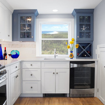
 Renovisions
To create a unique kitchen, we take inspiration from the personality of our clients; it’s a collaborative effort to develop the exact look and feel that best suits their lifestyles.
The challenge of this kitchen was to re-build the existing kitchen and adjoining full bath, creating a much better flow with plenty of storage for this active family (as they often entertain seaside).
The two-toned cabinetry in both white and laguna blue reflected a true beach-feel adorned with a terrific choice of starfish and shell shaped hardware to draw attention to this creative and beautifully transformed seaside kitchen.
We remind our clients that in order to be unique, do something unique! And this is nicely demonstrated in both the layout, color scheme and backsplash design details. Our client selected several hand painted decorative ocean creatures for the backsplash, drawing from colors in the room, and this created a truly unique conversation piece!
A glint of sparkle from the white quartz countertops brings you closer to the beach in this impressive oceanfront home.
From flooring to ceiling, we created a picture perfect beautiful beach house kitchen that is not only functional but provides a relaxed and inviting feel for these seaside owners.
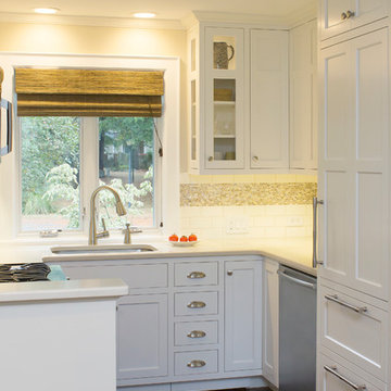
 emma delon
Maximizing the functionality of this space, and coordinating the new kitchen with the beautiful remodel completed previously by the client were the two most important aspects of this project. The existing spaces are elegantly decorated with an open plan, dark hardwood floors, and natural stone accents. The new, lighter, more open kitchen flows beautifully into the client’s existing dining room space. Satin nickel hardware blends with the stainless steel appliances and matches the satin nickel details throughout the home. The fully integrated refrigerator next to the narrow pull-out pantry cabinet, take up less visual weight than a traditional stainless steel appliance and the two combine to provide fantastic storage. The glass cabinet doors and decorative lighting beautifully highlight the client’s glassware and dishes. Finished with white subway tile, Dreamy Marfil quartz countertops, and a warm natural wood blind; the space warm, inviting, elegant, and extremely functional.
copyright 2013 marilyn peryer photography


 Liz Schupanitz Designs
A PLACE TO GATHER
Location: Eagan, MN, USA
This family of five wanted an inviting space to gather with family and friends. Mom, the primary cook, wanted a large island with more organized storage – everything in its place – and a crisp white kitchen with the character of an older home.
Challenges:
Design an island that could accommodate this family of five for casual weeknight dinners.
Create more usable storage within the existing kitchen footprint.
Design a better transition between the upper cabinets on the 8-foot sink wall and the adjoining 9-foot cooktop wall.
Make room for more counter space around the cooktop. It was poorly lit, cluttered with small appliances and confined by the tall oven cabinet.
Solutions:
A large island, that seats 5 comfortably, replaced the small island and kitchen table. This allowed for more storage including cookbook shelves, a heavy-duty roll out shelf for the mixer, a 2-bin recycling center and a bread drawer.
Tall pantries with decorative grilles were placed between the kitchen and family room. These created ample storage and helped define each room, making each one feel larger, yet more intimate.
A space intentionally separates the upper cabinets on the sink wall from those on the cooktop wall. This created symmetry on the sink wall and made room for an appliance garage, which keeps the countertops uncluttered.
Moving the double ovens to the former pantry location made way for more usable counter space around the cooktop and a dramatic focal point with the hood, cabinets and marble backsplash.
Special Features:
Custom designed corbels and island legs lend character.
Gilt open lanterns, antiqued nickel grilles on the pantries, and the soft linen shade at the kitchen sink add personality and charm.
The unique bronze hardware with a living finish creates the patina of an older home.
A walnut island countertop adds the warmth and feel of a kitchen table.
This homeowner truly understood the idea of living with the patina of marble. Her grandmother’s marble-topped antique table inspired the Carrara countertops.
The result is a highly organized kitchen with a light, open feel that invites you to stay a while.
Liz Schupanitz Designs
Photographed by: Andrea Rugg

 TKS Design Group
Download our free ebook, Creating the Ideal Kitchen. DOWNLOAD NOW
This client was referred to us from a past client. They are a busy 2-career household with young children and enjoy entertaining friends and family in their home. They have a beautiful open concept home but unfortunately the kitchen was not fitting for the rest of the home. They were not quite sure what to do with the space. We talked about trying to refresh it or do more of a minor remodel, but in the end they decided a full gut would get them to where they wanted to be.
One problem was there was no place for guests to hang out other than the large and awkward banquette area. The brick wall and tiled hood area were feeling a bit dated and tired. The space was just not functional for their lifestyle. There was no prep space near the cooktop and no landing area for items coming out of the ovens or refrigerator, plus a big dead zone in the center of the room.
Banquettes, like the one they previously had in the space, are great for small spaces, but when they get really large like this one, it makes getting in and out of the seating area awkward and uncomfortable. Plus, there was room for a large table, so we eliminated the awkward built in.
We started by removing the faux brick wall between the kitchen and back entry. We relocated the entry to the garage over a couple feet in order to get every last inch out of the new kitchen. We also made the decision to close up the primary window that faced the pretty ho hum brick wall of the neighbor’s house. There was plenty of light coming in from the seating area, so we just didn’t feel the window was adding much to the room.
Construction went smoothy. There was a bit of rework with electrical, flooring and HVAC, but in the end, we think it was well worth it.
The clients really wanted a sleek contemporary look, and we originally had planned for a full height slab backsplash, but due to it’s size, it was a budget buster. Instead, we got creative and settled on large format porcelain tiles that have a similar feel but were a fraction of the cost. We made sure the wall was plumb and level so that the fit and finish would mimic that of slab material.
The final space was quite a change. A large prep sink sits directly across from the new pro-style range with plenty additional prep space on the large island. The refrigerator and ovens now have miles of landing space, and a nice tight work triangle makes cooking a breeze.
Since we wanted a more contemporary feel, not many wall cabinets were included. Instead, we outfitted some of the drawers for dish storage with a peg system. Two large pantries flanking the refrigerator hold baking supplies and small appliances. Large drawers by the cooktop hold pots and pans, and an appliance garage tucked away to the left of the range hides away miscellaneous items. The large island also houses a microwave drawer and tons of storage, most of which is drawers offering maximum convenience.
The island now seats 5-6 people comfortably along with the new table in the seating area which can seat up to 8. Entertaining will be a breeze in this space. With such a clean backdrop, we knew we would need some drama with the lighting, so we chose two sets of staggered pendants, which we adjusted for the right visual balance above the island.
We also included a small coffee station to the right of the main kitchen, which helps keep the coffee clutter out of the kitchen proper. Two tones of complimentary gray are featured in this kitchen. The perimeter is a light gray that reads almost white. The island is a gray stain that adds some depth and interest with the visible wood texture. The countertops are clean white quartz, and the hardware, barstools and light fixtures add warm brass tones. I see lots of cooking and entertaining with family and friends in the near future in this bright and airy new space.
Designed by: Susan Klimala, CKD, CBD
Photography by: Michael Kaskel
For more information on kitchen and bath design ideas go to: www.kitchenstudio-ge.com
 Gilmans Kitchens and Baths
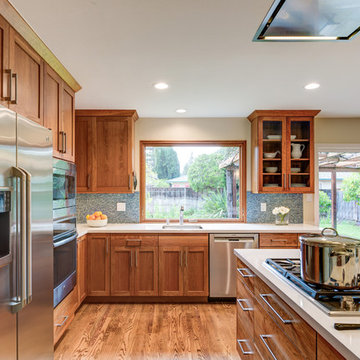
The original kitchen was tight and cramped, offering little storage and function. the clients wanted more countertop space and more storage solutions. They also wanted an open space plan, with views into their backyard, and to allow more natural light into the space.
The wall separating the kitchen and living space was removed and a large picturesque window was installed above the sink, creating a large and open space. A large island with open cubbies housed much of the homeowner's pots and pans, and other countertop appliances.
Treve Johnson Photography

 Twelve Stones Designs, LLC
The owners of this kitchen had spent the money to upgrade the finishes in their kitchen upon building the home 12 years ago, but after living in the space for several years they realized how nonfunctional the layout really was. The (then) two preschool aged children had grown into busy, hungry teenagers with many friends who also liked to hang out at the house. So the family needed a more functional kitchen with better traffic flow, space for daily activities revolving around the kitchen at different times of day, and a kitchen that could accommodate cooking for and serving large groups. Furthermore, the dark, traditional finishes no longer reflected the homeowners’ style. They requested a brighter, more relaxed, coastal style that reflected their love of the seaside cities they like to visit.
Originally, the kitchen was U-shaped with a narrow island in the middle. The island created narrow aisles that bottle-necked at the dishwasher, refrigerator, and cooktop areas. There was a pass-through from the foyer into the kitchen, but the owners never liked that the pass-through was also located so close to the powder room. The awkward proximity was unappealing and made guests feel uncomfortable.
The kitchen’s storage was made up of lots of narrow cabinets, apothecary drawers, clipped corner units, and very few drawers. It lacked useful storage for the larger items the family used on a daily basis. And the kitchen’s only pantry was small closet that had only builder-grade, narrow shelving with no illumination to be able to see the contents inside.
Overall, the kitchen’s lighting plan was poorly executed. Only six recessed cans illuminated the entire kitchen and nook areas. The under cabinet lighting was not evenly distributed either. In fact, the builder had mis-placed the under cabinet lighting around the decorative pilasters which made for choppy, dark cubbies. Further, the builder didn’t include any lighting over the sink or the bar area, which meant whoever was doing the dishes was always in their own shadow. That, coupled with the steep overhang of the game room above made the bar area feel like a dim, cavernous space that wasn’t inviting or task oriented. The kitchen looked out into the main living space, but the raised bar and a narrow wall (which held the only large cabinet in the kitchen) created more of a barrier than a relationship to the living room or breakfast nook. In fact, one couldn’t even see the breakfast nook from the cooktop or sink areas due to its orientation. The raised bar top was too narrow to comfortably sit to either dine at or chat from due to the lack of knee space. The the homeowners confided that the kitchen felt more like a dark, dirty prison than place where the family, or their guests, wanted to gather and commune.
The clients' needs and desires were:
➢ to create a kitchen that would be a space the family loved to be in; to relate to the adjacent spaces all around, and to have better flow for entertaining large groups
➢ to remove the walls between the breakfast nook and living area and to be able to utilize the natural light from the windows in both those areas
➢ to incorporate a functional chopping block for prepping fresh food for home cooked meals, an island with a large sink and drain board, 2 pull out trash cans, and seating for at least the 2 teens to eat or do homework
➢ to design a kitchen and breakfast nook with an airy, coastal, relaxed vibe that blended with the rest of the house's coastal theme
➢ to integrate a layered lighting plan which would include ample general illumination, specific task lighting, decorative lighting, and lots of illuminated storage
➢ to design a kitchen with not only more storage for all the husband’s kitchen gadgets and collection of oils and spices, but smart storage, including a coffee/breakfast bar and a place to store and conceal the toaster oven and microwave
➢ to find a way to utilize the large open space between the kitchen, pantry area, and breakfast nook
Twelve Stones Designs achieved the owner's goals by:
➢ removing the walls between the kitchen and living room to allow the natural light to filter in from the adjacent rooms and to create a connection between the kitchen, nook, and living spaces for a sense of unity and communion
➢ removing the existing pantry and designing 3 large pantry style cabinets with LED tape lights and rollout drawers to house lots of kitchen appliances, gadgets, and tons of groceries. We also took the cabinets all the way up to the 9’ ceiling for additional storage for seasonal items and bulk storage.
➢ designing 2 islands - 1 with a gorgeous black walnut chopping block that houses a drawer for chopping and carving knives and a custom double pull out trash unit for point of use utilization - and 1 that houses the dishwasher, a large Blanco Gourmet sink with integrated drain board, woven baskets for fresh root vegetables and kitchen towels, plenty of drawer storage for kitchen items, and bar seating for up to 4 diners.
➢ closing off the space between the kitchen and the powder room to create a beautiful new private alcove for the powder room as well as adding some decorative storage. This also gave us space to include more tall storage near the new range for precision placement of the husband’s extensive oil and spice collection as well as a location for a combo-steam oven the wife wanted for baking and cooking healthy meals.
The project is enhanced functionally by:
➢ incorporated USB and standard receptacles for the kids’ laptops and phone charging in the large island
➢ designing the small island to include additional open shelving for items used on a daily basis such as a variety of bowls, plates, and colanders. This set up also works well for the husband who prefers to “plate” his dinners in restaurant-style fashion before presenting them to the table.
➢ the integration of specific storage units, such as double stacked cutlery drawers, a custom spice pull-out, a Kuerig coffee and tea pod drawer, and custom double stacked utensil drawers
➢ moving the refrigerator to the old oven location - this eliminated the bottle neck as well as created a better relationship to the eating table. It also utilizes the floor space between the pantry, nook, and kitchen
➢ creating a banquet style breakfast nook - this banquette seating not only doubles the amount of seating for large gatherings but it better utilizes the odd space between the kitchen and the previous nook area. It also helps to create a distinct pathway from the mudroom room through the pantry area, kitchen, nook, and living room.
➢ the coffee/breakfast bar area which includes the perfect location for the concealed microwave and toaster oven, convenient storage for the coffee pods and tea accoutrements. Roll-out drawers below also house the smoothie maker, hot water kettle, and a plethora of smoothie-making ingredients such as protein powders, smoothie additives, etc. Furthermore, the drawers below the Keurig house measuring utensil, cutlery, baking supplies and tupperware storage.
➢ incorporating lots of wide drawers and pullouts to accommodate large cookware.
➢ utilizing as much vertical space as possible by building storage to the ceiling which accommodates the family’s abundant amount of serving platters, baking sheets, bakeware, casserole dishes, and additional cutting boards.
The project is enhanced aesthetically by:
➢ new 5-piece Versailles pattern porcelain tile that now seamlessly joins the entire down stairs area together creating a bright, cohesiveness feeling instead of choppy separated spaces - it also adds a coastal feeling
➢ designing a cabinet to conceal the microwave and toaster oven
➢ the coastal influenced light fixtures over the nook table and island
➢ the sandy colors of the Langdon Cambria countertops. The swirling pattern and sparkling quartz pieces remind the homeowner of black-and-tan sandy beaches
➢ the striped banquet seating whose creamy white background and blue-green stripes were the inspiration for the cabinet and wall colors.
➢ All the interior doors were painted black to coordinate with the blacks and grays in the backsplash tile and countertop. This also adds a hint of tailored formality to an otherwise casual space.
➢ the use of WAC's Oculux small aperture LED units for the overhead lighting complimented with Diode LED strips for task lighting under the cabinets and inside the pantry and glass wall cabinets. All of the lighting applications are on separate dimmer switches.
Innovative uses of materials or construction methods by Realty Restoration LLC:
➢ Each 1-1/2” x 3” block of reclaimed end-grain black walnut that makes up the center island chopping block was hand milled and built in the shop. It was designed to look substantial and proportional to the surrounding elements, executed by creating the 4 inch tall top with a solid wood chamfered edge band.
➢ The metal doors on either side of the vent hood were also custom designed for this project and built in the Realty Restoration LLC shop. They are made 1x2, 11-gauge mild steel with ribbed glass. Weighing 60 lbs a piece, heavy duty cabinet hinges were added to support the weight of the door and keep them from sagging.
➢ Under-cabinet receptacles were added along the range wall in order to have a clean, uninterrupted backsplash.
Design obstacles to overcome:
➢ Because we were removing the demising walls between the kitchen and living room, we had to find a way to plumb and vent the new island. We did this by tunneling through the slab (the slab had post tension cables which prevented us from just trenching) to run a new wet vent through a nearby structural wall. We pulled the existing hot and cold lines between upper floor joists and ran them down the structural wall as well and up through a conduit in the tunnel.
➢ Since we were converting from wall overs to a gas range it allowed us to utilize the 220 feed for the wall ovens to provide a new sub panel for all the new kitchen circuits
➢ Due to framing deficiencies inherited from the original build there was a 1-1/2” differential in the floor-to-ceiling height over a 20 foot span; by utilizing the process of cutting and furring coupled with the crown moulding details on the cabinet elevations we were able to mask the problem and provide seamless transitions between the cabinet components.
Evidence of superior craftsmanship:
➢ uniquely designed, one-of-a-kind metal “X” end panels on the large island. The end panels were custom made in the Realty Restoration LLC shop and fitted to the exact dimensions of the island. The welding seams are completely indistinguishable - the posts look like they are cut from a single sheet of metal
➢ square metal posts on the small island were also custom made and designed to compliment and carry through the metal element s throughout the kitchen
➢ the beautiful, oversized end panels on the pantry cabinets which give the breakfast nook a tailored look
➢ integrating a large format 5 piece Versailles tile pattern to seamlessly flow from the existing spaces into the new kitchen space
➢ By constructing a custom cabinet that jogged around a corner we could not remodel (housing the entry way coat closet) we were able to camouflage the adjacent wall offset within the upper and lower cabinets. By designing around the existing jog in the structural walls we accomplished a few things: we were able to find the space to house, and hide, the microwave and toaster oven yet still have a clean cohesive appearance from the kitchen side. Additionally, the owners were able to keep their much needed coat closet and we didn’t have to increase the budget with unnecessary structural work.
Sponsored
Columbus, OH
Free consultation for landscape design!

Peabody Landscape Group
Franklin County's Reliable Landscape Design & Contracting
 Jackson Design & Remodeling
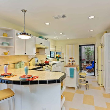
For a client with an enthusiastic appreciation of retro design, this sunny ode to kitchens of the past is a cheerful and comforting retreat for today. The client wanted a kitchen that creatively expressed her fun, unconventional taste while providing all the modern conveniences of a contemporary home.
Space was borrowed from an existing office to provide more open area and easier navigation in the kitchen. Bright, optimistic yellow sets the tone in the room, with retro-inspired appliances in buttery yellow chosen as key elements of the design. A generous apron-front farm sink gleams with clean white enameled cast iron and is outfitted with a rare retro faucet with spray and scrub brush attachments. Black trim against the yellow ceramic tile countertops defines the kitchen’s lines. Simple maple cabinetry painted white with black ceramic knobs provides a modern level of storage.
Playful positioning of contrasting tiles on the floor presents a modern, quirky interpretation of the traditional checkerboard pattern in this classic kitchen with an original point of view.
 Astro Design Inc.
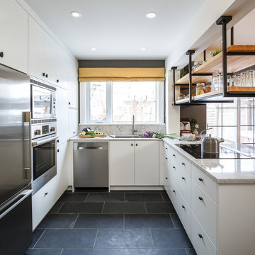
This old tiny kitchen now boasts big space, ideal for a small family or a bigger gathering. It's main feature is the customized black metal frame that hangs from the ceiling providing support for two natural maple butcher block shevles, but also divides the two rooms. A downdraft vent compliments the functionality and aesthetic of this installation.
The kitchen counters encroach into the dining room, providing more under counter storage. The concept of a proportionately larger peninsula allows more working and entertaining surface. The weightiness of the counters was balanced by the wall of tall cabinets. These cabinets provide most of the kitchen storage and boast an appliance garage, deep pantry and a clever lemans system for the corner storage.
Design: Astro Design Centre, Ottawa Canada
Photos: Doublespace Photography
 Roundhouse
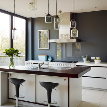
Roundhouse Urbo bespoke matt lacquer kitchen
Eat-in kitchen - large contemporary eat-in kitchen idea in London with an undermount sink, flat-panel cabinets, white cabinets and an island
Eat-in kitchen - large contemporary eat-in kitchen idea in London with an undermount sink, flat-panel cabinets, white cabinets and an island
1