
Search results for "Painted textured columns" in Home Design Ideas
 Jules Duffy Designs
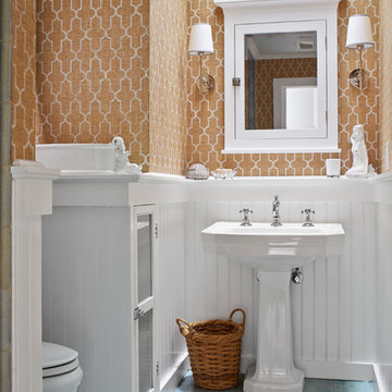
Staining this floor made all the difference! We even used copper nails to tack down the flooring which sparkle like little gems.
Alcove shower - coastal painted wood floor and turquoise floor alcove shower idea in New York with a pedestal sink, a two-piece toilet and orange walls
Alcove shower - coastal painted wood floor and turquoise floor alcove shower idea in New York with a pedestal sink, a two-piece toilet and orange walls
 ADŌR Homes
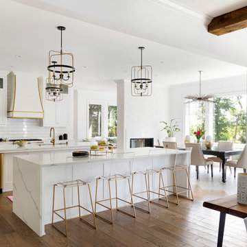
Benjamin Moore Super White cabinets, walls and ceiling
waterfall edge island
quartz counter tops
Savoy house pendants
Emtek satin brass hardware
Thermador appliances - 30" Fridge and 30" Freezer columns, double oven, coffee maker and 2 dishwashers
Custom hood with metallic paint applied banding and plaster texture
Island legs in metallic paint with black feet
white 4x12 subway tile
smoke glass
double sided fireplace
mountain goat taxidermy
Currey chandelier
acrylic and brass counter stools
Shaker style doors with Ovolo sticking
raspberry runners
oak floors in custom stain
marble cheese trays
Image by @Spacecrafting

Find the right local pro for your project
 Robert Nehrebecky AIA, Re:New Architecture
Robert Nehrebecky AIA, Re:New Architecture
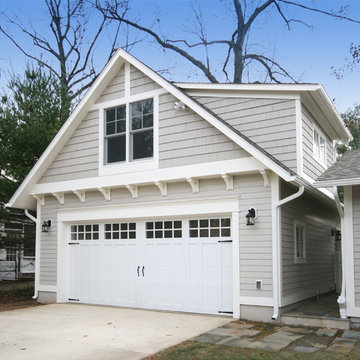
Example of a classic detached garage design in DC Metro
Example of a classic detached garage design in DC Metro
 Drury Design
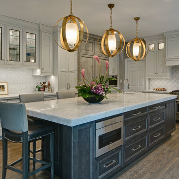
This kitchen is home to two taller individuals who both use the space equally and requested a taller workspace to comfortably accommodate their needs. The island cabinets are standard 34-1/2” tall but the Iceberg countertops were installed with a 3” build-up to add height to the island. Cabinets on the long wall were designed to break up the wall of white: buffet on the end with walnut-framed glass cabinets and seashell backsplash; double refrigerators in a painted, distressed mahogany finish were pulled forward to simulate texture and depth on the wall; wide pantry cabinets with roll-out drawers sitting on the countertops flank the refrigerators. On the opposite wall, a new window box at the kitchen sink was built to add more countertop behind the sink and to let in more light, adding dimension to the room.
The cabinetry in the original existing kitchen was disjointed at the dining room entrance and made the room appear much smaller than it really was. To remedy this, the entry to the dining room from the kitchen was closed up and relocated around the corner from the foyer; 2 simple, stacked columns were built to highlight the new opening. These transitional style columns and wider room openings at the family room and dining room entrances provide an open layout suitable for large groups to mingle comfortably; family room cabinetry and dining room fireplace surround matches kitchen cabinets.

 Thyme & Place Design LLC
When my client had to move from her company office to work at home, she set up in the dining room. Despite her best efforts, this was not the long-term solution she was looking for. My client realized she needed a dedicated space not on the main floor of the home. On one hand, having your office space right next to the kitchen is handy. On the other hand, it made separating work and home life was not that easy.
The house was a ranch. In essence, the basement would run entire length of the home. As we came down the steps, we entered a time capsule. The house was built in the 1950’s. The walls were covered with original knotty pine paneling. There was a wood burning fireplace and considering this was a basement, high ceilings. In addition, there was everything her family could not store at their own homes. As we wound though the space, I though “wow this has potential”, Eventually, after walking through the laundry room we came to a small nicely lit room. This would be the office.
My client looked at me and asked what I thought. Undoubtedly, I said, this can be a great workspace, but do you really want to walk through this basement and laundry to get here? Without reservation, my client said where do we start?
Once the design was in place, we started the renovation. The knotty pine paneling had to go. Specifically, to add some insulation and control the dampness and humidity. The laundry room wall was relocated to create a hallway to the office.
At the far end of the room, we designated a workout zone. Weights, mats, exercise bike and television are at the ready for morning or afternoon workouts. The space can be concealed by a folding screen for party time. Doors to an old closet under the stairs were relocated to the workout area for hidden storage. Now we had nice wall for a beautiful console and mirror for storage and serving during parties.
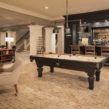
In order to add architectural details, we covered the old ugly support columns with simple recessed millwork panels. This detail created a visual division between the bar area and the seating area in front of the fireplace. The old red brick on the fireplace surround was replaced with stack stone. A mantle was made from reclaimed wood. Additional reclaimed wood floating shelves left and right of the fireplace provides decorative display while maintaining a rustic element balancing the copper end table and leather swivel rocker.
We found an amazing rug which tied all of the colors together further defining the gathering space. Russet and burnt orange became the accent color unifying each space. With a bit of whimsy, a rather unusual light fixture which looks like roots from a tree growing through the ceiling is a conversation piece.
The office space is quite and removed from the main part of the basement. There is a desk large enough for multiple screens, a small bookcase holding office supplies and a comfortable chair for conference calls. Because working from home requires many online meetings, we added a shiplap wall painted in Hale Navy to contrast with the orange fabric on the chair. We finished the décor with a painting from my client’s father. This is the background online visitors will see.
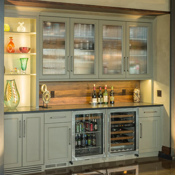
The last and best part of the renovation is the beautiful bar. My client is an avid collector of wine. She already had the EuroCave refrigerator, so I incorporated it into the design. The cabinets are painted Temptation Grey from Benjamin Moore. The counter tops are my favorite hard working quartzite Brown Fantasy. The backsplash is a combination of rustic wood and old tin ceiling like porcelain tiles. Together with the textures of the reclaimed wood and hide poofs balanced against the smooth finish of the cabinets, we created a comfortable luxury for relaxing.
There is ample storage for bottles, cans, glasses, and anything else you can think of for a great party. In addition to the wine storage, we incorporated a beverage refrigerator, an ice maker, and a sink. Floating shelves with integrated lighting illuminate the back bar. The raised height of the front bar provides the perfect wine tasting and paring spot. I especially love the pendant lights which look like wine glasses.
Finally, I selected carpet for the stairs and office. It is perfect for noise reduction. Meanwhile for the overall flooring, I specifically selected a high-performance vinyl plank floor. We often use this product as it is perfect to install on a concrete floor. It is soft to walk on, easy to clean and does not reduce the overall height of the space.
 Allen Construction
Architect: Becker Henson Niksto
General Contractor: Allen Construction
Photographer: Jim Bartsch Photography
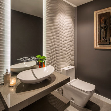
Example of a trendy 3/4 concrete floor and gray floor powder room design in Santa Barbara with open cabinets, a one-piece toilet, gray walls, a vessel sink, solid surface countertops and gray countertops
Example of a trendy 3/4 concrete floor and gray floor powder room design in Santa Barbara with open cabinets, a one-piece toilet, gray walls, a vessel sink, solid surface countertops and gray countertops

Sponsored
Sunbury, OH

J.Holderby - Renovations
Franklin County's Leading General Contractors - 2X Best of Houzz!
 TVL Creative Ltd.
Our clients had just recently closed on their new house in Stapleton and were excited to transform it into their perfect forever home. They wanted to remodel the entire first floor to create a more open floor plan and develop a smoother flow through the house that better fit the needs of their family. The original layout consisted of several small rooms that just weren’t very functional, so we decided to remove the walls that were breaking up the space and restructure the first floor to create a wonderfully open feel.
After removing the existing walls, we rearranged their spaces to give them an office at the front of the house, a large living room, and a large dining room that connects seamlessly with the kitchen. We also wanted to center the foyer in the home and allow more light to travel through the first floor, so we replaced their existing doors with beautiful custom sliding doors to the back yard and a gorgeous walnut door with side lights to greet guests at the front of their home.
Living Room
Our clients wanted a living room that could accommodate an inviting sectional, a baby grand piano, and plenty of space for family game nights. So, we transformed what had been a small office and sitting room into a large open living room with custom wood columns. We wanted to avoid making the home feel too vast and monumental, so we designed custom beams and columns to define spaces and to make the house feel like a home. Aesthetically we wanted their home to be soft and inviting, so we utilized a neutral color palette with occasional accents of muted blues and greens.
Dining Room
Our clients were also looking for a large dining room that was open to the rest of the home and perfect for big family gatherings. So, we removed what had been a small family room and eat-in dining area to create a spacious dining room with a fireplace and bar. We added custom cabinetry to the bar area with open shelving for displaying and designed a custom surround for their fireplace that ties in with the wood work we designed for their living room. We brought in the tones and materiality from the kitchen to unite the spaces and added a mixed metal light fixture to bring the space together
Kitchen
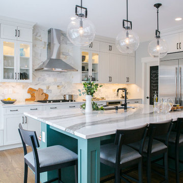
We wanted the kitchen to be a real show stopper and carry through the calm muted tones we were utilizing throughout their home. We reoriented the kitchen to allow for a big beautiful custom island and to give us the opportunity for a focal wall with cooktop and range hood. Their custom island was perfectly complimented with a dramatic quartz counter top and oversized pendants making it the real center of their home. Since they enter the kitchen first when coming from their detached garage, we included a small mud-room area right by the back door to catch everyone’s coats and shoes as they come in. We also created a new walk-in pantry with plenty of open storage and a fun chalkboard door for writing notes, recipes, and grocery lists.
Office
We transformed the original dining room into a handsome office at the front of the house. We designed custom walnut built-ins to house all of their books, and added glass french doors to give them a bit of privacy without making the space too closed off. We painted the room a deep muted blue to create a glimpse of rich color through the french doors
Powder Room
The powder room is a wonderful play on textures. We used a neutral palette with contrasting tones to create dramatic moments in this little space with accents of brushed gold.
Master Bathroom
The existing master bathroom had an awkward layout and outdated finishes, so we redesigned the space to create a clean layout with a dream worthy shower. We continued to use neutral tones that tie in with the rest of the home, but had fun playing with tile textures and patterns to create an eye-catching vanity. The wood-look tile planks along the floor provide a soft backdrop for their new free-standing bathtub and contrast beautifully with the deep ash finish on the cabinetry.
 Esslinger Design Company
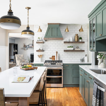
Cabinets were updated with an amazing green paint color, the layout was reconfigured, and beautiful nature-themed textures were added throughout. The bold cabinet color, rich wood finishes, and warm metal tones featured in this kitchen are second to none!
Cabinetry Color: Rainy Afternoon by Benjamin Moore
Walls: Revere Pewter by Benjamin Moore
Island and shelves: Knotty Alder in "Winter" stain
Photo credit: Picture Perfect House
 PB Kitchen Design
The key to this project was to create a kitchen fitting of a residence with strong Industrial aesthetics. The PB Kitchen Design team managed to preserve the warmth and organic feel of the home’s architecture. The sturdy materials used to enrich the integrity of the design, never take away from the fact that this space is meant for hospitality. Functionally, the kitchen works equally well for quick family meals or large gatherings. But take a closer look at the use of texture and height. The vaulted ceiling and exposed trusses bring an additional element of awe to this already stunning kitchen.
Project specs: Cabinets by Quality Custom Cabinetry. 48" Wolf range. Sub Zero integrated refrigerator in stainless steel.
Project Accolades: First Place honors in the National Kitchen and Bath Association’s 2014 Design Competition

 Advance Design Studio, Ltd.
Jennifer and Dan have lived in their Deer Park Illinois home for 15 years, slowly making minor fixes like painting and decorating; but they had a new plan for their kitchen the entire time. An awkwardly placed garage door, and an island cooktop with a terrible downdraft made a full-scale kitchen remodel an absolute must. Jennifer had many ideas in mind and wanted to work with a company that could provide high-end work, while partnering with a designer that would tailor the kitchen to her ideas.
She was intrigued by the phrase “Common Sense Remodeling” in Advance Design’s feature she discovered while perusing an issue of the community’s Quintessential Barrington Magazine. Doing further research on the company’s website, as she looked through project profiles and read about Advance Design’s “Common Sense Remodeling” philosophy, she promptly scheduled an appointment to see if the people and ideas she read about were truly who they said they were. The more she read, the more she knew that the “Common Sense” approach to remodeling they described was exactly the type of company she was looking for.
The partnership was sealed after an initial consultation with Owner Todd Jurs and Project Designer Michelle Lecinski. They displayed a combination of friendliness, professionalism and respect that was unmatched by any of the other companies Jennifer talked to. She knew that with Advance Design, she would be able to retain the vision that she had in mind with high-quality craftsmanship.
“I reached out to Advance Design because of the ‘Common Sense Remodeling’ tagline,” Jennifer said. “That’s what lingered for me”. “Advance Design was the most respectful- of the house and of my design ideas, and the most professional of the handful of companies that looked at my project”.
Soon after the meeting Jennifer began working with Michelle on the project design. They quickly developed chemistry. Jennifer loved how Michelle researched and located every detail that Jennifer wanted for the kitchen. Between the two of them, every concept and idea was worked through and perfected. “Jennifer had definite ideas about what she wanted the new kitchen to look like, she just didn’t know how to bring it all together. We worked together really well to make her ideas into the practical reality necessary for a well-functioning kitchen, with the look and feel that she had envisioned”, says Michelle.
“Michelle was wonderful in using the CAD system she would show me new drawings every time we changed the layout while working through the design,” Jennifer said. “She was a really wonderful partner in execution, she made sure everything happened quickly and easily.”
The finished design drew out elements of Jennifer’s style and personality. The pair call the look “sophisticated farmhouse” to describe the kitchen renovation to family and friends. The result was a beautifully crafted, authentic-feeling space that satisfied Jennifer’s dreams 15 years in the making. The whole project consisted of a kitchen remodel, mudroom upgrade with powder room, and garage entry relocation. “The projects I personally like the best, are the ones that put the client’s dreams on display,” Project Designer Michelle said. “And this is one of those projects.”
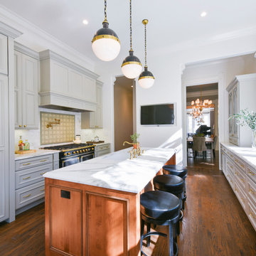
The main focal point of the kitchen is custom zinc and brass ventilation hood with a vintage sheen, which was hand made to order by a small company in Indiana named Vogler Metalworking. “It’s like sculpture, a true work of art”, says Jennifer. Your eye is immediately drawn towards this elegant yet practical hood that eliminated the home’s downdraft problem and added a striking conversation piece at the same time. The carpenters had to use special gloves when transporting and installing it, so they didn’t smudge it with fingerprints. The beautiful hood centers proudly over the stunning black enamel and brass LaCornue Range. “I had a friend who had a LaCornue range and after learning how easy it was to cook perfect meals, I was convinced I wanted to have one”, says Jennifer. This unique, breathtaking combination anchors the entire kitchen and is apparent immediately as you walk into the great room the surrounds the space.
DuraSupreme Crestwood cabinets with a Kendall Panel add function and sophistication. A custom gray paint color paired with a storm blue was developed so that the new kitchen looked like it belonged to the existing space. Unlacquered brass faucets and hardware were important to Jennifer because she wanted the living finishes to age over time. Remarkable brass diamond mesh cabinet door inserts imported from the UK continue to add this one-of-a-kind kitchen renovation; giving it a “you won’t see this everywhere” quality. The use of old railcar flooring for the coffee bar countertop and reclaimed oak for the open shelving gives an authenticity to the space uncommon in kitchens today.
Jennifer and Michelle fell in love with the Limestone Grey Stone while they were investigating unique island countertop ideas. They liked the fact that the limestone as a living finish will age and change over time. Calcutta Miel Quartz countertops made for an excellent pairing around the perimeter, as it’s durable and perfect for cooking preparations. A textured white subway tile backsplash that runs to the ceiling keeps your eye moving towards the open shelving, and to the main focal point of the stunning range hood combination.
“The kitchen functions beautifully, and it’s gorgeous,” beams Jennifer as she gestures with both hands while smiling ear to ear. “The most important thing was I wanted a kitchen that had a wonderful flow, cooked beautiful meals and was a great gathering place for family and friends, and this space does that perfectly! Beauty wise, it turned out exactly how I had envisioned. I felt the function part was the hardest part, and that was nailed”!
Relocating the garage entry to the new mudroom was a huge priority and has finally separated the family’s arriving home functions from their kitchen. Now coats and shoes and bags have their own area for dropping once members arrive home. Matching gray DuraSupreme cabinetry helped create gorgeous, purposeful lockers for the family. A reclaimed vintage sink and custom wall paper were added to the tiny powder room to beautify the once previously only functional space. Advance Design was even able to create a custom space for their dog to sleep while the family is away.
“It was unbelievable that a project of this size was completed in such a short time, and I think that’s because of the large amount of planning and preparation that went into it,” Jennifer marveled, “When we started, we were ready, and everything was prepared”.
When it came to execution, Project Manager Justin Davis and his crew were quick, accessible, and organized. Projects like this kitchen are typically completed in as little as 8-10 weeks. Jennifer’s kitchen however despite the relocation of some challenging HVAC in a soffit and moving of an exterior door was completed remarkably fast in part because the team was working with an existing tile floor that ran throughout the first floor that the client really loved.
“You get to know these people really well because they’re living in your house while you’re living in your house. They were so fast and really good, it didn’t take as long as even planned” reported Jennifer. “I would text Justin and he always responded almost immediately. I got to know all the guys who were working in our house and they were all wonderful people”.
Details in a customized kitchen like this one require skill and care from the people who install it. “All the guys on the job were skilled at what the did. I wanted small details like little feet to look like furniture, that is where their carpentry skill came in to make these all perfect”, said Jennifer. “The tile guys were wonderful. They even let me determine how I wanted the texture with the grout to appear for a salt and pepper look; now that is a very skilled trade person making it custom”.
In Jennifer’s interview, she continued to reference Advance Design’s “Common Sense Remodeling”, so I took a minute to ask her exactly what that phrase meant to her and how it played out in her experience with her project and the Advance Design team. Here is what she said: “I was intrigued about Common Sense Remodeling and in my head that there would be clear costs and prices, great communication between the design team, the execution team and me”, said Jennifer. They did deliver on that, it was so clear about the cost breakdown, what I could expect from everyone who came to my house, and everything that we had ordered. That to me is the Common Sense”!
It’s great to see a client take literally our assertion that a well-planned remodeling project is simply “Common Sense”! She anticipated each step of the way would be clear, concise, and predictable, all the while protecting the outcome due to the careful upfront planning. “Advance Design delivered on their ‘Common Sense Remodeling’ promise,” Jennifer said. “From the design team, to the execution team - everything was straight forward like I imagined. The project turned out exactly how I envisioned, I enjoyed this process and absolutely would recommend Advance Design Studio to anyone.”
 Simonsen-Hickok Interiors
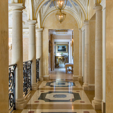
Vaulted ceilings were painted in a trompe l'oeil fashion with a blue background and gilded stars.
Taylor Architectural Photography
Hallway - mid-sized traditional marble floor and multicolored floor hallway idea in Miami with beige walls
Hallway - mid-sized traditional marble floor and multicolored floor hallway idea in Miami with beige walls
 O’Hara Interiors
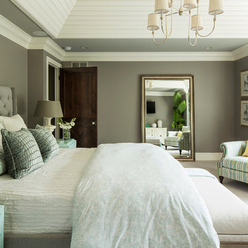
A great way to brighten up a bedroom is with painted nightstands. In this case, we wanted to maintain a calming environment with neutral wall colors and bedding. To add a bit of cheer to the space, we upholstered two lounge chairs and painted both nightstands similar shaded of aqua. Martha O'Hara Interiors, Interior Design | L. Cramer Builders + Remodelers, Builder | Troy Thies, Photography | Shannon Gale, Photo Styling
Please Note: All “related,” “similar,” and “sponsored” products tagged or listed by Houzz are not actual products pictured. They have not been approved by Martha O’Hara Interiors nor any of the professionals credited. For information about our work, please contact design@oharainteriors.com.


 Town Line Wallpaper & Paint Inc.
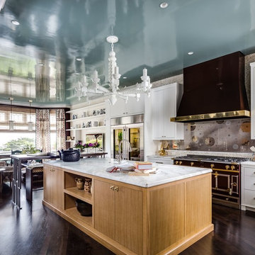
Kitchen painted with full-spectrum C2 Paint featuring a high gloss ceiling.
Large transitional single-wall dark wood floor and brown floor open concept kitchen photo in Boston with flat-panel cabinets, white cabinets, multicolored backsplash, black appliances, an island, marble countertops and glass sheet backsplash
Large transitional single-wall dark wood floor and brown floor open concept kitchen photo in Boston with flat-panel cabinets, white cabinets, multicolored backsplash, black appliances, an island, marble countertops and glass sheet backsplash
 Dura Supreme Cabinetry
With an ideal location in the Pacific Heights neighborhood of San Francisco, this dated Victorian residence had "beautiful bones" but had been sitting on the market for a year before being purchased with plans to revitalize the interior. Interior designer, Noel Han, explained, "Historical Victorian homes in this area often have beautiful architectural elements that I aim to preserve, but the floor plan and layout tend to be stuffy, not live-able and not light filled. Modern families want bright, light-filled, spacious rooms that take advantage of outdoor views and living spaces, and function well for storage, meals and entertaining."
Preserving the architectural integrity and special features of the home was one of Han's goals but at the same time, she re-designed the space, moving walls and adding windows to create an open floorplan that flowed easily between the kitchen and outdoor living spaces. Where the range once stood in the original design, now an entire wall of windows provides panoramic views of the outdoors and fills the kitchen with light. Below the windows, Han designed a long bank of base cabinets with drawers to provide plenty of storage and work surface. Light now pours into the space even on foggy days. The range was moved to the opposite wall so that beautiful window views could be added to the kitchen.
Han selected a palette of finishes with an eye toward creating a "soft color aesthetic". "White painted finishes are very popular right now but would have felt stark and cold in this space," she explained. "The French grey paint from Dura Supreme was a perfect complement for this vintage Victorian home, to create a classic color scheme".
"This beautiful home already had hardware elements with a vintage brass finish, so I carefully selected antiqued, brushed brass hardware, plumbing and metal finishes to blend with the original elements," said Han. She continued, "The La Cornue French Range adds modern function with a French antique look."
"I appreciate working with Dura Supreme cabinetry because of the quality of the cabinetry, fast delivery and the custom options. I'm able to create beautiful architectural details like the pull-out columns on both sides of the range and the curved mullion doors on the furniture hutch, and they offer a stunning palette of finishes and styles," explained Han. For the bath cabinetry, Han created a similar palette of finishes and styles to create a complementary look throughout the entire home.
Product Details:
Perimeter: Dura Supreme Cabinetry shown in the St. Augustine door style and Mullion Pattern #15 door style with a “Zinc” painted finish.
Kitchen Island: Dura Supreme Cabinetry shown in the St. Augustine door style with a Clove stain and Black Accent finish on Cherry wood.
For more information about Noel Han, Interior Designer, click to her website here www.atelnoel.com.
For more information about Gilmans Kitchens and Baths, click to their website here www.gkandb.com.
Photography by: Ned Bonzi www.nedbonzi.com.
Request a FREE Dura Supreme Brochure Packet:
http://www.durasupreme.com/request-brochure
 Studio 511
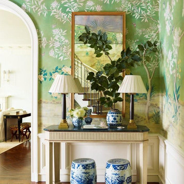
The hall table is a custom made piece design by in collaboration with the interior designer, Ashley Whittaker. The floor has an inlay Greek key border, and the walls are covered hand painted Gracie paper.


 O’Hara Interiors
Martha O'Hara Interiors, Interior Design | L. Cramer Builders + Remodelers, Builder | Troy Thies, Photography | Shannon Gale, Photo Styling
Please Note: All “related,” “similar,” and “sponsored” products tagged or listed by Houzz are not actual products pictured. They have not been approved by Martha O’Hara Interiors nor any of the professionals credited. For information about our work, please contact design@oharainteriors.com.
 2Scale Architects
Benjamin Hill Photography
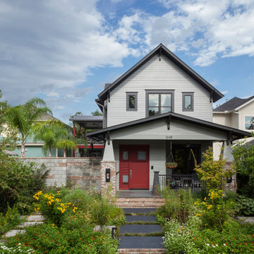
Arts and crafts gray two-story gable roof photo in Houston
Arts and crafts gray two-story gable roof photo in Houston
 Marie Burgos Design
Established in 1895 as a warehouse for the spice trade, 481 Washington was built to last. With its 25-inch-thick base and enchanting Beaux Arts facade, this regal structure later housed a thriving Hudson Square printing company. After an impeccable renovation, the magnificent loft building’s original arched windows and exquisite cornice remain a testament to the grandeur of days past. Perfectly anchored between Soho and Tribeca, Spice Warehouse has been converted into 12 spacious full-floor lofts that seamlessly fuse old-world character with modern convenience.
Steps from the Hudson River, Spice Warehouse is within walking distance of renowned restaurants, famed art galleries, specialty shops and boutiques. With its golden sunsets and outstanding facilities, this is the ideal destination for those seeking the tranquil pleasures of the Hudson River waterfront.
Expansive private floor residences were designed to be both versatile and functional, each with 3- to 4-bedrooms, 3 full baths, and a home office. Several residences enjoy dramatic Hudson River views.
This open space has been designed to accommodate a perfect Tribeca city lifestyle for entertaining, relaxing and working.
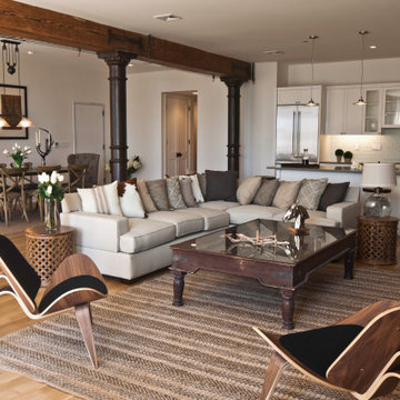
This living room design reflects a tailored “old-world” look, respecting the original features of the Spice Warehouse. With its high ceilings, arched windows, original brick wall and iron columns, this space is a testament of ancient time and old world elegance.
The design choices are a combination of neutral, modern finishes such as the Oak natural matte finish floors and white walls, white shaker style kitchen cabinets, combined with a lot of texture found in the brick wall, the iron columns and the various fabrics and furniture pieces finishes used throughout the space and highlighted by a beautiful natural light brought in through a wall of arched windows.
The layout is open and flowing to keep the feel of grandeur of the space so each piece and design finish can be admired individually.
As soon as you enter, a comfortable Eames lounge chair invites you in, giving her back to a solid brick wall adorned by the “cappuccino” art photography piece by Francis Augustine and surrounded by flowing linen taupe window drapes and a shiny cowhide rug.
The cream linen sectional sofa takes center stage, with its sea of textures pillows, giving it character, comfort and uniqueness. The living room combines modern lines such as the Hans Wegner Shell chairs in walnut and black fabric with rustic elements such as this one of a kind Indonesian antique coffee table, giant iron antique wall clock and hand made jute rug which set the old world tone for an exceptional interior.
Photography: Francis Augustine
1