Search results for "I'vealso" in Home Design Ideas
Scott Davis Photography
Elegant white tile and stone tile bathroom photo in Salt Lake City with an undermount sink, white cabinets, marble countertops and recessed-panel cabinets

I was hired to update this condo, working around the existing countertops as they were something the owner didn't want to replace. I selected a paint color for the cabinetry, feeling like the cherry cabinets just didn't fit in this space, nor did they seem to be the right compliment to the existing granite. I hired Haven Finishing Studio to work their magic and transform the cabinets into what looks like a brand new kitchen! They did beautiful work!!! Removed the outdated backsplash and replaced it with a metallic back painted glass subway tile. Removed track lighting in the kitchen and living room and replaced with vintage industrial modern lighting. So excited to have this opportunity in downtown GR, hoping for a lot more opportunities like this!!!
Photo Credit: Ben Perfect Photo

Donna Dotan Photography Inc.
Example of a transitional single-wall laundry closet design in New York with white cabinets, white walls, a side-by-side washer/dryer and white countertops
Find the right local pro for your project

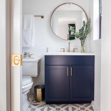
Bathroom - transitional gray tile and subway tile mosaic tile floor bathroom idea in Chicago with an undermount sink, recessed-panel cabinets, white cabinets and gray walls

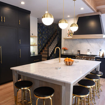
Hi everyone, I'm Sarah and Ogun we are here with fine line kitchens. So we are a couple working together. I do the interior design and remodeling of the space material selection meeting with the clients. And I handled operations outside, you know meaning all the construction work that is taking place the inside. The houses that we work in. I handle all the aspects of the construction, so today's project is very special. We're in Vienna and the client had a very big family. It's a family of seven that lives here. So we had a few aspects that we needed to keep in mind while designing this one. Having everybody be able to sit on the island. So we wanted plenty of seating all the way around. We didn't want anybody standing or anything like that. So what we did is we maximize the space. The center island is the biggest part of the kitchen. We use a natural stone to kind of give it a beautiful texture versus quartz. It's kind of standard white or kind of fabricated, so I wanted something very natural. We did this because I took my inspiration from the outside, so the inspiration if you look at the view right in front of me is there are so many greens there's a lot of brass accents and I wanted to bring this. Into this kitchen while designing it for my clients. She is very warm very. She wanted a very homey, comfy kind of look for the kitchen. So that's what we did today. As you can see, the cabinets are sage green, very light, so I still think it's a neutral, but it's a lighter color that again brings the outside in and we combine that with the oak right behind me so it's a slightly warm oak. It's not very dark. It's not very light. It's a medium brown and the same color went on the island. To kind of tie these two in and the backsplash, my favorite part is where you can see a little bit of design. It is, in my opinion still classic, but includes a pattern so the outside part is as we said in the beginning, is handled by my husband. I'd like him to speak a little bit about that. Thanks, Sarah, I want to talk to you guys a little bit about the construction part of this project. Originally this kitchen was located mostly in this area. They had their stove there sing. It was more of a peninsula layout in Sarah's and the customer vision they wanted. They wanted to get rid of the peninsula and they want to be able to have a huge island that can at least sit seven people because they're familiar with seven. So we wanted to make sure that we can achieve this design and bring it to life so that they can be happy with this layout. Some of the challenges we had, the house, the home being, you know, old home. There were a lot of you know the older electrical and plumbing that had to be replaced. We had to relocate the stove from here to this area. Over here we had put a nice foot fan that we had to relocate all the ductwork and the plumbing. Was being on the peninsula area. We had to relocate it to the center islands. So we achieved all this and kind of like bring it to bring in this kitchen up to date it looks beautiful. That's true, so yes, the old layout did not function for my clients because everything was kind of gathered on one side of the kitchen. So there was like a peninsula right there. So the end of this island kind of continued straight. And that was just the L shape. Kind of where everything was and there used to be another big table here, so they were using only kind of half of the space. So like I said at the beginning, our vision was to kind of feed everybody at the island, create some symmetry. 'cause I love that. So as you can see behind me, this is kind of the focal point symmetrical. Everything is kind of even we wanted to also panel the fridge here so it mimics the pantry and another size. So when you're looking at it, it is bringing again that symmetry back again. I hope you enjoyed this kitchen and this video and I'll see you soon. So how do you think this project turned out? It's nice. I like the color. I think it turned out nice. It's kind of like a little bit different color than what we always do. So I realize. Are you giving me a little bit of credit here that I did something different? Are you proud? I'm so proud of you. Other than that I like it. That they have kind of like a two sink. So if this was our kitchen, if we ever like you can have your own. I can have mine if we ever get into a fight then this can be like my own kitchen. Why are we gonna bring in a fight right now? So I'm cooking anyway. You're grilling most of the time, So what are you even talking about? My kitchen? That's my kitchen. You can just take the small sink. That's fine. It's always good to have your own space right there, so anyways. Thank you guys for watching. We hope to see you soon and if you have any questions please click the link below. It'll lead you to our website, house, YouTube and all of the social media is so nice to have you guys. We'll see you soon. Thanks bye bye-bye.

Interior Design By Krista Watterworth
Beach style freestanding bathtub photo in Miami with an undermount sink, shaker cabinets and gray cabinets

Guest Bedroom. Perfect themed room for a beach house.
Photo Credit: CJ Walker
Bedroom - tropical bedroom idea in Miami with green walls

Sponsored
Columbus, OH
Hope Restoration & General Contracting
Columbus Design-Build, Kitchen & Bath Remodeling, Historic Renovations
The goal of this project was to update the outdated master bathroom to better meet the homeowners design tastes and the style of the rest of this foothills home, as well as update all the doors on the first floor, and create a contemporary mud room and staircase to the basement.
The homeowners wanted a master suite that had a masculine feel, incorporated elements of black steel, wood, and contrast with clean white tiles and counter-tops and helped their long and skinny layout feel larger/ make better use of the space they have. They also wanted a more spacious and luxurious shower with water temperature control. A large window that existed above the original soaking tub offered spectacular views down into Boulder valley and it was important to keep this element in the updated design. However, privacy was also very important. Therefore, a custom-built powder coated steel shelf, was created to provide privacy blocking, add storage, and add a contrasting design element to the white wall tiles. Black honeycomb floor tiles, new black walnut cabinetry, contemporary wall paper, a floor to ceiling glass shower wall, and updated fixtures elevated the space and gave the clients exactly the look and feel that they wanted.
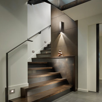
Unique custom metal design elements can be found throughout the new spaces (shower, mud room bench and shelving, and staircase railings and guardrails), and give this home the contemporary feel that the homeowners desired.

This adorable beach cottage is in the heart of the village of La Jolla in San Diego. The goals were to brighten up the space and be the perfect beach get-away for the client whose permanent residence is in Arizona. Some of the ways we achieved the goals was to place an extra high custom board and batten in the great room and by refinishing the kitchen cabinets (which were in excellent shape) white. We created interest through extreme proportions and contrast. Though there are a lot of white elements, they are all offset by a smaller portion of very dark elements. We also played with texture and pattern through wallpaper, natural reclaimed wood elements and rugs. This was all kept in balance by using a simplified color palate minimal layering.
I am so grateful for this client as they were extremely trusting and open to ideas. To see what the space looked like before the remodel you can go to the gallery page of the website www.cmnaturaldesigns.com
Photography by: Chipper Hatter

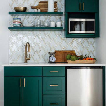
This one is near and dear to my heart. Not only is it in my own backyard, it is also the first remodel project I've gotten to do for myself! This space was previously a detached two car garage in our backyard. Seeing it transform from such a utilitarian, dingy garage to a bright and cheery little retreat was so much fun and so rewarding! This space was slated to be an AirBNB from the start and I knew I wanted to design it for the adventure seeker, the savvy traveler, and those who appreciate all the little design details . My goal was to make a warm and inviting space that our guests would look forward to coming back to after a full day of exploring the city or gorgeous mountains and trails that define the Pacific Northwest. I also wanted to make a few bold choices, like the hunter green kitchen cabinets or patterned tile, because while a lot of people might be too timid to make those choice for their own home, who doesn't love trying it on for a few days?At the end of the day I am so happy with how it all turned out!
---
Project designed by interior design studio Kimberlee Marie Interiors. They serve the Seattle metro area including Seattle, Bellevue, Kirkland, Medina, Clyde Hill, and Hunts Point.
For more about Kimberlee Marie Interiors, see here: https://www.kimberleemarie.com/

Bill Taylor
Example of a classic formal and open concept dark wood floor and coffered ceiling living room design in Boston with white walls, a standard fireplace and a stone fireplace

This one is near and dear to my heart. Not only is it in my own backyard, it is also the first remodel project I've gotten to do for myself! This space was previously a detached two car garage in our backyard. Seeing it transform from such a utilitarian, dingy garage to a bright and cheery little retreat was so much fun and so rewarding! This space was slated to be an AirBNB from the start and I knew I wanted to design it for the adventure seeker, the savvy traveler, and those who appreciate all the little design details . My goal was to make a warm and inviting space that our guests would look forward to coming back to after a full day of exploring the city or gorgeous mountains and trails that define the Pacific Northwest. I also wanted to make a few bold choices, like the hunter green kitchen cabinets or patterned tile, because while a lot of people might be too timid to make those choice for their own home, who doesn't love trying it on for a few days?At the end of the day I am so happy with how it all turned out!

With an ideal location in the Pacific Heights neighborhood of San Francisco, this dated Victorian residence had "beautiful bones" but had been sitting on the market for a year before being purchased with plans to revitalize the interior. Interior designer, Noel Han, explained, "Historical Victorian homes in this area often have beautiful architectural elements that I aim to preserve, but the floor plan and layout tend to be stuffy, not live-able and not light filled. Modern families want bright, light-filled, spacious rooms that take advantage of outdoor views and living spaces, and function well for storage, meals and entertaining."
Preserving the architectural integrity and special features of the home was one of Han's goals but at the same time, she re-designed the space, moving walls and adding windows to create an open floorplan that flowed easily between the kitchen and outdoor living spaces. Where the range once stood in the original design, now an entire wall of windows provides panoramic views of the outdoors and fills the kitchen with light. Below the windows, Han designed a long bank of base cabinets with drawers to provide plenty of storage and work surface. Light now pours into the space even on foggy days. The range was moved to the opposite wall so that beautiful window views could be added to the kitchen.
Han selected a palette of finishes with an eye toward creating a "soft color aesthetic". "White painted finishes are very popular right now but would have felt stark and cold in this space," she explained. "The French grey paint from Dura Supreme was a perfect complement for this vintage Victorian home, to create a classic color scheme".
"This beautiful home already had hardware elements with a vintage brass finish, so I carefully selected antiqued, brushed brass hardware, plumbing and metal finishes to blend with the original elements," said Han. She continued, "The La Cornue French Range adds modern function with a French antique look."
"I appreciate working with Dura Supreme cabinetry because of the quality of the cabinetry, fast delivery and the custom options. I'm able to create beautiful architectural details like the pull-out columns on both sides of the range and the curved mullion doors on the furniture hutch, and they offer a stunning palette of finishes and styles," explained Han. For the bath cabinetry, Han created a similar palette of finishes and styles to create a complementary look throughout the entire home.
Product Details:
Perimeter: Dura Supreme Cabinetry shown in the St. Augustine door style and Mullion Pattern #15 door style with a “Zinc” painted finish.
Kitchen Island: Dura Supreme Cabinetry shown in the St. Augustine door style with a Clove stain and Black Accent finish on Cherry wood.
For more information about Noel Han, Interior Designer, click to her website here www.atelnoel.com.
For more information about Gilmans Kitchens and Baths, click to their website here www.gkandb.com.
Photography by: Ned Bonzi www.nedbonzi.com.
Request a FREE Dura Supreme Brochure Packet:
http://www.durasupreme.com/request-brochure

This incredible closet is custom in every way. It was designed to meet the specific needs and desires of our client. The cabinetry was slightly distressed, glazed and load with extensive detail. The rolling ladder moves around entire closet for upper storage. Several pull out and slide out shelves, scarf racks, hanger racks and custom storage accessories were included in the design. A custom dresser with upper glass cabinets along with built-in hamper are also included. It wouldn't be complete without a vertical, tilted shoe rack. Ceiling painted in a rich robin’s egg blue with sparkle additive sets this closet apart from any other. The custom upholstered storage bench with pillows at the end of the room and crystal chandelier finishes this room beautifully. Photo Credit - Hall Of Portraits

I was hired by the parents of a soon-to-be teenage girl turning 13 years-old. They wanted to remodel her bedroom from a young girls room to a teenage room. This project was a joy and a dream to work on! I got the opportunity to channel my inner child. I wanted to design a space that she would love to sleep in, entertain, hangout, do homework, and lounge in.
The first step was to interview her so that she would feel like she was a part of the process and the decision making. I asked her what was her favorite color, what was her favorite print, her favorite hobbies, if there was anything in her room she wanted to keep, and her style.
The second step was to go shopping with her and once that process started she was thrilled. One of the challenges for me was making sure I was able to give her everything she wanted. The other challenge was incorporating her favorite pattern-- zebra print. I decided to bring it into the room in small accent pieces where it was previously the dominant pattern throughout her room. The color palette went from light pink to her favorite color teal with pops of fuchsia. I wanted to make the ceiling a part of the design so I painted it a deep teal and added a beautiful teal glass and crystal chandelier to highlight it. Her room became a private oasis away from her parents where she could escape to. In the end we gave her everything she wanted.
Photography by Haigwood Studios

The Kitchen has a very open feeling, aided by the wood beam lighting and very high ceilings. The island is beautifully warm with the Iroko wood insert on the honed Zebrino marble. Large windows over the sink allow natural light to fill the space and the white cabinetry lends a nice contrast to the dark walnut island. Marble and Stainless steel backsplash with open shelving is contemporary yet fuctional, giving the owner a beautiful backdrop to his professional Wolf range. The apron sink is also a wonderful touch under-mounted below the marble countertop.

 
Free ebook, Creating the Ideal Kitchen. DOWNLOAD NOW
 
Our clients had been in their home since the early 1980’s and decided it was time for some updates. We took on the kitchen, two bathrooms and a powder room.
The layout in the kitchen was functional for them, so we kept that pretty much as is. Our client wanted a contemporary-leaning transitional look — nice clean lines with a gray and white palette. Light gray cabinets with a slightly darker gray subway tile keep the northern exposure light and airy. They also purchased some new furniture for their breakfast room and adjoining family room, so the whole space looks completely styled and new. The light fixtures are staggered and give a nice rhythm to the otherwise serene feel.
The homeowners were not 100% sold on the flooring choice for little powder room off the kitchen when I first showed it, but now they think it is one of the most interesting features of the design. I always try to “push” my clients a little bit because that’s when things can get really fun and this is what you are paying for after all, ideas that you may not come up with on your own.
We also worked on the two upstairs bathrooms. We started first on the hall bath which was basically just in need of a face lift. The floor is porcelain tile made to look like carrera marble. The vanity is white Shaker doors fitted with a white quartz top. We re-glazed the cast iron tub.
The master bath was a tub to shower conversion. We used a wood look porcelain plank on the main floor along with a Kohler Tailored vanity. The custom shower has a barn door shower door, and vinyl wallpaper in the sink area gives a rich textured look to the space. Overall, it’s a pretty sophisticated look for its smaller fooprint.
Designed by: Susan Klimala, CKD, CBD
Photography by: Michael Alan Kaskel
For more information on kitchen and bath design ideas go to: www.kitchenstudio-ge.com

Sponsored
Sunbury, OH
J.Holderby - Renovations
Franklin County's Leading General Contractors - 2X Best of Houzz!

a bathroom was added between the existing garage and home. A window couldn't be added, so a skylight brings needed sunlight into the space.
WoodStone Inc, General Contractor
Home Interiors, Cortney McDougal, Interior Design
Draper White Photography

 
Free ebook, Creating the Ideal Kitchen. DOWNLOAD NOW
 
One of my favorite things to work on is older homes with a bit of history because I find it an interesting challenge to marry the historical architectural features of a home with modern design elements that work well for my client’s current lifestyle.
This home was particularly fun because it was the second kitchen we had done for this family and was quite a departure from the style of the first kitchen.
The before shot of the kitchen shows a view from the family room. See the dropped ceiling? We were curious, was this just part of the design or was the dropped ceiling there to hide mechanicals? Well we soon found out that it was mostly decorative (yay!), and with the exception of a little bit of work to some plumbing from an upstairs bathroom and rerouting of the ventilation system within the original floor joists, we were in the clear, phew! The shot of the completed kitchen from roughly the same vantage point shows how much taller the ceilings are. It makes a huge difference in the feel of the space. Dark and gloomy turned fresh and light!
Another serious consideration was what do we do with the skinny transom window above the refrigerator. After much back and forth, we decided to eliminate it and do some open shelving instead. This ended up being one of the nicest areas in the room. I am calling it the “fun zone” because it houses all the barware, wine cubbies and a bar fridge — the perfect little buffet spot for entertaining. It is flanked on either side by pull out pantries that I’m sure will get a ton of use. Since the neighboring room has literally three walls of almost full height windows, the kitchen gets plenty of light.
The gold shelving brackets, large pendant fixtures over the island and the tile mural behind the range all pay subtle homage to the home’s prairie style architecture and bring a bit of sparkle to the room.
Even though the room is quite large, the work triangle is very tight with the large Subzero fridge, sink and range all nearby for easy maneuvering during meal prep. There is seating for four at the island, and work aisles are generous.
Designed by: Susan Klimala, CKD, CBD
Photography by: LOMA Studios
For more information on kitchen and bath design ideas go to: www.kitchenstudio-ge.com

Photo by Joe Fletcher
Artwork on Wall by Christopher Winter ("Songs of Innocence I")
Inspiration for a contemporary formal gray floor and concrete floor living room remodel in San Francisco with white walls, a two-sided fireplace and no tv
1