
Search results for "Absorbance" in Home Design Ideas
 building Lab, inc.
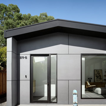
Silicon Valley ADU: front entry: swing door with sidelite.
building Lab is a design build firm specialized in modern architecture.
Large minimalist gray one-story concrete fiberboard exterior home photo in San Francisco with a metal roof and a gray roof
Large minimalist gray one-story concrete fiberboard exterior home photo in San Francisco with a metal roof and a gray roof

 Pierre Jean-Baptiste Interiors
This lower level space started off as a storage space for inherited household furniture and miscellaneous infrequently used items. Pierre Jean-Baptiste Interiors reimagined the space as it now exists using some of our clients few requirements including a stage for the family comedians at the rear of the lower level, a movie screening area, a serving table for frequent soiree’s, and cozy resilient furnishings. We infused style into this lower level changing the paint colors, adding new carpet to absorb sound and provide style. We also were sure to include color in the space strategically. Be sure to subscribe to our YouTube channel for the upcoming video of this space!
 Bennett Design Co.
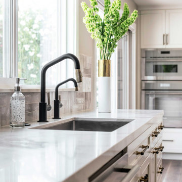
This young family purchased their first home in 2021, and let's say it was full of original 1970s charm - i.e., nothing had been done to this house in the past 50 years.
We had recently completed a project for a family member, so they called us in to help. During our initial consultation, they shared a modest project budget, and we explained that we wouldn't be able to accomplish much on such a limited budget. Several weeks passed, and they ultimately raised their funding, and we signed on for the job.
Even after doubling their budget, we still had our work cut out for us. The original kitchen was very small in comparison to the square footage of the home, and opening up the space meant we needed to add two structural beams between the first and second stories.
These homeowners already had one small child, and were expecting another in the coming months. They also have large families in the area, so creating an ample gathering space for multiple cooks was crucial to the final layout. Some of their wish list items included a bar and a large island with plenty of seating. They also wanted the kitchen open to the family room.
This home had a formal and informal dining area, so we opted to absorb the casual eating area into the newly expanded kitchen floorplan. We relocated their laundry room to create an extended family room, which included the new bar area. We were also able to use the under-stair space to create a kitchen pantry. The kitchen transformed from 115 sq. ft. to a spacious 260 sq. ft., all within existing poorly used space. We were able to create clear sightlines to the backyard and pool from the new kitchen and family room, perfect for a young family.
Aesthetically speaking, our clients wanted a neutral space that could grow and change with their family. We kept the expensive items like cabinets, countertops, and tile in classic finishes like whites and navy blues, while we had more fun with things like the faucet, hardware, and light fixtures that could easily be updated over the years. The finished product is a warm, clean, family-friendly space that invites you to come in and pull up a chair.
Find the right local pro for your project
 User
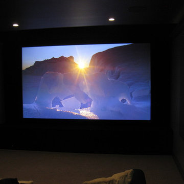
UserView to the 128" diagonal screen with a 4K image.
The wall behind the screen, the side walls, and the ceiling area around the screen are covered in black velvet cloth material. The velvet absorbs 95% of the light, minimizing reflections from the screen. This helps enhance the contrast and black levels of the image and makes the projected image pop off of the screen.
 dRemodeling Design-Build
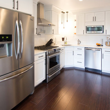
Choosen by the client, the homeowner decided to go away from the color of the black pulls for the appliances. Going with stainless steel, the appliances refract light from the recessed ceiling lights and outdoors, absorbing the warmth of the space. A great choice!
 K&A Construction
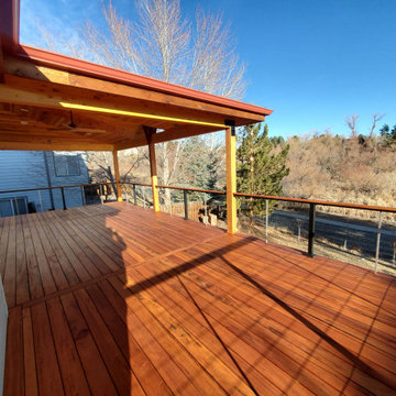
The needs for this project included an expansive outdoor space that provides an unobstructed view of the open space behind the home while also being able to enjoy the sunny Colorado weather. Through an in depth design process the decision to use Tigerwood, a hardwood decking, was established. Tigerwood provides a long lasting decking option that looks beautiful and absorbs wear and tear much better than its softwood and composite counterparts.
For the roof it was decided that a timber frame design with cedar tongue and groove would be the best duo for form, function, and aesthetics. This allowed for multiple lights, outlets, and a ceiling fan to be integrated into the design.
 Arabesque Tile & Stone
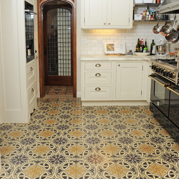
Tuscan single-wall ceramic tile eat-in kitchen photo in San Francisco with shaker cabinets, white cabinets, marble countertops, white backsplash, subway tile backsplash, black appliances and no island
 Westland Design
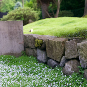
Moss Garden: A Living Carpet of Tranquility
A moss garden is a serene, low-maintenance landscape feature that evokes a profound sense of calm and natural beauty. Composed of vibrant, velvety mosses that thrive in shaded, humid environments, these gardens offer a soft, carpet-like groundcover that replaces traditional lawns or gravel with rich, green texture.
At Westland Design, our moss gardens are thoughtfully integrated into the overall landscape to enhance a feeling of timelessness and stillness. Whether nestled beneath the canopy of trees, edging a stone pathway, or surrounding a tranquil water feature, moss brings subtle movement and color to quiet corners of the garden.
Key qualities of a moss garden include:
Evergreen softness: Moss provides lush, year-round greenery that requires no mowing or fertilizing.
Quiet beauty: It absorbs sound, contributing to a peaceful, contemplative environment.
Natural elegance: Ideal for Japanese-style gardens or woodland settings, moss complements stone, water, and wood elements with organic harmony.
A moss garden is more than a design choice—it’s an invitation to slow down, observe closely, and appreciate nature’s quiet elegance.
 Sai Remodeling LLC
Headline: Stop replacing your kid's closet every few years. ? (Mercer Island Project)
Body:
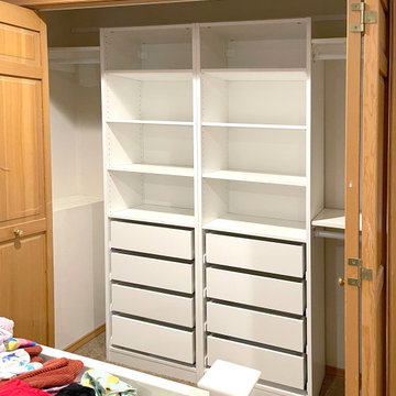
A recent client in Mercer Island reached out with a common frustration: their existing custom closet couldn't survive their kids. The shelves were bowing, the standard drawers were breaking from being slammed, and the floor was a constant mountain of clothes. (See the "Before" photo).
Kids' rooms require heavy-duty engineering, not just pretty panels. Here is how we rebuilt the space logic:
✔️ Impact-Resistant Hardware: We installed heavy-duty, soft-close glides. When kids slam the drawers, the hardware absorbs the shock, preserving the cabinet frame.
✔️ The Drawer Matrix: We eliminated deep, chaotic shelves. By increasing the number of drawers, we created an intuitive sorting system that actually encourages kids to put things away.
✔️ Structural Integrity: Built with solid materials designed for decades of daily physical stress.
A closet isn't just a box; it's a daily operating system for your home. If your current storage is failing, let's redesign the logic of your space.
? Serving Mercer Island, Bellevue, Renton & surrounding areas.
? Send a direct message to book a space consultation.
Sai Remodeling LLC | Hybrid Customization Closets
_
#SaiRemodeling #MercerIslandWA #BellevueHomes #SeattleContractor #ClosetDesign #HomeOrganization #BuiltToLast
 Billdr Renovation
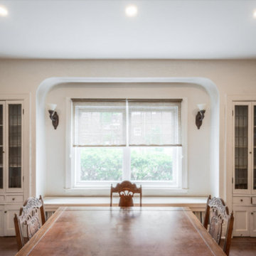
The project involved opening the ceiling on the ground floor of a 1930s duplex and replacing the plaster finish with a gypsum ceiling system. Aluminum electrical wiring was also replaced to conform to current standards, and the existing lighting was exchanged for new pot lights in all rooms. Once the ceilings were opened, an acoustic, soundproofing insulation system was installed to absorb interior noise from the second floor of the duplex. The soundproofing system consists of blown wool insulation, padded with a thin layer of air between it and the gypsum ceiling finish, along with the installation of resilient bars.
Inspiration for a mid-sized french country dark wood floor and brown floor enclosed dining room remodel in Toronto with beige walls - Houzz
 User
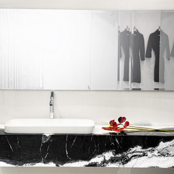
UserElegance and harmony make this natural stone a precious ally for designers. Any environment can absorb and make its own its innate sophistication and allow it to emerge in the lines of the furnishing. Like a very elegant gown, nature skilfully interwove these two "non" colours, black and white, in order to put visual lyrics into sophisticated verses. The appearance becomes the foreground element, the mirror of a soul that preserves unaltered the grace of times past, combining it with the modern taste, which is seen in the cleanness of the lines. A medley that nature, the driving force of the Antolini company, once created with surprising authenticity.
 Murison's Flooring America
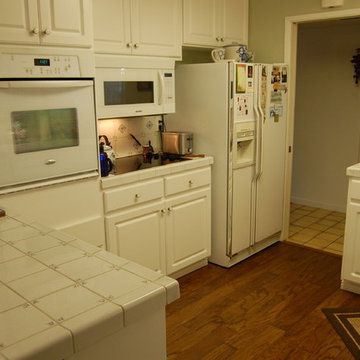
This beautiful kitchen is adjacent to the tile entryway and transitions well with the use of a matching T-molding. The placement of the rug absorbs water that may splash on the floor when it is in use. It is still important to leave no standing water on hardwood surfaces of any kind. Photo by Troy Ocariza
 THE Remodel Group
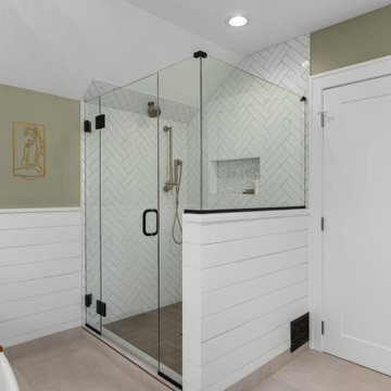
A luxurious en suite bath was created within this classic 1925 Portland bungalow by reconfiguring the second story’s original small bedrooms and tiny half bath. In this welcoming new urban boho space, eclectic finishes mingle harmoniously, integrated through subtle repetition of shapes and materials.
A furniture-style vanity sets the tone for this luxurious space, introducing materials, colors, shapes, and textures that repeat throughout. Individual walnut hexagons join to create distinctive vanity doors, offset beautifully by horizontal-grain drawers. Topping the cabinetry is a simple concrete countertop with integral sinks. An expansive framed mirror above enlarges and brightens the room. Within the mirror, sconces float, their globes a nod to the hexagons below. Champagne bronze fixtures reflect the warm walnut glow. Nestled into the back corner, a stunning shower features waterjet tiles in a double herringbone pattern, each precisely cut and laid to maintain design integrity at every surface transition. Teak floor tiles and a pebbled niche hint at the classic spa experience. Across from the shower, a large hexagonal window provides a treetop view from the free-standing tub below. The gentle oval of the tub and the beaded chandelier above provide a pleasing contrast to the strong lines surrounding it, as do the softly-shaded pebbles in the full-length niche. Shiplap wainscotting wraps the room, creating an illusion of height in the compact space. Subtle flooring and soft green walls create an understated backdrop for the bold mix of materials, unifying them into a serene oasis.
Asking a century-old home to accommodate a modern luxury bath is a tall order. Asbestos-laden plaster and flooring had to be abated. The subfloor had to be leveled and reinforced to increase strength and prevent deflection. Water lines and multiple electrical circuits had to be brought across and up without disturbing a beautifully-paneled ceiling, something we accomplished by firring out stair walls to hide the chases. Our client had visions of a leafy view from her tub, but the new layout eliminated existing windows. Placing a new window was complicated by deep eaves and flat soffits. By pushing the header into the roofline, however, we were able to accommodate a picture window. The flat soffit was replaced by an inverse hip lined with stained tongue and groove cedar, tying it to the bathroom finishes. Bringing materials up a narrow staircase became truly challenging when it was time to install the big items. However, strategic removal of drywall around the landing got the job done. Our attention to detail is showcased in the shower tile, where precise cuts were required at surface transitions to maintain the integrity of a complex double herringbone lay. The project was delivered on time.
Savvy layout choices minimized spending on structural changes. Because we were dealing with dormer space, head height was an issue. Raising the ceiling would have been complex and expensive so our design accommodated the constraints – tub on the low outside wall, shower on the full-height interior wall. The vanity spanned the spread, accommodating our petite client on the exterior side and her taller husband on the interior side. An under-eave closet was closed off to create room for both a freestanding tub and a separate shower. Rather than building replacement storage elsewhere, we simply added a new door into the closet from the primary bedroom. This was made possible by absorbing the short hallway separating the existing bed and bathroom into the primary bedroom. This new layout also created an en suite relationship between the primary bedroom and the new bath. We saved additional dollars by selecting a furniture-style vanity rather than using custom cabinetry, and the countertop with integral sinks provided a cost savings over a more traditional quartz countertop with undermount sinks. Affordable shower tiles allowed us to put more money into a dynamic tile layout. The project was delivered within budget.
 An Original, Inc.
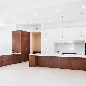
Full view of the kitchen and refrigeration/freezer built in units. As you can see, there are no handles on the cabinets. We used a Blum Tip On mechanical solution with a Legra box design. Walnut has all been vertically grain matched. A super matte white Luxe finish on the back wall absorbs the light, while the glass backsplash reflects it. A custom designed and fabricated stainless steel hood is flush and co-planar with the adjacent white cabinetry. The island is made with custom stained vertical grain walnut. The thicker ends serve to both support the 14' overhang as well as provide aesthetic balance. Dual sinks, dual dishwashers, and Wolf cooking applinaces.
 Klopf Architecture
Built for the Bluff, A Sea Ranch Home is Remade from the Inside Out
The house had always been grounded, on an ocean bluff at The Sea Ranch. It sits unencumbered, adjacent to one of the most dramatic stretches of the Sonoma coast with protected commons meadow to the east, uninterrupted Pacific views to the west, and a bluff trail running alongside. What it lacked was the feeling of home, one that could hold up its own against the natural landscape.
The owners are entrepreneurs with deep involvement across tech, real estate, and development and they know how things are built. The Sea Ranch house had been in their lives for years, a second residence and a place for family to gather. Built for a different time, it felt more compromising than comfortable. Sitting in a closed off nook, the kitchen fit one cook at a time and turned its back on the rest of the house. The entry was dim and compressed, divided by a structural column that presented itself at exactly the wrong moment. The primary suite was small relative to the view outside it. A large rear bedroom sat behind a lowered ceiling with a bathroom that had never been added. The house was certainly worth the trouble of doing it right.
What followed was not one project but four, each with its own design challenge, each addressed over a period of time.
Where the House Meets the Ocean
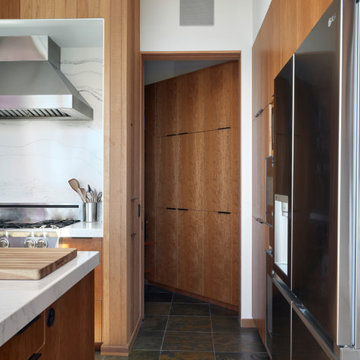
The most complex piece of the project, in both structural and spatial terms, was the kitchen expansion. The existing room was a single-person galley squeezed in as an afterthought with no meaningful connection to the dining room, the living space, or the deck outside. To make it useful for a family that cooks and gathers, it needed to grow outward into an existing patio and flow into the rooms around it.
A big challenge was the roofline. Several planes at different pitches and angles converged directly where additional volume was needed. A new form had to join that geometry without reading as a correction. The solution found the simplest possible connection between the existing angles, a roofline that from outside the structure, appears entirely original. From the bluff trail where the addition is visible, there is no discernible seam.
Inside, the kitchen is now open to the living and dining rooms without interruption. A large sliding glass door connects the space onto the rear deck. The deck itself was expanded and oriented so that the body of the house shields it from the coastal wind which is a common consideration that determines whether outdoor space at The Sea Ranch actually gets used. The result is a room that works for large family gatherings where no one feels cutoff, and one that makes the boundary between being inside and outside easy to ignore.
Welcoming Light
A structural column stood at the convergence of eight distinct roof planes in the entry. It was load-bearing, but it was also the reason the entry had always felt like a hallway rather than a welcoming arrival.
With the structural engineer, a custom steel connector was designed to receive beams from six separate directions, redistributing the load through a single new continuous beam. The column was surgically removed. Three triangular skylights were then cut into the roof above, their shapes drawn from the
existing geometry of the planes around them. The entry is now bright and open. The skylights feel native to the structure because they follow the logic already present in the roof.
Two Suites, Two Views
At opposite ends of the house, the two bedroom suites were each reconfigured, and each found a different way to introduce more of the landscape into the room.
An addition to the primary suite extended the structure outward to create a wraparound plan with a loop from the bedroom through bath and closet that had not been possible before. The expansion opened a slot view from the tub and shower toward the ocean. The view is precise and private. The ocean view is present and deliberate.
The rear bedroom absorbed an adjacent storage room to transform it into a full second suite with a vaulted ceiling, a large bathroom with a tub, a shower, and a sauna. A private fenced garden courtyard sits just beyond the glass bringing the outdoors inside. The tub was placed so that, looking past the courtyard and through the bedroom beyond, the ocean is visible at the far end. It is a long view and it makes the room feel larger and more settled than its footprint would suggest.
Glass on Four Sides, Fire at the Center
The main living and gathering room had always been caught between two competing facts: glass on four sides meant exceptional views but at The Sea Ranch, it also meant a cold room. A 360-degree cylindrical fireplace was added at the center on a raised stone base, providing radiant heat in every direction and giving the room a focal point around which a group naturally orients itself, whether that means two people at the end of the day or the whole family after dinner.
Owners Who Picked Up the Tools
The owner was not a passive client. they came with construction knowledge, specific ideas, and the desire to be an active part of the process, a dynamic that other architects may had found difficult, which Klopf Architecture accepted as an asset. They took it upon themselves to complete some of the work during construction, including the installation of a new radiant heating system beneath the floors.
The radiant system added to the older and less-desirable forced-air setup. At The Sea Ranch, that change matters as the house sits close enough to the ocean and moving air competes with the sound of it, where radiant heat does not. Solar panels were added to the roof as part of the new system. Insulation was upgraded throughout the walls, roof, and crawl space. The house that had always had the right setting now holds warmth the way a house on the bluff should.
They were also deeply involved in the design and selections throughout, and the finished house reflects both of them in ways that are specific rather than generic. The process took longer and moved through more iterations than a more arms-length relationship might have allowed. The result is more defined and personal because of it.
The Landscape Holds Priority
Every exterior decision was shaped by The Sea Ranch Design Standards, which require that buildings defer to the landscape around them rather than compete with it. Because this house sits on the bluff and is visible from the public trail, the additions faced a close review. Existing materials were matched. Geometries were resolved. The additions had to become indistinguishable from the original building.
From the trail, the house reads exactly as it always has — low, cedar-clad, secondary to the meadow and the water. The setting holds priority. Inside, the house has been remade.
Klopf Architecture Project Team: Geoff Campen and Trenton Jewett
Contractor: Shawn Bettega Construction
Photography: ©2025 Mariko Reed
Year Completed: 2023
Location: The Sea Ranch, CA
 iFloors Kitchen & Bath
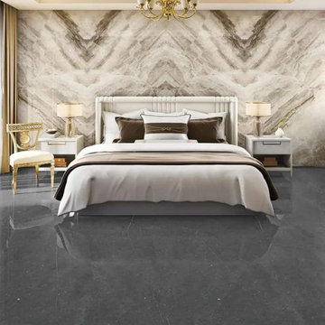
Dolce Grey is a beautiful crystalline grey marble look that comes in a bookmatch configuration that would add symmetry and focus to any space. This cool color along with the bookmtach configuration is ideal for focal fireplaces, countertops+backsplash, bathrooms and accent walls.
The color comes in two bookmatchable faces that can generate up to 4 different symmetric looks depending on how you choose to align the faces. Unlike natural stone, porcelain does not stain, absorb water, crack due to heat and requires virtually ZERO MAINTENANCE compared to natural stones.
You can purchase this product as material only to be delivered as slabs from our local warehouse in Houston, TX or select our professional installation services to ensure top quality workmanship.
 New Creations Custom Kitchen and Bath
These clients love to entertain and host large parties, but their existing kitchen was just too small and outdated. They have a large family with two huge dogs, so we knew we had to create a layout to accommodate everyone. We wanted to open the back wall so that the kitchen could expand into a formal dining room that they rarely used.
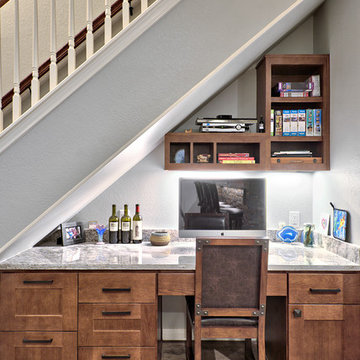
We were able to remove the built-in pantry, open the back wall, and absorb the entire formal dining room, to create a massive, open, chef’s kitchen. We designed a large eat-in central island built around a 36” gas cooktop with a heavy-duty downdraft pop-up vent. We maximized the cabinetry storage and made the most of every cabinet with pull-out organizers, hands-free trash pull-out, roll-out trays, large pantry cabinets, and gorgeous backlit glass front cabinets. We also created a large stone front bar area complete with a bar sink, double beverage centers, and an ice maker. We added built-in bench seating in the breakfast nook, a custom built-in desk area to utilize the space under the stairs, and refaced the fireplace to match the stacked stone in the bar area.
 Last Detail Interior Design
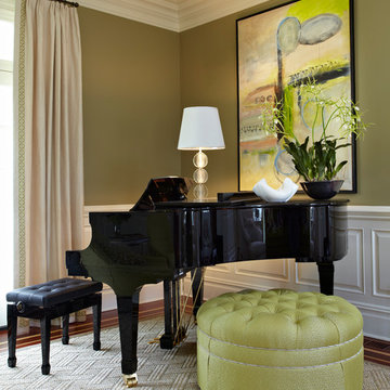
An ottoman tucks under the piano at the ready for extra seating as needed.
Photography: Paul Johnson
Inspiration for a transitional home design remodel in New York
Inspiration for a transitional home design remodel in New York
 Westland Design
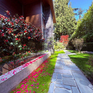
Moss Garden: A Living Carpet of Tranquility
A moss garden is a serene, low-maintenance landscape feature that evokes a profound sense of calm and natural beauty. Composed of vibrant, velvety mosses that thrive in shaded, humid environments, these gardens offer a soft, carpet-like groundcover that replaces traditional lawns or gravel with rich, green texture.
At Westland Design, our moss gardens are thoughtfully integrated into the overall landscape to enhance a feeling of timelessness and stillness. Whether nestled beneath the canopy of trees, edging a stone pathway, or surrounding a tranquil water feature, moss brings subtle movement and color to quiet corners of the garden.
Key qualities of a moss garden include:
Evergreen softness: Moss provides lush, year-round greenery that requires no mowing or fertilizing.
Quiet beauty: It absorbs sound, contributing to a peaceful, contemplative environment.
Natural elegance: Ideal for Japanese-style gardens or woodland settings, moss complements stone, water, and wood elements with organic harmony.
A moss garden is more than a design choice—it’s an invitation to slow down, observe closely, and appreciate nature’s quiet elegance.
 iCork Floor
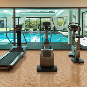
Want some of the best flooring benefits for a healthier home gym. Cork is the way.
Why cork works well as a home gym flooring material. Tiles, concrete and industrial carpet over concrete offer no resilience, and can be uncomfortable and potentially unhealthy. Cork flooring can provide important thermal and respiratory benefits. Created with a honeycomb structure, the millions of cells found in cork are filled with air, which accounts for its ability to absorb impact shocks and sounds. Install cork today and reap the benefits.
https://www.icorkfloor.com/store/sisal-12mm-cork-floating-flooring/
109