
Search results for "Absorbent" in Home Design Ideas
 Brownsmith Restoration
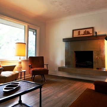
With this project we wanted to highlight our passion for Mid-Century Modern design. We purchased this home, a bland 1950's rambler, and renovated it, showcasing our love for the clean aesthetic of Mid-Century Modern designs. We solicited the help of our friends at Locus Architecture. Together we re-imagined the home. The original home had a tiny, panic inducing kitchen. By taking down a wall, and absorbing a bedroom, we were able to double the size of the kitchen. We also finished a three season porch that allowed space for a generous, sun soaked, dining room which the home desperately needed. We built sleek, custom cabinets with inset slab doors and concrete countertops. We also finished the entire basement, adding a bedroom, family room, laundry room, mudroom and 3/4 bath.
 Klopf Architecture
Built for the Bluff, A Sea Ranch Home is Remade from the Inside Out
The house had always been grounded, on an ocean bluff at The Sea Ranch. It sits unencumbered, adjacent to one of the most dramatic stretches of the Sonoma coast with protected commons meadow to the east, uninterrupted Pacific views to the west, and a bluff trail running alongside. What it lacked was the feeling of home, one that could hold up its own against the natural landscape.
The owners are entrepreneurs with deep involvement across tech, real estate, and development and they know how things are built. The Sea Ranch house had been in their lives for years, a second residence and a place for family to gather. Built for a different time, it felt more compromising than comfortable. Sitting in a closed off nook, the kitchen fit one cook at a time and turned its back on the rest of the house. The entry was dim and compressed, divided by a structural column that presented itself at exactly the wrong moment. The primary suite was small relative to the view outside it. A large rear bedroom sat behind a lowered ceiling with a bathroom that had never been added. The house was certainly worth the trouble of doing it right.
What followed was not one project but four, each with its own design challenge, each addressed over a period of time.
Where the House Meets the Ocean
The most complex piece of the project, in both structural and spatial terms, was the kitchen expansion. The existing room was a single-person galley squeezed in as an afterthought with no meaningful connection to the dining room, the living space, or the deck outside. To make it useful for a family that cooks and gathers, it needed to grow outward into an existing patio and flow into the rooms around it.
A big challenge was the roofline. Several planes at different pitches and angles converged directly where additional volume was needed. A new form had to join that geometry without reading as a correction. The solution found the simplest possible connection between the existing angles, a roofline that from outside the structure, appears entirely original. From the bluff trail where the addition is visible, there is no discernible seam.
Inside, the kitchen is now open to the living and dining rooms without interruption. A large sliding glass door connects the space onto the rear deck. The deck itself was expanded and oriented so that the body of the house shields it from the coastal wind which is a common consideration that determines whether outdoor space at The Sea Ranch actually gets used. The result is a room that works for large family gatherings where no one feels cutoff, and one that makes the boundary between being inside and outside easy to ignore.
Welcoming Light
A structural column stood at the convergence of eight distinct roof planes in the entry. It was load-bearing, but it was also the reason the entry had always felt like a hallway rather than a welcoming arrival.
With the structural engineer, a custom steel connector was designed to receive beams from six separate directions, redistributing the load through a single new continuous beam. The column was surgically removed. Three triangular skylights were then cut into the roof above, their shapes drawn from the
existing geometry of the planes around them. The entry is now bright and open. The skylights feel native to the structure because they follow the logic already present in the roof.
Two Suites, Two Views
At opposite ends of the house, the two bedroom suites were each reconfigured, and each found a different way to introduce more of the landscape into the room.
An addition to the primary suite extended the structure outward to create a wraparound plan with a loop from the bedroom through bath and closet that had not been possible before. The expansion opened a slot view from the tub and shower toward the ocean. The view is precise and private. The ocean view is present and deliberate.
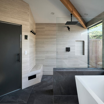
The rear bedroom absorbed an adjacent storage room to transform it into a full second suite with a vaulted ceiling, a large bathroom with a tub, a shower, and a sauna. A private fenced garden courtyard sits just beyond the glass bringing the outdoors inside. The tub was placed so that, looking past the courtyard and through the bedroom beyond, the ocean is visible at the far end. It is a long view and it makes the room feel larger and more settled than its footprint would suggest.
Glass on Four Sides, Fire at the Center
The main living and gathering room had always been caught between two competing facts: glass on four sides meant exceptional views but at The Sea Ranch, it also meant a cold room. A 360-degree cylindrical fireplace was added at the center on a raised stone base, providing radiant heat in every direction and giving the room a focal point around which a group naturally orients itself, whether that means two people at the end of the day or the whole family after dinner.
Owners Who Picked Up the Tools
The owner was not a passive client. they came with construction knowledge, specific ideas, and the desire to be an active part of the process, a dynamic that other architects may had found difficult, which Klopf Architecture accepted as an asset. They took it upon themselves to complete some of the work during construction, including the installation of a new radiant heating system beneath the floors.
The radiant system added to the older and less-desirable forced-air setup. At The Sea Ranch, that change matters as the house sits close enough to the ocean and moving air competes with the sound of it, where radiant heat does not. Solar panels were added to the roof as part of the new system. Insulation was upgraded throughout the walls, roof, and crawl space. The house that had always had the right setting now holds warmth the way a house on the bluff should.
They were also deeply involved in the design and selections throughout, and the finished house reflects both of them in ways that are specific rather than generic. The process took longer and moved through more iterations than a more arms-length relationship might have allowed. The result is more defined and personal because of it.
The Landscape Holds Priority
Every exterior decision was shaped by The Sea Ranch Design Standards, which require that buildings defer to the landscape around them rather than compete with it. Because this house sits on the bluff and is visible from the public trail, the additions faced a close review. Existing materials were matched. Geometries were resolved. The additions had to become indistinguishable from the original building.
From the trail, the house reads exactly as it always has — low, cedar-clad, secondary to the meadow and the water. The setting holds priority. Inside, the house has been remade.
Klopf Architecture Project Team: Geoff Campen and Trenton Jewett
Contractor: Shawn Bettega Construction
Photography: ©2025 Mariko Reed
Year Completed: 2023
Location: The Sea Ranch, CA
 Mogul Interior
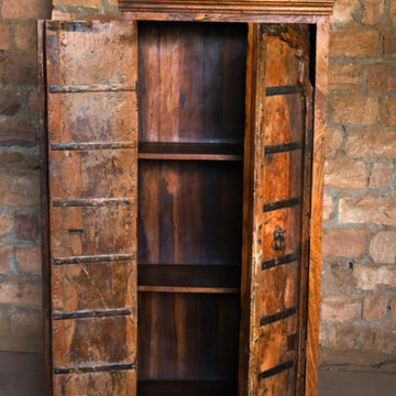
Creating expansive outdoor living spaces beyond the pool in your country farmhouse acreage is being in a dynamic conversation with nature's beauty and artistic elements. Older pool decks were smaller and enclosed and kept you away from absorbing nature's energies. The newer back to normal is including the outdoors as an extension of the house. Creating larger spaces for outdoor dining, a fire pit, and using antique architectural elements that brings in new energy and connectivity to the open spaces.
Find the right local pro for your project
 The Design Studio | MTS Renovations
Basement Development – Fort Sask Fitness
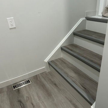
The Design Studio | MTS Renovations transformed an unfinished residential basement into a fully functional, home-based fitness gym—Fort Sask. Fitness. This custom-designed space provides an inviting yet high-performance environment tailored for personal training and fitness sessions.
Project Scope & Features:
Design & Permitting - We prepared concept design layouts that we converted to construction drawings. We prepared and submitted all permitting applications for this home based business and provided client representation through each phase of the project up to and including final occupancy inspection.
Space Planning & Layout Optimization – We maximized the existing footprint for optimal functionality, ensuring seamless equipment placement, circulation, and safety.
Flooring Selection – We installed durable, shock-absorbing gym flooring to support high-impact training and reduce noise transfer.
Lighting & Electrical Upgrades – We enhanced brightness and visibility with LED lighting, strategically placed for an energizing atmosphere. We added dedicated electrical circuits to accommodate specialized fitness equipment.
Ventilation & Climate Control – We incorporated efficient HVAC solutions to maintain air quality and temperature for a comfortable workout space.
Custom Storage & Organization – We integrated built-in under-stair equipment shelving and storage solutions for weights, resistance bands, and fitness accessories.
Aesthetic & Branding Integration – We designed a modern, motivating environment with finishes that align with the Fort Sask. Fitness brand identity.
Soundproofing Enhancements – We implemented acoustic treatments to minimize noise impact on the rest of the home.
By blending function with design, this basement transformation created a professional-grade fitness space that caters to both personal and client needs—all within the convenience of a residential setting.
 Tracy Berman Interiors
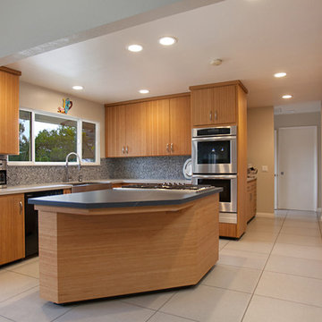
This contemporary kitchen was in need of a lighter and brighter counter top and backsplash. The black granite on both was absorbing all the light and distracting from the beauty of the newly refaced bamboo cabinets. A pallet of light grey and charcoal grey Silestone quartz counter tops were installed with a suede finish. The glass mosaic backsplash adds interest, texture and color. Now the kitchen and adjoining hutch and hall cabinets reflect the style of the rest of the home.
 EAG Studio
On a quiet street just steps from San Francisco’s beloved Dolores Park, a formerly modest urban structure has been transformed into a luminous vertical residence that quietly redefines contemporary city living. Through a comprehensive remodel and both vertical and horizontal expansion, the project turns a constrained urban footprint into a sequence of serene, art-forward living spaces that unfold upward toward expansive city views.
The architecture balances restraint and warmth: crisp contemporary geometry softened by natural materials, artful lighting, and carefully curated interiors. The result is a home that feels simultaneously grounded and elevated—deeply connected to its neighborhood yet remarkably private.
Reimagining the Urban Envelope
The original building has been almost entirely reconceived. The facade now reads as a disciplined composition of plaster volumes and precisely detailed window openings framed by subtle projecting bands. The geometry references San Francisco’s classic rhythm of bayed facades while stripping the language down to a refined modern expression.
Behind this quiet exterior lies a dramatically expanded interior volume. The redesign adds both additional floor area and new vertical circulation, transforming what was once a conventional city house into a multi-level architectural sequence organized around light, art, and views.
At the roofline, planted terraces soften the building’s silhouette and create a green crown visible from surrounding hillsides.
Interiors as a Sequence of Galleries
Inside, the home unfolds as a series of spatial moments connected by a sculptural stair and gallery-like corridors.
Wide plank oak floors run throughout, providing continuity and warmth against a palette of plaster walls, dark steel detailing, and natural stone. The hallways function almost as curated galleries, with layered artworks suspended in front of mesh panels that create depth and subtle shadow.
Light filters through carefully placed windows and stair openings, transforming circulation spaces into contemplative transitions rather than mere passageways.
A Living Room Anchored by Stone and Light
The primary living room occupies one of the home’s central floors, where a quiet interplay of texture and geometry defines the space.
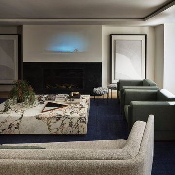
A monumental fireplace wrapped in dark stone forms the room’s anchor, its mass contrasting with a recessed ceiling plane that seems to float above the seating area. Integrated perimeter lighting creates a soft architectural glow that washes the ceiling and walls.
Furniture is sculptural yet understated—rounded lounge chairs in warm ochre velvet, tailored sofas, and a striking marble cocktail table whose expressive veining becomes a focal artwork in itself. Deep blue carpeting grounds the seating arrangement and subtly absorbs light, enhancing the calm atmosphere.
Above the fireplace, a delicate projection artwork introduces a moment of visual poetry—an unexpected cinematic gesture that transforms the wall into a quietly animated canvas.
Kitchen as Architectural Furniture
The kitchen expresses a different register: crisp, tactile, and materially rich.
Custom walnut cabinetry spans the wall in a continuous plane, punctuated only by the sculpted hood and integrated appliances. The wood’s depth and warmth are balanced by expanses of pale marble that flow seamlessly from countertop to backsplash.
Three dome pendants hover above the island like industrial sculptures, casting pools of warm light onto the stone surface.
A row of vivid red stools introduces a controlled burst of color, a small but confident departure from the otherwise restrained palette.
Dining With a Living Backdrop
Adjacent to the kitchen, the dining room opens toward a glass wall overlooking a vertical garden of climbing ivy. The greenery becomes a constantly changing backdrop—lush and shadowy during the day, atmospheric and cinematic after sunset.
A dark wood table anchors the room, surrounded by pale oak chairs whose understated forms echo Scandinavian design traditions. The simplicity of the furniture allows the view and natural light to become the dominant experience.
Intimate Spaces and Material Contrast
Throughout the home, smaller rooms offer moments of intimacy and material experimentation.
The powder room pairs textured wall coverings with a dramatic black marble vanity whose bold veining feels almost geological. A suspended mirror and slender pendant create a sculptural composition against the tactile backdrop.
The primary bedroom, by contrast, feels serene and expansive. Floor-to-ceiling glazing frames sweeping views of the city, while soft textiles and warm wood paneling create a cocooning effect. Slender black columns subtly define a sitting area without interrupting the openness of the space.
Bathing Above the City
In the primary bathroom, a sculptural freestanding tub sits beside a panoramic window overlooking San Francisco’s hills and rooftops.
The room’s palette—light oak, grey stone, and matte metals—reinforces the spa-like atmosphere. Floating cabinetry and integrated lighting maintain a sense of visual lightness despite the richness of the materials.
Entertaining Above the Park
Higher in the house, a lounge and bar area becomes the social heart of the home. Here, dark stone slabs with dramatic veining wrap the bar wall like a piece of monumental art.
Open shelving displays glassware and spirits, while integrated wine storage hints at the home’s entertaining ambitions. A soft leather sectional and low glass table create a relaxed setting for conversation, framed by expansive views of the city skyline.
Cinema and Retreat
The lower level introduces yet another atmosphere: a dedicated media room designed for immersive viewing.
Dark walls, plush seating, and soft lighting create a cinematic environment that contrasts intentionally with the airy upper floors. It’s a retreat within the home—intimate, quiet, and removed from the brightness above.
Architecture That Balances Discipline and Warmth
What makes the project particularly compelling is its balance between architectural discipline and lived warmth.
Every element—from the carefully framed views to the restrained material palette—contributes to a cohesive spatial narrative. Yet the home never feels austere. Natural materials, curated art, and layered lighting create a sense of comfort and depth.
The result is a house that feels both architecturally rigorous and deeply human.
A Contemporary Interpretation of San Francisco Living
In a neighborhood defined by historic homes and iconic park views, this transformation offers a contemporary interpretation of San Francisco living.
It respects the city’s urban density while embracing openness, light, and vertical living. The home rises quietly above its surroundings, culminating in panoramic vistas that stretch across rooftops, hills, and sky.
What began as a conventional structure has become something far more nuanced: a modern urban sanctuary—part gallery, part retreat, and wholly connected to the vibrant city just beyond its walls.
 User
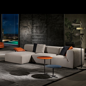
UserThe Play is one giant single piece of plump perfection. Its grand symmetry is so appealing, it looks out of this world. It's intelligently covered with acrylic fibre layers. The legs are crafted from shock absorbing plastic. This luxurious piece is everything you could want from a valuable asset of comfortable furniture.
 Studio AR+D Architects
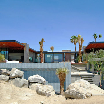
Fading into the rolling hillside landscape, this retreat absorbs the 360 degrees of captivating mountain, city and valley views. The project becomes fully engrained in these views when the warm colors of the desert’s minerals seem to ignite the corten steel cladding which burns a deep red and orange. Roof gardens allow the home to blend seamlessly with landscape and the guest house dissolves into the sloping landscape in order to optimize mountain views while still maintaining a visual connection to the outdoor play areas.
 Alair Columbia | TigerTown Home Improvement
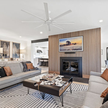
This fireplace surround is from The WoodVeneerHub.com. It is a walnut veneer over acoustical backing to absorb sound in this hard surfaced, open space. The fireplace chimney was condemned and unrepairable so we used a boi-ethanol burner kit with ceramic logs. Fan by MinkaAire. Rug from Ruggable.com
 Brittanys Design
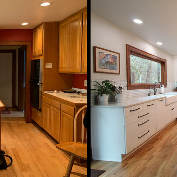
This 1924 beauty deserved a well planned and carefully detailed main level remodel. The goal for this project was to restore some of the original design elements and mix with modern day living and materials. Removing the wall between kitchen and dining space allowed the Gravelly Lake view to be absorbed from every angle. By carrying similar colors, styles and materials around the different rooms the home now has a cohesive style.
 Tracy Berman Interiors
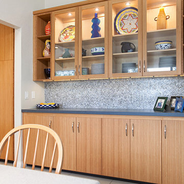
This contemporary kitchen was in need of a lighter and brighter counter top and backsplash. The black granite on both was absorbing all the light and distracting from the beauty of the newly refaced bamboo cabinets. A pallet of light grey and charcoal grey Silestone quartz counter tops were installed with a suede finish. The glass mosaic backsplash adds interest, texture and color. Now the kitchen and adjoining hutch and hall cabinets reflect the style of the rest of the home.
 Studio MMA Architecture + Design
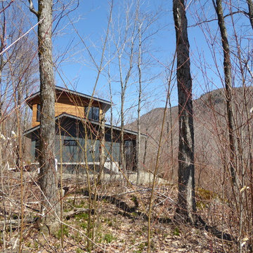
Located on a wooded lot on the south side of Mount Orford in Estrie, this country house is designed to enjoy views of the wooded slope down to a stream at the bottom of the valley and rising to the opposite cliff. The south offers a splendid view of distant mountains. Of modest size, the house is simple, modern and showcases natural materials. It opens towards the forest and the landscape while preserving the intimacy of the customers. The interior is spacious; the living spaces are communicating and friendly, with a high ceiling above the living room and a large picture window in front of the master bedroom, on the mezzanine. The living areas open onto an outdoor terrace that anchors the house to its rocky terrain, protected from the weather and hidden from the street. The rock of the land is highlighted at the edge of the terrace, where a rock face down the slope. A large roof overhang protects the house from the sun in the summer, and the low-level concrete floors absorb sunlight in the winter. The house has been designed according to the criteria of LEED and Novoclimat.
 Bridgewater
The new owners were looking forward to living in their new home with an open floor plan, tall vaulted ceilings, and great views. It featured a large Great Room with two big French Doors separating the Dining Room from the Master Bedroom.
But after only a few months they identified a major design flaw: Each of the French Doors had ten glass windows with two large windows above each door. (Check out our before and after designs, traffic flow diagrams and photos of this project.) Glass windows and doors allowed sound and light from guests or the TV in the great room to easily sneak into the bedroom. With unique work and sleep schedules (he’s a pilot, she’s a registered nurse) this design wasn’t working.
Then there was a traffic flow design flaw: The Master Bedroom had a second entrance from a hallway. To get into the bedroom from the hallway you needed to walk down another claustrophobic hallway.
To get from the Master Bedroom to the Master Bath begin at the most remote corner of the bedroom and down a hallway between two closets. Once inside the bath, a huge triangular Jacuzzi dominating the space.
So, from a privacy and traffic flow perspective, this home had some major design issues.
When Craig Weber first met with the owners, he listened to their ideas and concerns. The owners trusted Craig to come up with the most efficient and most effective solution to this design dilemma. He offered a solution that resolved the bed-bath traffic flow problem, offered some bedroom room privacy, and updated the bath.
First, the two French Doors and windows were removed. A new wall was built with sound-absorbing materials, making the Great Room and Dining Room more comfortable spaces for entertaining while creating the bedroom privacy the owners craved.
Solving the Bedroom/Bath traffic flow problem began with removing the two existing closets. The bath door was relocated next to the hall entrance, and then a new walk-in closet was added adjacent to the hallway entrance. The solution offered easy access to and from the bath, closet and hallway without a hint of claustrophobia.
The Master Bath underwent a major transformation designed for convenience and comfort – especially during long, cold Minnesota winters.
Most everything from the former bath was torn out, beginning with the giant Jacuzzi.
A new bathtub that is wider and deeper than the standard size was installed with brushed Nickel fixtures. It’s the perfect place to relax with a glass of wine and candles.
Warm floors are a Minnesota “must have.” The bath’s new ceramic floor features in-floor electric heat. Getting in and out of the tub is easy and comfortable.
The new walk-in shower again features in-floor heating and a place to sit. The most interesting feature of this shower may the custom ceramic tile installed with unique patterns.
A new vanity Cambria Bradshaw countertops features two under-hung ceramic sinks with matching brushed Nickel fixtures.
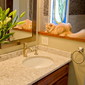
Tall ceilings and three glass windows near the ceiling flood the room with natural light. A new energy-efficient window frames an ornamental stained glass window created by the owner’s father – a great personal touch.
A quiet place to sleep. A private dining room for entertaining. A Master Bath to die for. And easy traffic flow. The owners couldn’t have been more delighted with the outcome. And Lilly, their cat, loves it too.
 Better Builders
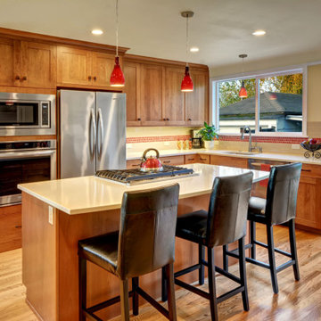
In this cozy 24 x 24-foot first-floor home, both space and budget were tight, but the homeowner envisioned a spacious, chef-style kitchen. To bring her dream to life, we made the most of every square inch with thoughtful, creative solutions.
By absorbing a small bedroom, we expanded the kitchen to allow for a spacious kitchen island and created a more functional and inviting layout. To enhance flow and make the space feel larger, we reduced the walls around the basement stairway, opening up sightlines into the dining room. This thoughtful change brought a sense of openness without compromising the home’s original style.
Clever design solutions and custom cabinetry maximized storage, including a custom corner drawer in lieu of a traditional lazy Susan and a built-in cutting board with a dedicated knife drawer. Custom cabinetry tailored to the homeowner’s needs added both form and function, while new windows and a back door flooded the space with natural light, further enhancing its airy feel.
The result is a thoughtfully expanded kitchen that is respectful of the home's original style and architecture and feels open, bright, and perfectly suited for both everyday cooking and entertaining—a true chef’s dream within the home’s charming footprint.
 Walcott Adams Verneuille Architects
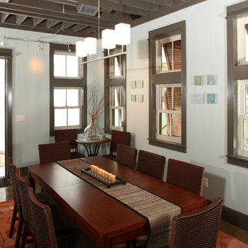
Certified LEED Platinum Florida beach residence. 2,100 s.f. 4 bedroom, 3 bath house with the efficiency of a ship. Every detail, from lighting fixtures to furniture was carefully considered to minimize environmental impacts and conserve energy. All of the runoff from the roof and parking areas are absorbed on site, with landscaping designed to be low maintenance and attract wildlife.

 FUTAR
FUTARÇimstone applies European Standards for its quality control and produces with the Italian BRETON technology. Combining the natural stone textures with the robustness of quartz, Çimstone is reliably used for laboratories in particular due to its anti-bacterial hygienic composition. Further, it may be applied to such different areas of use as internal walls, facade, stairs, window sills, skirting and flooring.
Not absorbing liquid due to its compact composition, Çimstone is stain-proof and displays a high resistance to the abrasive effects of acids and bases thanks to this property. It may be produced in different colours compatible with cupboard covers, which suit different expectations, with texture and design alternatives. Capable of being provided with effects with such different materials as mirror, glass, seashells colored with pigments, Çimstone offers such alternatives different from those surface covering materials which have come to be accustomed up to the present time and completes the changing kitchen and bathroom culture and modern designs of the present day.
 S2decor
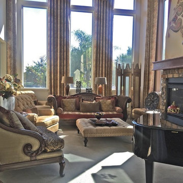
Moroccan interior design looks luxurious and exotic. In this project we paid attention to details, added original Moroccan furniture to the rooms and then combined them with rich colors of Moroccan decor to create unique appeal of ethnic decorating style.
Moroccan Interior Decors are a creative blend of African, Arab, and Mediterranean decorating style. Moroccan decor includes ethnic motifs and decoration patterns that have been absorbed from different cultures.
 Better Builders
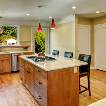
In this cozy 24 x 24-foot first-floor home, both space and budget were tight, but the homeowner envisioned a spacious, chef-style kitchen. To bring her dream to life, we made the most of every square inch with thoughtful, creative solutions.
By absorbing a small bedroom, we expanded the kitchen to allow for a spacious kitchen island and created a more functional and inviting layout. To enhance flow and make the space feel larger, we reduced the walls around the basement stairway, opening up sightlines into the dining room. This thoughtful change brought a sense of openness without compromising the home’s original style.
Clever design solutions and custom cabinetry maximized storage, including a custom corner drawer in lieu of a traditional lazy Susan and a built-in cutting board with a dedicated knife drawer. Custom cabinetry tailored to the homeowner’s needs added both form and function, while new windows and a back door flooded the space with natural light, further enhancing its airy feel.
The result is a thoughtfully expanded kitchen that is respectful of the home's original style and architecture and feels open, bright, and perfectly suited for both everyday cooking and entertaining—a true chef’s dream within the home’s charming footprint.
 b.b.begonia
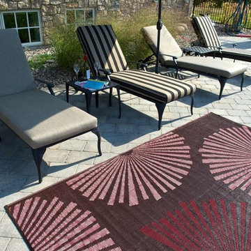
Inspired by the Orient, the oversized motif in the b.b.begonia Fantasia Outdoor Rug will definitely add a touch of elegance to any space. In hues of red and pink against a brown background, the b.b.begonia Fantasia rug offers a revealing dramatic contrast on each side. You’ll definitely adore this accent piece to match your furniture and decors. This reversible mat is a great solution for the patio, deck, pool area or yard.
Made from recycled Polypropylene, this b.b.begonia Fantasia Outdoor Rug is mold and mildew resistant as it doesn’t absorb dirt or stains. Easy to clean, leaves, mud or food spills are rinsed away with water and soap with no trouble. Plus the tightly woven tubular yarn material of b.b.begonia rugs supports your need for a durable and strong rug to outlast the elements. Moreover, the rugs are treated with U.V. inhibitors and state of the art conditioners to ensure color fastness.
 Jay-Quinones Contracting Inc.
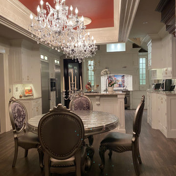
This was a complete kitchen renovation. The remodel included removing skylights and installing a two story bump up adding no square footage to the room but creating a dramatic visual even for the most discriminating designer. When you enter this kitchen your eyes wander trying to absorb the immense planning and detail that went into the renovation but ultimately you find yourself positioned under the large Theresa Maria chandelier gazing into the sky. The kitchen was designed around the 48 inch Thermador stove. The 2 story inset cabinet creation around the stove flows up into the addition creating a visual masterpiece that is only rivaled by original pieces of art works created by the likes of Van Gogh, Picasso and Rembrandt. The sink was relocated from the exterior wall and into the island so that the stove wall would be isolated and not connected any other cabinets. The 36-inch-wide refrigerator and 36-inch-wide freezer were designed and installed next to a microwave cabinet that makes heating up items as convenient as 1,2,3. The outside cabinet wall section is perfect for entertaining with the 42 inch base cabinets. The massive two-tiered island of 124 inches long is perfect for everyday family living. A farmer’s sink adds the perfect touch to this traditional design. Renovating a kitchen without ceiling detail is one of the most overlooked parts of the renovation. The amount of money spent on the renovation depends on the budget of course but I highly recommend including ceiling detail as much as one considers the tile backsplash.
89