
Search results for "Additional functionalities" in Home Design Ideas
 Ideal Construction & Remodeling
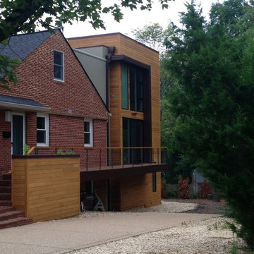
Ideal Construction and Remodeling can design and build your home addition so that it will be everything you hoped it would be, functionally, quality-wise and aesthetically. Our talented home design team has the know-how to design your home addition so that it will suit your needs and fit your budget.
When we design your home addition, we know it has to functionally support your lifestyle. It must also architecturally integrate seamlessly with your exiting home’s exterior look and interior flow. A successful home addition adds to the beauty and value of your home.
Visit our website ( http://idealconstructionva.com/) to schedule your free estimate!
 Kristin Hoaglund Design
This beautiful French Provincial home is set on 10 acres, nestled perfectly in the oak trees. The original home was built in 1974 and had two large additions added; a great room in 1990 and a main floor master suite in 2001. This was my dream project: a full gut renovation of the entire 4,300 square foot home! I contracted the project myself, and we finished the interior remodel in just six months. The exterior received complete attention as well. The 1970s mottled brown brick went white to completely transform the look from dated to classic French. Inside, walls were removed and doorways widened to create an open floor plan that functions so well for everyday living as well as entertaining. The white walls and white trim make everything new, fresh and bright. It is so rewarding to see something old transformed into something new, more beautiful and more functional.
 Waterlily Interiors
Stylish Productions
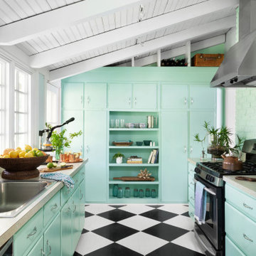
Inspiration for a coastal u-shaped multicolored floor, exposed beam and vaulted ceiling kitchen remodel in Baltimore with a drop-in sink, flat-panel cabinets, turquoise cabinets, laminate countertops, black appliances, no island and beige countertops
Inspiration for a coastal u-shaped multicolored floor, exposed beam and vaulted ceiling kitchen remodel in Baltimore with a drop-in sink, flat-panel cabinets, turquoise cabinets, laminate countertops, black appliances, no island and beige countertops
Find the right local pro for your project
 Hansen's Renovations
Completed in partnership with LAM Studios Inc., this Fall 2024 renovation transformed multiple areas of a Dilworth home into a cohesive, functional, and beautifully updated living environment. The project included a complete kitchen remodel, living room renovation, bathroom remodel, laundry room update, dining room renovation, fireplace enhancement, and hallway improvements.
The kitchen serves as the centerpiece of the renovation, featuring improved functionality, modern finishes, and a layout designed to support everyday living and entertaining. Adjacent living and dining spaces were thoughtfully redesigned to create a seamless flow throughout the home, while the updated fireplace provides a warm and inviting focal point.
Additional improvements to the bathroom, laundry room, and hallway enhanced both comfort and efficiency, ensuring every space contributes to the home's overall functionality and style. Through careful planning, quality craftsmanship, and timeless design choices, this renovation successfully blends modern living with lasting elegance.
The result is a beautifully refreshed home that feels brighter, more connected, and perfectly tailored to the homeowners' lifestyle.
 TKS Design Group
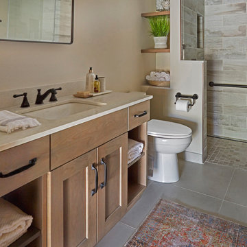
This project was completed for clients who wanted a comfortable, accessible 1ST floor bathroom for their grown daughter to use during visits to their home as well as a nicely-appointed space for any guest. Their daughter has some accessibility challenges so the bathroom was also designed with that in mind.
The original space worked fairly well in some ways, but we were able to tweak a few features to make the space even easier to maneuver through. We started by making the entry to the shower flush so that there is no curb to step over. In addition, although there was an existing oversized seat in the shower, it was way too deep and not comfortable to sit on and just wasted space. We made the shower a little smaller and then provided a fold down teak seat that is slip resistant, warm and comfortable to sit on and can flip down only when needed. Thus we were able to create some additional storage by way of open shelving to the left of the shower area. The open shelving matches the wood vanity and allows a spot for the homeowners to display heirlooms as well as practical storage for things like towels and other bath necessities.
We carefully measured all the existing heights and locations of countertops, toilet seat, and grab bars to make sure that we did not undo the things that were already working well. We added some additional hidden grab bars or “grabcessories” at the toilet paper holder and shower shelf for an extra layer of assurance. Large format, slip-resistant floor tile was added eliminating as many grout lines as possible making the surface less prone to tripping. We used a wood look tile as an accent on the walls, and open storage in the vanity allowing for easy access for clean towels. Bronze fixtures and frameless glass shower doors add an elegant yet homey feel that was important for the homeowner. A pivot mirror allows adjustability for different users.
If you are interested in designing a bathroom featuring “Living In Place” or accessibility features, give us a call to find out more. Susan Klimala, CKBD, is a Certified Aging In Place Specialist (CAPS) and particularly enjoys helping her clients with unique needs in the context of beautifully designed spaces.
Designed by: Susan Klimala, CKD, CBD
Photography by: Michael Alan Kaskel
 Décor Aid
Everyone deserves to end the day in a comfortable, tranquil home. And for those with children, it can seem impossible to reconcile the challenges of family life with the need to have a well-designed space. Our client—a financial executive and her family of four—had not considered a design makeover since moving into their apartment, which was more than ten years ago. So when she reached out to Decor Aid, she asked us to modernize and brighten her home, in addition to creating a space for her family to hang out and relax.
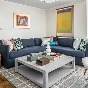
The apartment originally featured sunflower-yellow walls and a set of brown suede living room furniture, all of which significantly darkened the space. The living room also did not have sufficient seating options, so the client was improvising seating arrangements when guests would come over.
With no outward facing windows, the living room received little natural light, and so we began the redesign by painting the walls a classic grey, and adding white crown molding.
As a pathway from the front door to the kitchen, the living room functions as a high-traffic area of the home. So we sourced a geometric indoor-outdoor area rug, and established a layout that’s easy to walk through. We also sourced a coffee table from Serena & Lily. Our client has teenage twins, and so we sourced a sturdy sectional couch from Restoration Hardware, and placed it in a corner which was previously being underused.
We hired an electrician to hide all of the cables leading to the media console, and added custom window treatments. In the kitchen, we painted the cabinets a semi-gloss white, and added slate flooring, for a clean, crisp, modern look to match the living room.
The finishing touches included a set of geometric table objects, comfortable throw rugs, and plush high-shine pillows. The final result is a fully functional living room for this family of four.
 TOC design & construction inc.
DESIGNED BY TOC design
CONSTRUCTION BY TOC design & Construction inc.
PHOTOS BY : Tania Scardellato
I was fortunate to have a young family approach me in desperate need to renovate there only 3 piece bathroom. This space was In dire need of a remodel, with old brown wall to wall tiles and a dated bulky yellow brown single sink vanity.
Storage was a must, lighting a necessity, and proper accessibility to the shower bath area.
We had a tight budget to respect, but a full gut of this bathroom was required. And a good thing too, once we started doing the demolition we noticed that mildew and rotting floors and walls had accumulated throughout the years. Doing it right the first time is no joke when dealing with water and electrical issues.
We discarded all reminisce of old and built from scratch, new walls, new plumbing, new electrical ,new insulation and a new window, a new fan that actually exhausted outside ( I say this laughing as you would be amazed at how many fans are installed but don’t exhaust outside, and you the client would never know unless you go inside the attic space.
Once all the hard stuff was done, the rest is just a matter of smart design. If you have a small bathroom here are some tips to guide you.
10 tips for making a small bathroom feel larger
Is your tiny bathroom cramping your functionality and style, leaving you longing for the enormous bathrooms gracing the pages of design magazines? Even if your bathroom is a fraction of the size, all it takes is some design savvy to make the most of the space you have. Consider these 10 smart tips that will help your bathroom look, feel and function like those larger contenders.
1-Get creative with corners
Space is at a premium in small bathrooms, so it's important to maximize every inch. Corners, for example, provide extra space for shelving, storage units and even hooks. Get creative and install unique design solutions that are not only functional, but also eye-catching. If you love the airiness of floating cabinets, add baskets or decorative boxes under for extra storage. If you are installing floating cabinets insure that they are installed securely to studs or plywood at wall.
2- Let solid colors shine
Busy patterns have a shrinking effect and make small bathrooms seem even smaller. Conversely, light natural hues make a space feel more open. If you're itching to get creative with design, experiment with textures but keep overpowering patterns to a minimum. Tone on tone is the best to achieve this.
3 - Maximize your bathtub
A bathtub takes up a significant portion of the room, but modern, compact options with curved basins, can make the tub feel larger when in use, all while conserving space.
4 - Select a smaller faucet
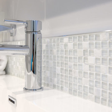
A faucet is jewelry for the bathroom. And just as accessories can overpower an outfit, a big bulky faucet isn't flattering in a small bath. Single-handle designs conserve counter space, while a wall-mount installation frees it up all together and can create quite the wow-factor, if the budget can accommodate the required changes to plumbing behind the wall.
5 - Make vanity storage simple
If you're in a storage war with your small bathroom, you're not alone in the battle. Toiletries and personal supplies without a place to call home only add clutter and chaos. Store smart with a space-saving vanity, the dual sink vanity shown here, looks quite simple, but in reality it has 4 sets of full extension drawers, and the vanity tower adds extra storage without overpowering the use of space.
6 - Show off the shower
Shower curtains may be pretty, but they interrupt the visual flow of a bathing space and make it feel significantly smaller. In bathrooms with small footprints, opt for a clear glass sliding shower door that doesn't require the clearance of one with a hinged design. Or as shown in this design and for fraction less expensive a half hinged panel installed on a fixed tempered glass panel. If you're embarking on a big remodel, create the illusion of more space by using same tile in the shower that's used throughout; instead of seeing them as two separate zones, the eye will read them as one.
7 - Discover the treasure of hidden storage
Work with a contractor, and you just might find some serious storage potential hidden behind your walls. Whether it's utilizing space between the studs for shallow shelving or a creating a small linen closet by annexing space from an adjacent room, even small additions can make a big difference.
8 - Focal Point
Tile is a beautiful, durable addition to any bathroom. For dainty spaces, consider installing tile at a diagonal to accentuate the focal point or as in this bathroom I used an oversized textured pattern to bring depth to the space at the window wall.
9 - Choose the right lights
Strategically install light to reflect and brighten a small bathroom to make it appear larger. Recessed lighting is an affordable solution for tiny rooms, offering ample light while taking up little space. Wall sconces alongside a mirror also reflect off the walls and make a room feel bright and airy. I always recommend going with LED lighting at 2800 to 3000K.
10 – Accessorize
This is your time to shine in your decorating skills, have fun with your towels, you can change the color scheme daily just by adding pops of color in your accessories, make sure to get items that serve a dual purpose, like baskets, boxes they can always be used as hampers, storing of towels and even a nice display for your guest.

Sponsored
Columbus, OH

Hope Restoration & General Contracting
Columbus Design-Build, Kitchen & Bath Remodeling, Historic Renovations
 Saikley Architects
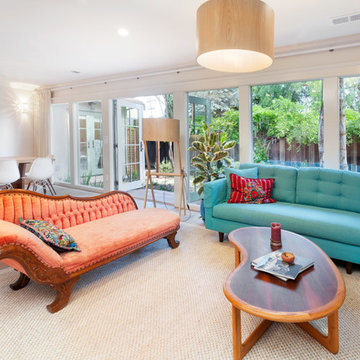
Down-to-studs remodel and second floor addition. The original house was a simple plain ranch house with a layout that didn’t function well for the family. We changed the house to a contemporary Mediterranean with an eclectic mix of details. Space was limited by City Planning requirements so an important aspect of the design was to optimize every bit of space, both inside and outside. The living space extends out to functional places in the back and front yards: a private shaded back yard and a sunny seating area in the front yard off the kitchen where neighbors can easily mingle with the family. A Japanese bath off the master bedroom upstairs overlooks a private roof deck which is screened from neighbors’ views by a trellis with plants growing from planter boxes and with lanterns hanging from a trellis above.
Photography by Kurt Manley.
https://saikleyarchitects.com/portfolio/modern-mediterranean/
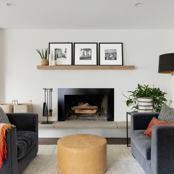 Kristin Hoaglund Design
This beautiful French Provincial home is set on 10 acres, nestled perfectly in the oak trees. The original home was built in 1974 and had two large additions added; a great room in 1990 and a main floor master suite in 2001. This was my dream project: a full gut renovation of the entire 4,300 square foot home! I contracted the project myself, and we finished the interior remodel in just six months. The exterior received complete attention as well. The 1970s mottled brown brick went white to completely transform the look from dated to classic French. Inside, walls were removed and doorways widened to create an open floor plan that functions so well for everyday living as well as entertaining. The white walls and white trim make everything new, fresh and bright. It is so rewarding to see something old transformed into something new, more beautiful and more functional.
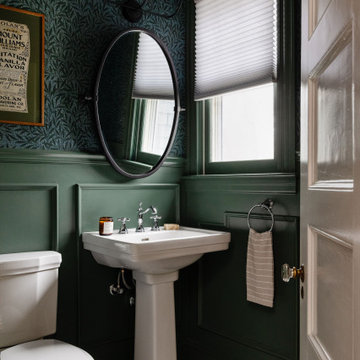
 McGuire + Co. Kitchen & Bath
Design-build kitchen, powder room, and butler’s pantry remodel in an 1890 Victorian home in Wakefield, MA. Full renovation included reconfiguring the powder room layout and opening a load-bearing wall between the kitchen and dining room to improve flow and functionality.
Kitchen remodel features frameless full overlay cabinetry in Steel Blue, quartz countertops (Alleanza Dolomiti Extra), beveled crackle tile backsplash, and hardwood flooring. Island addition replaces freestanding table and adds prep space with microwave drawer. Full-height wall cabinets maximize kitchen storage. Historic-inspired details include ogee-edge countertops, bridge-style faucet in English Bronze, decorative corbels, polished nickel hardware, and industrial-style sconces.
Powder room renovation includes reduced footprint layout, basketweave floor tile, applied molding, wallpaper, and vintage-inspired plumbing fixtures in chrome.
Butler’s pantry remodel features inset cherry cabinetry in a coffee stain finish, quartz countertops, glass-front cabinets, beverage fridge, bar sink, and wallpapered cabinetry interiors. Designed as a functional wet bar and storage extension off dining room.
Style: Traditional / Victorian kitchen remodel, historic home renovation, design-build remodeling contractor Wakefield MA.
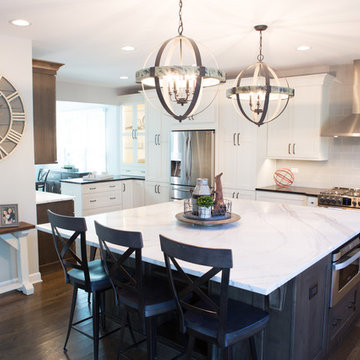
 Advance Design Studio, Ltd.
Jackie and Sean loved the Algonquin neighborhood they lived in with the peaceful neighborhood and the close proximity to work and school. What they didn’t love was how outdated their home had become. With a cramped kitchen and an unused dining room, they decided a remodel was the perfect solution to their problem. They would be able to continue to live in the area they loved, while at the same time they could have the dream home they envisioned.
After a thorough search, Jackie came across Advance Design Studio. She was impressed by all of the positive reviews she saw on the internet and saw herself identifying with all of the project stories she saw on the website. Once they met with designer Scott Christensen and owner Todd Jurs, they knew Advance Design was the right company to make their dreams a reality.
The project consisted of four main areas: the kitchen/dining/powder room, the laundry room, the master bathroom, and the kid’s bathroom. They wanted to expand the kitchen into the seldom used dining room and add a large island for hosting parties and family gatherings. They also wanted new hardwood flooring throughout the first level. The laundry room needed to be more functional, and all three bathrooms were in dire need of updating.
The closed off kitchen was opened up to create a sweeping space between the new eating area and the much larger kitchen. A handsome dry bar complete with a beverage refrigerator and lighted glass door cabinetry makes an elegant transition across from a peninsula area filled with storage. An additional decorative cabinet lighting up elegant dishware through the mullioned glass sits directly across from the drybar.
An expansive island was critical to the kitchen plans. Jackie, Sean and Scott worked closely together to create just the right details for their design. They wanted the island to be functional in addition to being the centerpiece of the room. Added storage for the kid’s school supplies was hidden behind cabinet doors so the children could do their schoolwork right at the island, and a microwave drawer glides open with the touch of a finger hidden inconspicuously within the island space. The easy to care for Cambria Britannica Quartz island top with its sweeping grey and white marble look perched atop hand-carved Craftsman corbels was absolutely what they were hoping for, blending both beauty and function perfectly.
Adding a nice contrast to the brightness of the quartz and the white cabinetry, Kodiak - Leather granite countertops were used to balance the light and dark tones of the space. Dura Supreme Classic White painted cabinets grace the perimeter, while Maple Poppy Seed stained cabinets with a beautiful soft grey woodgrain were used in the beverage center and island. The two tones compliment the large space balancing it out nicely creating interest and elegance with the simple Craftsman style full overlay doors.
A deep warm Barnwood White Oak flooring was added throughout the lower level. The new floor brings additional contrast to the bright kitchen and provides unity with the now open floorplan as it rolls in to the foyer and family room. Final details like the show-stopping lunar like duo light fixtures complete the space and intermix expertly with crisscross details of the glass door mullions, the island bar seating and even accessories in the space.
The small cluttered laundry room needed more space and more storage. With a busy family it seemed to overflow daily and did not have anywhere to hide the families “in and out stuff.” Scott designed the new space with a stackable washer and dryer and much more efficiently organized cabinetry. Doing laundry is now (almost!) a pleasure and keeping everyone’s “stuff” hidden, but readily accessible is now a snap.
The master bath was not a place where the couple enjoyed spending time getting ready for their day. The tub almost never was used, so removing it made it possible to build an extra-large shower, replacing the small cramped cube of the previous shower they hated. Clean, horizontal lines softly draw your eye around the space with porcelain tile called Driftwood Sea spray. Full overlay cabinetry in a soft white vanity with double sinks makes getting ready for the day much more convenient for the busy couple.
Long floor planks made of porcelain tile mimic real hardwood floors in a soft grey to compliment the shower, but with the ease and care of a tile surface. Cambrian Black Granite counters with a matte finish and under mount porcelain sinks with handsome brushed chrome hardware complete the handsome space. A real bonus in any master bath; a custom built in storage nook was tucked in the corner of the space for linens and heavenly storage.
The kid’s bath was in sad shape because it was original to the house. To keep the budget in control, the tub which was in great condition was retained, but focus was on the new large brick style porcelain charcoal tile on the floor, crisp white new Craftsman style cabinetry with pretty furniture details on the corner base, a striking granite top with white under mount porcelain sinks and fresh hardware and faucets. Some beautiful soft grey wood mirrors to match mom and dads were custom sized and placed under new lighting, and 4 hooks were smartly arranged down the wall for kids’ towels.
This couple was determined not to move, and made their house their dream home. Not only does their home function greatly now, but Jackie says, “When the neighbors come to visit, they’re asking if they can “steal” the design”! The added functionality, elegance, and open floor plan were exactly what this family needed in order to stay.
Advance Design Studio, Joe Nowak
 Meghan Shadrick Interiors
Jessica Delaney Photography
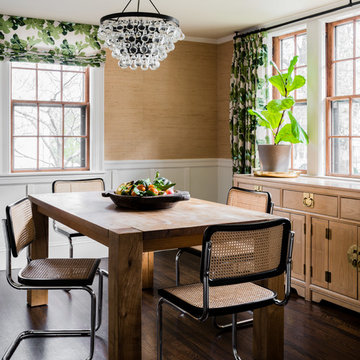
Dining room - small transitional dark wood floor and brown floor dining room idea in Boston with beige walls and no fireplace
Dining room - small transitional dark wood floor and brown floor dining room idea in Boston with beige walls and no fireplace
 Fabco Sanctuary
The architect and designer Guy Derwent was approached by his client with a clear and compelling brief: to completely transform a grand Victorian terrace house they were planning to renovate. The client envisioned something far beyond a standard renovation – this was to be a bold and dramatic reimagining of a family home that could grow with them over time.
With the property having remained largely untouched for more than fifty years, the architects saw an opportunity to unlock its potential and deliver a contemporary design that would contrast beautifully with its Victorian heritage.
The existing layout consisted of a series of small, disconnected rooms to the rear of the house. To respond to the client’s need for openness and flexibility, the architect proposed a radical restructuring of the ground floor:
The rear rooms were completely removed
Suspended timber floors were lowered by up to two metres to align with the garden
Two bold extensions were added
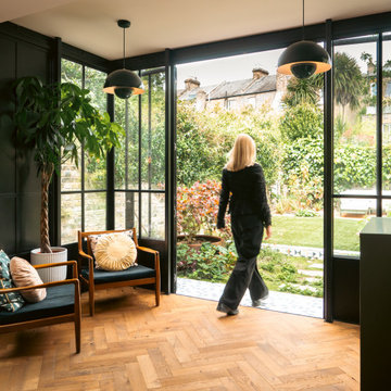
The first extension filled in the side return with a London stock brick facade and a glazed roof, while the second – a striking black steel and glass pavilion was glazed on three sides and placed along the garden elevation.
This new pavilion redefined the building’s relationship with the garden. Its steel-framed glazing created a seamless dialogue between interior and exterior, offering a sense of immersion in the surrounding landscape.
At the heart of the plan sits a dramatic, five-metre-tall dining space that acts as a transition from the original entrance hall into the new addition. A large, circular cast-glass window, framed in steel, provides a visual and spatial link between old and new, allowing light and movement to travel through the depth of the home.
Throughout the project, a series of black metal elements were introduced as sculptural interventions – each marking moments of transformation within the house. These included the bespoke steel framed circular window, a custom metal staircase, a cylindrical support column, and the striking steel and glass garden pavilion. Together, they formed a coherent architectural language that underscored the project’s bold intent.
Our steel windows and doors played a vital role in delivering the project’s vision. The architects chose steel for its refined sight lines and distinctive material character, which helped bridge the gap between the historical context of the building and the bold new additions.
The black steel frames provided a crisp contrast to the pale London stock brick and added definition to the glazed pavilion, reinforcing the sense of architectural precision. In particular, the fine steel profiles of the garden room allowed the extension to feel both lightweight and immersive, blurring the boundary between the house and its garden.
The architect drew inspiration from the Bauhaus Movement, particularly the work of Walter Gropius, whose approach to functional beauty and industrial materials informed the design of the garden pavilion.
Here, our glazing system was used not just for transparency, but as an expressive architectural element. The carefully proportioned panels help to conceal the roof thickness and reinforce the pavilion’s industrial yet abstract character – a deliberate nod to product design and modernist detailing.
Sustainability was an important factor in the selection of materials. Our steel systems, made from 99% recycled content and 100% recyclable, aligned with the project’s broader environmental goals.
The architects noted that this commitment to material longevity and circularity was central to their decision to use steel. The durability and recyclability of the windows and doors ensured the project met both aesthetic and ethical criteria.
This London terrace house now stands as a celebration of contrast – between heritage and innovation, solidity and transparency, tradition and transformation. Our steel windows and doors were not simply components; they were essential tools in crafting a home that is as bold and expressive as it is functional.
The result is a home designed for modern family life, where light, space, and materiality come together in perfect harmony.
Sponsored
Columbus, OH

Structural Remodeling
Franklin County's Heavy Timber Specialists | Best of Houzz 2020!
 Murphy Bros. Design | Build | Remodel
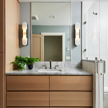
The guest bathroom’s single vanity features warm medium wood tones paired with a gray marble countertop, creating a balanced and inviting look. Flanked by layered lighting sconces, the vanity is complemented by custom cabinetry and a linen closet, combining style and functionality in the newly added space.
 Casa Utopia Builders
This stunning project by Casa Utopia Builders in Fremont, California showcases a full custom home remodel and addition, blending modern design with warm natural finishes to create a sophisticated and functional space.
The transformation included a 530 sq. ft. home addition, expanded living areas, a new open-concept kitchen, and multiple modern bathroom remodels, as well as a full upgrade to the flooring, lighting, and finishes throughout the home.
Key Highlights:
Vaulted ceilings with LED recessed lighting and new skylights
Contemporary floating staircase with glass railing and custom oak hardwood flooring
Elegant floor-to-ceiling fireplace with tile surround and built-in lighting
Chef-style kitchen with custom cabinetry, waterfall-edge island, and under-cabinet lighting
Spa-like bathrooms with floating vanities, modern tilework, LED mirrors, and frameless glass showers
Smart home upgrades including EV charging station and solar-ready panel
Complete exterior stucco and paint, new doors/windows, and a custom outdoor gazebo rebuild
This project demonstrates our full-scope capabilities—from foundation and framing to the final interior finishes. It reflects our commitment to design excellence, high-end craftsmanship, and client-focused project management.
? Project Location: Fremont, CA
? Scope: Full Home Remodel + 530 SQFT Addition
? Style Tags: Contemporary | Modern | Warm Minimalism | Luxury Remodel
 Nar Design Group
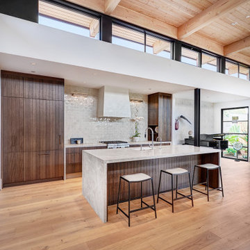
A combination of quarter sawn white oak material with kerf cuts creates harmony between the cabinets and the warm, modern architecture of the home. We mirrored the waterfall of the island to the base cabinets on the range wall. This project was unique because the client wanted the same kitchen layout as their previous home but updated with modern lines to fit the architecture. Floating shelves were swapped out for an open tile wall, and we added a double access countertwall cabinet to the right of the range for additional storage. This cabinet has hidden front access storage using an intentionally placed kerf cut and modern handleless design. The kerf cut material at the knee space of the island is extended to the sides, emphasizing a sense of depth. The palette is neutral with warm woods, dark stain, light surfaces, and the pearlescent tone of the backsplash; giving the client’s art collection a beautiful neutral backdrop to be celebrated.
For the laundry we chose a micro shaker style cabinet door for a clean, transitional design. A folding surface over the washer and dryer as well as an intentional space for a dog bed create a space as functional as it is lovely. The color of the wall picks up on the tones of the beautiful marble tile floor and an art wall finishes out the space.
In the master bath warm taupe tones of the wall tile play off the warm tones of the textured laminate cabinets. A tiled base supports the vanity creating a floating feel while also providing accessibility as well as ease of cleaning.
An entry coat closet designed to feel like a furniture piece in the entry flows harmoniously with the warm taupe finishes of the brick on the exterior of the home. We also brought the kerf cut of the kitchen in and used a modern handleless design.
The mudroom provides storage for coats with clothing rods as well as open cubbies for a quick and easy space to drop shoes. Warm taupe was brought in from the entry and paired with the micro shaker of the laundry.
In the guest bath we combined the kerf cut of the kitchen and entry in a stained maple to play off the tones of the shower tile and dynamic Patagonia granite countertops.

 Stalburg Design
This stylish, family friendly kitchen is also an entertainer’s dream! This young family desired a bright, spacious kitchen that would function just as well for the family of 4 everyday, as it would for hosting large events (in a non-covid world). Apart from these programmatic goals, our aesthetic goal was to accommodate all the function and mess into the design so everything would be neatly hidden away behind beautiful cabinetry and panels.
The navy, bifold buffet area serves as an everyday breakfast and coffee bar, and transforms into a beautiful buffet spread during parties (we’ve been there!). The fridge drawers are great for housing milk and everyday items during the week, and both kid and adult beverages during parties while keeping the guests out of the main cooking zone. Just around the corner you’ll find the high gloss navy bar offering additional beverages, ice machine, and barware storage – cheers!
Super durable quartz with a marbled look keeps the kitchen looking neat and bright, while withstanding everyday wear and tear without a problem. The practical waterfall ends at the island offer additional damage control in bringing that hard surface all the way down to the beautiful white oak floors.
Underneath three large window walls, a built-in banquette and custom table provide a comfortable, intimate dining nook for the family and a few guests while the stunning chandelier ties in nicely with the other brass accents in the kitchen. The thin black window mullions offer a sharp, clean contrast to the crisp white walls and coordinate well with the dark banquette.
Thin, tall windows on either side of the range beautifully frame the stunningly simple, double curvature custom hood, and large windows in the bar/butler’s pantry allow additional light to really flood the space and keep and airy feel. The textured wallpaper in the bar area adds a touch of warmth, drama and interest while still keeping things simple.

Sponsored
Columbus, OH
Hope Restoration & General Contracting
Columbus Design-Build, Kitchen & Bath Remodeling, Historic Renovations
 Priority Remodeling
Priority Remodeling's Exquisite One-Bedroom ADU Project
In the world of home improvement and design, every so often, a project emerges that flawlessly marries aesthetics with functionality. The recent completion of a one-bedroom Accessory Dwelling Unit (ADU) by Priority Remodeling stands as a testament to this golden rule.
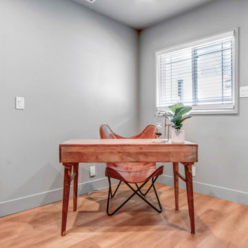
As one steps into the space, the first thing that catches the eye is the immaculate and contemporary design of the room. Muted gray walls serve as the perfect backdrop, enhancing the natural brightness of the room, thanks to the strategically positioned windows. The window blinds, neatly tucked away, provide options for privacy while allowing natural light to illuminate the space.
The minimalist office area showcases a sleek wooden desk paired with a luxurious leather chair. A simple potted plant adds a touch of organic green, giving a nod to the importance of biophilic design elements. With ample space for working or studying, it offers the perfect environment for productivity and focus.
Transitioning into the bedroom area, the understated elegance continues. The centerpiece - a comfortable bed with crisp white linens - invites rest and relaxation. The headboard's unique nailhead trim design adds a touch of sophistication without overpowering the room. Adjacent to it, a cozy sitting area with a leather lounge chair and throw pillow makes for an ideal reading or relaxation spot.
Both practical and aesthetic, the choice of wooden flooring complements the neutral color palette, warming up the space and providing continuity. The floor seamlessly ties the different areas together, creating a cohesive and harmonious environment.
In sum, Priority Remodeling's recent ADU project is a masterclass in modern interior design. Each element has been meticulously chosen and placed, ensuring both functionality and beauty. This ADU is not just a living space; it's an experience. A testament to the prowess and vision of Priority Remodeling.
---------
In recent years, Accessory Dwelling Units (ADUs) have surged in popularity among homeowners, and for a multitude of good reasons. These self-contained living spaces, often constructed in the backyard or converted from existing structures like garages, bring forth a myriad of benefits:
Additional Income Stream: One of the most immediate benefits of an ADU is the potential for rental income. Homeowners can rent out these units to tenants, providing a steady stream of revenue that can help offset mortgage payments or other expenses.
Increased Property Value: Well-designed and constructed ADUs can significantly increase a property's value. It's not just about the added square footage but also the flexibility and functionality that such a space offers.
Housing Flexibility: ADUs can serve multiple purposes over time. They can start as a home office, transition to a living space for a college-going child, and later serve as a residence for aging parents. This adaptability is invaluable in ever-changing life scenarios.
Sustainable Living: Smaller spaces typically consume fewer resources, both in their construction and daily operation. This makes ADUs an environmentally friendly choice for those keen on reducing their carbon footprint.
Community Building: ADUs can help address housing shortages in dense urban areas. By providing affordable rental options, they contribute to community diversity and vitality.
Privacy with Proximity: For families looking to support relatives (like elderly parents or adult children), an ADU offers the perfect balance. Family members live close by, fostering connection and support, yet both parties maintain their privacy.
Cost-effective Expansion: Compared to the costs associated with buying a larger home or constructing a full-fledged home addition, ADUs often present a more economical solution to gaining extra living space.
Incorporating an ADU into one's property is not just about creating additional space but about unlocking a range of benefits that enhance both the financial and functional aspects of homeownership. As seen in Priority Remodeling's recent project, an ADU can also be a pinnacle of design and comfort, proving that with the right vision, even compact spaces can offer a grand living experience.

 Advance Design Studio, Ltd.
Curtis and Peggy had been thinking of a kitchen remodel for quite some time, but they knew their house would have a unique set of challenges. Their older Victorian house was built in 1891. The kitchen cabinetry was original, and they wanted to keep the authenticity of their period home while adding modern comforts that would improve their quality of life.
A friend recommended Advance Design Studio for their exceptional experience and quality of work. After meeting with designer Michelle Lecinski at Advance Design, they were confident they could partner with Advance to accomplish the unique kitchen renovation they’d been talking about for years. “We wanted to do the kitchen for a long, long time,” Curtis said. “(We asked ourselves) what are we actually going to do? How are we going to do this? And who are we going to find to do exactly what we want?”
The goal for the project was to keep the home renovation and new kitchen feeling authentic to the time in which it was built. They desperately wanted the modern comforts that come with a larger refrigerator and the dishwasher that they never had! The old home was also a bit drafty so adding a fireplace, wall insulation and new windows became a priority. They very much wanted to create a comfortable hearth room adjacent to the kitchen, complete with old world brick.
The original cabinetry had to go to make way for beautiful new kitchen cabinetry that appears as if it was a hundred years old, but with all the benefits of cutting-edge storage, self-closing drawers, and a brand-new look. “We just wanted to keep it old looking, but with some modern updates,” Peggy said.
Dura Supreme Highland Cabinets with a Heritage Old World Painted Finish replaced the original 1891 cabinets. The hand-applied careful rubbed-off detailing makes these exquisite cabinets look as if they came from a far-gone era. Despite the small size of the kitchen, Peggy, Curtis and Michelle utilized every inch with custom cabinet sizes to increase storage capacity. The custom cabinets allowed for the addition of a 24” Fisher Paykel dishwasher with a concealing Dura Supreme door panel. Michelle was also able to work into the new design a larger 30” Fisher Paykel French refrigerator. “We made every ¼ inch count in this small space,” designer Michelle said. “Having the ability to custom size the cabinetry was the only way to achieve this.”
“The kitchen essentially was designed around the Heartland Vintage range and oven,” says Michelle. A classic appliance that combines nostalgic beauty and craftsmanship for modern cooking, with nickel plated trim and elegantly shaped handles and legs; the not to miss range is a striking focal point of the entire room and an engaging conversation piece.
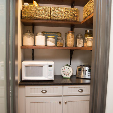
Granite countertops in Kodiak Satin with subtle veining kept with the old-world style. The delicate porcelain La Vie Crackle Sonoma tile kitchen backsplash compliments the home’s style perfectly. A handcrafted passthrough designed to show off Peggy’s fine china was custom built by project carpenters Justin Davis and Jeff Dallain to physically and visually open the space. Additional storage was created in the custom panty room with Latte Edinburg cabinets, hand-made weathered wood shelving with authentic black iron brackets, and an intricate tin copper ceiling.
Peggy and Curtis loved the idea of adding a Vermont stove to make the hearth-room not only functional, but a truly beckoning place to be. A stunning Bordeaux red Vermont Castings Stove with crisp black ventilation was chosen and combined with the authentic reclaimed Chicago brick wall. Advance’s talented carpenters custom-built elegant weathered shelves to house family memorabilia, installed carefully chosen barn sconces, and made the hearth room an inviting place to relax with a cup of coffee and a good book.
“Peggy and Curtis’ project was so much fun to work on. Creating a space that looks and feels like it always belonged in this beautiful old Victorian home is a designer’s dream. To see the delight in their faces when they saw the design details coming together truly made it worth the time and effort that went into making the very compact kitchen space work”, said Michelle. “The result is an amazing custom kitchen, packed with functionality in every inch, nook and cranny!” exclaims Michelle.
The renovation didn’t end with the kitchen. New Pella windows were added to help lessen the drafts. The removal of the original windows and trim necessitated the re-creation of hand-made corbels and trim details no longer available today. The talented carpenter team came to the rescue, crafting new pieces and masterfully finishing them as if they were always there. New custom gutters were formed and installed with a front entry rework necessary to accommodate the changes.
The whole house functions better, but it still feels like the original 1891 home. “From start to finish it’s just a much better space than we used to have,” Peggy said. “Jeff and Justin were amazing.” Curtis added; “We were lucky to find Advance Design, because they really came through for us. I loved that they had everything in house, anything you needed to have done, they could do it”.
27