
Search results for "Additional functionalities" in Home Design Ideas
 Alair Homes Plano
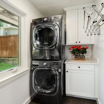
Our clients purchased this 1950 ranch style cottage knowing it needed to be updated. They fell in love with the location, being within walking distance to White Rock Lake. They wanted to redesign the layout of the house to improve the flow and function of the spaces while maintaining a cozy feel. They wanted to explore the idea of opening up the kitchen and possibly even relocating it. A laundry room and mudroom space needed to be added to that space, as well. Both bathrooms needed a complete update and they wanted to enlarge the master bath if possible, to have a double vanity and more efficient storage. With two small boys and one on the way, they ideally wanted to add a 3rd bedroom to the house within the existing footprint but were open to possibly designing an addition, if that wasn’t possible.
In the end, we gave them everything they wanted, without having to put an addition on to the home. They absolutely love the openness of their new kitchen and living spaces and we even added a small bar! They have their much-needed laundry room and mudroom off the back patio, so their “drop zone” is out of the way. We were able to add storage and double vanity to the master bathroom by enclosing what used to be a coat closet near the entryway and using that sq. ft. in the bathroom. The functionality of this house has completely changed and has definitely changed the lives of our clients for the better!
 Kitchen Design Gallery
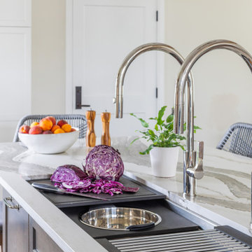
Example of a mid-sized beach style kitchen design in Jacksonville with shaker cabinets and quartz countertops
 M.J. Whelan Construction
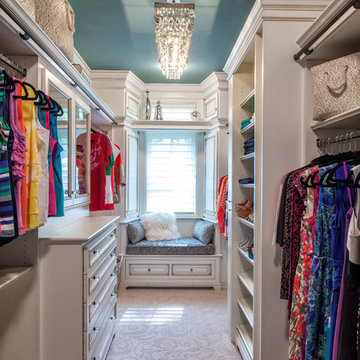
This incredible closet is custom in every way. It was designed to meet the specific needs and desires of our client. The cabinetry was slightly distressed, glazed and load with extensive detail. The rolling ladder moves around entire closet for upper storage. Several pull out and slide out shelves, scarf racks, hanger racks and custom storage accessories were included in the design. A custom dresser with upper glass cabinets along with built-in hamper are also included. It wouldn't be complete without a vertical, tilted shoe rack. Ceiling painted in a rich robin’s egg blue with sparkle additive sets this closet apart from any other. The custom upholstered storage bench with pillows at the end of the room and crystal chandelier finishes this room beautifully. Photo Credit - Hall Of Portraits
Find the right local pro for your project
 Décor Aid
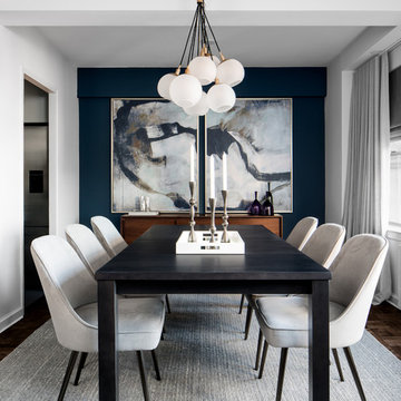
New Yorkers are always on the prowl for innovative ways to make the most of the space they have. An upper east side couple, challenged with a slightly narrow L shaped apartment sought out Decor Aid’s help to make the most of their Manhattan condo. Paired with one of our senior designer, Kimberly P., we learned that the clients wanted a space that looked beautiful, comfortable and also packed with functionality for everyday living.
“Immediately upon seeing the space, I knew that we needed to create a narrative that allowed the design to control how you moved through the space,” reports Kimberly, senior interior designer.
After surveying each room and learning a bit more about their personal style, we started with the living room remodel. It was clear that the couple wanted to infuse mid-century modern into the design plan. Sourcing the Room & Board Jasper Sofa with its narrow arms and tapered legs, it offered the mid-century look, with the modern comfort the clients are used to. Velvet accent pillows from West Elm and Crate & Barrel add pops of colors but also a subtle touch of luxury, while framed pictures from the couple’s honeymoon personalize the space.
Moving to the dining room next, Kimberly decided to add a blue accent wall to emphasize the Horchow two piece Percussion framed art that was to be the focal point of the dining area. The Seno sideboard from Article perfectly accentuated the mid-century style the clients loved while providing much-needed storage space. The palette used throughout both rooms were very New York style, grays, blues, beiges, and whites, to add depth, Kimberly sourced decorative pieces in a mixture of different metals.
“The artwork above their bureau in the bedroom is photographs that her father took,”
Moving into the bedroom renovation, our designer made sure to continue to stick to the client’s style preference while once again creating a personalized, warm and comforting space by including the photographs taken by the client’s father. The Avery bed added texture and complimented the other colors in the room, while a hidden drawer at the foot pulls out for attached storage, which thrilled the clients. A deco-inspired Faceted mirror from West Elm was a perfect addition to the bedroom due to the illusion of space it provides. The result was a bedroom that was full of mid-century design, personality, and area so they can freely move around.
The project resulted in the form of a layered mid-century modern design with touches of luxury but a space that can not only be lived in but serves as an extension of the people who live there. Our designer was able to take a very narrowly shaped Manhattan apartment and revamp it into a spacious home that is great for sophisticated entertaining or comfortably lazy nights in.
 Hochuli Design & Remodeling Team
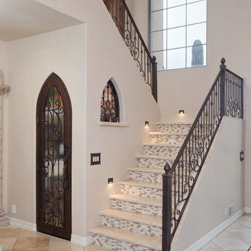
An used closet under the stairs is transformed into a beautiful and functional chilled wine cellar with a new wrought iron railing for the stairs to tie it all together. Travertine slabs replace carpet on the stairs.
LED lights are installed in the wine cellar for additional ambient lighting that gives the room a soft glow in the evening.
Photos by:
Ryan Wilson
 Studio M Interiors
Scott Amundson Photography
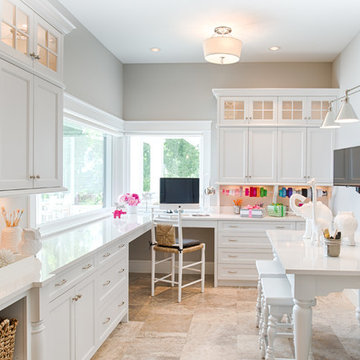
Elegant built-in desk beige floor craft room photo in Minneapolis with gray walls and no fireplace
Elegant built-in desk beige floor craft room photo in Minneapolis with gray walls and no fireplace
 Lisa Robazza Design
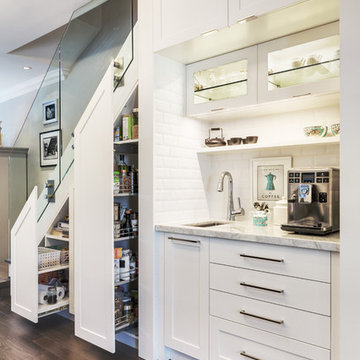
Additional pullout storage was custom designed under the stairs allowing for pantry, brooms and other utility items. When closed, the doors create a finished panelled effect, keeping the stair sophisticated and the storage hidden.
Photos: Dave Remple
Sponsored
Columbus, OH

Structural Remodeling
Franklin County's Heavy Timber Specialists | Best of Houzz 2020!
 ZeroEnergy Design
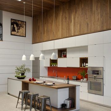
Modern family loft renovation. A young couple starting a family in the city purchased this two story loft in Boston's South End. Built in the 1990's, the loft was ready for updates. ZED transformed the space, creating a fresh new look and greatly increasing its functionality to accommodate an expanding family within an urban setting. Improvement were made to the aesthetics, scale, and functionality for the growing family to enjoy.
Photos by Eric Roth.
Construction by Ralph S. Osmond Company.
Green architecture by ZeroEnergy Design.

 Studio Dearborn
A hip young family moving from Boston tackled an enormous makeover of an antique colonial revival home in downtown Larchmont. The kitchen area was quite spacious but benefitted from a small bump out for a banquette and additional windows. Navy blue island and tall cabinetry matched to Benjamin Moore’s Van Deusen blue is balanced by crisp white (Benjamin Moore’s Chantilly Lace) cabinetry on the perimeter. The mid-century inspired suspended fireplace adds warmth and style to the kitchen. A tile covered range hood blends the ventilation into the walls. Brushed brass hardware by Lewis Dolan in a contemporary T-bar shape offer clean lines in a warm metallic tone.
White Marble countertops on the perimeter are balanced by white quartz composite on the island. Kitchen design and custom cabinetry by Studio Dearborn. Countertops by Rye Marble. Refrigerator--Subzero; Range—Viking French door oven--Viking. Dacor Wine Station. Dishwashers—Bosch. Ventilation—Best. Hardware—Lewis Dolan. Lighting—Rejuvenation. Sink--Franke. Stools—Soho Concept. Photography Adam Kane Macchia.
 Advance Design Studio, Ltd.
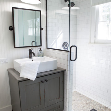
This 1930's Barrington Hills farmhouse was in need of some TLC when it was purchased by this southern family of five who planned to make it their new home. The renovation taken on by Advance Design Studio's designer Scott Christensen and master carpenter Justin Davis included a custom porch, custom built in cabinetry in the living room and children's bedrooms, 2 children's on-suite baths, a guest powder room, a fabulous new master bath with custom closet and makeup area, a new upstairs laundry room, a workout basement, a mud room, new flooring and custom wainscot stairs with planked walls and ceilings throughout the home.
The home's original mechanicals were in dire need of updating, so HVAC, plumbing and electrical were all replaced with newer materials and equipment. A dramatic change to the exterior took place with the addition of a quaint standing seam metal roofed farmhouse porch perfect for sipping lemonade on a lazy hot summer day.
In addition to the changes to the home, a guest house on the property underwent a major transformation as well. Newly outfitted with updated gas and electric, a new stacking washer/dryer space was created along with an updated bath complete with a glass enclosed shower, something the bath did not previously have. A beautiful kitchenette with ample cabinetry space, refrigeration and a sink was transformed as well to provide all the comforts of home for guests visiting at the classic cottage retreat.
The biggest design challenge was to keep in line with the charm the old home possessed, all the while giving the family all the convenience and efficiency of modern functioning amenities. One of the most interesting uses of material was the porcelain "wood-looking" tile used in all the baths and most of the home's common areas. All the efficiency of porcelain tile, with the nostalgic look and feel of worn and weathered hardwood floors. The home’s casual entry has an 8" rustic antique barn wood look porcelain tile in a rich brown to create a warm and welcoming first impression.
Painted distressed cabinetry in muted shades of gray/green was used in the powder room to bring out the rustic feel of the space which was accentuated with wood planked walls and ceilings. Fresh white painted shaker cabinetry was used throughout the rest of the rooms, accentuated by bright chrome fixtures and muted pastel tones to create a calm and relaxing feeling throughout the home.
Custom cabinetry was designed and built by Advance Design specifically for a large 70” TV in the living room, for each of the children’s bedroom’s built in storage, custom closets, and book shelves, and for a mudroom fit with custom niches for each family member by name.
The ample master bath was fitted with double vanity areas in white. A generous shower with a bench features classic white subway tiles and light blue/green glass accents, as well as a large free standing soaking tub nestled under a window with double sconces to dim while relaxing in a luxurious bath. A custom classic white bookcase for plush towels greets you as you enter the sanctuary bath.
Joe Nowak
 LUX Design | Interior Design Build
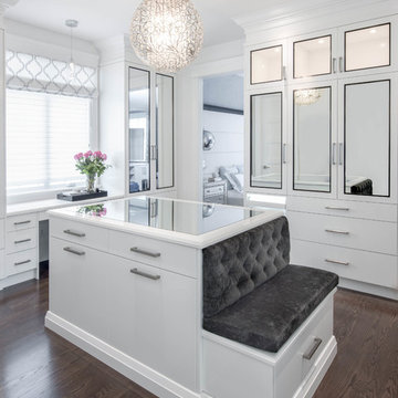
This custom walk in closet has been designed by Lux Design, to reflect the high end style of the home owners. Beautiful pendant fixture have been selected to add additional lighting to the space, as well as complete the glamorous feel of the room. Subtle pink accents added for the perfect feminine touch.
 CG&S Design-Build
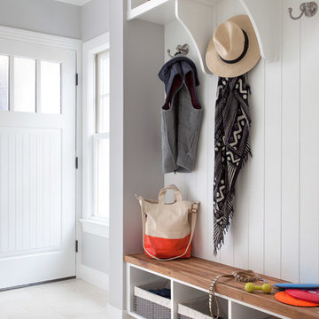
Design by Joanna Hartman
Photography by Ryann Ford
Styling by Adam Fortner
This space features Crema Marfil Honed 12x12 floor tile and Restoration Hardware "Vintage Hooks".
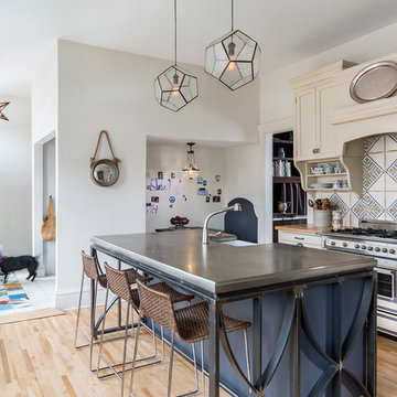
Eat-in kitchen - cottage galley light wood floor eat-in kitchen idea in Minneapolis with a farmhouse sink, recessed-panel cabinets, beige cabinets, wood countertops, multicolored backsplash, ceramic backsplash, paneled appliances and an island

 Flat Rock Productions
DESIGN: Eric Richmond, Flat Rock Productions;
BUILDER: Miller Custom Construction;
PHOTO: Stadler Studio
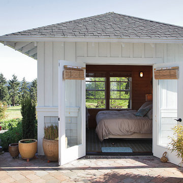
Example of a small beach style one-story wood exterior home design in Seattle with a hip roof
Example of a small beach style one-story wood exterior home design in Seattle with a hip roof
 Crown Point Cabinetry
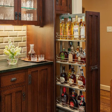
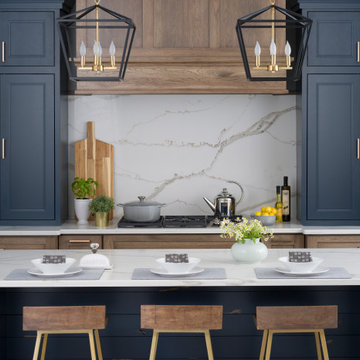
This custom Arts & Crafts Crown Point Cabinetry kitchen and bar area features, Quartersawn White Oak with a Washington Cherry stained finish. The Island and custom Range Hood both feature, Bee’s Wax over Eco Brown stain and Burnished over Maple. The kitchen and bar area cabinetry have a Craftsman style door with Black Walnut pegs, while the island presents an Old Cupboard door style that blends seamlessly. Additionally, the doors and drawers also feature a soft close element. Photo by Crown Point Cabinetry

 Dura Supreme Cabinetry
This modern farmhouse kitchen features a beautiful combination of Navy Blue painted and gray stained Hickory cabinets that’s sure to be an eye-catcher. The elegant “Morel” stain blends and harmonizes the natural Hickory wood grain while emphasizing the grain with a subtle gray tone that beautifully coordinated with the cool, deep blue paint.
The “Gale Force” SW 7605 blue paint from Sherwin-Williams is a stunning deep blue paint color that is sophisticated, fun, and creative. It’s a stunning statement-making color that’s sure to be a classic for years to come and represents the latest in color trends. It’s no surprise this beautiful navy blue has been a part of Dura Supreme’s Curated Color Collection for several years, making the top 6 colors for 2017 through 2020.
Beyond the beautiful exterior, there is so much well-thought-out storage and function behind each and every cabinet door. The two beautiful blue countertop towers that frame the modern wood hood and cooktop are two intricately designed larder cabinets built to meet the homeowner’s exact needs.
The larder cabinet on the left is designed as a beverage center with apothecary drawers designed for housing beverage stir sticks, sugar packets, creamers, and other misc. coffee and home bar supplies. A wine glass rack and shelves provides optimal storage for a full collection of glassware while a power supply in the back helps power coffee & espresso (machines, blenders, grinders and other small appliances that could be used for daily beverage creations. The roll-out shelf makes it easier to fill clean and operate each appliance while also making it easy to put away. Pocket doors tuck out of the way and into the cabinet so you can easily leave open for your household or guests to access, but easily shut the cabinet doors and conceal when you’re ready to tidy up.
Beneath the beverage center larder is a drawer designed with 2 layers of multi-tasking storage for utensils and additional beverage supplies storage with space for tea packets, and a full drawer of K-Cup storage. The cabinet below uses powered roll-out shelves to create the perfect breakfast center with power for a toaster and divided storage to organize all the daily fixings and pantry items the household needs for their morning routine.
On the right, the second larder is the ultimate hub and center for the homeowner’s baking tasks. A wide roll-out shelf helps store heavy small appliances like a KitchenAid Mixer while making them easy to use, clean, and put away. Shelves and a set of apothecary drawers help house an assortment of baking tools, ingredients, mixing bowls and cookbooks. Beneath the counter a drawer and a set of roll-out shelves in various heights provides more easy access storage for pantry items, misc. baking accessories, rolling pins, mixing bowls, and more.
The kitchen island provides a large worktop, seating for 3-4 guests, and even more storage! The back of the island includes an appliance lift cabinet used for a sewing machine for the homeowner’s beloved hobby, a deep drawer built for organizing a full collection of dishware, a waste recycling bin, and more!
All and all this kitchen is as functional as it is beautiful!
Request a FREE Dura Supreme Brochure Packet:
http://www.durasupreme.com/request-brochure

Sponsored
Columbus, OH
Structural Remodeling
Franklin County's Heavy Timber Specialists | Best of Houzz 2020!
 Fabcab
Location: Port Townsend, Washington.
Photography by Dale Lang
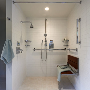
Mid-sized trendy master white tile and subway tile ceramic tile walk-in shower photo in Seattle with a two-piece toilet, white walls and an undermount sink
Mid-sized trendy master white tile and subway tile ceramic tile walk-in shower photo in Seattle with a two-piece toilet, white walls and an undermount sink
 Bruns Architecture
Tricia Shay Photography
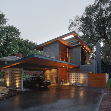
Inspiration for a mid-sized contemporary gray two-story mixed siding house exterior remodel in Milwaukee with a shed roof
Inspiration for a mid-sized contemporary gray two-story mixed siding house exterior remodel in Milwaukee with a shed roof
 Noble Renovation
This nook area used to be the old porch area..
big /massive changes happened on this project
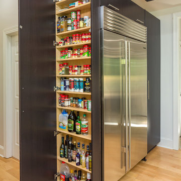
Large trendy single-wall light wood floor eat-in kitchen photo in Raleigh with an undermount sink, flat-panel cabinets, dark wood cabinets, quartz countertops, white backsplash, glass tile backsplash, stainless steel appliances, an island and white countertops
Large trendy single-wall light wood floor eat-in kitchen photo in Raleigh with an undermount sink, flat-panel cabinets, dark wood cabinets, quartz countertops, white backsplash, glass tile backsplash, stainless steel appliances, an island and white countertops
3