
Search results for "Additional ideas" in Home Design Ideas
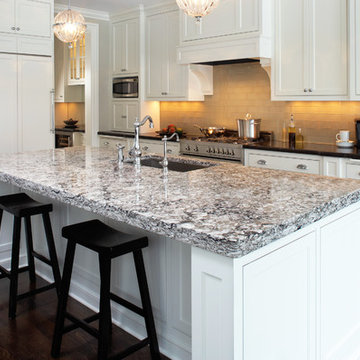
 Cambria
Kitchen - traditional l-shaped dark wood floor kitchen idea in Minneapolis with an undermount sink, beaded inset cabinets, white cabinets, gray backsplash, subway tile backsplash, paneled appliances and an island
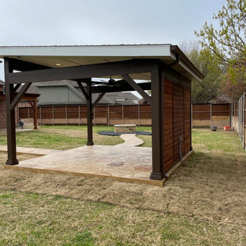
 Archadeck of Northeast Dallas
This custom backyard cabana is one part of a multi-faceted outdoor design that features a stain and stamp patio and walkways, a fire pit and custom shade pergola.
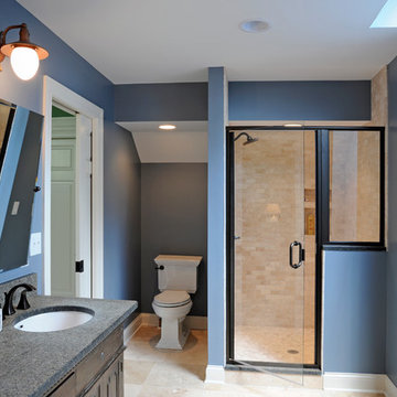
 Dave Fox Design Build Remodelers
This remodel consisted of a whole house transformation. We took this 3 bedroom dated home and turned it into a 5 bedroom award winning showpiece, all without an addition. By reworking the awkward floor plan and lowering the living room floor to be level with the rest of the house we were able to create additional space within the existing footprint of the home. What was once the small lack-luster master suite, is now 2 kids bedrooms that share a jack and jill bath. The master suite was relocated to the first floor, and the kitchen that was located right at the front door, is now located in the back of the home with great access to the patio overlooking the golf course.
View more about this project and our company at our website: www.davefox.com
Find the right local pro for your project
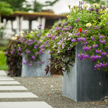
 LaurelRock
Neil Landino.
Design Credit: Stephen Stimson Associates
Inspiration for a mid-sized contemporary partial sun backyard stone landscaping in New York.
Inspiration for a mid-sized contemporary partial sun backyard stone landscaping in New York.
 Diff Miller Style & Design
Lawrence Te
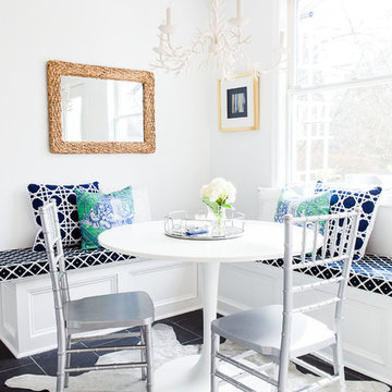
Kitchen/dining room combo - transitional kitchen/dining room combo idea in Philadelphia with white walls
Kitchen/dining room combo - transitional kitchen/dining room combo idea in Philadelphia with white walls
 Thomas Towne Reavey, Inc.
David Anderson Photography
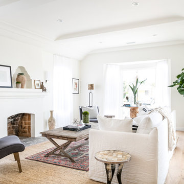
Transitional medium tone wood floor living room photo in Los Angeles with white walls and a standard fireplace
Transitional medium tone wood floor living room photo in Los Angeles with white walls and a standard fireplace

 Morrison Interiors
Surrounded by canyon views and nestled in the heart of Orange County, this 9,000 square foot home encompasses all that is “chic”. Clean lines, interesting textures, pops of color, and an emphasis on art were all key in achieving this contemporary but comfortable sophistication.
Photography by Chad Mellon


 White Sands Coastal Development
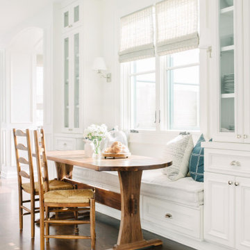
We remodeled this 5,400-square foot, 3-story home on ’s Second Street to give it a more current feel, with cleaner lines and textures. The result is more and less Old World Europe, which is exactly what we were going for. We worked with much of the client’s existing furniture, which has a southern flavor, compliments of its former South Carolina home. This was an additional challenge, because we had to integrate a variety of influences in an intentional and cohesive way.
We painted nearly every surface white in the 5-bed, 6-bath home, and added light-colored window treatments, which brightened and opened the space. Additionally, we replaced all the light fixtures for a more integrated aesthetic. Well-selected accessories help pull the space together, infusing a consistent sense of peace and comfort.
 Built Tough Construction of North Georgia
Design Services Provided - Architect was asked to convert this 1950's Split Level Style home into a Traditional Style home with a 2-story height grand entry foyer. The new design includes modern amenities such as a large 'Open Plan' kitchen, a family room, a home office, an oversized garage, spacious bedrooms with large closets, a second floor laundry room and a private master bedroom suite for the owners that includes two walk-in closets and a grand master bathroom with a vaulted ceiling. The Architect presented the new design using Professional 3D Design Software. This approach allowed the Owners to clearly understand the proposed design and secondly, it was beneficial to the Contractors who prepared Preliminary Cost Estimates. The construction duration was nine months and the project was completed in September 2015. The client is thrilled with the end results! We established a wonderful working relationship and a lifetime friendship. I am truly thankful for this opportunity to design this home and work with this client!

 User
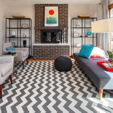
UserStrong symmetry provides focus and balance in the adjacent den while incorporating calming pops of color.
Inspiration for a 1950s formal and open concept light wood floor living room remodel in Other with gray walls and a brick fireplace
Inspiration for a 1950s formal and open concept light wood floor living room remodel in Other with gray walls and a brick fireplace

 TKS Design Group
Download our free ebook, Creating the Ideal Kitchen. DOWNLOAD NOW
For many, extra time at home during COVID left them wanting more from their homes. Whether you realized the shortcomings of your space or simply wanted to combat boredom, a well-designed and functional home was no longer a want, it became a need. Tina found herself wanting more from her Old Irving Park home and reached out to The Kitchen Studio about adding function to her kitchen to make the most of the available real estate.
At the end of the day, there is nothing better than returning home to a bright and happy space you love. And this kitchen wasn’t that for Tina. Dark and dated, with a palette from the past and features that didn’t make the most of the available square footage, this remodel required vision and a fresh approach to the space. Lead designer, Stephanie Cole’s main design goal was better flow, while adding greater functionality with organized storage, accessible open shelving, and an overall sense of cohesion with the adjoining family room.
The original kitchen featured a large pizza oven, which was rarely used, yet its footprint limited storage space. The nearby pantry had become a catch-all, lacking the organization needed in the home. The initial plan was to keep the pizza oven, but eventually Tina realized she preferred the design possibilities that came from removing this cumbersome feature, with the goal of adding function throughout the upgraded and elevated space. Eliminating the pantry added square footage and length to the kitchen for greater function and more storage. This redesigned space reflects how she lives and uses her home, as well as her love for entertaining.
The kitchen features a classic, clean, and timeless palette. White cabinetry, with brass and bronze finishes, contrasts with rich wood flooring, and lets the large, deep blue island in Woodland’s custom color Harbor – a neutral, yet statement color – draw your eye.
The kitchen was the main priority. In addition to updating and elevating this space, Tina wanted to maximize what her home had to offer. From moving the location of the patio door and eliminating a window to removing an existing closet in the mudroom and the cluttered pantry, the kitchen footprint grew. Once the floorplan was set, it was time to bring cohesion to her home, creating connection between the kitchen and surrounding spaces.
The color palette carries into the mudroom, where we added beautiful new cabinetry, practical bench seating, and accessible hooks, perfect for guests and everyday living. The nearby bar continues the aesthetic, with stunning Carrara marble subway tile, hints of brass and bronze, and a design that further captures the vibe of the kitchen.
Every home has its unique design challenges. But with a fresh perspective and a bit of creativity, there is always a way to give the client exactly what they want [and need]. In this particular kitchen, the existing soffits and high slanted ceilings added a layer of complexity to the lighting layout and upper perimeter cabinets.
While a space needs to look good, it also needs to function well. This meant making the most of the height of the room and accounting for the varied ceiling features, while also giving Tina everything she wanted and more. Pendants and task lighting paired with an abundance of natural light amplify the bright aesthetic. The cabinetry layout and design compliments the soffits with subtle profile details that bring everything together. The tile selections add visual interest, drawing the eye to the focal area above the range. Glass-doored cabinets further customize the space and give the illusion of even more height within the room.
While her family may be grown and out of the house, Tina was focused on adding function without sacrificing a stunning aesthetic and dreamy finishes that make the kitchen the gathering place of any home. It was time to love her kitchen again, and if you’re wondering what she loves most, it’s the niche with glass door cabinetry and open shelving for display paired with the marble mosaic backsplash over the range and complimenting hood. Each of these features is a stunning point of interest within the kitchen – both brag-worthy additions to a perimeter layout that previously felt limited and lacking.
Whether your remodel is the result of special needs in your home or simply the excitement of focusing your energy on creating a fun new aesthetic, we are here for it. We love a good challenge because there is always a way to make a space better – adding function and beauty simultaneously.
 Chloe Joelle Beautiful Living
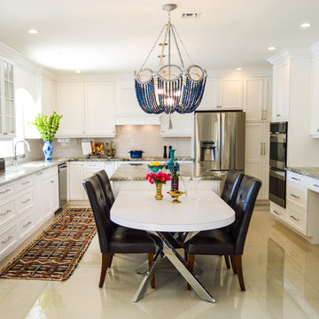
Large white kitchen with granite topped island and custom kitchen table built in. Custom blue beaded Ro Sham Beaux chandelier, along with high hats give lots of lighting options. Custom arched frames over windows mirror the arched windows in the attached family room.

Sponsored
Columbus, OH
Free consultation for landscape design!

Peabody Landscape Group
Columbus' Reliable Landscape Design & Contracting
 Milgard Windows & Doors
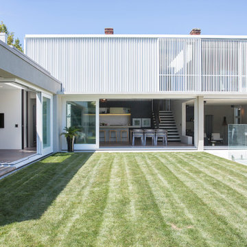
The Kiguchi family moved into their Austin, Texas home in 1994. Built in the 1980’s as part of a neighborhood development, they happily raised their family here but longed for something more contemporary. Once they became empty nesters, they decided it was time for a major remodel. After spending many years visiting Austin AIA Home Tours that highlight contemporary residential architecture, they had a lot of ideas and in 2013 were ready to interview architects and get their renovation underway.
The project turned into a major remodel due to an unstable foundation. Architects Ben Arbib and Ed Hughey, of Arbib Hughey Design were hired to solve the structural issue and look for inspiration in the bones of the house, which sat on top of a hillside and was surrounded by great views.
Unfortunately, with the old floor plan, the beautiful views were hidden by small windows that were poorly placed. In order to bring more natural light into the house the window sizes and configurations had to be addressed, all while keeping in mind the homeowners desire for a modern look and feel.
To achieve a more contemporary and sophisticated front of house, a new entry was designed that included removing a two-story bay window and porch. The entrance of the home also became more integrated with the landscape creating a template for new foliage to be planted. Older exterior materials were updated to incorporate a more muted palette of colors with a metal roof, dark grey siding in the back and white stucco in the front. Deep eaves were added over many of the new large windows for clean lines and sun protection.
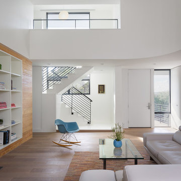
“Inside it was about opening up the floor plan, expanding the views throughout the house, and updating the material palette to get a modern look that was also warm and inviting,” said Ben from Arbib Hughey Design. “Prior to the remodel, the house had the typical separation of rooms. We removed the walls between them and changed all of the windows to Milgard Thermally Improved Aluminum to connect the inside with the outside. No matter where you are you get nice views and natural light.”
The architects wanted to create some drama, which they accomplished with the window placement and opening up the interior floor plan to an open concept approach. Cabinetry was used to help delineate intimate spaces. To add warmth to an all-white living room, white-washed oak wood floors were installed and pine planks were used around the fireplace. The large windows served as artwork bringing the color of nature into the space.
An octagon shaped, elevated dining room, (named “the turret”), had a big impact on the design of the house. They architects rounded the corners and added larger window openings overlooking a new sunken garden. The great room was also softened by rounding out the corners and that circular theme continued throughout the house, being picked up in skylight wells and kitchen cabinetry. A staircase leading to a catwalk was added and the result was a two-story window wall that flooded the home with natural light.
When asked why Milgard® Thermally Improved Aluminum windows were selected, the architectural team listed many reasons:
1) Aesthetics: “We liked the slim profiles and narrow sightlines. The window frames never get in the way of the view and that was important to us. They also have a very contemporary look that went well with our design.”
2) Options: “We liked that we could get large sliding doors that matched the windows, giving us a very cohesive look and feel throughout the project.”
3) Cost Effective: “Milgard windows are affordable. You get a good product at a good price.”
4) Custom Sizes: “Milgard windows are customizable, which allowed us to get the right window for each location.”
Ready to take on your own traditional to modern home remodeling project? Arbib Hughey Design advises, “Work with a good architect. That means picking a team that is creative, communicative, listens well and is responsive. We think it’s important for an architect to listen to their clients and give them something they want, not something the architect thinks they should have. At the same time you want an architect who is willing and able to think outside the box and offer up design options that you may not have considered. Design is about a lot of back and forth, trying out ideas, getting feedback and trying again.”
The home was completely transformed into a unique, contemporary house perfectly integrated with its site. Internally the home has a natural flow for the occupants and externally it is integrated with the surroundings taking advantage of great natural light. As a side note, it was highly praised as part of the Austin AIA homes tour.
 Angela Otten - Inspire Kitchen Design Studio
Emily Redfield; EMR Photography
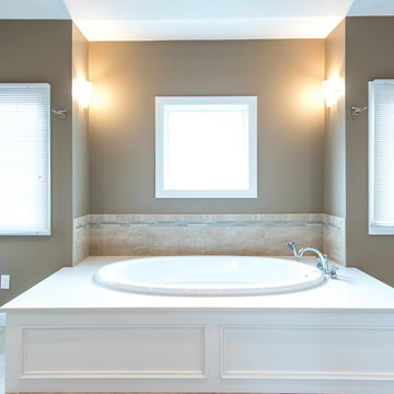
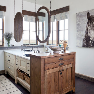
Country dark wood floor bathroom photo in Denver with a drop-in sink, white walls and recessed-panel cabinets
Country dark wood floor bathroom photo in Denver with a drop-in sink, white walls and recessed-panel cabinets
 Normandy Remodeling
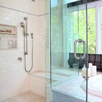
Normandy Design Manager Troy Pavelka created this master bathroom as part of a master suite addition to a Victorian home. Staying true to that era, he selected detailed and ornate blue tile throughout the space.
 ZeroEnergy Design
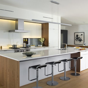
ZeroEnergy Design (ZED) created this modern home for a progressive family in the desirable community of Lexington.
Thoughtful Land Connection. The residence is carefully sited on the infill lot so as to create privacy from the road and neighbors, while cultivating a side yard that captures the southern sun. The terraced grade rises to meet the house, allowing for it to maintain a structured connection with the ground while also sitting above the high water table. The elevated outdoor living space maintains a strong connection with the indoor living space, while the stepped edge ties it back to the true ground plane. Siting and outdoor connections were completed by ZED in collaboration with landscape designer Soren Deniord Design Studio.
Exterior Finishes and Solar. The exterior finish materials include a palette of shiplapped wood siding, through-colored fiber cement panels and stucco. A rooftop parapet hides the solar panels above, while a gutter and site drainage system directs rainwater into an irrigation cistern and dry wells that recharge the groundwater.
Cooking, Dining, Living. Inside, the kitchen, fabricated by Henrybuilt, is located between the indoor and outdoor dining areas. The expansive south-facing sliding door opens to seamlessly connect the spaces, using a retractable awning to provide shade during the summer while still admitting the warming winter sun. The indoor living space continues from the dining areas across to the sunken living area, with a view that returns again to the outside through the corner wall of glass.
Accessible Guest Suite. The design of the first level guest suite provides for both aging in place and guests who regularly visit for extended stays. The patio off the north side of the house affords guests their own private outdoor space, and privacy from the neighbor. Similarly, the second level master suite opens to an outdoor private roof deck.
Light and Access. The wide open interior stair with a glass panel rail leads from the top level down to the well insulated basement. The design of the basement, used as an away/play space, addresses the need for both natural light and easy access. In addition to the open stairwell, light is admitted to the north side of the area with a high performance, Passive House (PHI) certified skylight, covering a six by sixteen foot area. On the south side, a unique roof hatch set flush with the deck opens to reveal a glass door at the base of the stairwell which provides additional light and access from the deck above down to the play space.
Energy. Energy consumption is reduced by the high performance building envelope, high efficiency mechanical systems, and then offset with renewable energy. All windows and doors are made of high performance triple paned glass with thermally broken aluminum frames. The exterior wall assembly employs dense pack cellulose in the stud cavity, a continuous air barrier, and four inches exterior rigid foam insulation. The 10kW rooftop solar electric system provides clean energy production. The final air leakage testing yielded 0.6 ACH 50 - an extremely air tight house, a testament to the well-designed details, progress testing and quality construction. When compared to a new house built to code requirements, this home consumes only 19% of the energy.
Architecture & Energy Consulting: ZeroEnergy Design
Landscape Design: Soren Deniord Design
Paintings: Bernd Haussmann Studio
Photos: Eric Roth Photography

Sponsored
Columbus, OH

Hope Restoration & General Contracting
Columbus Design-Build, Kitchen & Bath Remodeling, Historic Renovations
 Brad Cox, Architect, Inc.
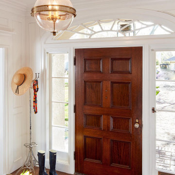
This gorgeous, bright entry is a lovely "welcome home". The door, transom and sidelights are original to the house.
Inspiration for a large timeless dark wood floor, brown floor and wall paneling entryway remodel in San Francisco with white walls and a dark wood front door
Inspiration for a large timeless dark wood floor, brown floor and wall paneling entryway remodel in San Francisco with white walls and a dark wood front door

 Middlefork Luxury Home Builders
This gracious property in the award-winning Blaine school district - and just off the Southport Corridor - marries an old world European design sensibility with contemporary technologies and unique artisan details. With more than 5,200 square feet, the home has four bedrooms and three bathrooms on the second floor, including a luxurious master suite with a private terrace.
The house also boasts a distinct foyer; formal living and dining rooms designed in an open-plan concept; an expansive, eat-in, gourmet kitchen which is open to the first floor great room; lower-level family room; an attached, heated, 2-½ car garage with roof deck; a penthouse den and roof deck; and two additional rooms on the lower level which could be used as bedrooms, home offices or exercise rooms. The home, designed with an extra-wide floorplan, achieved through side yard relief, also has considerable, professionally-landscaped outdoor living spaces.
This brick and limestone residence has been designed with family-functional experiences and classically proportioned spaces in mind. Highly-efficient environmental technologies have been integrated into the design and construction and the plan also takes into consideration the incorporation of all types of advanced communications systems.
The home went under contract in less than 45 days in 2011.
Jim Yochum
121