
Search results for "Addresses future oriented" in Home Design Ideas

 Drury Design
THE SETUP
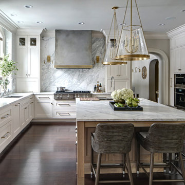
Once these empty nest homeowners decided to stay put, they knew a new kitchen was in order. Passionate about cooking, entertaining, and hosting holiday gatherings, they found their existing kitchen inadequate. The space, with its traditional style and outdated layout, was far from ideal. They longed for an elegant, timeless kitchen that was not only show-stopping but also functional, seamlessly catering to both their daily routines and special occasions with friends and family. Another key factor was its future appeal to potential buyers, as they’re ready to enjoy their new kitchen while also considering downsizing in the future.
Design Objectives:
Create a more streamlined, open space
Eliminate traditional elements
Improve flow for entertaining and everyday use
Omit dated posts and soffits
Include storage for small appliances to keep counters clutter-free
Address mail organization and phone charging concerns
THE REMODEL
Design Challenges:
Compensate for lost storage from omitted wall cabinets
Revise floorplan to feature a single, spacious island
Enhance island seating proximity for a more engaging atmosphere
Address awkward space above existing built-ins
Improve natural light blocked by wall cabinet near the window
Create a highly functional space tailored for entertaining
Design Solutions:
Tall cabinetry and pull-outs maximize storage efficiency
A generous single island promotes seamless flow and ample prep space
Strategic island seating arrangement fosters easy conversation
New built-ins fill arched openings, ensuring a custom, clutter-free look
Replace wall cabinet with lighted open shelves for an airy feel
Galley Dresser and Workstation offer impeccable organization and versatility, creating the perfect setup for entertaining with everything easily accessible.
THE RENEWED SPACE
The new kitchen exceeded every expectation, thrilling the clients with its revitalized, expansive design and thoughtful functionality. The transformation brought to life an open space adorned with marble accents, a state-of-the-art steam oven, and the seamless integration of the Galley Dresser, crafting a kitchen not just to be used, but to be cherished. This is more than a culinary space; it’s a new heart of their home, ready to host countless memories and culinary adventures.
 Klopf Architecture
Built for the Bluff, A Sea Ranch Home is Remade from the Inside Out
The house had always been grounded, on an ocean bluff at The Sea Ranch. It sits unencumbered, adjacent to one of the most dramatic stretches of the Sonoma coast with protected commons meadow to the east, uninterrupted Pacific views to the west, and a bluff trail running alongside. What it lacked was the feeling of home, one that could hold up its own against the natural landscape.
The owners are entrepreneurs with deep involvement across tech, real estate, and development and they know how things are built. The Sea Ranch house had been in their lives for years, a second residence and a place for family to gather. Built for a different time, it felt more compromising than comfortable. Sitting in a closed off nook, the kitchen fit one cook at a time and turned its back on the rest of the house. The entry was dim and compressed, divided by a structural column that presented itself at exactly the wrong moment. The primary suite was small relative to the view outside it. A large rear bedroom sat behind a lowered ceiling with a bathroom that had never been added. The house was certainly worth the trouble of doing it right.
What followed was not one project but four, each with its own design challenge, each addressed over a period of time.
Where the House Meets the Ocean
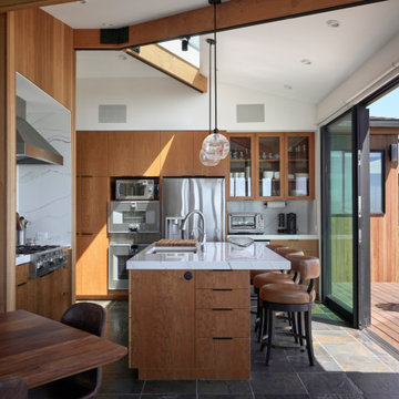
The most complex piece of the project, in both structural and spatial terms, was the kitchen expansion. The existing room was a single-person galley squeezed in as an afterthought with no meaningful connection to the dining room, the living space, or the deck outside. To make it useful for a family that cooks and gathers, it needed to grow outward into an existing patio and flow into the rooms around it.
A big challenge was the roofline. Several planes at different pitches and angles converged directly where additional volume was needed. A new form had to join that geometry without reading as a correction. The solution found the simplest possible connection between the existing angles, a roofline that from outside the structure, appears entirely original. From the bluff trail where the addition is visible, there is no discernible seam.
Inside, the kitchen is now open to the living and dining rooms without interruption. A large sliding glass door connects the space onto the rear deck. The deck itself was expanded and oriented so that the body of the house shields it from the coastal wind which is a common consideration that determines whether outdoor space at The Sea Ranch actually gets used. The result is a room that works for large family gatherings where no one feels cutoff, and one that makes the boundary between being inside and outside easy to ignore.
Welcoming Light
A structural column stood at the convergence of eight distinct roof planes in the entry. It was load-bearing, but it was also the reason the entry had always felt like a hallway rather than a welcoming arrival.
With the structural engineer, a custom steel connector was designed to receive beams from six separate directions, redistributing the load through a single new continuous beam. The column was surgically removed. Three triangular skylights were then cut into the roof above, their shapes drawn from the
existing geometry of the planes around them. The entry is now bright and open. The skylights feel native to the structure because they follow the logic already present in the roof.
Two Suites, Two Views
At opposite ends of the house, the two bedroom suites were each reconfigured, and each found a different way to introduce more of the landscape into the room.
An addition to the primary suite extended the structure outward to create a wraparound plan with a loop from the bedroom through bath and closet that had not been possible before. The expansion opened a slot view from the tub and shower toward the ocean. The view is precise and private. The ocean view is present and deliberate.
The rear bedroom absorbed an adjacent storage room to transform it into a full second suite with a vaulted ceiling, a large bathroom with a tub, a shower, and a sauna. A private fenced garden courtyard sits just beyond the glass bringing the outdoors inside. The tub was placed so that, looking past the courtyard and through the bedroom beyond, the ocean is visible at the far end. It is a long view and it makes the room feel larger and more settled than its footprint would suggest.
Glass on Four Sides, Fire at the Center
The main living and gathering room had always been caught between two competing facts: glass on four sides meant exceptional views but at The Sea Ranch, it also meant a cold room. A 360-degree cylindrical fireplace was added at the center on a raised stone base, providing radiant heat in every direction and giving the room a focal point around which a group naturally orients itself, whether that means two people at the end of the day or the whole family after dinner.
Owners Who Picked Up the Tools
The owner was not a passive client. they came with construction knowledge, specific ideas, and the desire to be an active part of the process, a dynamic that other architects may had found difficult, which Klopf Architecture accepted as an asset. They took it upon themselves to complete some of the work during construction, including the installation of a new radiant heating system beneath the floors.
The radiant system added to the older and less-desirable forced-air setup. At The Sea Ranch, that change matters as the house sits close enough to the ocean and moving air competes with the sound of it, where radiant heat does not. Solar panels were added to the roof as part of the new system. Insulation was upgraded throughout the walls, roof, and crawl space. The house that had always had the right setting now holds warmth the way a house on the bluff should.
They were also deeply involved in the design and selections throughout, and the finished house reflects both of them in ways that are specific rather than generic. The process took longer and moved through more iterations than a more arms-length relationship might have allowed. The result is more defined and personal because of it.
The Landscape Holds Priority
Every exterior decision was shaped by The Sea Ranch Design Standards, which require that buildings defer to the landscape around them rather than compete with it. Because this house sits on the bluff and is visible from the public trail, the additions faced a close review. Existing materials were matched. Geometries were resolved. The additions had to become indistinguishable from the original building.
From the trail, the house reads exactly as it always has — low, cedar-clad, secondary to the meadow and the water. The setting holds priority. Inside, the house has been remade.
Klopf Architecture Project Team: Geoff Campen and Trenton Jewett
Contractor: Shawn Bettega Construction
Photography: ©2025 Mariko Reed
Year Completed: 2023
Location: The Sea Ranch, CA
Find the right local pro for your project
 Modern Traditions Interior Design LLC
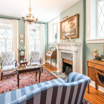
This room just needed a fresh coat of paint to update it. Located immediately to the left of the new bright entryway and within eyesight of the rich blue dining room. We selected a green from the oriental rug that also highlights the painting over the fireplace.
Sara E. Eastman Photography
 ZeroEnergy Design
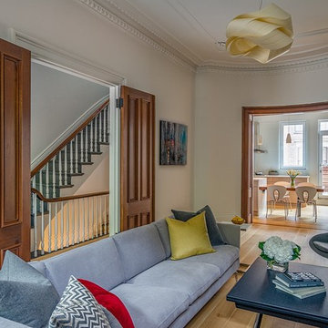
This renovated brick rowhome in Boston’s South End offers a modern aesthetic within a historic structure, creative use of space, exceptional thermal comfort, a reduced carbon footprint, and a passive stream of income.
DESIGN PRIORITIES. The goals for the project were clear - design the primary unit to accommodate the family’s modern lifestyle, rework the layout to create a desirable rental unit, improve thermal comfort and introduce a modern aesthetic. We designed the street-level entry as a shared entrance for both the primary and rental unit. The family uses it as their everyday entrance - we planned for bike storage and an open mudroom with bench and shoe storage to facilitate the change from shoes to slippers or bare feet as they enter their home. On the main level, we expanded the kitchen into the dining room to create an eat-in space with generous counter space and storage, as well as a comfortable connection to the living space. The second floor serves as master suite for the couple - a bedroom with a walk-in-closet and ensuite bathroom, and an adjacent study, with refinished original pumpkin pine floors. The upper floor, aside from a guest bedroom, is the child's domain with interconnected spaces for sleeping, work and play. In the play space, which can be separated from the work space with new translucent sliding doors, we incorporated recreational features inspired by adventurous and competitive television shows, at their son’s request.
MODERN MEETS TRADITIONAL. We left the historic front facade of the building largely unchanged - the security bars were removed from the windows and the single pane windows were replaced with higher performing historic replicas. We designed the interior and rear facade with a vision of warm modernism, weaving in the notable period features. Each element was either restored or reinterpreted to blend with the modern aesthetic. The detailed ceiling in the living space, for example, has a new matte monochromatic finish, and the wood stairs are covered in a dark grey floor paint, whereas the mahogany doors were simply refinished. New wide plank wood flooring with a neutral finish, floor-to-ceiling casework, and bold splashes of color in wall paint and tile, and oversized high-performance windows (on the rear facade) round out the modern aesthetic.
RENTAL INCOME. The existing rowhome was zoned for a 2-family dwelling but included an undesirable, single-floor studio apartment at the garden level with low ceiling heights and questionable emergency egress. In order to increase the quality and quantity of space in the rental unit, we reimagined it as a two-floor, 1 or 2 bedroom, 2 bathroom apartment with a modern aesthetic, increased ceiling height on the lowest level and provided an in-unit washer/dryer. The apartment was listed with Jackie O'Connor Real Estate and rented immediately, providing the owners with a source of passive income.
ENCLOSURE WITH BENEFITS. The homeowners sought a minimal carbon footprint, enabled by their urban location and lifestyle decisions, paired with the benefits of a high-performance home. The extent of the renovation allowed us to implement a deep energy retrofit (DER) to address air tightness, insulation, and high-performance windows. The historic front facade is insulated from the interior, while the rear facade is insulated on the exterior. Together with these building enclosure improvements, we designed an HVAC system comprised of continuous fresh air ventilation, and an efficient, all-electric heating and cooling system to decouple the house from natural gas. This strategy provides optimal thermal comfort and indoor air quality, improved acoustic isolation from street noise and neighbors, as well as a further reduced carbon footprint. We also took measures to prepare the roof for future solar panels, for when the South End neighborhood’s aging electrical infrastructure is upgraded to allow them.
URBAN LIVING. The desirable neighborhood location allows the both the homeowners and tenant to walk, bike, and use public transportation to access the city, while each charging their respective plug-in electric cars behind the building to travel greater distances.
OVERALL. The understated rowhouse is now ready for another century of urban living, offering the owners comfort and convenience as they live life as an expression of their values.
Eric Roth Photo
 safe ZOnea
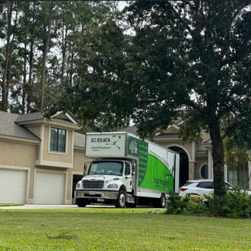
Staging a home for sale or for a major transition is a strange in-between state. You are still living in the space, but you are also preparing it to impress strangers, support showings, and remain functional until the final move-out day. That tension between “home” and “product” is where storage quietly becomes one of your smartest tools. Used well, storage lets you reduce clutter, protect important items, and create the kind of rooms that photograph beautifully and feel calm when buyers walk through the door.
A staged move is rarely just about shifting boxes from one address to another. It is about managing timing, presentation, and stress at the same time. When storage is built into the plan from day one, the entire process feels less rushed and more strategic. Rooms open up gradually, essentials stay accessible, and you never feel like you are drowning in half-packed chaos. Understanding how to use storage as a staging partner, not just a place to dump excess stuff, is what turns a messy transition into a controlled, professional-looking move.
Why Storage Is the Backbone of Every Staged Move
Visual space is emotional space. When every surface is covered, and every corner is full, buyers feel crowded before they have even evaluated the layout. Storage gives you a way to pull back without making drastic decisions about what to keep or donate. Seasonal décor, bulky furniture, duplicate items, archives, and personal collections can be moved out early, so the home reads cleaner and more open while still feeling lived-in. That balance between warmth and simplicity is exactly what good staging tries to achieve.
In more complex situations, such as live-work properties or home offices, storage becomes even more important. You may need to keep a business running while also presenting a polished environment to viewers. Partnering with local movers in Boston makes it easier to shift equipment, files, and nonessential pieces into storage in phases, so work can continue while the visible areas of the property stay controlled and presentable.
How Staging and Storage Work Together to Control Visual Impact
Staging works best when every object in a room has a clear purpose. A sofa frames a conversation. A table suggests gathering. A lamp softens the mood. Everything else that is not essential to that story competes for attention. Storage supports staging by giving you a clean staging bench off-site, where nonessential items can wait without being constantly shuffled between rooms or piled into overstuffed closets.
The art lies in deciding what stays and what goes. Family photos, extensive collections, excess seating, and rarely used appliances often move into storage first. What remains should be enough to show scale, comfort, and function without revealing the full weight of daily life. Commercial properties go through a similar filtering process. Extra desks, surplus equipment, outdated signage, and inactive files often move out early so the active workspace feels lean, efficient, and future-ready before a relocation supported by commercial movers takes place.
Strategic Timing of Storage before the Actual Move
The worst time to think about storage is when boxes are already stacked in the hallway. In a staged move, storage decisions ideally begin as soon as you know the property will be listed or the space will be transitioned. That might be a month or more before the main moving date. Starting early gives you time to sort, label, and prioritize instead of throwing things together in a panic.
An early storage phase also helps you test how the home feels with less in it. You may discover that removing a few large pieces transforms a cramped room into an open, inviting space. For commercial spaces, early storage lets operations continue with fewer interruptions. Departments can send nonessential items out in waves. When the main relocation comes, much of the excess is already safely stored, and what remains is easier for a commercial movers Boston team to handle with speed and care.
The Emotional Psychology behind Letting Storage Hold Your Belongings
Letting belongings leave the house ahead of you can feel unsettling. There is always a quiet fear that once something is out of sight, it will be forgotten, damaged, or harder to reclaim. That is why some people resist using storage even when they know it would make the staging process easier. Acknowledging that emotion instead of dismissing it helps you plan more honestly and avoids last-minute regret.
The reality is that good storage is not a black hole; it is a temporary pause. When items are packed thoughtfully, labeled clearly, and placed in an environment you trust, they become easier to manage than when they are tucked into random cupboards or stacked in spare rooms. For many people, living with fewer visible possessions during staging actually reduces tension. The home feels lighter and easier to maintain. Businesses notice the same effect when storage removes outdated equipment and clutter from the floor. The workspace looks more focused, and staff can concentrate on current tasks instead of navigating around accumulated history.
Protecting Assets While They Live in Storage
Sending belongings into storage is only a good idea if they come back in the same or better condition. That is where quality control matters. Furniture, textiles, electronics, files, and artwork each have different vulnerabilities. Moisture, temperature swings, dust, and rough handling can all damage them in ways that only become obvious later. Choosing the right type of storage and packing accordingly is central to the genius of using storage as part of a staged move rather than as a desperate overflow container.
Climate-controlled units, padded wrapping, elevated pallets, careful stacking, and clearly marked boxes all reduce risk. The goal is to handle items fewer times, not more. When storage is integrated into the move plan, belongings can travel directly from the home to storage and later from storage to the new address with minimal extra movement. Many owners coordinate those transfers through a well trusted movers in Boston, so the same team that moves items out early also manages their final delivery, preserving continuity and accountability.
How Storage Reduces Risk during Multi-Phase Moves
Few staged moves happen in a single clean step. There are often gaps between listing and selling, between selling and closing, between closing and final move-out. If renovations, inspections, or office reconfigurations are involved, the timeline becomes even more layered. Storage absorbs those gaps, so you are not forced to live among towers of boxes or stack equipment in hallways waiting for the next phase.
By treating storage as a flexible middle ground, you can move things out gradually while still having access when needed. For example, archived files can go first, followed by seasonal décor, then surplus furniture. As each stage ends, fewer items remain to be shifted on the final date. This phased approach reduces the risk of rushed, late-night packing sessions, careless stacking, and damaged items. It also makes it easier for commercial moving crews to work efficiently because they are handling a manageable volume of goods at each phase rather than everything at once.
Using Storage to Maintain Clean Show-Ready Conditions
One of the hardest parts of staging is keeping the property consistently show-ready. Every viewing becomes its own small event. Floors need to be cleared, surfaces wiped, and personal items tucked away. When too many belongings remain in the home, each showing takes a heavy amount of effort. Storage cuts that workload dramatically by taking nonessentials completely off the stage.
With fewer items to move and hide, maintaining a neutral, inviting look becomes much more realistic. You are not scrambling to stuff things into closets or push items under the bed. Instead, the home sits closer to show condition all the time, and the final touches before a viewing are minimal. In commercial environments, using storage helps maintain a professional appearance for clients and staff, even while the space is being prepared for a larger transition. Active tools and furniture stay in play, while inactive pieces quietly support the future from storage.
Storage as a Strategic Tool in Business Relocation Planning
For businesses, storage is more than a convenience; it is part of risk management. Office relocations and staged commercial moves have to juggle lease deadlines, equipment deliveries, IT cutovers, and staffing realities. Trying to shift everything in one move often results in downtime, lost files, and strained teams. Storage turns the move into a series of controlled steps instead of a single disruptive jump.
Unused furniture, archived documents, and non-critical inventory can be moved into storage weeks ahead of the main relocation. As the new space becomes ready, items can move out of storage and directly into position. This reduces double-handling and keeps the old and new locations from filling with half-unpacked material. A business that coordinates these flows with professional commercial movers in Boston usually experiences smoother transitions, because storage is treated as a working part of the operational plan rather than a leftover problem.
The Hidden Cost Benefits of Proper Storage Planning
On paper, storage looks like an extra expense. In reality, poorly managed moves cost far more. When everything is rushed into boxes at the last minute, items are damaged, misplaced, or transported multiple times. Extra labor hours, emergency packing supplies, replacement furniture, and extended timelines quickly outweigh the cost of well-used storage. Staging without storage also tends to keep homes and offices crowded longer, which can hurt impressions and, in the case of a sale, influence offers.
When storage is integrated from the beginning, you minimize waste. You handle items fewer times, you know where things are, and you avoid paying people to shift the same objects repeatedly. Staged homes that look better often sell faster or draw stronger interest, which helps recover investment on the back end. Businesses benefit from less downtime, safer handling of equipment, and predictable work schedules. Those gains are why many clients prefer partnering with a commercial moving company in Boston that understands storage as a cost-control tool, not just a place to park overflow.
Conclusion
The true genius of using storage during a staged home move is that it quietly rewrites the rules of transition. Instead of treating space as something that must absorb every box and belonging until the last possible moment, you treat storage as a flexible extension of the home or office. This shift in thinking opens rooms, clears sightlines, and makes every phase of the move more intentional. Staging becomes easier, maintenance becomes lighter, and the stress of living in a half-moved environment drops noticeably. When storage is chosen carefully, used early, and coordinated with the overall moving plan, it protects both physical assets and emotional energy. Buyers and visitors see a calm, collected space. You experience a less chaotic path from “here” to “there.” Whether you are selling a home, repositioning a business, or managing a complex phased relocation, storage can turn a disruptive event into a managed, almost elegant process.
For people who want that level of control and care during a staged move, Stairhopper movers have built a strong reputation by treating storage, timing, and transport as parts of one connected strategy. Their team is known for listening closely, planning around real-life constraints, and moving both residential and commercial clients through transitions with calm, steady execution. They approach every project as a partnership, aligning storage use, staging needs, and final delivery so that what matters most arrives safely, on schedule, and with as little disruption as possible.
Frequently Asked Questions
Q1. When should I arrange storage for a staged home move?
Ideally, four to six weeks before listing or transition, so clearing, packing, and staging can happen gradually without rushed decisions or last-minute stress.
Q2. Is climate-controlled storage necessary for staged moves?
It is highly recommended for wood furniture, electronics, artwork, and documents, since temperature and humidity swings can quietly damage materials over time.
Q3. How does storage help keep a home show-ready?
By moving nonessential items off-site, daily tidying becomes simpler, and each room can stay closer to a staged condition between viewings or inspections.
Q4. Can storage reduce the length of the final moving day?
Yes. When many items are moved into storage in advance, the final moving day focuses on essentials, which shortens timelines and reduces physical and mental strain.
Q5. Is storage useful for short-term business relocations?
Even in short relocations, storage helps prevent overcrowded offices and allows departments to move in phases without interrupting everyday operations.
Q6. How do I decide what should go into storage first?
Start with rarely used items, seasonal décor, surplus furniture, and archived materials, then work toward pieces that are visually distracting or make rooms feel cramped.
Q7. Will using storage make it harder to find things later?
Not if packing and labeling are done carefully. Clear categories, room-based labels, and simple inventories make stored items easier to locate than when scattered at home.
Q8. Does storage still make sense if my move happens in one day?
Yes, because staging and preparation begin well before that day. Storage keeps the home functional and attractive during the weeks leading up to the final move.
 McKay Landscape Lighting
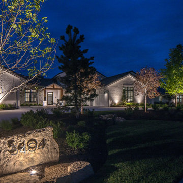
Take a tour of the lake house landscape lighting design at this gorgeous property in Valley, Nebraska. It increases nighttime security, enhances the architectural features, and creates the perfect ambiance for long, leisurely evenings spent enjoying the lake.
Learn more about the lighting design: www.mckaylighting.com/blog/lake-house-landscape-lighting-design
Go to the photo gallery: www.mckaylighting.com/modern-farmhouse
Sponsored
Delaware, OH

Buckeye Basements, Inc.
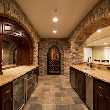
Central Ohio's Basement Finishing ExpertsBest Of Houzz '13-'21
 River Valley Landscapes
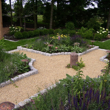
The property is one of the original farm houses located on the main street of a small town. It has been in the family for many years and our client just inherited the property. They were trying to have balance of preserving the old while realizing modern day living has its benefits too. The house had a large addition added using mostly old style materials, but designed with function and modern day luxuries. Our goal was to carry that theme to the outside.
Our first problem we had to address was how to transition between the first floor elevation changes. The lower room was the husband’s office. He stated in the future he may have clients over and it would be nice to have an area to sit outside. The wife’s main concern was to renew the four corner garden. She also felt it was very important to be able to see it from the kitchen area. Finally there was an old wishing well stuck right outside the kitchen. They both felt it would be neat to be able to incorporate this in some how. They wanted a patio area with a built in grill to accommodate there family and friends. They also wanted to keep a large play area for the kids.
We were able to pull this off successfully. We addressed the first issue by having a small lower level flagstone area. This area is large enough for 1 to 2 people to sit comfortably. It also provides a transition from his office to the larger patio area. We installed a simple small gravel sitting area opposite of the main patio. This provides our client a secluded place to relax or do business. Mrs.... told me she is amazed how much her and her husband enjoys this area. It is so peaceful looking at the small creek over a glass of wine.
We built a natural limestone retaining wall to create the patio terrace. The stone was chosen to extend the houses architectural elements into the landscape. Irregular broken flagstone was used to give it a more casual feel. We installed three Serviceberries into the patio terrace to replace some trees that were taken down during the remodeling. She was very concern that they would block the view of the four corner garden. We new they were crucial to nestle in the terrace, so we placed them for a couple days for her to decide. Fortunately she agreed they not only kept the view open, but helped frame the garden.
The four corner garden was designed to be viewed from afar and experienced up close. We wanted the space to have some formal structure while keeping with the casual farm house feel. Another natural limestone retaining wall was created. This leveled the garden terrace and helped associate it with the rest of the property. The four corner garden is nestled into the existing woods edge. This provides three distinct experiences to entering the garden; a more formal from the driveway, an open feel from the lower lawn, and a more natural / casual experience from the wooded area. The Plymouth brown gravel was used for the center of the garden. This helped highlight the stone post that was found during construction. The gravel also brings the sense of sound into the garden space. Lamb’s ear was chosen as a fun way to get kids interest in horticulture.
The balance of using the new to create the old feel is what makes this project a success. The property has already hosted a local historical society event and won an award for its preservation efforts. When Mrs.... can’t find her husband, she knows he is either reading the newspaper by the grill or resting in the hammock along the wood’s path.
 Modern House Numbers
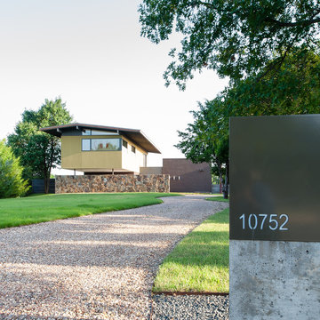
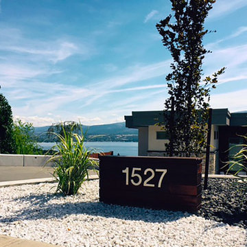
Soho Modern House Numbers (modernhousenumbers.com) available in 4", 6", 8", 12" or 15" high. aluminum numbers are 3/8" thick, brushed finish with a high quality clear coat and a 1/2" standoff providing a subtle shadow.
 Mary Cook
Taylor Photo
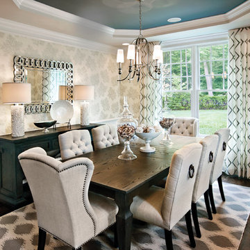
Inspiration for a transitional dark wood floor and brown floor dining room remodel in Chicago with beige walls
Inspiration for a transitional dark wood floor and brown floor dining room remodel in Chicago with beige walls
 Klopf Architecture
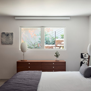
Set on a narrow hillside lot overlooking the San Francisco Bay in Point Richmond, California, Bay Heirloom is a Mid-Century Modern family home restored, modernized and adapted for contemporary living. Oriented south-southwest toward the Marin Headlands, with views of the Golden Gate Bridge, the residence captures shifting Bay light throughout the day, from fog-muted mornings to vivid, glowing sunsets.
The home was built by Karlyn Neel’s grandfather, the owner of the construction company Flo-Crete, one of the Bay Area’s early concrete pumping firms. Flo-Crete completed the foundation and structural concrete work, with family photographs documenting the original cinderblock walls and pours. The firm also contributed to major regional infrastructure projects, including the Transbay BART tube and Candlestick Park, situating the house within a broader legacy of Bay Area construction. Growing up, Neel spent considerable time in the home, developing an early appreciation for mid-century modern principles. Instead of parting with this family heirloom, she purchased the home from her grandfather’s estate.
While her grandfather continued to live in the Point Richmond house, Neel purchased a Mid-Century Modern residence in Palm Desert. In contrast to the Bay Area’s cool temperatures, salt air, and persistent winds, the desert home is shaped by heat and sun and requires a different material response. A substantial renovation she led there emphasized thermal performance, filtered light, and restrained detailing. The experience later informed the restoration of her Bay Area family home.
What began as a modest Mid-Century Modern update expanded when decades of exposure to marine conditions revealed leaks and significant structural and seismic deficiencies. Neel was determined to honor her grandfather’s perseverance and without hesitation pivoted to a much more intensive project. Addressing these challenges required close coordination between Neel, Klopf Architecture and Kasten Builders, with architectural restraint and construction precision guiding each intervention. Rather than alter the home’s defining features, the project focused on reinforcing the structure from within. Discreet beams were embedded along the rear facade and in an upstairs wall, strengthening the building while maximizing the wall of glass facing the Bay and opening the wall between the kitchen and the living space. These structural interventions allowed the space to open fully to the Bay without visual interruption, with the kitchen repositioned as the social and functional core of an open, continuous living space. The building envelope was updated using weather- and corrosion-resistant materials appropriate to the marine environment.
The house unfolds vertically from the street, beginning with a modest garage level and workshop, with the main living spaces located below. Original slate flooring at the entry was preserved, along with select furnishings and artwork collected by Neel’s grandfather, anchoring the restored interior in its past. A restrained palette of black accents and pale, natural finishes replaces darker wood tones, reinforcing openness and calm. A naturally illuminated stair connects to the lowest level, where a former basement was transformed into a guest suite and family room opening onto a deck. From there, steps lead directly to a small concrete boat ramp at the water’s edge.
Throughout the project, decisions were guided by continuity rather than transformation for its own sake. Lessons drawn from both desert and coastal climates informed a material strategy rooted in performance and restraint. Bay Heirloom stands as a measured evolution of a family house, structurally renewed and carefully modernized, grounded in the discipline and care that first shaped it.
Klopf Architecture Project Team: John Klopf, AIA, Angela Todorova and Fernanda Bernardes
Landscape Architect: Huettl Landscape Architecture
General Contractor: Kasten Builders
Photography: ©2025 Mariko Reed
Year Completed: 2022
Location: Point Richmond, CA
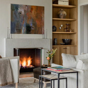
 SV Design
What began as a renovation project morphed into a new house, driven by the natural beauty of the site.
The new structures are perfectly aligned with the coastline, and take full advantage of the views of ocean, islands, and shoals. The location is within walking distance of town and its amenities, yet miles away in the privacy it affords. The house is nestled on a nicely wooded lot, giving the residence screening from the street, with an open meadow leading to the ocean on the rear of the lot.
The design concept was driven by the serenity of the site, enhanced by textures of trees, plantings, sand and shoreline. The newly constructed house sits quietly in a location advantageously positioned to take full advantage of natural light and solar orientations. The visual calm is enhanced by the natural material: stone, wood, and metal throughout the home.
The main structures are comprised of traditional New England forms, with modern connectors serving to unify the structures. Each building is equally suited for single floor living, if that future needs is ever necessary. Unique too is an underground connection between main house and an outbuilding.
With their flowing connections, no room is isolated or ignored; instead each reflects a different level of privacy and social interaction.
Just as there are layers to the exterior in beach, field, forest and oceans, the inside has a layered approach. Textures in wood, stone, and neutral colors combine with the warmth of linens, wools, and metals. Personality and character of the interiors and its furnishings are tailored to the client’s lifestyle. Rooms are arranged and organized in an intersection of public and private spaces. The quiet palette within reflects the nature outside, enhanced with artwork and accessories.
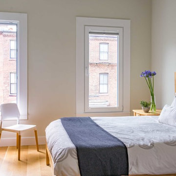 ZeroEnergy Design
This renovated brick rowhome in Boston’s South End offers a modern aesthetic within a historic structure, creative use of space, exceptional thermal comfort, a reduced carbon footprint, and a passive stream of income.
DESIGN PRIORITIES. The goals for the project were clear - design the primary unit to accommodate the family’s modern lifestyle, rework the layout to create a desirable rental unit, improve thermal comfort and introduce a modern aesthetic. We designed the street-level entry as a shared entrance for both the primary and rental unit. The family uses it as their everyday entrance - we planned for bike storage and an open mudroom with bench and shoe storage to facilitate the change from shoes to slippers or bare feet as they enter their home. On the main level, we expanded the kitchen into the dining room to create an eat-in space with generous counter space and storage, as well as a comfortable connection to the living space. The second floor serves as master suite for the couple - a bedroom with a walk-in-closet and ensuite bathroom, and an adjacent study, with refinished original pumpkin pine floors. The upper floor, aside from a guest bedroom, is the child's domain with interconnected spaces for sleeping, work and play. In the play space, which can be separated from the work space with new translucent sliding doors, we incorporated recreational features inspired by adventurous and competitive television shows, at their son’s request.
MODERN MEETS TRADITIONAL. We left the historic front facade of the building largely unchanged - the security bars were removed from the windows and the single pane windows were replaced with higher performing historic replicas. We designed the interior and rear facade with a vision of warm modernism, weaving in the notable period features. Each element was either restored or reinterpreted to blend with the modern aesthetic. The detailed ceiling in the living space, for example, has a new matte monochromatic finish, and the wood stairs are covered in a dark grey floor paint, whereas the mahogany doors were simply refinished. New wide plank wood flooring with a neutral finish, floor-to-ceiling casework, and bold splashes of color in wall paint and tile, and oversized high-performance windows (on the rear facade) round out the modern aesthetic.
RENTAL INCOME. The existing rowhome was zoned for a 2-family dwelling but included an undesirable, single-floor studio apartment at the garden level with low ceiling heights and questionable emergency egress. In order to increase the quality and quantity of space in the rental unit, we reimagined it as a two-floor, 1 or 2 bedroom, 2 bathroom apartment with a modern aesthetic, increased ceiling height on the lowest level and provided an in-unit washer/dryer. The apartment was listed with Jackie O'Connor Real Estate and rented immediately, providing the owners with a source of passive income.
ENCLOSURE WITH BENEFITS. The homeowners sought a minimal carbon footprint, enabled by their urban location and lifestyle decisions, paired with the benefits of a high-performance home. The extent of the renovation allowed us to implement a deep energy retrofit (DER) to address air tightness, insulation, and high-performance windows. The historic front facade is insulated from the interior, while the rear facade is insulated on the exterior. Together with these building enclosure improvements, we designed an HVAC system comprised of continuous fresh air ventilation, and an efficient, all-electric heating and cooling system to decouple the house from natural gas. This strategy provides optimal thermal comfort and indoor air quality, improved acoustic isolation from street noise and neighbors, as well as a further reduced carbon footprint. We also took measures to prepare the roof for future solar panels, for when the South End neighborhood’s aging electrical infrastructure is upgraded to allow them.
URBAN LIVING. The desirable neighborhood location allows the both the homeowners and tenant to walk, bike, and use public transportation to access the city, while each charging their respective plug-in electric cars behind the building to travel greater distances.
OVERALL. The understated rowhouse is now ready for another century of urban living, offering the owners comfort and convenience as they live life as an expression of their values.
Eric Roth Photo


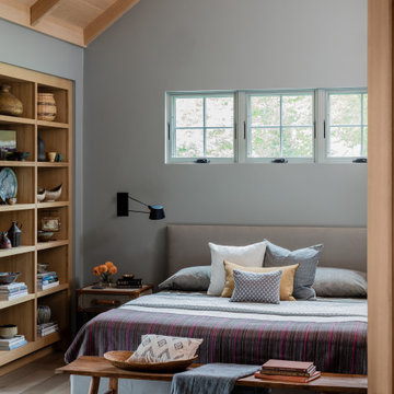 SV Design
What began as a renovation project morphed into a new house, driven by the natural beauty of the site.
The new structures are perfectly aligned with the coastline, and take full advantage of the views of ocean, islands, and shoals. The location is within walking distance of town and its amenities, yet miles away in the privacy it affords. The house is nestled on a nicely wooded lot, giving the residence screening from the street, with an open meadow leading to the ocean on the rear of the lot.
The design concept was driven by the serenity of the site, enhanced by textures of trees, plantings, sand and shoreline. The newly constructed house sits quietly in a location advantageously positioned to take full advantage of natural light and solar orientations. The visual calm is enhanced by the natural material: stone, wood, and metal throughout the home.
The main structures are comprised of traditional New England forms, with modern connectors serving to unify the structures. Each building is equally suited for single floor living, if that future needs is ever necessary. Unique too is an underground connection between main house and an outbuilding.
With their flowing connections, no room is isolated or ignored; instead each reflects a different level of privacy and social interaction.
Just as there are layers to the exterior in beach, field, forest and oceans, the inside has a layered approach. Textures in wood, stone, and neutral colors combine with the warmth of linens, wools, and metals. Personality and character of the interiors and its furnishings are tailored to the client’s lifestyle. Rooms are arranged and organized in an intersection of public and private spaces. The quiet palette within reflects the nature outside, enhanced with artwork and accessories.
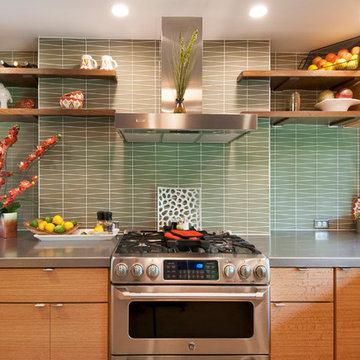
 NJW Renovations Unlimited
What this Mid-century modern home originally lacked in kitchen appeal it made up for in overall style and unique architectural home appeal. That appeal which reflects back to the turn of the century modernism movement was the driving force for this sleek yet simplistic kitchen design and remodel.
Stainless steel aplliances, cabinetry hardware, counter tops and sink/faucet fixtures; removed wall and added peninsula with casual seating; custom cabinetry - horizontal oriented grain with quarter sawn red oak veneer - flat slab - full overlay doors; full height kitchen cabinets; glass tile - installed countertop to ceiling; floating wood shelving; Karli Moore Photography
 Signature Designs Kitchen | Bath | Interiors
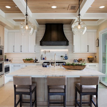
Our client desired a bespoke farmhouse kitchen and sought unique items to create this one of a kind farmhouse kitchen their family. We transformed this kitchen by changing the orientation, removed walls and opened up the exterior with a 3 panel stacking door.
The oversized pendants are the subtle frame work for an artfully made metal hood cover. The statement hood which I discovered on one of my trips inspired the design and added flare and style to this home.
Nothing is as it seems, the white cabinetry looks like shaker until you look closer it is beveled for a sophisticated finish upscale finish.
The backsplash looks like subway until you look closer it is actually 3d concave tile that simply looks like it was formed around a wine bottle.
We added the coffered ceiling and wood flooring to create this warm enhanced featured of the space. The custom cabinetry then was made to match the oak wood on the ceiling. The pedestal legs on the island enhance the characterizes for the cerused oak cabinetry.
Fabulous clients make fabulous projects.
 Drury Design
THE SETUP
Once these empty nest homeowners decided to stay put, they knew a new kitchen was in order. Passionate about cooking, entertaining, and hosting holiday gatherings, they found their existing kitchen inadequate. The space, with its traditional style and outdated layout, was far from ideal. They longed for an elegant, timeless kitchen that was not only show-stopping but also functional, seamlessly catering to both their daily routines and special occasions with friends and family. Another key factor was its future appeal to potential buyers, as they’re ready to enjoy their new kitchen while also considering downsizing in the future.
Design Objectives:
Create a more streamlined, open space
Eliminate traditional elements
Improve flow for entertaining and everyday use
Omit dated posts and soffits
Include storage for small appliances to keep counters clutter-free
Address mail organization and phone charging concerns
THE REMODEL
Design Challenges:
Compensate for lost storage from omitted wall cabinets
Revise floorplan to feature a single, spacious island
Enhance island seating proximity for a more engaging atmosphere
Address awkward space above existing built-ins
Improve natural light blocked by wall cabinet near the window
Create a highly functional space tailored for entertaining
Design Solutions:
Tall cabinetry and pull-outs maximize storage efficiency
A generous single island promotes seamless flow and ample prep space
Strategic island seating arrangement fosters easy conversation
New built-ins fill arched openings, ensuring a custom, clutter-free look
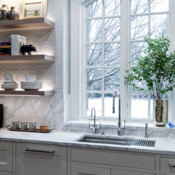
Replace wall cabinet with lighted open shelves for an airy feel
Galley Dresser and Workstation offer impeccable organization and versatility, creating the perfect setup for entertaining with everything easily accessible.
THE RENEWED SPACE
The new kitchen exceeded every expectation, thrilling the clients with its revitalized, expansive design and thoughtful functionality. The transformation brought to life an open space adorned with marble accents, a state-of-the-art steam oven, and the seamless integration of the Galley Dresser, crafting a kitchen not just to be used, but to be cherished. This is more than a culinary space; it’s a new heart of their home, ready to host countless memories and culinary adventures.
This is one of 2 prep sinks by The Galley.

 MA Peterson Design Build, Inc.
MA Peterson
www.mapeterson.com
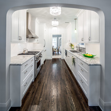
A bright and airy galley kitchen, offering easy pass-through for the family.
Inspiration for a mid-sized timeless galley dark wood floor and brown floor enclosed kitchen remodel in Minneapolis with an undermount sink, shaker cabinets, white backsplash, white cabinets, granite countertops, subway tile backsplash and no island
Inspiration for a mid-sized timeless galley dark wood floor and brown floor enclosed kitchen remodel in Minneapolis with an undermount sink, shaker cabinets, white backsplash, white cabinets, granite countertops, subway tile backsplash and no island
 ZeroEnergy Design
This renovated brick rowhome in Boston’s South End offers a modern aesthetic within a historic structure, creative use of space, exceptional thermal comfort, a reduced carbon footprint, and a passive stream of income.
DESIGN PRIORITIES. The goals for the project were clear - design the primary unit to accommodate the family’s modern lifestyle, rework the layout to create a desirable rental unit, improve thermal comfort and introduce a modern aesthetic. We designed the street-level entry as a shared entrance for both the primary and rental unit. The family uses it as their everyday entrance - we planned for bike storage and an open mudroom with bench and shoe storage to facilitate the change from shoes to slippers or bare feet as they enter their home. On the main level, we expanded the kitchen into the dining room to create an eat-in space with generous counter space and storage, as well as a comfortable connection to the living space. The second floor serves as master suite for the couple - a bedroom with a walk-in-closet and ensuite bathroom, and an adjacent study, with refinished original pumpkin pine floors. The upper floor, aside from a guest bedroom, is the child's domain with interconnected spaces for sleeping, work and play. In the play space, which can be separated from the work space with new translucent sliding doors, we incorporated recreational features inspired by adventurous and competitive television shows, at their son’s request.
MODERN MEETS TRADITIONAL. We left the historic front facade of the building largely unchanged - the security bars were removed from the windows and the single pane windows were replaced with higher performing historic replicas. We designed the interior and rear facade with a vision of warm modernism, weaving in the notable period features. Each element was either restored or reinterpreted to blend with the modern aesthetic. The detailed ceiling in the living space, for example, has a new matte monochromatic finish, and the wood stairs are covered in a dark grey floor paint, whereas the mahogany doors were simply refinished. New wide plank wood flooring with a neutral finish, floor-to-ceiling casework, and bold splashes of color in wall paint and tile, and oversized high-performance windows (on the rear facade) round out the modern aesthetic.
RENTAL INCOME. The existing rowhome was zoned for a 2-family dwelling but included an undesirable, single-floor studio apartment at the garden level with low ceiling heights and questionable emergency egress. In order to increase the quality and quantity of space in the rental unit, we reimagined it as a two-floor, 1 or 2 bedroom, 2 bathroom apartment with a modern aesthetic, increased ceiling height on the lowest level and provided an in-unit washer/dryer. The apartment was listed with Jackie O'Connor Real Estate and rented immediately, providing the owners with a source of passive income.
ENCLOSURE WITH BENEFITS. The homeowners sought a minimal carbon footprint, enabled by their urban location and lifestyle decisions, paired with the benefits of a high-performance home. The extent of the renovation allowed us to implement a deep energy retrofit (DER) to address air tightness, insulation, and high-performance windows. The historic front facade is insulated from the interior, while the rear facade is insulated on the exterior. Together with these building enclosure improvements, we designed an HVAC system comprised of continuous fresh air ventilation, and an efficient, all-electric heating and cooling system to decouple the house from natural gas. This strategy provides optimal thermal comfort and indoor air quality, improved acoustic isolation from street noise and neighbors, as well as a further reduced carbon footprint. We also took measures to prepare the roof for future solar panels, for when the South End neighborhood’s aging electrical infrastructure is upgraded to allow them.
URBAN LIVING. The desirable neighborhood location allows the both the homeowners and tenant to walk, bike, and use public transportation to access the city, while each charging their respective plug-in electric cars behind the building to travel greater distances.
OVERALL. The understated rowhouse is now ready for another century of urban living, offering the owners comfort and convenience as they live life as an expression of their values.
Photography: Eric Roth Photo

 Barbara Grushow Designs Inc.
Jim Bartsch Photography
Bathroom - mid-sized transitional master white tile and subway tile mosaic tile floor and gray floor bathroom idea in Los Angeles with a wall-mount sink, gray walls, a hinged shower door and a niche
Bathroom - mid-sized transitional master white tile and subway tile mosaic tile floor and gray floor bathroom idea in Los Angeles with a wall-mount sink, gray walls, a hinged shower door and a niche
1