
Search results for "Adequately" in Home Design Ideas
 Lesley Glotzl
Jeff Glotzl
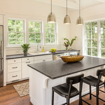
Mid-sized farmhouse single-wall medium tone wood floor open concept kitchen photo with a double-bowl sink, shaker cabinets, white cabinets, granite countertops, gray backsplash, stainless steel appliances and an island
Mid-sized farmhouse single-wall medium tone wood floor open concept kitchen photo with a double-bowl sink, shaker cabinets, white cabinets, granite countertops, gray backsplash, stainless steel appliances and an island
 Molidor Custom Builders, Inc.
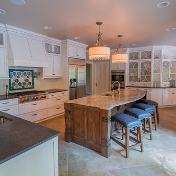
This Kitchen located in a traditional Tudor-style home in Lake Forest, IL needed a drastic change to reflect the sophisticated style and personality of the young, modern family with its executive yet family-oriented lifestyle. Our clients presented us with multiple design and functionality challenges including, but not limited to their kitchen feeling dark and enclosed even with their wonderful 9’ ceilings. There was a true lack of connection between their family room and kitchen, which made it difficult for them to enjoy their time together as a young family. The kitchen lacked storage, included a small desk area used for storing china, and a broken working triangle between appliances and prep areas.
From the client’s lackluster kitchen we set out to provide them with functional and attractive solutions to maximize their storage, space and provide quality that would stand the test of time.
We started by changing the orientation of the kitchen in turn opening up the exterior wall with beautiful French sliding patio doors that originally housed an under-sized window where under perched the kitchen sink. Instantly ample light poured into the space connecting the wooded lot to the kitchen as well as large deck for entertaining. We also opened the adjoining wall to the family room, which allotted open passage and a clear view to join the family space together. A bar height countertop was added for entertaining yet allowed for some visual separation between the spaces. We added spice drawers, towel pull outs at the sink and a wall of display and china cabinetry that mimic the cabinetry designed in the family room with beautiful, serpentine curved mullions by a floating banquette in the breakfast nook.
The exterior runs of the kitchen cabinetry are custom-made and hand finished with a beautiful warm white paint and café latte glaze. With espresso brown marble counters. The center ten-foot island is a rustic alder furniture-grade beauty with hand-turned legs and beautiful shaker panel doors and green marble top that brings in the tones of the teals, creams and browns running through the space. All of this sets on top of a beautiful twelve by twenty-four stone tile laid in an angled herringbone pattern. The kitchen backsplash is a custom tone crackle subway tile with a custom colored hand-cut Ann Sacks glass mosaic representing escargot over the professional-grade oven, surrounded by a hand-poured teal glass border.
The great room appeared extremely dark despite having large windows that reached towards the vaulted ceilings. The client felt attention was not drawn to the outside. The solution we drafted included pulling the mullions out of the windows and painting the trim work white. The fireplace was on one wall and the television on another. With the current furniture arrangements the back would have been to the fireplace. We changed the orientation of the room by placing the television over the fireplace in a recessed niche trimmed with stone and faced the upper portion in silk and the lower in large-format travertine. In creating a more intriguing fireplace façade we provided a focus for the furniture grouping to sit within. An oversized section with extra deep seating allows for a comfortable place to perch and spend family time while watching movies. The lighting in the space prior was not adequate so we created the addition of a small chandelier over the game table near the windows and added volume to the ceiling by including a larger chandelier central within the room with more candles. These changes helped update the formerly outdated dark and dreary space.
With the bones of the room uplifted we drew our attention to adding detail in furnishings and window treatments. We accented the room with subtle patterning on top of bold color choices. The chairs offer depth and dimension with the green citron accented seats and peacock-patterned back fabric that help tone the colors down. To lighting the space we added an oversized cocktail ottoman that floats beautifully within the space and brings in the blue accents with button tufts as a peek-a-boo effect within. The sliding tray works perfectly to function as both a cocktail table and place to rest one’s feet. The game table in the rear of the room has an inlaid cross-cut branch marquis within the top and is surrounded by clean-lined chairs and a curved banquette perfect for a family to play games at and spend their quality time. Beautiful bounding window treatments drape the two-story window wall with an over-sized medallion patterned top treatment cascading into solid blue striated fabric trimmed with beaded shell trim for an appropriately dynamic finishing touch to the space.
The kitchen and family room meld beautifully together and offer a crisp yet welcoming feel to the home in keeping with the Tudor styling and modern family needs. It’s a space truly to be enjoyed by all who visit.
Katherine Elizabeth Designs
 Kimberlee Marie Interiors
Set in the charming neighborhood of Wedgwood, this Cape Cod-style home needed a major update to satisfy our client's lifestyle needs. The living room, dining room, and kitchen were all separated, making it hard for our clients to carry out day-to-day life with small kids or adequately entertain. Our client also loved to cook for her family, so having a large open concept kitchen where she could cook, keep tabs on the kids, and entertain simultaneously was very important. To accommodate those needs, we bumped out the back and side of the house and eliminated all the walls in the home's communal areas. Adding on to the back of the house also created space in the basement where they could add a separate entrance and mudroom.
We wanted to make sure to blend the character of this home with the client's love for color, modern flare, and updated finishes. So we decided to keep the original fireplace and give it a fresh look with tile, add new hardwood in a lighter stain to match the existing and bring in pops of color through the kitchen cabinets and furnishings. New windows, siding, and a fresh coat of paint were added to give this home the curbside appeal it deserved.
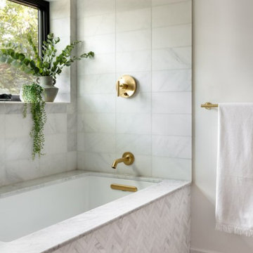
In the second phase of this remodel, we transformed the basement bathroom and storage room into a primary suite. With the addition of baby number three, our clients wanted to create a retreat they could call their own. Bringing in soft, muted tones made their bedroom feel calm and collected, a relaxing place to land after a busy day. With our client’s love of patterned tile, we decided to go a little bolder in the bathroom with the flooring and vanity wall. Adding the marble in the shower and on the countertop helped balance the bold tile choices and keep both spaces feeling cohesive.
Find the right local pro for your project
 Jennifer Gardner Design
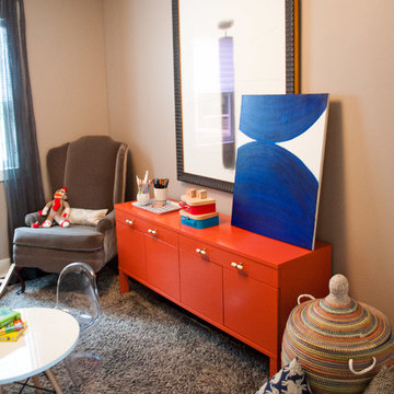
This dining room turned playroom was designed for an energetic 2 year old. Our top priorities were maximizing a small space, providing adequate storage for toys and books and developing a design aesthetic that would be both inviting to a two year old and also flow beautifully from the adjacent living room and kitchen. We chose a warm, neutral wall color and accented it with pops of orangey red and vivid blues. Textures and patterns were incorporated to create playful visual interest. A sensory wall was added to offer stimulating play and beloved artwork was installed to add a touch of grown up sophisticated. An IKEA cabinet was painted a bold red and offers plenty of organized hidden storage. New knobs by Anthropologie were added to give the cabinet a custom feel. Large pillows in John Robshaw fabric offer a soft place to rest and the modern eiffel table and clear panton chairs become the epicenter for art, puzzles and snacks. This room is bursting with bright, bold color and a center for fun childhood experience. It was a joy to design for a very special Seattle family!
 Design District Access
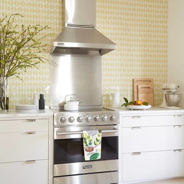
Example of a mid-sized transitional single-wall laminate floor eat-in kitchen design in San Diego with flat-panel cabinets, white cabinets, quartz countertops, white backsplash, stainless steel appliances and no island
 Scott D. Koch Architect L.L.C.
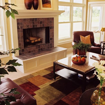
Corner daylighting and open planning help make this moderately sized space feel much larger than it really is. Through house views and extending sight lines diagonally through the larger dimension of the space combined with outdoor views and adequate daylighting can expand the percieved space visually.
 Michael Nash Design, Build & Homes
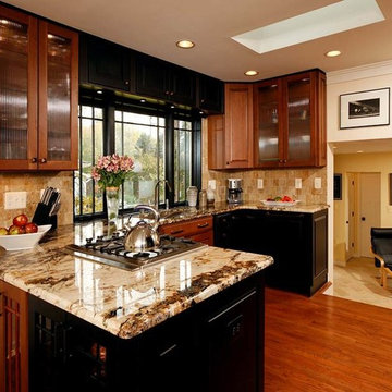
2013 PROFESSIONAL REMODELER, SILVER AWARD WINNER, RESIDENTIAL KITCHEN
This 1970’s split-level single-family home in an upscale Arlington neighborhood had been neglected for years. With his surrounding neighbors all doing major exterior and interior remodeling, however, the owner decided it was time to renovate his property as well.
The home’s signature space is a kitchen that combines both form and function. Custom-made dark and light cherry cabinets are topped by exotic granite countertops. Prairie-style windows, wide plank hard wood floors and a tumbled stone backsplash complete the Arts & Crafts design.
Professional-grade appliances include a gas cooktop, double wall ovens and a large refrigerator/freezer with matching inset cabinet panels. The kitchen work triangle guarantees ultimate efficiency. Recessed lighting and a skylight assures adequate lighting in the space at all times.


 Vetter Architects
A minimal insertion into a densely wooded landscape, the Collector’s Pavilion provides the owners with an 8,000 sf private fitness space and vintage automobile gallery. On a gently sloping site in amongst a grove of trees, the pavilion slides into the topography - mimicking and contrasting the surrounding landscape with a folded roof plane that hovers over a board formed concrete base.
The clients’ requirement for a nearby room to display a growing car collection as well as provide a remote area for personal fitness carries with it a series of challenges related to privacy and security. The pavilion nestles into the wooded site - finding a home in a small clearing - and merges with the sloping landscape. The building has dual personalities, serving as a private and secure bunker from the exterior, while transforming into a warm and inviting space on the interior. The use of indirect light and the need to obscure direct views from the public right away provides the client with adequate day light for day-to-day use while ensuring that strict privacy is maintained. This shifting personality is also dramatically affected by the seasons - contrasting and merging with the surrounding environment depending on the time of year.
The Collector’s Pavilion employs meticulous detailing of its concrete to steel to wood connections, exploring the grounded nature of poured concrete in conjunction with a delicate wood roof system that floats above a grid of steel. Above all, the Pavilion harmonizes with it’s natural surroundings through it’s materiality, formal language, and siting.
Overview
Chenequa, WI
Size
8,000 sf
Completion Date
May 2013
Services
Architecture, Landscape Architecture, Interior Design
 Balboa Design Group
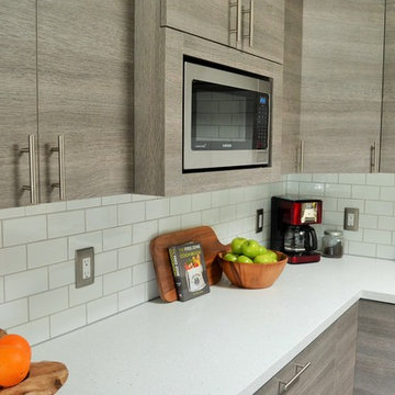
Our client's original kitchen lacked adequate storage and counter space. To create a more open flow from the living room to the kitchen, we decided to remove some walls and cabinets over the island, replacing with a ceiling-mount vent hood. We also incorporated an L-shaped counter along the north facing wall to maximize counter space and increase the amount of storage. The combination of custom gray distressed wood cabinetry and sparkling white quartzite countertops create a stunning atmosphere in this previously lackluster kitchen.
 Jennifer Gardner Design
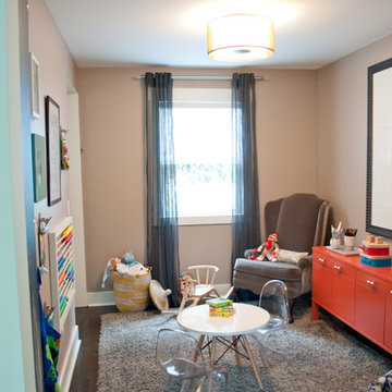
This dining room turned playroom was designed for an energetic 2 year old. Our top priorities were maximizing a small space, providing adequate storage for toys and books and developing a design aesthetic that would be both inviting to a two year old and also flow beautifully from the adjacent living room and kitchen. We chose a warm, neutral wall color and accented it with pops of orangey red and vivid blues. Textures and patterns were incorporated to create playful visual interest. A sensory wall was added to offer stimulating play and beloved artwork was installed to add a touch of grown up sophisticated. An IKEA cabinet was painted a bold red and offers plenty of organized hidden storage. New knobs by Anthropologie were added to give the cabinet a custom feel. Large pillows in John Robshaw fabric offer a soft place to rest and the modern eiffel table and clear panton chairs become the epicenter for art, puzzles and snacks. This room is bursting with bright, bold color and a center for fun childhood experience. It was a joy to design for a very special Seattle family!
 Lunada Consulting & Design, Inc.
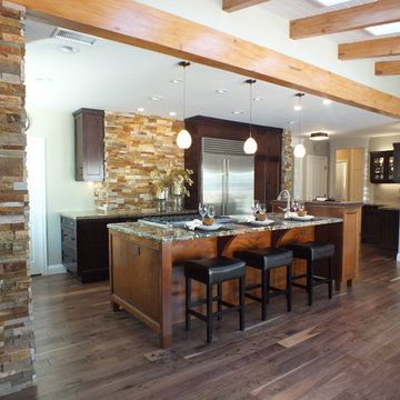
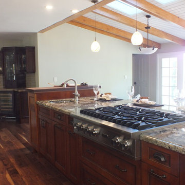
Clients were looking for an open space that had the feel of a relaxed weekend retreat in the kitchen. Counter seating includes interaction with the cook, and there is ample storage space without feeling closed in. The appliances are of adequate size for family and entertaining guests, and there is great traffic flow. Some special features included are: Stone facade focal point and flanking stone end walls; Dual counter heights on island provide height for laptop usage plus creates a visual transition from the working space of the island; faux beam between kitchen and family room adding to the open feel; new hardwood floor; stainless steel farm sink and service sink; LED lighting fixtures.
Photo cred: Carbajal
 Care Free Homes, Inc.
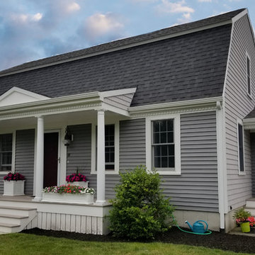
Mastic Cedar Discovery Vinyl Siding in the color, Victorian Grey. Mastic Carvedwood 44 Vinyl Siding in the color, Deep Granite. TimberTech AZEK Deck in the color, Slate Gray. GAF Timberline HD Roofing System in the color, Charcoal. Photo Credit: Care Free Homes, Inc.
 Lunada Consulting & Design, Inc.
Clients were looking for an open space that had the feel of a relaxed weekend retreat in the kitchen. Counter seating includes interaction with the cook, and there is ample storage space without feeling closed in. The appliances are of adequate size for family and entertaining guests, and there is great traffic flow. Some special features included are: Stone facade focal point and flanking stone end walls; Dual counter heights on island provide height for laptop usage plus creates a visual transition from the working space of the island; faux beam between kitchen and family room adding to the open feel; new hardwood floor; stainless steel farm sink and service sink; LED lighting fixtures.
Photo cred: Carbajal
 KabCo Kitchens
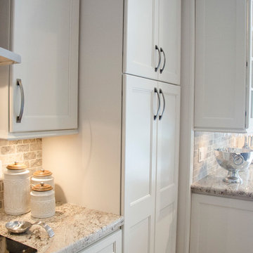
These beautiful white cabinets are provide adequate storage with plenty of roll outs. Photo Credit: Julie Lehite
Open concept kitchen - large transitional porcelain tile open concept kitchen idea in Miami with an undermount sink, shaker cabinets, granite countertops, multicolored backsplash, stone tile backsplash, stainless steel appliances and an island
Open concept kitchen - large transitional porcelain tile open concept kitchen idea in Miami with an undermount sink, shaker cabinets, granite countertops, multicolored backsplash, stone tile backsplash, stainless steel appliances and an island
 Vetter Architects
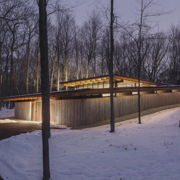
A minimal insertion into a densely wooded landscape, the Collector’s Pavilion provides the owners with an 8,000 sf private fitness space and vintage automobile gallery. On a gently sloping site in amongst a grove of trees, the pavilion slides into the topography - mimicking and contrasting the surrounding landscape with a folded roof plane that hovers over a board formed concrete base.
The clients’ requirement for a nearby room to display a growing car collection as well as provide a remote area for personal fitness carries with it a series of challenges related to privacy and security. The pavilion nestles into the wooded site - finding a home in a small clearing - and merges with the sloping landscape. The building has dual personalities, serving as a private and secure bunker from the exterior, while transforming into a warm and inviting space on the interior. The use of indirect light and the need to obscure direct views from the public right away provides the client with adequate day light for day-to-day use while ensuring that strict privacy is maintained. This shifting personality is also dramatically affected by the seasons - contrasting and merging with the surrounding environment depending on the time of year.
The Collector’s Pavilion employs meticulous detailing of its concrete to steel to wood connections, exploring the grounded nature of poured concrete in conjunction with a delicate wood roof system that floats above a grid of steel. Above all, the Pavilion harmonizes with it’s natural surroundings through it’s materiality, formal language, and siting.
Overview
Chenequa, WI
Size
8,000 sf
Completion Date
May 2013
Services
Architecture, Landscape Architecture, Interior Design
 Window Works
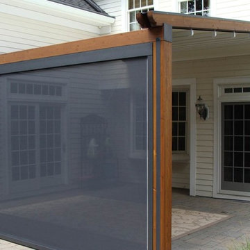
Homeowner had been considering construction of a pergola for quite some time, but was reluctant to do so due to lack of rain protection. Although there are several pergola kit retrofit products that meet most of their goals, none of them were a good fit by matching all. The desire was for a retractable patio awning that aesthetically matched a pergola, but was retractable, and provided protection from both UV and inclement weather on their south facing patio. Part of the goal was to provide a flexible outdoor entertaining area, but also to integrate a front drop shade to help reduce the summer's afternoon sun from entering the space; as well as the bay window and sliding doors.
The "Gennius", a waterproof retractable awning by Durasol Awnings was selected by the homeowner for aesthetics and function, with a solar screen drop shade integrated between the upright support posts.
As young parents, it was of utmost importance to find a durable fabric for the drop shade that not only blocked an adequate amount of sun, but retained as much view of the pool for safety when deployed. Mermet brand Natte was chosen for the drop shade. Both the retracting fabric roof and the integrated drop shade are operated by radio controlled motors and hand-held remote control.
The homeowner now has complete control of the area, with on-demand protection to suit their tastes.
 CUSTOM CRAFT - Design Build Remodel
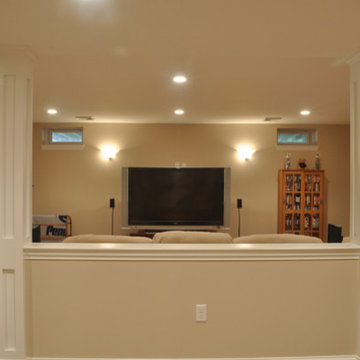
The television was positioned to provide adequate viewing from just about any location in the room. The recessed lighting and wall sconces can be dimmed low for movie night or turned up for family games.
 J.P. Hoffman Design Build
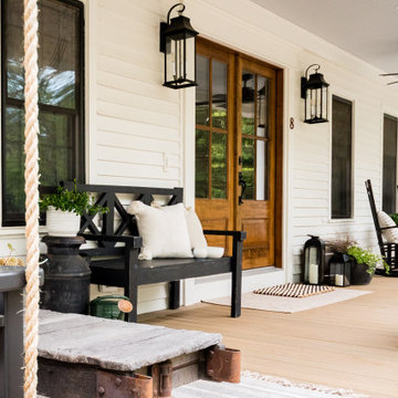
Our client's dream renovation included an exterior upgrade with a Farmer's Porch and a Porch Swing. We renovated the 1st floor and kitchen as well but here, although the photos include a yard trying to grow grass, we accomplished the vision no?!
 Kohn Shnier architects
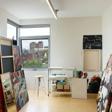
This impressive detached building is located in the heart of the bustling Dundas West strip, and presents a unique opportunity for creative live + work space.
Designed by Kohn Shnier Architects, the building was completed in 2008 and has been owner-occupied ever since. Modern steel and concrete construction enable clear spans throughout, and the virtual elimination of bulkheads. The main floor features a dynamic retail space, that connects to a lower level with high ceilings – perfect as a workshop, atelier or as an extension of the retail.
Upstairs, a spacious loft-like apartment is spread over 2 floors. The mainfloor includes a decadent chef’s kitchen finished in Corian, with a large eat-at island. The combined living & dining rooms connect with a large south-facing terrace with exceptional natural light and neighbourhood views. Upstairs, the master bathroom features abundant built-in closets, together with a generous ensuite bathroom. A second open space is presently used as a studio, but is easily converted to a closed 2nd bedroom.
Parking is provided at the rear of the building, and the rooftop functions as a green roof. The finest materials have been used in this very special building, from anodized aluminium windows paired with black manganese brick, to high quality appliances and dual furnaces to provide adequate heating and fire separation between the retail and residential units. Photo by Tom Arban
28